Round 9 - Challenge 09 - Results
ROUND 9 - CHALLENGE 09 - RESULTS
I am so sorry for the delay in posting this! But without further delay - RESULTS!
1ST PLACE [5 points]:
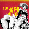
kayable with +4 votes (and more first place votes).
2ND PLACE [4 points]:

mm3butterfly with +4 votes.
3RD PLACE [3 points]:

angelamaria with +3 votes (and most first place votes).
BEST INTERPRETATION/MOST CREATIVE [2 points]:
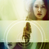
ellaangelus with +3 votes.
MODS CHOICE [1 point]:
absolutelybatty

val_valerie
The coloring here is fantastic! I love the atmosphere it evokes in the icon!
raiindust

vampire_sessah
The use of caps here is lovely, and I really enjoy the literal interpretation of escape.
TABLE KEY:
+++ = 1st Place Vote
++ = 2nd Place Vote
+ = 3rd Place Vote | Beginning of a new comment.
Note: Votes are not weighted in this round. Meaning a 1st, 2nd or 3rd vote will only give you 1 point when tallying the votes. Except in the case of a tie - then the icon with the most 1st place votes will be given first.
ICON VOTES

angelamariaPOSITIVE VOTES
++ Fantastic coloring and lightning
+++ The coloring here is fantastic - very natural, but eye-catching too. I love the lighting too, it really makes the icon stand out.
+++ I really love the lighting in this icon. Some parts o the top seem a little bit too bright, since they lose detail, so some layer masks might fix that (or they might not? I'm not sure if it would look better with them or not).
BEST INTERPRETATION/MOST CREATIVE
NONE.
CONSTRUCTIVE VOTES
NONE.
ADDITIONAL VOTES
+ Great choice of cap, it does look a bit LQ however, especially with the dark border.
+ I love the wide crop you went for and the sense of openess it portrays. Also a big thumbs up for the colouring and lightning.
gribouillePOSITIVE VOTES
NONE.
BEST INTERPRETATION/MOST CREATIVE
NONE.
CONSTRUCTIVE VOTES
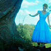
+ I really like the balancing of the crop in here. I think her skin is too blue, so perhaps masking her skin out will help make the subject stand out from the background and her surroundings.
+ The colors on this icon seem very flat on my screen. Playing around with curves, color balance, or selective color layers to bring in a bit more contrast between Alice's skin/the warmer neutrals of the tree and dirt vs. the blue of the sky and the green of the shrubbery would bring a coloring scheme to the icon that really made it pop.
ADDITIONAL VOTES
NONE.

sheekapPOSITIVE VOTES
NONE.
BEST INTERPRETATION/MOST CREATIVE
NONE.
CONSTRUCTIVE VOTES
NONE.
ADDITIONAL VOTES
NONE.

val_valeriePOSITIVE VOTES
+++ The monochrome colouring of this is really beautiful.
+ Very nice colouring and the cropping is spot on.
+ There is movement in this icon and I really like that because it is capturing the theme very well. I also like the monochrome colours you choose and the lightning is lovely.
BEST INTERPRETATION/MOST CREATIVE
NONE.
CONSTRUCTIVE VOTES
+ I like the monochrome coloring and the crop here, but there are some problems with sharpness and blurriness that distract from the good elements. It's especially visible on her face - the lips are sharp, but the eyes and her jawline are rather blurry. I think this could be a great icon if you sharpened the blurry places and blurred the sharp places a bit!
ADDITIONAL VOTES
NONE.

ellaangelusPOSITIVE VOTES
+++ I really like the colouring and the composition of this (the target texture really fits too!)
++ Great colouring and composition. It's a very nice icon overall.
++ Interesting composition, I love the negative space bit in the middle and the target circle is a nice touch, although not entirely in line with escape, I think? ;) But nevertheless it's a pretty icon.
BEST INTERPRETATION/MOST CREATIVE
+ No reason provided
+ Very nice composition ! The texture used fits the icon perfectly and does not seem out of place at all, it's very well executed.
+ Love the choice of caps combined here!
CONSTRUCTIVE VOTES
+ The composition of this is really stunning. However the colouring is a bit too bland. Amy doesn't really stand out from the beige background. Perhaps upping the contrast and colouring of her will make the icon stand out more.
ADDITIONAL VOTES
NONE.

marcasitePOSITIVE VOTES
+ I love the unusualness of this angle and how the distance is emphasized in the crop. I feel like I'm going to just fall over :s Lovely coloring too.
BEST INTERPRETATION/MOST CREATIVE
+ Great crop and best demonstrates the theme, imho.
CONSTRUCTIVE VOTES
NONE.
ADDITIONAL VOTES
+ Interesting composition and concept, but the icon looks a bit oversharpened around his face, and a bit too bright. I believe a darker coloring and more shadows, or maybe even a monotone coloring, would give this icon more impact.

regisPOSITIVE VOTES
NONE.
BEST INTERPRETATION/MOST CREATIVE
NONE.
CONSTRUCTIVE VOTES
NONE.
ADDITIONAL VOTES
+ Interesting composition and concept, but the icon looks a bit oversharpened around his face, and a bit too bright. I believe a darker coloring and more shadows, or maybe even a monotone coloring, would give this icon more impact.

margerydaw_s2POSITIVE VOTES
NONE.
BEST INTERPRETATION/MOST CREATIVE
NONE.
CONSTRUCTIVE VOTES
+ I really love this icon but I feel like the text doesn't quite fit it, maybe a script font or something less stiff and rigid might fit the icon a little better
+ Lovely coloring and far/negative space crop! The text however does not seem to match the feel of the icon, it's too blocky and a pixel font just doesn't seem to suit here. Color is lovely though!
ADDITIONAL VOTES
+ The icon has lovely soft coloring, but the text seems a bit obtrusive here. I believe the icon would be better without it, but if the maker insists on it, make it smaller, reposition it (maybe placing it lower in the canvas) and choose another font (the "blockyness" of the font makes it look pixelly and unmatching of the general softness of the icon)

12feethighPOSITIVE VOTES
NONE.
BEST INTERPRETATION/MOST CREATIVE
NONE.
CONSTRUCTIVE VOTES
+ the crop of this icon is a bit awkward. going for a wider crop would be more effective and give the icon a cleaner and more catching look. Maybe also try to make the persons black darker so that they don't appear in a dark shade of blue, which makes it also harder to tell things in the icon apart.
ADDITIONAL VOTES
+ Nice crop, unfortunately Stiles and Derek don't really stand out against the background making the icon look a bit bland, I think you should try and fix the lighting or play with colours and saturation.
+ This icon has lovely coloring but I'm not sure what's supposed to be happening? Maybe if the contrast wasn't so low the lines in the subjects didn't blend together I'd be able to.

rocketgirl2POSITIVE VOTES
+ Although the icon is a tad too blurry on my screen, I think the colouring is really stunning. You've really brought out the bright colours and I really like the fact the contrast is minimal.
BEST INTERPRETATION/MOST CREATIVE
NONE.
CONSTRUCTIVE VOTES
+ The colouring in this looks so lovely but the image looks blurry and lq to me
+ The characters all appear really blurry and washed out, although the rest of the colouring looks very bright and nice.
+ I really love the colours of this icon, because they are so wonderfully vibrant and the crop is also very wide and open, which I like. But the persons are far too blurry. You can't make out their faces and even their bodyshapes are blurry and washed out.
+ The crop is really lovely and the colors brought out in the icon is divine. But the icon looks rather LQ because of the "shine" or blurriness of the subjects, their outlines are blurry/too glowy, and the bottom portion of the icon is "grainy" which doesn't really suit the glowiness. Maybe lower the opacity of the layer that is providing the glow on the subjects?
+ The icon has lovely coloring and cropping, but it looks a bit too blurry in my screen, in a way I can't make out who the subjects are
ADDITIONAL VOTES
NONE.

kayablePOSITIVE VOTES
+++ Great use of text and the colouring is absoutely brilliant. I love it !
+++ I really adore your incorporation of text because it gives the icon a special feel and brings it much closer to the theme. I also really like the black&white character against coloured background compostion (and the cut out is extremely accurate too!)
+++ Love the composition! All together the icon really works for me, the blockiness of the text, the yellow of the top border and the text, the black and white coloring of the subject against the red background. I would probably bring the yellow portions of the icon a bit closer shade-wise but it's lovely as it is.
+ Great play of colors and black&white, the text is well executed too.
BEST INTERPRETATION/MOST CREATIVE
+ No reason provided.
+ Interesting use of colors.
CONSTRUCTIVE VOTES
NONE.
ADDITIONAL VOTES
NONE.

vampire_sessahPOSITIVE VOTES
+ I love the colours here :)
+ Love the composition and colors! The only critique I have is that her arm seems oddly cut off in the bottom cap, but give what you have, I'm not sure that's a ~fixable sort of issue.
BEST INTERPRETATION/MOST CREATIVE
NONE.
CONSTRUCTIVE VOTES
+ It's very difficult to see what is going on in the top part of the icon. The colouring is nice though, I just think you need a closer crop for the top part.
+ The coloring of this ico is lovely, but the way the bottom image is cropped makes it looks like her arm is cut off at the wrist, looks a bit unflattering.
+ The idea behind this icon is interesting, but it would work better if the two halves had different colorings, or maybe there was something dividing them - the grass in the top half blends with the grass in the bottom half, which makes it hard to see where one image ends and the other begins on the right side of the icon.
ADDITIONAL VOTES
+ This is an interesting composition but her hand being cut off is bothering me. Maybe switch the position of the caps so that her hand is cut off by the icon itself, and not by the other cap within the icon?

scoobyatemysnaxPOSITIVE VOTES
++ I love the crop here and the colouring is beautiful too!
+++ Amazing coloring, cropping and sharpening
++ The crop of this icon is perfect, so intimate and emotional. The muted coloring fits the intimate mood too, the overall effect is stunning.
BEST INTERPRETATION/MOST CREATIVE
+ No reason provided.
CONSTRUCTIVE VOTES
+ Nice soft colouring and brilliant crop, I just think it needs to be a little bit brighter around Aleesha so you can see her better.
+ I feel like this icon has so much potential with its interesting crop, but right now it's a little too dark for me. The face on the bottom is the brightest thing by far, so it draws almost all of my attention. Some work on getting the top face a tad lighter (and maybe a tad sharper) to match the one on the bottom would balance them out well. I also think a fill layer of a pretty dark color - maybe the dark reds that I sort of see in the left side of the icon - set to screen at a very low opacity would help soften up some of the darks and maybe bring a bit more detail into the negative space areas of the icon.
ADDITIONAL VOTES
NONE.

mm3butterflyPOSITIVE VOTES
++ I really like the originality of the crop. The cap you've chosen works really well for the theme.
++ The cropping is very creative and the close crop captures her emotions quite well. i also really like the coolouring that gives the whole icon a rather haunted feeling.
+ I really like the muted coloring and texture use on this icon, the rotation and the sharpness - they work together well and create an interesting look.
+++ Gorgeous crop here! The fact that her skin tone isn't the same from the left side of the icon to the right throws me off a bit, though - maybe making a new fill layer with the reddish hues in the shadows of her face and then setting it to hue at a low percentage could bring some reds back into her general forehead area.
BEST INTERPRETATION/MOST CREATIVE
+ No reason provided.
CONSTRUCTIVE VOTES
NONE.
ADDITIONAL VOTES
NONE.
Updated Scoring Spreadsheet
I am so sorry for the delay in posting this! But without further delay - RESULTS!
1ST PLACE [5 points]:

kayable with +4 votes (and more first place votes).
2ND PLACE [4 points]:

mm3butterfly with +4 votes.
3RD PLACE [3 points]:

angelamaria with +3 votes (and most first place votes).
BEST INTERPRETATION/MOST CREATIVE [2 points]:

ellaangelus with +3 votes.
MODS CHOICE [1 point]:
absolutelybatty

val_valerie
The coloring here is fantastic! I love the atmosphere it evokes in the icon!
raiindust

vampire_sessah
The use of caps here is lovely, and I really enjoy the literal interpretation of escape.
TABLE KEY:
+++ = 1st Place Vote
++ = 2nd Place Vote
+ = 3rd Place Vote | Beginning of a new comment.
Note: Votes are not weighted in this round. Meaning a 1st, 2nd or 3rd vote will only give you 1 point when tallying the votes. Except in the case of a tie - then the icon with the most 1st place votes will be given first.
ICON VOTES

angelamariaPOSITIVE VOTES
++ Fantastic coloring and lightning
+++ The coloring here is fantastic - very natural, but eye-catching too. I love the lighting too, it really makes the icon stand out.
+++ I really love the lighting in this icon. Some parts o the top seem a little bit too bright, since they lose detail, so some layer masks might fix that (or they might not? I'm not sure if it would look better with them or not).
BEST INTERPRETATION/MOST CREATIVE
NONE.
CONSTRUCTIVE VOTES
NONE.
ADDITIONAL VOTES
+ Great choice of cap, it does look a bit LQ however, especially with the dark border.
+ I love the wide crop you went for and the sense of openess it portrays. Also a big thumbs up for the colouring and lightning.
gribouillePOSITIVE VOTES
NONE.
BEST INTERPRETATION/MOST CREATIVE
NONE.
CONSTRUCTIVE VOTES
+ I really like the balancing of the crop in here. I think her skin is too blue, so perhaps masking her skin out will help make the subject stand out from the background and her surroundings.
+ The colors on this icon seem very flat on my screen. Playing around with curves, color balance, or selective color layers to bring in a bit more contrast between Alice's skin/the warmer neutrals of the tree and dirt vs. the blue of the sky and the green of the shrubbery would bring a coloring scheme to the icon that really made it pop.
ADDITIONAL VOTES
NONE.

sheekapPOSITIVE VOTES
NONE.
BEST INTERPRETATION/MOST CREATIVE
NONE.
CONSTRUCTIVE VOTES
NONE.
ADDITIONAL VOTES
NONE.

val_valeriePOSITIVE VOTES
+++ The monochrome colouring of this is really beautiful.
+ Very nice colouring and the cropping is spot on.
+ There is movement in this icon and I really like that because it is capturing the theme very well. I also like the monochrome colours you choose and the lightning is lovely.
BEST INTERPRETATION/MOST CREATIVE
NONE.
CONSTRUCTIVE VOTES
+ I like the monochrome coloring and the crop here, but there are some problems with sharpness and blurriness that distract from the good elements. It's especially visible on her face - the lips are sharp, but the eyes and her jawline are rather blurry. I think this could be a great icon if you sharpened the blurry places and blurred the sharp places a bit!
ADDITIONAL VOTES
NONE.

ellaangelusPOSITIVE VOTES
+++ I really like the colouring and the composition of this (the target texture really fits too!)
++ Great colouring and composition. It's a very nice icon overall.
++ Interesting composition, I love the negative space bit in the middle and the target circle is a nice touch, although not entirely in line with escape, I think? ;) But nevertheless it's a pretty icon.
BEST INTERPRETATION/MOST CREATIVE
+ No reason provided
+ Very nice composition ! The texture used fits the icon perfectly and does not seem out of place at all, it's very well executed.
+ Love the choice of caps combined here!
CONSTRUCTIVE VOTES
+ The composition of this is really stunning. However the colouring is a bit too bland. Amy doesn't really stand out from the beige background. Perhaps upping the contrast and colouring of her will make the icon stand out more.
ADDITIONAL VOTES
NONE.

marcasitePOSITIVE VOTES
+ I love the unusualness of this angle and how the distance is emphasized in the crop. I feel like I'm going to just fall over :s Lovely coloring too.
BEST INTERPRETATION/MOST CREATIVE
+ Great crop and best demonstrates the theme, imho.
CONSTRUCTIVE VOTES
NONE.
ADDITIONAL VOTES
+ Interesting composition and concept, but the icon looks a bit oversharpened around his face, and a bit too bright. I believe a darker coloring and more shadows, or maybe even a monotone coloring, would give this icon more impact.

regisPOSITIVE VOTES
NONE.
BEST INTERPRETATION/MOST CREATIVE
NONE.
CONSTRUCTIVE VOTES
NONE.
ADDITIONAL VOTES
+ Interesting composition and concept, but the icon looks a bit oversharpened around his face, and a bit too bright. I believe a darker coloring and more shadows, or maybe even a monotone coloring, would give this icon more impact.

margerydaw_s2POSITIVE VOTES
NONE.
BEST INTERPRETATION/MOST CREATIVE
NONE.
CONSTRUCTIVE VOTES
+ I really love this icon but I feel like the text doesn't quite fit it, maybe a script font or something less stiff and rigid might fit the icon a little better
+ Lovely coloring and far/negative space crop! The text however does not seem to match the feel of the icon, it's too blocky and a pixel font just doesn't seem to suit here. Color is lovely though!
ADDITIONAL VOTES
+ The icon has lovely soft coloring, but the text seems a bit obtrusive here. I believe the icon would be better without it, but if the maker insists on it, make it smaller, reposition it (maybe placing it lower in the canvas) and choose another font (the "blockyness" of the font makes it look pixelly and unmatching of the general softness of the icon)

12feethighPOSITIVE VOTES
NONE.
BEST INTERPRETATION/MOST CREATIVE
NONE.
CONSTRUCTIVE VOTES
+ the crop of this icon is a bit awkward. going for a wider crop would be more effective and give the icon a cleaner and more catching look. Maybe also try to make the persons black darker so that they don't appear in a dark shade of blue, which makes it also harder to tell things in the icon apart.
ADDITIONAL VOTES
+ Nice crop, unfortunately Stiles and Derek don't really stand out against the background making the icon look a bit bland, I think you should try and fix the lighting or play with colours and saturation.
+ This icon has lovely coloring but I'm not sure what's supposed to be happening? Maybe if the contrast wasn't so low the lines in the subjects didn't blend together I'd be able to.

rocketgirl2POSITIVE VOTES
+ Although the icon is a tad too blurry on my screen, I think the colouring is really stunning. You've really brought out the bright colours and I really like the fact the contrast is minimal.
BEST INTERPRETATION/MOST CREATIVE
NONE.
CONSTRUCTIVE VOTES
+ The colouring in this looks so lovely but the image looks blurry and lq to me
+ The characters all appear really blurry and washed out, although the rest of the colouring looks very bright and nice.
+ I really love the colours of this icon, because they are so wonderfully vibrant and the crop is also very wide and open, which I like. But the persons are far too blurry. You can't make out their faces and even their bodyshapes are blurry and washed out.
+ The crop is really lovely and the colors brought out in the icon is divine. But the icon looks rather LQ because of the "shine" or blurriness of the subjects, their outlines are blurry/too glowy, and the bottom portion of the icon is "grainy" which doesn't really suit the glowiness. Maybe lower the opacity of the layer that is providing the glow on the subjects?
+ The icon has lovely coloring and cropping, but it looks a bit too blurry in my screen, in a way I can't make out who the subjects are
ADDITIONAL VOTES
NONE.

kayablePOSITIVE VOTES
+++ Great use of text and the colouring is absoutely brilliant. I love it !
+++ I really adore your incorporation of text because it gives the icon a special feel and brings it much closer to the theme. I also really like the black&white character against coloured background compostion (and the cut out is extremely accurate too!)
+++ Love the composition! All together the icon really works for me, the blockiness of the text, the yellow of the top border and the text, the black and white coloring of the subject against the red background. I would probably bring the yellow portions of the icon a bit closer shade-wise but it's lovely as it is.
+ Great play of colors and black&white, the text is well executed too.
BEST INTERPRETATION/MOST CREATIVE
+ No reason provided.
+ Interesting use of colors.
CONSTRUCTIVE VOTES
NONE.
ADDITIONAL VOTES
NONE.

vampire_sessahPOSITIVE VOTES
+ I love the colours here :)
+ Love the composition and colors! The only critique I have is that her arm seems oddly cut off in the bottom cap, but give what you have, I'm not sure that's a ~fixable sort of issue.
BEST INTERPRETATION/MOST CREATIVE
NONE.
CONSTRUCTIVE VOTES
+ It's very difficult to see what is going on in the top part of the icon. The colouring is nice though, I just think you need a closer crop for the top part.
+ The coloring of this ico is lovely, but the way the bottom image is cropped makes it looks like her arm is cut off at the wrist, looks a bit unflattering.
+ The idea behind this icon is interesting, but it would work better if the two halves had different colorings, or maybe there was something dividing them - the grass in the top half blends with the grass in the bottom half, which makes it hard to see where one image ends and the other begins on the right side of the icon.
ADDITIONAL VOTES
+ This is an interesting composition but her hand being cut off is bothering me. Maybe switch the position of the caps so that her hand is cut off by the icon itself, and not by the other cap within the icon?

scoobyatemysnaxPOSITIVE VOTES
++ I love the crop here and the colouring is beautiful too!
+++ Amazing coloring, cropping and sharpening
++ The crop of this icon is perfect, so intimate and emotional. The muted coloring fits the intimate mood too, the overall effect is stunning.
BEST INTERPRETATION/MOST CREATIVE
+ No reason provided.
CONSTRUCTIVE VOTES
+ Nice soft colouring and brilliant crop, I just think it needs to be a little bit brighter around Aleesha so you can see her better.
+ I feel like this icon has so much potential with its interesting crop, but right now it's a little too dark for me. The face on the bottom is the brightest thing by far, so it draws almost all of my attention. Some work on getting the top face a tad lighter (and maybe a tad sharper) to match the one on the bottom would balance them out well. I also think a fill layer of a pretty dark color - maybe the dark reds that I sort of see in the left side of the icon - set to screen at a very low opacity would help soften up some of the darks and maybe bring a bit more detail into the negative space areas of the icon.
ADDITIONAL VOTES
NONE.

mm3butterflyPOSITIVE VOTES
++ I really like the originality of the crop. The cap you've chosen works really well for the theme.
++ The cropping is very creative and the close crop captures her emotions quite well. i also really like the coolouring that gives the whole icon a rather haunted feeling.
+ I really like the muted coloring and texture use on this icon, the rotation and the sharpness - they work together well and create an interesting look.
+++ Gorgeous crop here! The fact that her skin tone isn't the same from the left side of the icon to the right throws me off a bit, though - maybe making a new fill layer with the reddish hues in the shadows of her face and then setting it to hue at a low percentage could bring some reds back into her general forehead area.
BEST INTERPRETATION/MOST CREATIVE
+ No reason provided.
CONSTRUCTIVE VOTES
NONE.
ADDITIONAL VOTES
NONE.
Updated Scoring Spreadsheet