Round 9 - Challenge 12 - Results
ROUND 9 - CHALLENGE 12 - RESULTS
Thanks for another brilliant round, you guys! Stay tuned for the MVP announcement and the overall round winners!
1ST PLACE [5 points]:

vampire_sessah with +5 votes.
2ND PLACE [4 points]:

regis with +4 votes (and more first place votes).
3RD PLACE [3 points]:

margerydaw_s2 with +4 votes.
MOST CREATIVE [2 points]:
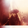
&
ellaangelus & 12feethigh with +3 votes.
MODS CHOICE [1 point]:
absolutelybatty

angelamaria
[I think, were I in the voting position instead of the mod position, I probably would have given this icon my concrit vote as well, but only because I really and quite truly think it is kind of brilliant and can really see how it might go to the next level. I love the whole idea behind it, and the interesting take on the composition as well as the moodiness of it that transitions into a kind of triumph. Basically, this icon made me geek out like the icon nerd that I am.]
raiindust

marcasite
[The crop here is gorgeous, and I love how the texture work accentuates the yellow tones - such a beautiful representation of the theme.]
TABLE KEY:
+++ = 1st Place Vote
++ = 2nd Place Vote
+ = 3rd Place Vote | Beginning of a new comment.
Note: Votes are not weighted in this round. Meaning a 1st, 2nd or 3rd vote will only give you 1 point when tallying the votes. Except in the case of a tie - then the icon with the most 1st place votes will be given first.
ICON VOTES

scoobyatemysnaxPOSITIVE VOTES
+++ I love the use of silhouette here and the colouring is lovely.
+++ Fantastic silhouette/shadow! I love how wistful the icon feels, perfect coloring too.
++ Great work with the light/shadows, it just looks a bit oversharpened on my screen.
MOST CREATIVE
None.
CONSTRUCTIVE VOTES
+ Nice cropping, but the bottom part of the icon and the figure appear very dark on my screen, it's dark to make out who the subject is.
ADDITIONAL VOTES
+ I really like the idea of this icon, but the blacks are so dark that a lot of the shadows just blend together. I think having perhaps a smidge less contrast (by lowering the opacity of soft light layers, having lower settings in a brightness/contrast layer, setting a dark yellow layer to screen at a low opacity, etc.) would allow you to pull out some of the details in the shadow so the bottom half of the icon doesn't just look like a black chunk.
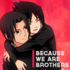
kayablePOSITIVE VOTES
None.
MOST CREATIVE
None.
CONSTRUCTIVE VOTES
None.
ADDITIONAL VOTES
None.

mm3butterflyPOSITIVE VOTES
+++ I love the texture use and coloring here. You might want to be careful about your whites getting washed out, because they're a tad bright near the top of her face. I also think the text would work better if it were nudged just a tad to the right so it weren't overlapping her lips at all. Overall, though, this icon has a great effect.
+ love the texture use and color.
MOST CREATIVE
+ The icon seems a bit oversaturated, but I think it works well for the theme. And the crop is stunning.
CONSTRUCTIVE VOTES
None.
ADDITIONAL VOTES
None.
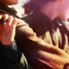
gribouillePOSITIVE VOTES
+ That's a really interesting crop!
MOST CREATIVE
None.
CONSTRUCTIVE VOTES
+ The crop on this icon is really creative but, I think, a little too extreme. It's a little confusing at first glance and I had to look at it for a moment to figure out what was going on. I think making the crop a little large so we could see more of (his?) face would really improve the icon.
+ love the crop but the top feels a bit blurry and the pink on her neck feels separate from the warmth of the rest of the icon.
+ I love the daring crop here! I think it needs a bit of depth though, a bit of "drama" if you will, to make the icon less flat and pop out more. Maybe a b/w gradient set on soft light?
+ It's kind of difficult to figure out what's going on in this icon, especially since it's a bit blurry on my monitor. I think a slightly different crop that showed a bit of the person's features (on the right) would help people orient themselves as to what's going on. Maybe a bit more work with the colors so the main thing people saw wasn't a dullish brown would also make the icon a bit more visually interesting and encourage people to look at it longer.
ADDITIONAL VOTES
None.

val_valeriePOSITIVE VOTES
++ This icon has stunning muted colours and the shadows are incredible. Very clever of the maker to pick a Jon Snow cap for ~warmth challenge.
MOST CREATIVE
None.
CONSTRUCTIVE VOTES
None.
ADDITIONAL VOTES
+ Love the crop and the muted coloring!

rocketgirl2POSITIVE VOTES
None.
MOST CREATIVE
None.
CONSTRUCTIVE VOTES
+ I really adore the purple colouring and the softness of this, but I think it'll look even better with a bit of sharpness to Sam's features.
+ I love your choice of colours, however he looks a little too blurry on my screen.
+ the coloring on this icon is great but the icon could use just a little bit of sharpening.
+ Lovely coloring, but I feel the icon could use a little sharpness, at least around his eyes to bring the focus in.
ADDITIONAL VOTES
+ Great crop and coloring, but it could benefit a lot from a bit of sharpening.

vampire_sessahPOSITIVE VOTES
+++ coloring and use of light is wonderful.
++ Really apt for the theme, the coloring and light work is fantastic.
++ Pretty use of lighting and color.
+ I really like the use of texture and negative space, as well as the choice of cap.
+ I think the light texture on the side of this icon is a really clever addition because it transports it from what was probably a very pretty and simple negative space icon into something special. The cutout is perfectly done and all the work the maker did around what was a very smart choice of cap seems to be geared towards both the theme and emphasizing the emotion behind the icon. Really great job!
MOST CREATIVE
None.
CONSTRUCTIVE VOTES
+ I love the colours in this icon but the cut-out looks a tad sharp (at her hair) and maybe mask the gradient on top a little because it's a little overpowering.
ADDITIONAL VOTES
None.

ellaangelusPOSITIVE VOTES
None.
MOST CREATIVE
+ No reason provided.
+ No reason provided.
+ I love the lighting and coloring here, and the bottom border is a nice touch.
CONSTRUCTIVE VOTES
None.
ADDITIONAL VOTES
+ I almost voted for this icon, but the darks are all muddled and sort of blend in to one another. I think a color balance layer/light & dark blobs/layer masks could help maintain details even in the darks and that would make your icon really stand out.

regisPOSITIVE VOTES
+++ Brilliant colouring and cropping.
+++ The crop on this and the lighting is gorgeous! I love how the vibrant oranges really make this icon outstanding. Their clothes look a little smooth, like there was a Topaz (or similar) filter applied and it's making the clothes look unrealistic so the maker might think about a reduced opacity layer mask but, imo, it's a very minor issue and the icon works really well as is.
++ that crop! Color is amazing and the crop is wonderful.
+ Great crop, great coloring!
MOST CREATIVE
+ Not only is the lighting gorgeous on this icon but everything centers around bringing out the emotion behind the kiss. The shadows give the icon beautiful depth and even though the icon seems pretty simple I also think that a lot of work and thought has gone into it. Really great job to the maker!
CONSTRUCTIVE VOTES
+ It's a lovely icon in concept, but the execution suffers from a couple of problems the aspect ratio looks off to me, and it seems a bit overexposed on my screen, specially on Han's cheek and Leia's jaw, in a way that makes it hard to define her features.
ADDITIONAL VOTES
+ I like the bright yellow background, but the way it bleeds onto the people and contrasts with their otherwise reddish skin (sometimes in very sharp lines) makes the icon look a bit low quality. A couple of layer masks to lessen the contrast or maybe some work with a smudge brush would help make the lines between the colors less pixellated/rough.

angelamariaPOSITIVE VOTES
None.
MOST CREATIVE
None.
CONSTRUCTIVE VOTES
+ The two bright blobs on the side of her hair are very distracting, as well as the text. I think you should brighten the subject and make her more colourful by playing with curves, levels and saturation, and lower the blob's opacity.
+ The crop on this icon is gorgeous and the use of text is really creative. Unfortunately, for me, The light textures on the top right and left corners are overpowering Ariel and making the icon seem a little flat. I think that using a curves layer to add light to Ariel would benefit the icon immensely.
+ I like the play between light and shadow you have here, but the light is too overwhelming. The glowiness sort of eats away at the visible parts of her face, and since it's the brightest part of the icon by far, draws the eye away from her. I'm also not sure about the decision to make your text stretch all the way across the icon, especially since it gets lost in the glowy area.
ADDITIONAL VOTES
+ This icon has lovely coloring, but I believe it would look even better without the text. It is too distracting and it doesn't contribute much to the icon. The crop as it is has no place for unobtrusive text. If the maker insists on it, though, if it was smaller and closer together, without any transparency and the typo was fixed ("something"?), and moved away from her face, and maybe choosing another font (blockier coupled with a script one for accent, maybe) it would look better.

margerydaw_s2POSITIVE VOTES
+++ I absolutely love the warm feeling of this icon. Gorgeous crop and colouring.
++ Very cute icon, I love the colouring !
+ I like this icon, but the lighting on her face seems a little extreme at some points. I think a tad less brightness + more color on her face would help it look a bit more cohesive.
+ The coloring is really soft and cute, matching the mood of the icon very nicely.
MOST CREATIVE
None.
CONSTRUCTIVE VOTES
None.
ADDITIONAL VOTES
None.

marcasitePOSITIVE VOTES
+++ Lovely crop and cap choice and fantastic sharpening.
++ The sharpening on this icon is so beautifully done! Personally I find that sharpening crops that focus so much on the subject hair can be trick, especially for subject that are blonde or a similar color because the lighter colors show up pixelation even more, if that makes sense? Here though the sharpening is lovely albeit a little grainy on the shadows of her chin and neck and the gentle colors and lighting are really pretty too.
MOST CREATIVE
None.
CONSTRUCTIVE VOTES
+ What a unique crop! I think the grunge works really well in here too. My only problem is the background texture, the left side of it that looks like a border. It's a bit distracting. Perhaps smudging it will help.
ADDITIONAL VOTES
+ The cropping is lovely ! I just think the icon is a bit too yellow, which makes her skin appear slightly unnatural, maybe playing with the channel mixer and adding some reds on her skin could help.

12feethighPOSITIVE VOTES
++ I love what you've done with this icon! The colouring is lovely and the slight monochrome-ish effect you have going is really pretty too.
+ Although the icon seems a bit too sharp in some places, I think it's really beautiful. I love the grungy texture use and the painting over her hair.
MOST CREATIVE
+ Very nice use of colour !!
+ No reason provided.
+ No reason provided.
CONSTRUCTIVE VOTES
+ This is a fantastic icon and I love the general coloring, but her face looks a bit awkward and oddly colored in relation to the rest, had coupled with the deep shadows make the subject look sickly. Maybe a warmer or yellower tone instead of the pink used here would solve the problem. There also an oversharpening issue on my screen, near the light side of her face and right side of her hair, that could be smoothed out and make it an even better icon.
ADDITIONAL VOTES
+ I really like the way you coloured Sansa's hair ad the way it blends in with the background ! However I find her skin too pale and pinkish, which clashes with the ret of the icon, you might want to make it a tiny bit more colourful. Also her features are a bit oversharpened as her left cheeks look a bit pixellated on my sreen.

sheekapPOSITIVE VOTES
None.
MOST CREATIVE
None.
CONSTRUCTIVE VOTES
None.
ADDITIONAL VOTES
+ Interesting use of red, the cropping is a bit odd however as it cuts off the top of her head. I think you could go with a close crop centering around her head, or maybe cutting off lower to focus on her chest and the apple she's holding.
Updated Scoring Spreadsheet
Thanks for another brilliant round, you guys! Stay tuned for the MVP announcement and the overall round winners!
1ST PLACE [5 points]:

vampire_sessah with +5 votes.
2ND PLACE [4 points]:

regis with +4 votes (and more first place votes).
3RD PLACE [3 points]:

margerydaw_s2 with +4 votes.
MOST CREATIVE [2 points]:

&

ellaangelus & 12feethigh with +3 votes.
MODS CHOICE [1 point]:
absolutelybatty

angelamaria
[I think, were I in the voting position instead of the mod position, I probably would have given this icon my concrit vote as well, but only because I really and quite truly think it is kind of brilliant and can really see how it might go to the next level. I love the whole idea behind it, and the interesting take on the composition as well as the moodiness of it that transitions into a kind of triumph. Basically, this icon made me geek out like the icon nerd that I am.]
raiindust

marcasite
[The crop here is gorgeous, and I love how the texture work accentuates the yellow tones - such a beautiful representation of the theme.]
TABLE KEY:
+++ = 1st Place Vote
++ = 2nd Place Vote
+ = 3rd Place Vote | Beginning of a new comment.
Note: Votes are not weighted in this round. Meaning a 1st, 2nd or 3rd vote will only give you 1 point when tallying the votes. Except in the case of a tie - then the icon with the most 1st place votes will be given first.
ICON VOTES

scoobyatemysnaxPOSITIVE VOTES
+++ I love the use of silhouette here and the colouring is lovely.
+++ Fantastic silhouette/shadow! I love how wistful the icon feels, perfect coloring too.
++ Great work with the light/shadows, it just looks a bit oversharpened on my screen.
MOST CREATIVE
None.
CONSTRUCTIVE VOTES
+ Nice cropping, but the bottom part of the icon and the figure appear very dark on my screen, it's dark to make out who the subject is.
ADDITIONAL VOTES
+ I really like the idea of this icon, but the blacks are so dark that a lot of the shadows just blend together. I think having perhaps a smidge less contrast (by lowering the opacity of soft light layers, having lower settings in a brightness/contrast layer, setting a dark yellow layer to screen at a low opacity, etc.) would allow you to pull out some of the details in the shadow so the bottom half of the icon doesn't just look like a black chunk.

kayablePOSITIVE VOTES
None.
MOST CREATIVE
None.
CONSTRUCTIVE VOTES
None.
ADDITIONAL VOTES
None.

mm3butterflyPOSITIVE VOTES
+++ I love the texture use and coloring here. You might want to be careful about your whites getting washed out, because they're a tad bright near the top of her face. I also think the text would work better if it were nudged just a tad to the right so it weren't overlapping her lips at all. Overall, though, this icon has a great effect.
+ love the texture use and color.
MOST CREATIVE
+ The icon seems a bit oversaturated, but I think it works well for the theme. And the crop is stunning.
CONSTRUCTIVE VOTES
None.
ADDITIONAL VOTES
None.
gribouillePOSITIVE VOTES
+ That's a really interesting crop!
MOST CREATIVE
None.
CONSTRUCTIVE VOTES
+ The crop on this icon is really creative but, I think, a little too extreme. It's a little confusing at first glance and I had to look at it for a moment to figure out what was going on. I think making the crop a little large so we could see more of (his?) face would really improve the icon.
+ love the crop but the top feels a bit blurry and the pink on her neck feels separate from the warmth of the rest of the icon.
+ I love the daring crop here! I think it needs a bit of depth though, a bit of "drama" if you will, to make the icon less flat and pop out more. Maybe a b/w gradient set on soft light?
+ It's kind of difficult to figure out what's going on in this icon, especially since it's a bit blurry on my monitor. I think a slightly different crop that showed a bit of the person's features (on the right) would help people orient themselves as to what's going on. Maybe a bit more work with the colors so the main thing people saw wasn't a dullish brown would also make the icon a bit more visually interesting and encourage people to look at it longer.
ADDITIONAL VOTES
None.

val_valeriePOSITIVE VOTES
++ This icon has stunning muted colours and the shadows are incredible. Very clever of the maker to pick a Jon Snow cap for ~warmth challenge.
MOST CREATIVE
None.
CONSTRUCTIVE VOTES
None.
ADDITIONAL VOTES
+ Love the crop and the muted coloring!

rocketgirl2POSITIVE VOTES
None.
MOST CREATIVE
None.
CONSTRUCTIVE VOTES
+ I really adore the purple colouring and the softness of this, but I think it'll look even better with a bit of sharpness to Sam's features.
+ I love your choice of colours, however he looks a little too blurry on my screen.
+ the coloring on this icon is great but the icon could use just a little bit of sharpening.
+ Lovely coloring, but I feel the icon could use a little sharpness, at least around his eyes to bring the focus in.
ADDITIONAL VOTES
+ Great crop and coloring, but it could benefit a lot from a bit of sharpening.

vampire_sessahPOSITIVE VOTES
+++ coloring and use of light is wonderful.
++ Really apt for the theme, the coloring and light work is fantastic.
++ Pretty use of lighting and color.
+ I really like the use of texture and negative space, as well as the choice of cap.
+ I think the light texture on the side of this icon is a really clever addition because it transports it from what was probably a very pretty and simple negative space icon into something special. The cutout is perfectly done and all the work the maker did around what was a very smart choice of cap seems to be geared towards both the theme and emphasizing the emotion behind the icon. Really great job!
MOST CREATIVE
None.
CONSTRUCTIVE VOTES
+ I love the colours in this icon but the cut-out looks a tad sharp (at her hair) and maybe mask the gradient on top a little because it's a little overpowering.
ADDITIONAL VOTES
None.

ellaangelusPOSITIVE VOTES
None.
MOST CREATIVE
+ No reason provided.
+ No reason provided.
+ I love the lighting and coloring here, and the bottom border is a nice touch.
CONSTRUCTIVE VOTES
None.
ADDITIONAL VOTES
+ I almost voted for this icon, but the darks are all muddled and sort of blend in to one another. I think a color balance layer/light & dark blobs/layer masks could help maintain details even in the darks and that would make your icon really stand out.

regisPOSITIVE VOTES
+++ Brilliant colouring and cropping.
+++ The crop on this and the lighting is gorgeous! I love how the vibrant oranges really make this icon outstanding. Their clothes look a little smooth, like there was a Topaz (or similar) filter applied and it's making the clothes look unrealistic so the maker might think about a reduced opacity layer mask but, imo, it's a very minor issue and the icon works really well as is.
++ that crop! Color is amazing and the crop is wonderful.
+ Great crop, great coloring!
MOST CREATIVE
+ Not only is the lighting gorgeous on this icon but everything centers around bringing out the emotion behind the kiss. The shadows give the icon beautiful depth and even though the icon seems pretty simple I also think that a lot of work and thought has gone into it. Really great job to the maker!
CONSTRUCTIVE VOTES
+ It's a lovely icon in concept, but the execution suffers from a couple of problems the aspect ratio looks off to me, and it seems a bit overexposed on my screen, specially on Han's cheek and Leia's jaw, in a way that makes it hard to define her features.
ADDITIONAL VOTES
+ I like the bright yellow background, but the way it bleeds onto the people and contrasts with their otherwise reddish skin (sometimes in very sharp lines) makes the icon look a bit low quality. A couple of layer masks to lessen the contrast or maybe some work with a smudge brush would help make the lines between the colors less pixellated/rough.

angelamariaPOSITIVE VOTES
None.
MOST CREATIVE
None.
CONSTRUCTIVE VOTES
+ The two bright blobs on the side of her hair are very distracting, as well as the text. I think you should brighten the subject and make her more colourful by playing with curves, levels and saturation, and lower the blob's opacity.
+ The crop on this icon is gorgeous and the use of text is really creative. Unfortunately, for me, The light textures on the top right and left corners are overpowering Ariel and making the icon seem a little flat. I think that using a curves layer to add light to Ariel would benefit the icon immensely.
+ I like the play between light and shadow you have here, but the light is too overwhelming. The glowiness sort of eats away at the visible parts of her face, and since it's the brightest part of the icon by far, draws the eye away from her. I'm also not sure about the decision to make your text stretch all the way across the icon, especially since it gets lost in the glowy area.
ADDITIONAL VOTES
+ This icon has lovely coloring, but I believe it would look even better without the text. It is too distracting and it doesn't contribute much to the icon. The crop as it is has no place for unobtrusive text. If the maker insists on it, though, if it was smaller and closer together, without any transparency and the typo was fixed ("something"?), and moved away from her face, and maybe choosing another font (blockier coupled with a script one for accent, maybe) it would look better.

margerydaw_s2POSITIVE VOTES
+++ I absolutely love the warm feeling of this icon. Gorgeous crop and colouring.
++ Very cute icon, I love the colouring !
+ I like this icon, but the lighting on her face seems a little extreme at some points. I think a tad less brightness + more color on her face would help it look a bit more cohesive.
+ The coloring is really soft and cute, matching the mood of the icon very nicely.
MOST CREATIVE
None.
CONSTRUCTIVE VOTES
None.
ADDITIONAL VOTES
None.

marcasitePOSITIVE VOTES
+++ Lovely crop and cap choice and fantastic sharpening.
++ The sharpening on this icon is so beautifully done! Personally I find that sharpening crops that focus so much on the subject hair can be trick, especially for subject that are blonde or a similar color because the lighter colors show up pixelation even more, if that makes sense? Here though the sharpening is lovely albeit a little grainy on the shadows of her chin and neck and the gentle colors and lighting are really pretty too.
MOST CREATIVE
None.
CONSTRUCTIVE VOTES
+ What a unique crop! I think the grunge works really well in here too. My only problem is the background texture, the left side of it that looks like a border. It's a bit distracting. Perhaps smudging it will help.
ADDITIONAL VOTES
+ The cropping is lovely ! I just think the icon is a bit too yellow, which makes her skin appear slightly unnatural, maybe playing with the channel mixer and adding some reds on her skin could help.

12feethighPOSITIVE VOTES
++ I love what you've done with this icon! The colouring is lovely and the slight monochrome-ish effect you have going is really pretty too.
+ Although the icon seems a bit too sharp in some places, I think it's really beautiful. I love the grungy texture use and the painting over her hair.
MOST CREATIVE
+ Very nice use of colour !!
+ No reason provided.
+ No reason provided.
CONSTRUCTIVE VOTES
+ This is a fantastic icon and I love the general coloring, but her face looks a bit awkward and oddly colored in relation to the rest, had coupled with the deep shadows make the subject look sickly. Maybe a warmer or yellower tone instead of the pink used here would solve the problem. There also an oversharpening issue on my screen, near the light side of her face and right side of her hair, that could be smoothed out and make it an even better icon.
ADDITIONAL VOTES
+ I really like the way you coloured Sansa's hair ad the way it blends in with the background ! However I find her skin too pale and pinkish, which clashes with the ret of the icon, you might want to make it a tiny bit more colourful. Also her features are a bit oversharpened as her left cheeks look a bit pixellated on my sreen.

sheekapPOSITIVE VOTES
None.
MOST CREATIVE
None.
CONSTRUCTIVE VOTES
None.
ADDITIONAL VOTES
+ Interesting use of red, the cropping is a bit odd however as it cuts off the top of her head. I think you could go with a close crop centering around her head, or maybe cutting off lower to focus on her chest and the apple she's holding.
Updated Scoring Spreadsheet