042: a text guide + doctor who tutorial!
Hello there, i've some resource/tutorial today, if you want to ask me something my thread on icon talk "ask the maker" is still open, you can find it here: ask the maker thread
TEXT/FONT GUIDE!
Nice _puchula_ asked me a general guide on my text-using on icons.
First, let me say that most of the time i don't know what i'm doing with text, and when i know, i never get close to what i thought.
Anyway, as a general rule i set most of my font on "crisp" because, well, i like it better, example!
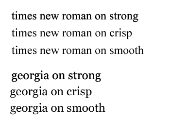
Strong makes the edges a bit to crispy for me and i don't really like smooth so crisp is perfect.
While workin on an icon i never think about the text, because, you know, i'm not really a fan of text, i think that if you can't use them they just fulfill your icons with stuff you don't need.
But some icons were really thought with text on them, for example this one:

i love this icon to the bones, i think that if you know the fandom, if you recognize the scene, you could probably appreciate that invasive text.
For that icon in particular i've used a font i really really like which is:

after putting on the text i've used the gaussian blur 0.2 on the words because it gave the text that micro blurrines that's nice.
Another icon that was born with "text" was this one:

for that one i've used this font:

which turns out good used in any way, capslocked or normal. as for the previous one, i've used a bit of gaussian blur.
On this icon

i decided to put a text because, to me, looked a bit empty. Probably it was the colouring, but still, i wanted to give it some "vibe" so i've used:
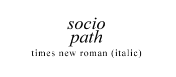
it looks good okay? especially if you use it on italic (you must change the setting from the menù, usually every font is set on "regular" some of them has different options though)
other examples of this BEAUTIFUL font:


Why gaussian blur at 0.2? I'll show you what it can do:
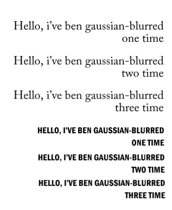
as you may notice on the coursive serifed font too much blur makes the text smooth and pretty almost "ethereal". On strongr font, using too much gaussian blur can be a mistake because the text would look odd.
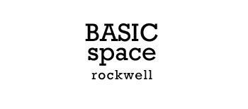
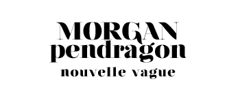
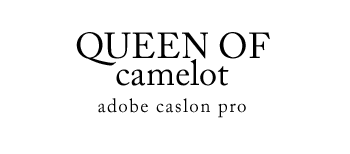
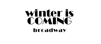
Okay, uhm, not sure what else to say, but i can show you my favourite fonts to use okay?

mixy101 asked me a tutorial about a who icons from my last bath, here's the tut!
original from batch // reproduction

//
I start with a cap:
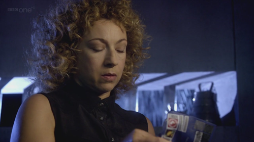
a) first, i selected the subject and pasted it in a new 100x100px document, and decided what kind of "crop" i wanted, i went for a straight central crop because i liked it, now, i've a base, i need to work on it!
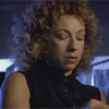
b) right know i've a very long-and-strange way to make my caps clear, and i'm sure that you can get the same resoult with less effort but still; that's what i did.
base » duplicate and set on screen » » duplicate the level and set it on softlight 100%
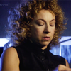
now there's some light! good, next step is the color!
c) my first step is usually with curves; i love them, they're pretty usefull, i'm not a genius with curves of course, but i'm confortable with them!
anyway, this is what i did:
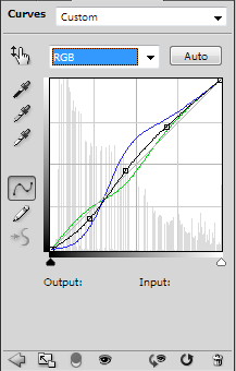
sorry, i'm not going to write down my point EXACTLY because you must play around with them 'cause they mess up very easily!
d) after curves, you need some selective colouring!
REDS:
-54 +3 +86 -7
YELLOWS
-10 -17 +39 +25
CYANS
100 100 -73 +60
BLUES
100 48 -17 31
WHITES
0 0 -64 -10
!!
cyans and blues are not really necessary, i needed them to clean up my blue-ish background but except for that, they're useless.
e) my last step was making that flash white light up, nothing special really, but i like it, anyway, i've selected a soft rounded brush and picked up this color #f8f9fe, used it on the canvas (upper corner) and then set it on screen, i moved it a bit and, afeter moving it in the canvas, i moved the layer down (right before my "duplicated sotflight base").
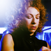
f) another selective colouring layer just because i wanted the lips to be a bit more pinkish
REDS
11 26 -15 -4
g) last step! i've used this yellow: #ffe30b on colour burn 11% to get a yellowish shade.
that's all!
original / replica

//
not the same, but pretty similar right?
if you have ANY question, please don't hesitate, i know my english sucks, but i'll try to help!
TEXT/FONT GUIDE!
Nice _puchula_ asked me a general guide on my text-using on icons.
First, let me say that most of the time i don't know what i'm doing with text, and when i know, i never get close to what i thought.
Anyway, as a general rule i set most of my font on "crisp" because, well, i like it better, example!

Strong makes the edges a bit to crispy for me and i don't really like smooth so crisp is perfect.
While workin on an icon i never think about the text, because, you know, i'm not really a fan of text, i think that if you can't use them they just fulfill your icons with stuff you don't need.
But some icons were really thought with text on them, for example this one:
i love this icon to the bones, i think that if you know the fandom, if you recognize the scene, you could probably appreciate that invasive text.
For that icon in particular i've used a font i really really like which is:

after putting on the text i've used the gaussian blur 0.2 on the words because it gave the text that micro blurrines that's nice.
Another icon that was born with "text" was this one:
for that one i've used this font:

which turns out good used in any way, capslocked or normal. as for the previous one, i've used a bit of gaussian blur.
On this icon
i decided to put a text because, to me, looked a bit empty. Probably it was the colouring, but still, i wanted to give it some "vibe" so i've used:

it looks good okay? especially if you use it on italic (you must change the setting from the menù, usually every font is set on "regular" some of them has different options though)
other examples of this BEAUTIFUL font:
Why gaussian blur at 0.2? I'll show you what it can do:

as you may notice on the coursive serifed font too much blur makes the text smooth and pretty almost "ethereal". On strongr font, using too much gaussian blur can be a mistake because the text would look odd.
Okay, uhm, not sure what else to say, but i can show you my favourite fonts to use okay?


mixy101 asked me a tutorial about a who icons from my last bath, here's the tut!
original from batch // reproduction
//

I start with a cap:

a) first, i selected the subject and pasted it in a new 100x100px document, and decided what kind of "crop" i wanted, i went for a straight central crop because i liked it, now, i've a base, i need to work on it!

b) right know i've a very long-and-strange way to make my caps clear, and i'm sure that you can get the same resoult with less effort but still; that's what i did.
base » duplicate and set on screen » » duplicate the level and set it on softlight 100%

now there's some light! good, next step is the color!
c) my first step is usually with curves; i love them, they're pretty usefull, i'm not a genius with curves of course, but i'm confortable with them!
anyway, this is what i did:

sorry, i'm not going to write down my point EXACTLY because you must play around with them 'cause they mess up very easily!
d) after curves, you need some selective colouring!
REDS:
-54 +3 +86 -7
YELLOWS
-10 -17 +39 +25
CYANS
100 100 -73 +60
BLUES
100 48 -17 31
WHITES
0 0 -64 -10
!!
cyans and blues are not really necessary, i needed them to clean up my blue-ish background but except for that, they're useless.
e) my last step was making that flash white light up, nothing special really, but i like it, anyway, i've selected a soft rounded brush and picked up this color #f8f9fe, used it on the canvas (upper corner) and then set it on screen, i moved it a bit and, afeter moving it in the canvas, i moved the layer down (right before my "duplicated sotflight base").

f) another selective colouring layer just because i wanted the lips to be a bit more pinkish
REDS
11 26 -15 -4
g) last step! i've used this yellow: #ffe30b on colour burn 11% to get a yellowish shade.
that's all!
original / replica
//

not the same, but pretty similar right?
if you have ANY question, please don't hesitate, i know my english sucks, but i'll try to help!