❝ 214 ❞ ► icon tutorials #21, #22 and #23 (ask the maker 3.0)
TUTORIALs (#21, #22 and #23) for ask the maker 3.0

WARNING: IMAGE HEAVY
katy_111 asked me the processes for these icons:
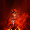
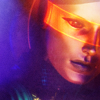
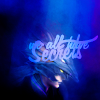
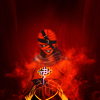
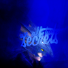
I don't save most of my .psds anymore I tried to recreate these icons to make a tutorial. Some are closer and some are not so close but the overall process is basically the same as the original. The mais difference is the textures used and the general effect. Hope you like it. :)
The recreated icons:


All icons were recreated using Photoshop CS6. I don't think you can recreate them exactly step by step in other programs but the general idea can be used. Only the first icon includes heavy adj
Now for the tutorials:
TUTORIAL #21

-
█ Original - Second Try █

█ STEP #01
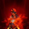
● Let's start this icon with the background. The original image from the game Kingdom Hearts II has a color range of dark red and red so I picked the dark red to be my background base.

-
█ STEP #02
● ... But then I thought a solid color alone would be boring so I added this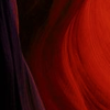
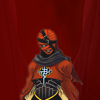
texture by ???* and duplicated the layer. The first layer I set to Normal and Opacity 17%. Then I added a Mask to this layer and erased a few blobs from the middle bottom. In the second layer I set it to normal again but Opacity 35%
In the end both layers will look like this:

* I don't remember who made this texture. If anyone knows please tell me so I can properly credit.

-
█ STEP #03
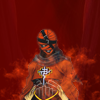
● Now it's time to add your subject to the icon. Extract the background, resize and place in a New Layer. I usually use the Blur Tool on the edges to soften it and to hide any vestige of a bad extraction.

-
█ STEP #04
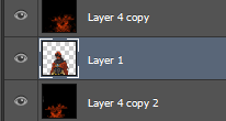
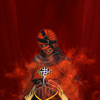
● Now this part is a bit of personal touch to add some depth and the smoke effect. Create a new layer and put it under the subject layer. Fill it with Black and use a Smoke Brush with the Color Red and play a bit with it. I don't remember exactly the Brush or Brush Set I used for this but a quick search on DeviantArt might help here. (I have 1600+ brushes loaded on my PSCS6. It's a bit hard to identify some.) Play a bit on the left side of the icon behind the subject. Set this Layer to Screen and Duplicate it. The duplication you'll put over the subject layer and flip it horizontally. It'll create a depth effect with the smoke.
The layers will look like this:

-
█ STEP #05
● Add this
texture again and set the Layer to Soft Light. You'll need to apply a Mask here erasing the parts over the subject.
The mask will look more and less like this:


-
█ STEP #06
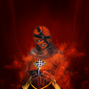
● Now we're going to apply the coloring. It's basically my everyday coloring but I'll repeat the steps. First add a New Gradient Fill Layer.
Settings:
Gradient Fill
White-to-Black gradient
Style - Radial
Angle - 90º
Set this Layer to Soft Light, Opacity 84%.
You'll need to apply another mask here. This time I just want to erase some parts over the subject's face and around it.
The mask will look more and less like this:


-
█ STEP #07
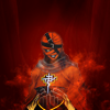
● Now let's add a Channel Mixer Layer.
New Adjustment Layer - Channel Mixer
Red +105, 0, 0
Green 0, +105, +5
Blue -5, -5, +105

-
█ STEP #08
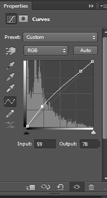
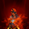
● And now we add a Curves Layer. You'll add two points.
1 - Output: 59 Input: 78
2 - Output: 206 Input: 216
The Curves needs to look like this:

-
█ STEP #09
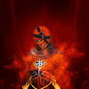
● I really love my colors saturated so let's add a Hue/Saturation Layer.
Master
Saturation +25
And now set the Opacity of this Layer to 60%.

-
█ STEP #10
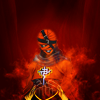
● Now let's add a Brightness/Contrast layer to make it shiny.
Brightness: +27
Contrast: +42
Set the Opacity of this Layer to 46-50%

-
█ STEP #11
● I think the colors still need some work with the Vibrance so let's add a Vibrance Layer.
Vibrance: +80

-
█ STEP #12
● And I need moar red here so let's add another Channel Mixer layer.
Red +110, +10, -6
Green -6, +106, -6
Blue +5, -7, +91
Set the Opacity of this Layer to 44%

-
█ STEP #13
● And now finally the final step for this composition and coloring. Copy Merged the icon and paste into a New Layer. Use the Gaussian Blur with a high Radius to make it barely recognizable. Set this layer to Soft Light and Opacity to 45-50%.
TUTORIAL #22

-
█ Original - Second Try █
█ STEP #01
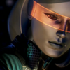
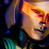
● Time to create your base. For this I'm using a Mass Effect 3 screencap. Just a crop and resize.

-
█ STEP #02
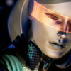
● I wanted it a bit brighter to make the colors to appear more. So duplicate the base layer and set it to Screen.

-
█ STEP #03
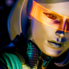
● Time for some ~saturation~! Add a New Vibrance Layer.
Vibrance +100
Saturation +20

-
█ STEP #04
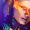
● I really wanted to play with the orange on the subject visor but I also wanted to add some color to the icon. So I added this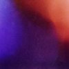
texture by midnight_road and set it to Soft Light. Opacity 56%.

-
█ STEP #05
● Duplicate the texture layer and now set it to Screen. Opacity 80%. We're almost getting there but the icon seems a bit not livid as I like.

-
█ STEP #06
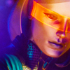
● Add another Vibrance Layer.
Vibrance +90
Saturation +8

-
█ STEP #07
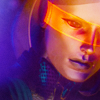
● Now Copy Merged and Paste into a New Layer. Set it to Soft Light and Opacity to 11%. I wanted the glow effect here but not too much. The low opacity is to make a little faint but still there.

-
█ STEP #08
● Now let's add the last touch here. Add this
texture again as a New Layer. Set it to Normal and Opacity 90%. Add a mask to erase the bits of texture over the subject's face.
The mask will look more and less like this:

TUTORIAL #23

-
█ Original - Second Try █

█ STEP #01
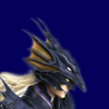
● Let's start with the base. Like the first tutorial I wanted a solid color to go with the image. I picked for this icon. The original image is from Final Fantasy IV - DS edition. I first wanted to use the purples, but the blues seemed more promising.

-
█ STEP #02
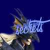
● Now let's add the subject in a new layer. Again if the extraction fails (like this time again) use the Blur Tool on the edges. Actually I use it all the time even when I'm not lazy with the extraction. It make the subject's edges less pixeled and a bit glowy.

-
█ STEP #03
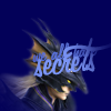
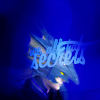
● I wanted the text to blend well with the composition so let's add it earlier. The text is "we all have" and "secrets". Font is Fangstasia and I resized it according to the image.

-
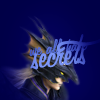
█ STEP #04
● Now duplicate the base layer, the one with the blue color. Put it over the texts and the subject layers. Erased everything on the middle and leave only the edges.

-
█ STEP #05
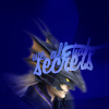
● Now duplicate it again and set to Soft Light.
The two layers together should looke like this:


-
█ STEP #06
● I wanted to do the coloring only with textures for this icon. So let's add our first texture. This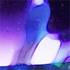
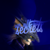
one made by midnight_road and set it to Soft Light and Opacity 47%. It makes everything too bright and I want the left side to be a bit dark so add a Mask to erase some left bits of the texture.
The mask will look more and less like this:


-
█ STEP #07
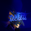
● I really wanted to make the left side darker so... Let's create a new layer and use the Round Brush Tool with the color Black and fill the left side.
The layer will look more and less like this:


-
█ STEP #08
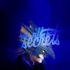
● Now everything is too dark so let's add some textures to make it bright and vibrant. First add a Vibrance Layer.
Vibrance +95
Saturation +7

-
█ STEP #09
● Now for the textures! First add this
texture by erzsebet. Set it to Soft Light.

-
█ STEP #10
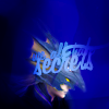
● Duplicate the layer and set it to Soft Light again. Opacity here is 17-27%.

-
█ STEP #11
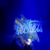
● Now add this
texture by midnight_road and set it to Soft Light.

-
█ STEP #12
● Now add this
texture by erzsebet. Set it to Soft Light and Opacity 41%.

-
█ STEP #13
● And guess what... No not another texture. Copy merged the icon and paste into a new layer. Again we want to give a glowy effect so set it to Soft Light.

-
█ STEP #14
● And to add a last touch add this
texture by naushika. This last touch is to make a paint like effect but very faint. Set it to Soft Light and Opacity 90%.
... Phew! That's over for now. :)

Ask The Maker || My Thread
► COMMENTS ARE NICE → ♥
► CREDITS ARE LOVE → twinstrike or twinstrikeish;
► RESOURCES → ( here );
► AFFILIATES → ( here );
► UPDATES → ( watch );


WARNING: IMAGE HEAVY
katy_111 asked me the processes for these icons:


I don't save most of my .psds anymore I tried to recreate these icons to make a tutorial. Some are closer and some are not so close but the overall process is basically the same as the original. The mais difference is the textures used and the general effect. Hope you like it. :)
The recreated icons:


All icons were recreated using Photoshop CS6. I don't think you can recreate them exactly step by step in other programs but the general idea can be used. Only the first icon includes heavy adj
Now for the tutorials:
TUTORIAL #21

-

█ Original - Second Try █

█ STEP #01
● Let's start this icon with the background. The original image from the game Kingdom Hearts II has a color range of dark red and red so I picked the dark red to be my background base.

-

█ STEP #02
● ... But then I thought a solid color alone would be boring so I added this

texture by ???* and duplicated the layer. The first layer I set to Normal and Opacity 17%. Then I added a Mask to this layer and erased a few blobs from the middle bottom. In the second layer I set it to normal again but Opacity 35%
In the end both layers will look like this:

* I don't remember who made this texture. If anyone knows please tell me so I can properly credit.

-

█ STEP #03
● Now it's time to add your subject to the icon. Extract the background, resize and place in a New Layer. I usually use the Blur Tool on the edges to soften it and to hide any vestige of a bad extraction.

-

█ STEP #04
● Now this part is a bit of personal touch to add some depth and the smoke effect. Create a new layer and put it under the subject layer. Fill it with Black and use a Smoke Brush with the Color Red and play a bit with it. I don't remember exactly the Brush or Brush Set I used for this but a quick search on DeviantArt might help here. (I have 1600+ brushes loaded on my PSCS6. It's a bit hard to identify some.) Play a bit on the left side of the icon behind the subject. Set this Layer to Screen and Duplicate it. The duplication you'll put over the subject layer and flip it horizontally. It'll create a depth effect with the smoke.
The layers will look like this:


-

█ STEP #05
● Add this

texture again and set the Layer to Soft Light. You'll need to apply a Mask here erasing the parts over the subject.
The mask will look more and less like this:


-

█ STEP #06
● Now we're going to apply the coloring. It's basically my everyday coloring but I'll repeat the steps. First add a New Gradient Fill Layer.
Settings:
Gradient Fill
White-to-Black gradient
Style - Radial
Angle - 90º
Set this Layer to Soft Light, Opacity 84%.
You'll need to apply another mask here. This time I just want to erase some parts over the subject's face and around it.
The mask will look more and less like this:


-

█ STEP #07
● Now let's add a Channel Mixer Layer.
New Adjustment Layer - Channel Mixer
Red +105, 0, 0
Green 0, +105, +5
Blue -5, -5, +105

-

█ STEP #08
● And now we add a Curves Layer. You'll add two points.
1 - Output: 59 Input: 78
2 - Output: 206 Input: 216
The Curves needs to look like this:


-

█ STEP #09
● I really love my colors saturated so let's add a Hue/Saturation Layer.
Master
Saturation +25
And now set the Opacity of this Layer to 60%.

-

█ STEP #10
● Now let's add a Brightness/Contrast layer to make it shiny.
Brightness: +27
Contrast: +42
Set the Opacity of this Layer to 46-50%

-

█ STEP #11
● I think the colors still need some work with the Vibrance so let's add a Vibrance Layer.
Vibrance: +80

-

█ STEP #12
● And I need moar red here so let's add another Channel Mixer layer.
Red +110, +10, -6
Green -6, +106, -6
Blue +5, -7, +91
Set the Opacity of this Layer to 44%

-

█ STEP #13
● And now finally the final step for this composition and coloring. Copy Merged the icon and paste into a New Layer. Use the Gaussian Blur with a high Radius to make it barely recognizable. Set this layer to Soft Light and Opacity to 45-50%.
TUTORIAL #22

-

█ Original - Second Try █

█ STEP #01
● Time to create your base. For this I'm using a Mass Effect 3 screencap. Just a crop and resize.

-

█ STEP #02
● I wanted it a bit brighter to make the colors to appear more. So duplicate the base layer and set it to Screen.

-

█ STEP #03
● Time for some ~saturation~! Add a New Vibrance Layer.
Vibrance +100
Saturation +20

-

█ STEP #04
● I really wanted to play with the orange on the subject visor but I also wanted to add some color to the icon. So I added this

texture by midnight_road and set it to Soft Light. Opacity 56%.

-

█ STEP #05
● Duplicate the texture layer and now set it to Screen. Opacity 80%. We're almost getting there but the icon seems a bit not livid as I like.

-

█ STEP #06
● Add another Vibrance Layer.
Vibrance +90
Saturation +8

-

█ STEP #07
● Now Copy Merged and Paste into a New Layer. Set it to Soft Light and Opacity to 11%. I wanted the glow effect here but not too much. The low opacity is to make a little faint but still there.

-

█ STEP #08
● Now let's add the last touch here. Add this

texture again as a New Layer. Set it to Normal and Opacity 90%. Add a mask to erase the bits of texture over the subject's face.
The mask will look more and less like this:

TUTORIAL #23

-

█ Original - Second Try █

█ STEP #01
● Let's start with the base. Like the first tutorial I wanted a solid color to go with the image. I picked for this icon. The original image is from Final Fantasy IV - DS edition. I first wanted to use the purples, but the blues seemed more promising.

-

█ STEP #02
● Now let's add the subject in a new layer. Again if the extraction fails (like this time again) use the Blur Tool on the edges. Actually I use it all the time even when I'm not lazy with the extraction. It make the subject's edges less pixeled and a bit glowy.

-

█ STEP #03
● I wanted the text to blend well with the composition so let's add it earlier. The text is "we all have" and "secrets". Font is Fangstasia and I resized it according to the image.

-

█ STEP #04
● Now duplicate the base layer, the one with the blue color. Put it over the texts and the subject layers. Erased everything on the middle and leave only the edges.

-

█ STEP #05
● Now duplicate it again and set to Soft Light.
The two layers together should looke like this:


-

█ STEP #06
● I wanted to do the coloring only with textures for this icon. So let's add our first texture. This

one made by midnight_road and set it to Soft Light and Opacity 47%. It makes everything too bright and I want the left side to be a bit dark so add a Mask to erase some left bits of the texture.
The mask will look more and less like this:


-

█ STEP #07
● I really wanted to make the left side darker so... Let's create a new layer and use the Round Brush Tool with the color Black and fill the left side.
The layer will look more and less like this:


-

█ STEP #08
● Now everything is too dark so let's add some textures to make it bright and vibrant. First add a Vibrance Layer.
Vibrance +95
Saturation +7

-

█ STEP #09
● Now for the textures! First add this

texture by erzsebet. Set it to Soft Light.

-

█ STEP #10
● Duplicate the layer and set it to Soft Light again. Opacity here is 17-27%.

-

█ STEP #11
● Now add this

texture by midnight_road and set it to Soft Light.

-

█ STEP #12
● Now add this

texture by erzsebet. Set it to Soft Light and Opacity 41%.

-

█ STEP #13
● And guess what... No not another texture. Copy merged the icon and paste into a new layer. Again we want to give a glowy effect so set it to Soft Light.

-

█ STEP #14
● And to add a last touch add this

texture by naushika. This last touch is to make a paint like effect but very faint. Set it to Soft Light and Opacity 90%.
... Phew! That's over for now. :)

Ask The Maker || My Thread
► COMMENTS ARE NICE → ♥
► CREDITS ARE LOVE → twinstrike or twinstrikeish;
► RESOURCES → ( here );
► AFFILIATES → ( here );
► UPDATES → ( watch );