2 Tutorials
Both tutorials were requested by lover_of_narnia over at icon_talk Ask the Maker. I thought I thought I had saved the PSD files, but it turns out I didn't so I had to attempt to recreate these as best I could.
It is made for Photoshop and sorry can't be translated.
Note: NO PSD will be given out so please don't ask. Why? Because the steps aren't that complicated to begin with.
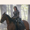
to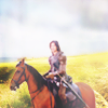
OR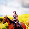
Part 1
01. Those who have seen any of past tutorials know that I like to work on my coloring, etc on a large image, but we are going to do things a bit different. Here we have an image of Ben Barnes as Prince Caspian. Note the image is scaled.
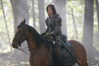
02. I then duplicated the image once and set to screen. It looks a bit washed out, but we'll correct that later. My main reason for using a screen layer here is that I find it a bit easier to work with a mask layer in this mode.
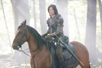
03. Now as stated in step 2-we'll be isolating the background for a solid background. You could use a variety of differnt tools to achieve this from erasing the background, cutting the image out, using a mask, etc. I won't go into details how to do it, but elea24 has a great tutorial for anyone wanting to find out how to do it here
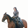
04. The said image using one of the methods in step 3. Yeah I know the horse is missing the tail, but alas nothing I can do about that now.
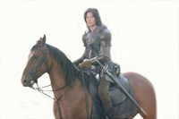
05. I then duplicated the image and set the layer to soft light. This adds a bit of contrast to the image.
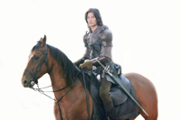
06. I cropped the image.
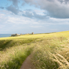
07. At this point any landscape image will do for the background. I used a stock one made by elea24
08. I moved the cropped image over to the landscape icon and set it darken. Don't worry we'll correct it in the next step.
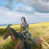
09. At this point you can use a mask layer to go over the field, but I did it the lazy way and just erased the bottom of the field around Caspin and the horse (note: by this I mean I go to the layer below where the stock image is at to erase) to get this:
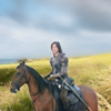
10. Then I flattened the image (control + alt + e) and set it to screen with the opacity set to 35%.

11. Then I duplicated the image above and set it to soft light with the opacity set to 33% to give it a bit more contrast.
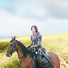
13. I then used a color balance layer to give it a bit more color, again depending on your image you may need to adjust.
Midtones: 29 | -5 | -20
Shadows: 0 | 0 | 0
Highlights: 0 | 0 | 0
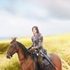
14. I then used a selective color layer. As you can see we now have more of that warm coloring. Again the numbers below will be different according to your image and just play around until it looks good for your own.
Reds: -61 | 35 | 42 | 0
Yellows: 58 | -25 | 36| 0
Neutrals: -15| 2 | -6 | 0
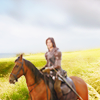
15. I then used a texture from light_ofmylife and set it to soft light with the opacity set to 32%.
to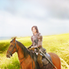
16. I then used another color balance layer, again depending on your image you may need to adjust.
Midtones: -9 | -9 | -22
Shadows: 0 | 0 | 0
Highlights: 0 | 0 | 0

17. I then used a selective color layer. Again the numbers below will be different according to your image and just play around until it looks good for your own.
Reds: -41 | 0 |5 | 0
Yellows: -5 | 0 | 5 | 0

18. Another selective color layer.
Reds: 38 | 0 |0 | 0
Yellows: 0 | 0 | -19 | 0
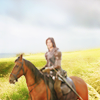
19. Yup another color balance layer.
Midtones: -22 | -15 | 27
Shadows: 0 | 0 | 0
Highlights: 0 | 0 | 0
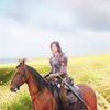
20. Another selective color layer.
Reds: -41 | 19 |64 | 0
Yellows: -41 | 0 | 92 | 0
Neutrals: 17| 0 | 0 | 0

21. I then used a color fill layer (#1e1103) to bring out more of the colors.

22. I then I flattened the image (control + alt + e) and although the icon looks good I still don't think it measures up to the original.

23. Using a selective color layer (our last-yay!) we can see more shadow depth on Caspin and the horse.
Neutrals: 11| 16 | 17 | 0
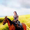
24. Now take that texture we used in Step #15 and set it to soft light with an opacity of 100%.
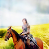
25. Our last Color Balance layer (almost done!).
Midtones: 12 | -15 | 16
Shadows: 0 | 0 | 0
Highlights: 0 | 0 | 0
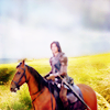
26. Another color fill layer to seal in the colors (#221804) set to soft light opacity of 72%.
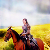
27. And finally a brightness / contrast layer.
Brightness: 13
Contrast: -1

28. Now the original has a bit more of that cloudy texture to it. To get it I just tend to make my own by adding a new layer on my image and with a small brush paint some lines over it in white then I go into Gaussian Blur set anywhere from 5 to 8 radius and then I hit control + f to "spread" out the lines. There are various tutorials floating around how to do this. If you need one let me know and I'll link to one.

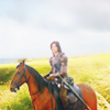
29. All Done! The original icon vs the new one. A bit different, but not that much.
/
/
Tutorial # 2
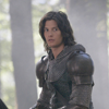
to
01. Now for the second version of icon follow steps 1-3 to get this:
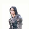
02. I then used a color fill layer (#1c0e01) set to soft light with an opacity of 100%. This brings out more a contrast.
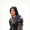
03. Now we use a color balance layer. Again depending on your image you might to play around with this.
Midtones: 30 | -8 | 13
Shadows: 0 | 0 | 0
Highlights: 0 | 0 | 0
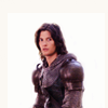
04. I then used a selective color layer. Again the numbers below will be different according to your image and just play around until it looks good for your own.
Reds: -20 | 0 | 0 | 0
Yellows: 0 | 0 | -9 | 0

05. I then used this texture by sweetmustard and set it to darken with an opacity of 33%.

to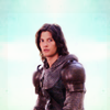
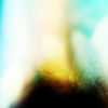
06. Then I used this texture by innocent_lexys and modified it a bit especially at the ends. what I did was cut out the left and right side just so I'm left with the middle and set to darken with an opacity of 100%.
to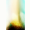
to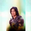
07. I duplicated the above texture that was modified and set to soft light with an opacity of 100%.
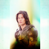
09. Finally I used a color fill layer (#150534) set to soft light with an opacity of 100%.

Again not the same as the original (since I couldn't find which texture I used for the original background), but it comes close.
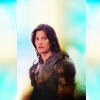
/
It is made for Photoshop and sorry can't be translated.
Note: NO PSD will be given out so please don't ask. Why? Because the steps aren't that complicated to begin with.

to

OR

Part 1
01. Those who have seen any of past tutorials know that I like to work on my coloring, etc on a large image, but we are going to do things a bit different. Here we have an image of Ben Barnes as Prince Caspian. Note the image is scaled.

02. I then duplicated the image once and set to screen. It looks a bit washed out, but we'll correct that later. My main reason for using a screen layer here is that I find it a bit easier to work with a mask layer in this mode.

03. Now as stated in step 2-we'll be isolating the background for a solid background. You could use a variety of differnt tools to achieve this from erasing the background, cutting the image out, using a mask, etc. I won't go into details how to do it, but elea24 has a great tutorial for anyone wanting to find out how to do it here
04. The said image using one of the methods in step 3. Yeah I know the horse is missing the tail, but alas nothing I can do about that now.

05. I then duplicated the image and set the layer to soft light. This adds a bit of contrast to the image.

06. I cropped the image.

07. At this point any landscape image will do for the background. I used a stock one made by elea24

08. I moved the cropped image over to the landscape icon and set it darken. Don't worry we'll correct it in the next step.

09. At this point you can use a mask layer to go over the field, but I did it the lazy way and just erased the bottom of the field around Caspin and the horse (note: by this I mean I go to the layer below where the stock image is at to erase) to get this:

10. Then I flattened the image (control + alt + e) and set it to screen with the opacity set to 35%.

11. Then I duplicated the image above and set it to soft light with the opacity set to 33% to give it a bit more contrast.

13. I then used a color balance layer to give it a bit more color, again depending on your image you may need to adjust.
Midtones: 29 | -5 | -20
Shadows: 0 | 0 | 0
Highlights: 0 | 0 | 0

14. I then used a selective color layer. As you can see we now have more of that warm coloring. Again the numbers below will be different according to your image and just play around until it looks good for your own.
Reds: -61 | 35 | 42 | 0
Yellows: 58 | -25 | 36| 0
Neutrals: -15| 2 | -6 | 0

15. I then used a texture from light_ofmylife and set it to soft light with the opacity set to 32%.

to

16. I then used another color balance layer, again depending on your image you may need to adjust.
Midtones: -9 | -9 | -22
Shadows: 0 | 0 | 0
Highlights: 0 | 0 | 0

17. I then used a selective color layer. Again the numbers below will be different according to your image and just play around until it looks good for your own.
Reds: -41 | 0 |5 | 0
Yellows: -5 | 0 | 5 | 0

18. Another selective color layer.
Reds: 38 | 0 |0 | 0
Yellows: 0 | 0 | -19 | 0

19. Yup another color balance layer.
Midtones: -22 | -15 | 27
Shadows: 0 | 0 | 0
Highlights: 0 | 0 | 0

20. Another selective color layer.
Reds: -41 | 19 |64 | 0
Yellows: -41 | 0 | 92 | 0
Neutrals: 17| 0 | 0 | 0

21. I then used a color fill layer (#1e1103) to bring out more of the colors.

22. I then I flattened the image (control + alt + e) and although the icon looks good I still don't think it measures up to the original.

23. Using a selective color layer (our last-yay!) we can see more shadow depth on Caspin and the horse.
Neutrals: 11| 16 | 17 | 0

24. Now take that texture we used in Step #15 and set it to soft light with an opacity of 100%.

25. Our last Color Balance layer (almost done!).
Midtones: 12 | -15 | 16
Shadows: 0 | 0 | 0
Highlights: 0 | 0 | 0

26. Another color fill layer to seal in the colors (#221804) set to soft light opacity of 72%.

27. And finally a brightness / contrast layer.
Brightness: 13
Contrast: -1

28. Now the original has a bit more of that cloudy texture to it. To get it I just tend to make my own by adding a new layer on my image and with a small brush paint some lines over it in white then I go into Gaussian Blur set anywhere from 5 to 8 radius and then I hit control + f to "spread" out the lines. There are various tutorials floating around how to do this. If you need one let me know and I'll link to one.

29. All Done! The original icon vs the new one. A bit different, but not that much.

/

/

Tutorial # 2

to

01. Now for the second version of icon follow steps 1-3 to get this:

02. I then used a color fill layer (#1c0e01) set to soft light with an opacity of 100%. This brings out more a contrast.

03. Now we use a color balance layer. Again depending on your image you might to play around with this.
Midtones: 30 | -8 | 13
Shadows: 0 | 0 | 0
Highlights: 0 | 0 | 0

04. I then used a selective color layer. Again the numbers below will be different according to your image and just play around until it looks good for your own.
Reds: -20 | 0 | 0 | 0
Yellows: 0 | 0 | -9 | 0

05. I then used this texture by sweetmustard and set it to darken with an opacity of 33%.

to

06. Then I used this texture by innocent_lexys and modified it a bit especially at the ends. what I did was cut out the left and right side just so I'm left with the middle and set to darken with an opacity of 100%.

to

to

07. I duplicated the above texture that was modified and set to soft light with an opacity of 100%.

09. Finally I used a color fill layer (#150534) set to soft light with an opacity of 100%.

Again not the same as the original (since I couldn't find which texture I used for the original background), but it comes close.

/
