030;; phuck up the oldies
A remake of one of my older icon posts, done for last5, featuring (who else?) Summer Glau.
old
new


old
new


Ewwww, that text. And she's all yellow. Gross. D: I fixed that up with a better crop, NO TEXT, and blue coloring.
old
new


Not too much was wrong with the original, but the the coloring made her face kinda blend together. She's making the cutest face in here, so I decided to focus on that.
old
new


Much too red in the old one. I zoomed in and added some blue to balance it out.
old
new


Once again, faces are blending together. Since I wanted Summer to be the main focus, I zoomed in on her and used better coloring.
old
new


Once again, prolly would've been fine without that STUPID TEXT. I used an easier-to-read font (Oh Cooper Black, whoever thought you'd be useful again?) and lighter coloring on the new one.
old
new


This was my favorite of the old batch, so I didn't want to do anything drastic with the new one. I just made it slightly lighter and zoomed in on her face.
old
new


One of the WORST images to work with. It's so LIGHT and sdbadhsajda. Anyhoo, I did better coloring and cropped to show her shoulder.
old
new


This was such a high-quality image that it shouldn't have been zoomed out.
old
new


I don't really like either of these. Whatever.
old
new


Didn't do too much to this one, just rotated it slightly and cropped it at her nose.
old
new

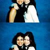
This is one of the cutest images ever, and I wanted to show the whole thing.
old
new


Once again, a really cute image. I scooted it over and didn't sharpen it as much.
old
new


Just changed the coloring and focused more on her dress. Not much else.
old
new


A beautiful picture of her, yet hard as hell to icon. At least you can see her nose in the new one. Sort of.
old
new
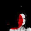

I actually don't know what I was trying to do with that red circle.
old
new


See previous icon.
old
new


Oh, ew. Ewewewewew. That icon is so gross. The new one isn't much better, but at least you can look at it without wanting to throw up.
old
new


The first one was okay, so I just zoomed in and did different coloring.
old
new


The first one was WAY oversharpened. I decided to crop the hand on her hip because it's much more interesting than another shoulder-up icon.
old
new


Couldn't do much with this one, since it's black-and-white. Just did a more interesting crop and lightened it a bit.
old
new


I think I was following a tutorial on this one. And failed miserably.
old
new


God, I remember I was SO PROUD of this one. I used like OVER 9000 textures and gradients.
old
new


Not too much different. Except now she looks like a human being.
old
new


I was really proud of this one too. Not too bad, but, once again, her nose is lost in teh coloring. I did a closer crop this time, focusing on her lips and hand.
old
new


O HAI THAR. I HAS NO NOSE LOL.
old
new
old
new
Ewwww, that text. And she's all yellow. Gross. D: I fixed that up with a better crop, NO TEXT, and blue coloring.
old
new
Not too much was wrong with the original, but the the coloring made her face kinda blend together. She's making the cutest face in here, so I decided to focus on that.
old
new
Much too red in the old one. I zoomed in and added some blue to balance it out.
old
new
Once again, faces are blending together. Since I wanted Summer to be the main focus, I zoomed in on her and used better coloring.
old
new
Once again, prolly would've been fine without that STUPID TEXT. I used an easier-to-read font (Oh Cooper Black, whoever thought you'd be useful again?) and lighter coloring on the new one.
old
new
This was my favorite of the old batch, so I didn't want to do anything drastic with the new one. I just made it slightly lighter and zoomed in on her face.
old
new
One of the WORST images to work with. It's so LIGHT and sdbadhsajda. Anyhoo, I did better coloring and cropped to show her shoulder.
old
new
This was such a high-quality image that it shouldn't have been zoomed out.
old
new
I don't really like either of these. Whatever.
old
new
Didn't do too much to this one, just rotated it slightly and cropped it at her nose.
old
new
This is one of the cutest images ever, and I wanted to show the whole thing.
old
new
Once again, a really cute image. I scooted it over and didn't sharpen it as much.
old
new
Just changed the coloring and focused more on her dress. Not much else.
old
new
A beautiful picture of her, yet hard as hell to icon. At least you can see her nose in the new one. Sort of.
old
new
I actually don't know what I was trying to do with that red circle.
old
new
See previous icon.
old
new
Oh, ew. Ewewewewew. That icon is so gross. The new one isn't much better, but at least you can look at it without wanting to throw up.
old
new
The first one was okay, so I just zoomed in and did different coloring.
old
new
The first one was WAY oversharpened. I decided to crop the hand on her hip because it's much more interesting than another shoulder-up icon.
old
new
Couldn't do much with this one, since it's black-and-white. Just did a more interesting crop and lightened it a bit.
old
new

I think I was following a tutorial on this one. And failed miserably.
old
new

God, I remember I was SO PROUD of this one. I used like OVER 9000 textures and gradients.
old
new

Not too much different. Except now she looks like a human being.
old
new

I was really proud of this one too. Not too bad, but, once again, her nose is lost in teh coloring. I did a closer crop this time, focusing on her lips and hand.
old
new

O HAI THAR. I HAS NO NOSE LOL.