Making Good Cartoon Icons- Tutorial 4// Sakura Drops
From 
to
in just seven steps!
Difficulty: Easy-peasy. Just colour layers and Hue/Saturation/Lightness.
Transferability: 100% transferable to just about everything.
STEP ONE
Start out with your base image. For this tutorial, we'll be using a screenshot of Sakura from Naruto Shippouden. Here is the base;

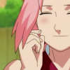
Nothing very special, right? Well, we can make it a little bit better by using the Hue/Saturation/Lightness feature. To use it, go to COLOUS > ADJUST > HUE/SATURATION/LIGHTNESS. For this particular image, I bumped the saturation up +10 to give it a little umph. This is my result;
STEP TWO
Step two is our main colour layers. Now, if I listed each and every colour layer, this tutorial would quickly become tedious, so I just made an image of the order of colours and their layer blend modes. It's read bottom to top, obviously. After all of that, I have this;
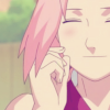
That's alright, but still not good enough.
STEP THREE
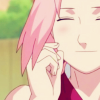
Now, duplicate your base layer, bring it to the top and set it to Soft Light, which yields this;
We're movin' on up!
STEP FOUR
Now, for a little secret! When I want dark, smooth colours, often times I don't want to deal with how picky curves is. So instead, I just slap on a layer of black (#000000) set to Soft Light. Believe me, it works! Here's what I have now;
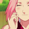
Ah, much better! But we're still not there yet. At this point, though, you can merge your layers, because that'll make things neater.
STEP FIVE
Stop, it's exclusion layer time! Make a new layer, fill it with #275969, and set it to Exclusion at 100% opacity. Which, predictably, makes the icon look like this;
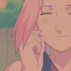
We're back to the square one of ickiness. Gag me. Fear not, however. It's all for the greater good!
STEP SIX
Now, we're gonna use our old trusty friend, Mr. Duplicate Your Base and Set to Soft Light at 100% opacity. That gives us this little number right here;
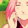
One more step, guys!
STEP SEVEN
To make it just a bit bolder, I'm going to up the saturation one more time. Once again, I used +10. It depends on the image. Then I smoothed out any nasty spots with the Smudge tool. All in all, I've shown you how to make an icon that looks a little something like this;

Much, much better! This works great on Disney caps especially. I made a great-looking batch of Lion King icons like this, except instead of using an exclusion layer, I stopped at step three, and duplicated my base twice and set to Soft Light instead of just once. But you'll never know what cool colouring effects you can get unless you take the time to experiment.
Thanks to reversescollide, whose profile codes I studied and used as a template to make this new tutorial format!

to

in just seven steps!
Difficulty: Easy-peasy. Just colour layers and Hue/Saturation/Lightness.
Transferability: 100% transferable to just about everything.
STEP ONE
Start out with your base image. For this tutorial, we'll be using a screenshot of Sakura from Naruto Shippouden. Here is the base;

Nothing very special, right? Well, we can make it a little bit better by using the Hue/Saturation/Lightness feature. To use it, go to COLOUS > ADJUST > HUE/SATURATION/LIGHTNESS. For this particular image, I bumped the saturation up +10 to give it a little umph. This is my result;

STEP TWO
Step two is our main colour layers. Now, if I listed each and every colour layer, this tutorial would quickly become tedious, so I just made an image of the order of colours and their layer blend modes. It's read bottom to top, obviously. After all of that, I have this;

That's alright, but still not good enough.
STEP THREE
Now, duplicate your base layer, bring it to the top and set it to Soft Light, which yields this;

We're movin' on up!
STEP FOUR
Now, for a little secret! When I want dark, smooth colours, often times I don't want to deal with how picky curves is. So instead, I just slap on a layer of black (#000000) set to Soft Light. Believe me, it works! Here's what I have now;

Ah, much better! But we're still not there yet. At this point, though, you can merge your layers, because that'll make things neater.
STEP FIVE
Stop, it's exclusion layer time! Make a new layer, fill it with #275969, and set it to Exclusion at 100% opacity. Which, predictably, makes the icon look like this;

We're back to the square one of ickiness. Gag me. Fear not, however. It's all for the greater good!
STEP SIX
Now, we're gonna use our old trusty friend, Mr. Duplicate Your Base and Set to Soft Light at 100% opacity. That gives us this little number right here;

One more step, guys!
STEP SEVEN
To make it just a bit bolder, I'm going to up the saturation one more time. Once again, I used +10. It depends on the image. Then I smoothed out any nasty spots with the Smudge tool. All in all, I've shown you how to make an icon that looks a little something like this;

Much, much better! This works great on Disney caps especially. I made a great-looking batch of Lion King icons like this, except instead of using an exclusion layer, I stopped at step three, and duplicated my base twice and set to Soft Light instead of just once. But you'll never know what cool colouring effects you can get unless you take the time to experiment.
Thanks to reversescollide, whose profile codes I studied and used as a template to make this new tutorial format!