_wizu
in
vainglorei
Tutorial #1
Tutorial using Photoshop 7. It's my first tutorial, so I hope it's not too hard to follow. Unfortunetly, I didn't have the .psd file for the original icon that this was requested for, so this will be slighty tweaked. We'll be going from this:
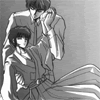
to this: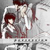
I started out with a cropped picture of Subaru and Seishirou from Tokyo Babylon, which as a reference, was cropped from this:
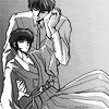
1. Duplicate the base and make sure it's set above the original image. Set the layer mode to soft light and then go to filter -> sharpen -> sharpen. Then go to image -> adjustments-> brightness/contrast and set brightness to +49 and contrast to +38

->
2. Next, I took a texture by sanami276 and pasted it on a new layer inbetween the orginal base, and the duplicated layer, and set the layer mode to multiply.
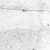
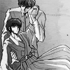
3. Still with the texture layer selected, rotate it by going to edit -> transform -> rotate 90 CW
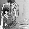
4. Duplicate your base image again and drag the layer to the top. Set the layer mode to soft light, and then go to filter -> blur -> gaussian blur and chose a radius of 1.0 pixels. Than go to image -> adjustments-> brightness/contrast and set brightness to +12 and contrast to +40

5. Next I created a new blank layer between the duplicated layer we just gaussian blured, and the previous duplicated layer that was sharpened. I then selected the brush tool and used a round anti-aliased brush to color in the skin, and then set the layer mode to multiply. For reference purposes, the color I used for the brush was #FFE9D3.
Note: you may have to go to image-> mode-> RGB color in order for the color to not be desaturated
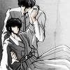
6. I took a completely different picture (thumbnail below) and pasted it into a new layer at the top, above the gaussian layer. I downsized it till the portion of Subaru's face would fit where I wanted it. Then I took the eraser and erased the areas of the new layer that covered any part of Seishirou and Subaru. Then set the layer mode to color burn and opacity to 69%.

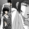
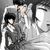
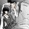
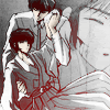
7. Next, I took a simple black and red gradient in a layer at the top of the pallete and set the layer mode to lighten.

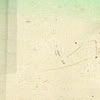
8. I used a texture from here for my text box. I went to image -> adjustments -> desaturate to turn it black and white. I then used the rectangular marquee tool to select the parts of the texture that I didn't want to use and then went to edit-> cut to get rid of them.
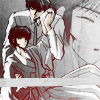
9. I then added text and tiny text with the text tool.
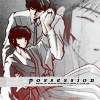
10. Lastly, I used ctrl + alt + print scrn to screencap the entire screen. It was then pasted into my document between the gradient layer and the layer with my text box. I then moved around the screencaped icon till it was where I wanted it. Then used the retangular marquee tool to select what I didn't want and used edit-> cut to get rid of it. Finally, go to image-> adjustments-> desaturate.

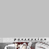
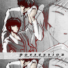

The same method was used to create icons such as:
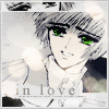
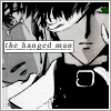
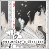
to this:
I started out with a cropped picture of Subaru and Seishirou from Tokyo Babylon, which as a reference, was cropped from this:

1. Duplicate the base and make sure it's set above the original image. Set the layer mode to soft light and then go to filter -> sharpen -> sharpen. Then go to image -> adjustments-> brightness/contrast and set brightness to +49 and contrast to +38
->
2. Next, I took a texture by sanami276 and pasted it on a new layer inbetween the orginal base, and the duplicated layer, and set the layer mode to multiply.
3. Still with the texture layer selected, rotate it by going to edit -> transform -> rotate 90 CW
4. Duplicate your base image again and drag the layer to the top. Set the layer mode to soft light, and then go to filter -> blur -> gaussian blur and chose a radius of 1.0 pixels. Than go to image -> adjustments-> brightness/contrast and set brightness to +12 and contrast to +40
5. Next I created a new blank layer between the duplicated layer we just gaussian blured, and the previous duplicated layer that was sharpened. I then selected the brush tool and used a round anti-aliased brush to color in the skin, and then set the layer mode to multiply. For reference purposes, the color I used for the brush was #FFE9D3.
Note: you may have to go to image-> mode-> RGB color in order for the color to not be desaturated
6. I took a completely different picture (thumbnail below) and pasted it into a new layer at the top, above the gaussian layer. I downsized it till the portion of Subaru's face would fit where I wanted it. Then I took the eraser and erased the areas of the new layer that covered any part of Seishirou and Subaru. Then set the layer mode to color burn and opacity to 69%.

7. Next, I took a simple black and red gradient in a layer at the top of the pallete and set the layer mode to lighten.
8. I used a texture from here for my text box. I went to image -> adjustments -> desaturate to turn it black and white. I then used the rectangular marquee tool to select the parts of the texture that I didn't want to use and then went to edit-> cut to get rid of them.
9. I then added text and tiny text with the text tool.
10. Lastly, I used ctrl + alt + print scrn to screencap the entire screen. It was then pasted into my document between the gradient layer and the layer with my text box. I then moved around the screencaped icon till it was where I wanted it. Then used the retangular marquee tool to select what I didn't want and used edit-> cut to get rid of it. Finally, go to image-> adjustments-> desaturate.

The same method was used to create icons such as: