Christie: tutorial 007
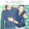
A requested tutorial for the coloring in many of my Jensen and Jared TCA Winter Tour icons. We'll make this one:

Photoshop CS // Selective Colors* // Difficulty: Medium
*Instead of just giving you the numbers I input for selective colors, I've explained step by step why I've increased this and decreased that. I hope you'll find it useful; it's so much better to learn the WHY behind selective colors rather than just inputting numbers like a drone!
01. Your base (image from SupernaturalCentral)
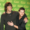
02. Duplicate your base. Go to Images >> Adjustments >> Variations. For this image, I clicked on lighter once, and more blue once. THIS WILL VARY FOR EVERY IMAGE! Study the base and see what you want to change about it. Is it too dark? Click the lighter option. Too yellow? Increase blues. Too blue? Increase yellows. Mess around and see what works; you can always click on 'Original' in the top left corner to go back to your starting point if you mess up.
Set this adjusted layer to Screen. It was too light, so I decreased the opacity to 40%.
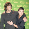
03. Create a new selective color adjustment layer. I want to get my skin tones set. The settings for this image were as follows; the goal being to bring out the yellows, browns and flesh tones in their skin:
REDS (-100, 0, +100, 0)
YELLOWS (-100, 0, +100, 0)
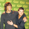
04. Now my skin tones are good, but the icon is way too yellow/green. Create a new selective color adjustment layer. The settings for this image were as follows; the goal being to reduce the greens/yellows without losing too much of the peachy flesh colors:
REDS (-100, 0, +100, 0)
We're gonna be upping the cyans in the neutral section, so I want to get my skin tones exaggerated so I don't lose too much of them when I go into the neutral section.
YELLOWS (+60, -60, -100, +20)
This takes some of the redness out of their faces so they don't look sunburnt, while leaving the yellows of the skintones. It also takes a lot of the bright yellow out of the background; partway to achieving the soft teal we want at the end.
NEUTRALS (+20, 0, -20, -10)
Based on our previous steps, now when we increase the cyan setting in neutrals, we're not losing all of the yellow in our skin. In fact, it gives us room to take down the yellow a bit, softening the background and also bringing the boys skin tone to a more realistic hue. The icon is a little dark so bringing down the black a bit helps, but it also takes it out of Jensen's shirt, so we'll fix that next...
BLACKS (0, 0, 0, +10)
This brings the dark color back to the boy's shirts without making the whole icon darker.
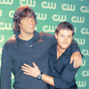
05. This next step is totally based on what the icon's looking like now. I felt like it could use a brightness/contrast lift, so I created a brightness/contrast adjustment layer. I kicked up the brightness +12 and the contrast +6.
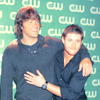
06. Now the icon's finished. I added a scratchy texture by loveicon and put it on screen to finish it off.

Other icons made with this method:


Photoshop CS // Selective Colors* // Difficulty: Medium
*Instead of just giving you the numbers I input for selective colors, I've explained step by step why I've increased this and decreased that. I hope you'll find it useful; it's so much better to learn the WHY behind selective colors rather than just inputting numbers like a drone!
01. Your base (image from SupernaturalCentral)

02. Duplicate your base. Go to Images >> Adjustments >> Variations. For this image, I clicked on lighter once, and more blue once. THIS WILL VARY FOR EVERY IMAGE! Study the base and see what you want to change about it. Is it too dark? Click the lighter option. Too yellow? Increase blues. Too blue? Increase yellows. Mess around and see what works; you can always click on 'Original' in the top left corner to go back to your starting point if you mess up.
Set this adjusted layer to Screen. It was too light, so I decreased the opacity to 40%.

03. Create a new selective color adjustment layer. I want to get my skin tones set. The settings for this image were as follows; the goal being to bring out the yellows, browns and flesh tones in their skin:
REDS (-100, 0, +100, 0)
YELLOWS (-100, 0, +100, 0)

04. Now my skin tones are good, but the icon is way too yellow/green. Create a new selective color adjustment layer. The settings for this image were as follows; the goal being to reduce the greens/yellows without losing too much of the peachy flesh colors:
REDS (-100, 0, +100, 0)
We're gonna be upping the cyans in the neutral section, so I want to get my skin tones exaggerated so I don't lose too much of them when I go into the neutral section.
YELLOWS (+60, -60, -100, +20)
This takes some of the redness out of their faces so they don't look sunburnt, while leaving the yellows of the skintones. It also takes a lot of the bright yellow out of the background; partway to achieving the soft teal we want at the end.
NEUTRALS (+20, 0, -20, -10)
Based on our previous steps, now when we increase the cyan setting in neutrals, we're not losing all of the yellow in our skin. In fact, it gives us room to take down the yellow a bit, softening the background and also bringing the boys skin tone to a more realistic hue. The icon is a little dark so bringing down the black a bit helps, but it also takes it out of Jensen's shirt, so we'll fix that next...
BLACKS (0, 0, 0, +10)
This brings the dark color back to the boy's shirts without making the whole icon darker.

05. This next step is totally based on what the icon's looking like now. I felt like it could use a brightness/contrast lift, so I created a brightness/contrast adjustment layer. I kicked up the brightness +12 and the contrast +6.

06. Now the icon's finished. I added a scratchy texture by loveicon and put it on screen to finish it off.

Other icons made with this method:
