Manga Icon Tutorial: SakuraPunch!
Manga Icon Tutorial: SakuraPunch!
Waheeey! My first icon tutorial, as suggested by reichi_heika. ^_^ Today we're going to learn basic manga coloring techniques and the advantage of using textures.
We'll be making this lovely little icon: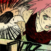
Program: Photoshop CS2 (Works for 7.0 as well.) I think it can be translated into PSP as well, I'm not 100% sure.
Difficulty: Medium (more time consuming than difficult, actually.)
Start!
Well, cropping your image is always the first start. However, for manga icons, I never start at the 100x100 size. It's much easier to color larger images. I like working with images that are at least 200x200 pixels in size. The image below is 356x376 pixels.
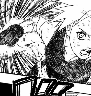
Step 1
Right, well this step is actually more than one step. It's pretty much the entire process. So, pay attention!
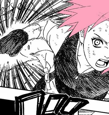
a) Using the magic wand tool, select a section of Sakura to color. I started with the easiest part, her hair.
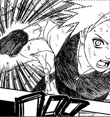
b) Now, choose her hair color as your foreground color. (I always use #fda4bd for Sakura's hair.)
And here comes the most important part!
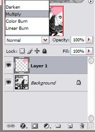
- Keeping the area selected, create a new layer.
- Go to Edit >> Fill >> choose 'Foreground Color' on the drop down menu >> click OK
- And we have pink hair! But there's one more crucial step to coloring manga icons-- the blend mode.
- On the layer palette, change the blend mode from "normal" to "multiply." Multiply lets the lineart show through. If the multiply function darkens your color, you can change the opacity of the layer accordingly.
- Deselect the layer.
And here's the result!
Step 2
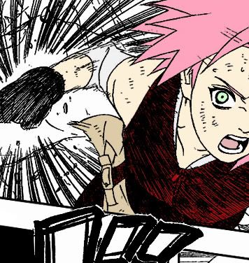
Repeat Step 1 for every part of Sakura. Remember to make a new layer for every colored section. You don't have to color the areas around Sakura, just focus on her.
To make the lineart appear bolder, duplicate the line art, then go to: Layers >> Arrange >> Bring to front. Then select multiply from the blending options. (This really improves the line quality for resizing.)
This is what I had when I finished coloring and made the line art bolder:
Step 3
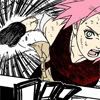
Resizing time! Scale your image down to 100x100 pixels, crop off any excess pixels if you have to. (I know that for this image, it was 106 pixels in height with 100 px of width, so I just cut those six pixels off.)
Step 4
We're almost done! Now, here's the fun part.
We'll be using this texture by colorfilter:
Copy and paste the texture onto a new layer over your image. (For this icon, I had to flip the texture horizontally.)
Change the blend mode of the layer from "normal" to "multiply"... and you're done!

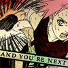
(Actually, for this icon, I wanted a little more color than the 1st multiply texture provided on its own, so I duplicated the multiply texture layer and set its opacity to 50%. It's hardly noticable, haha.)
With a nifty shape overlay on the initial uncolored image, I was able to add text to this icon after the resize:
This technique was also used on the following icons:


Additional Tips!
- Use those opacity sliders! They can really make all the difference!
- The textures you choose can really make or break your icon. Look for ones that can really enhance the icon. For instance, with the Sakura icon, the texture I used made her fist look like it's glowing red. In the "Vicious Bitter Words" icon, the texture I used there highlighted Sasuke's face, making it a focal point.
- Also, when choosing textures, look for ones that aren't too dark (unless that's what you're going for) you don't want them to nullify all the work you did coloring the image! (Unless that's what you're going for o.O)
So... that's it! ^_^ End of my first tutorial. Please tell me what you think! I'd like to see your results as well.
Feel free to look through all my icons here on vraxis and request a tutorial for anything you want to learn. ^^
Waheeey! My first icon tutorial, as suggested by reichi_heika. ^_^ Today we're going to learn basic manga coloring techniques and the advantage of using textures.
We'll be making this lovely little icon:
Program: Photoshop CS2 (Works for 7.0 as well.) I think it can be translated into PSP as well, I'm not 100% sure.
Difficulty: Medium (more time consuming than difficult, actually.)
Start!
Well, cropping your image is always the first start. However, for manga icons, I never start at the 100x100 size. It's much easier to color larger images. I like working with images that are at least 200x200 pixels in size. The image below is 356x376 pixels.

Step 1
Right, well this step is actually more than one step. It's pretty much the entire process. So, pay attention!
a) Using the magic wand tool, select a section of Sakura to color. I started with the easiest part, her hair.

b) Now, choose her hair color as your foreground color. (I always use #fda4bd for Sakura's hair.)
And here comes the most important part!
- Keeping the area selected, create a new layer.
- Go to Edit >> Fill >> choose 'Foreground Color' on the drop down menu >> click OK
- And we have pink hair! But there's one more crucial step to coloring manga icons-- the blend mode.
- On the layer palette, change the blend mode from "normal" to "multiply." Multiply lets the lineart show through. If the multiply function darkens your color, you can change the opacity of the layer accordingly.

- Deselect the layer.
And here's the result!

Step 2
Repeat Step 1 for every part of Sakura. Remember to make a new layer for every colored section. You don't have to color the areas around Sakura, just focus on her.
To make the lineart appear bolder, duplicate the line art, then go to: Layers >> Arrange >> Bring to front. Then select multiply from the blending options. (This really improves the line quality for resizing.)
This is what I had when I finished coloring and made the line art bolder:

Step 3
Resizing time! Scale your image down to 100x100 pixels, crop off any excess pixels if you have to. (I know that for this image, it was 106 pixels in height with 100 px of width, so I just cut those six pixels off.)

Step 4
We're almost done! Now, here's the fun part.
We'll be using this texture by colorfilter:

Copy and paste the texture onto a new layer over your image. (For this icon, I had to flip the texture horizontally.)
Change the blend mode of the layer from "normal" to "multiply"... and you're done!
(Actually, for this icon, I wanted a little more color than the 1st multiply texture provided on its own, so I duplicated the multiply texture layer and set its opacity to 50%. It's hardly noticable, haha.)
With a nifty shape overlay on the initial uncolored image, I was able to add text to this icon after the resize:
This technique was also used on the following icons:


Additional Tips!
- Use those opacity sliders! They can really make all the difference!
- The textures you choose can really make or break your icon. Look for ones that can really enhance the icon. For instance, with the Sakura icon, the texture I used made her fist look like it's glowing red. In the "Vicious Bitter Words" icon, the texture I used there highlighted Sasuke's face, making it a focal point.
- Also, when choosing textures, look for ones that aren't too dark (unless that's what you're going for) you don't want them to nullify all the work you did coloring the image! (Unless that's what you're going for o.O)
So... that's it! ^_^ End of my first tutorial. Please tell me what you think! I'd like to see your results as well.
Feel free to look through all my icons here on vraxis and request a tutorial for anything you want to learn. ^^