tutorial #11-- dan & emma
hey, everyone! here's yet another tutorial. citygirlamandab asked me to write up how i made these three icons from a previous batch, so here you have it!
all of this was done in PS7. uses selective coloring, so it's not translatable, but read on even if you don't have that tool, that's not ALL i use on it ^-^ you can still find some neat tricks inside.
if you DO have photoshop and CAN use selective coloring, keep in mind that this still does not work with every picture. everything depends on the quality of your original image and its inherent coloring. i find this type of color works better on images that have a bit of an earthy tone to them, lots of flesh color, like on images of blonde and brunette people. have that in mind when you use this tutorial.
***PLEASE DON'T COPY THIS EXACTLY!*** try to learn what i think while i'm making these instead of just copying and pasting every single layer onto your images, ok? remember it might not work for every single image out there, fiddle with the settings if you have to.
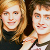
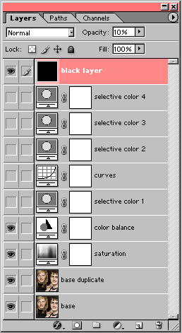
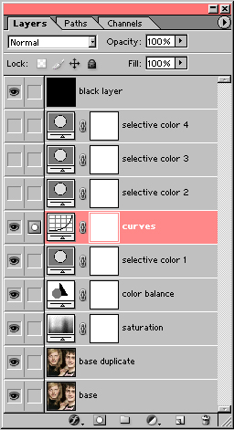
base_ my base was an image of daniel radcliffe & emma watson from a photoshoot for OotP. i think i rotated it a bit, cropped it, and resized to 100x100. then i ran auto contrast (image> adjustments> auto contrast) and auto color (image> adjustments> auto color) until i got something i liked for my base; this is completely at your discretion. i don't believe i sharpened it, because i prefer not to sharpen until the end if i plan to use selective coloring. this was my final base.
base duplicate_ i thought the base was a wee bit too dark, so i duplicated it and set the duplicate to screen at 100%. this made my icon so much brighter. a lot of people use curves or layers for this same purpose, and they work just as well if not better, just keep in mind that if your image is of good quality, a simple screen layer can do the trick just as easy.
saturation_ now they're bright enough, but they're looking a bit pale, aren't they? so i added a new hue/saturation adjustment layer (layer> new adjustment layer> hue/saturation) and cranked up the master saturation by about 50%. don't be shocked! at first glance it may look like they ended up looking bright orange, but don't worry, that can still be fixed. as long as they don't look as orange as the thing, it's still salvageable. and it's not as bad as you think, really. if you keep staring at it, you'll figure out that it actually looks quite nice, if you didn't go overboard with the saturation xD
color balance_ now, just to soften up the orange a bit, i decided to use a color balance layer. it's a very easy way to subtly change the coloring of an icon, so i like to use it often. i was going for making it a little bit less yellow, and have it lean more towards reddish. here are my settings:
midtones: -5/-15/5
make sure "preserve luminosity" is checked. i didn't touch the shadows OR the highlights. the reason was that if i touched either, the contrast would probably increase, and i didn't really want that at this point. here's what it looked like up to now.
selective color 1_ after i saw what i had after the last layer, i decided that i wanted to go in a different direction, so i decided to add a selective coloring layer (layer> new adjustment layer> selective color). you know, so instead of the whole thing looking orange, i could keep the blush in their faces but have their hair and eyes stand out with a different tone. my settings were the following:
reds: 100/0/0/0
yellows: 100/0/0/0
cyans: 100/0/0/0
blues: 100/0/0/0
whites: 100/0/0/0
neutrals: 100/0/-50/65
blacks: 100/0/0/100
you can see from the initial colors that i was amping up the cyan everywhere. this is because, since the icon was already orangy, adding cyan to the red would make it a bit more magenta, which is a more natural tone for their face than the orange... but then i didn't want it to be unrealistically magenta, so i increased the cyans and blacks in the neutrals; the neutrals basically affect the whole icon, so this made the whole thing a bit more blueish, taking away some of the magenta shock. i increased the blacks to get their hair to look a bit less blue, didn't want to make them look like aliens, after all xD anyway, after all that talk, this is what it looked like after that layer.
curves_ the problem with adding cyan and increasing the blacks is that now my icon ended up too contrasty (yes, i know that's not really a word ^^;;;). so i decided to go with a curves layer to soften the colors a bit. these were my settings (always in new nodes, unless stated otherwise):
RGB: 147/185 and 70/111
red: 147/158 and 88/96
blue: 77/68
i didn't touch the green because there isn't really any green on the icon and i didn't want it to be green anyway ^^;;; curves are nifty, they are. the RGB setting basically controls the brightness of the icon; the more to the left your curve is, the brighter the icon will be, and viceversa. as for the red and blue, it's the same thing-- the more to the left, the more red or blue the icon will be. in my case, the RGB setting made my icon a lot brighter (which helped with the overcontrast problem i had). the red setting didn't lean AS much to the left, just a little, so i didn't altogether lose the magenta tones i had gotten from the selective coloring layer. the blue setting, on the other hand, leans just a little bit to the right, to keep the icon from becoming too blue. here's what that looked like.
selective color 2_ i did like what i got from the last step, but i still thought i could keep experimenting. ah, curiosity is wonderful and annoying at the same time >.< so anyway, i attacked my reds again. i was trying to go back to orange, maybe see if i could get a sharper result. these were my settings:
red: -100/45/80/25
i made sure my yellow setting was increased more than my magenta setting in the red. this meant that the natural blush on their faces would lean more towards orange than magenta. here's what it came out like.
selective color 3_ now, after that i was a bit stumped. i have a few selective color layers saved, so i decided to try some of them to see if i could get something i liked. this one in particular, had these settings:
reds: -100/0/100/0
yellows: -15/0/-30/0
neutrals: 30/0/-40/0
and well, i wasn't planning on going back to blue, but i thought the result was cute enough. so yeah, not much planning for this layer ^^;;;
selective color 4_ and one last selective color layer! this is a bit of a subtle detail, but i quite like to use this layer. it turns your blues a little more cyan, and your cyans a little more green. the cool thing about it, is that it only modifies cyans and blues, so if your icon doesn't have any blue/cyan/green, the layer won't do anything to it, so there's no chance of a mess up ^_^
cyans: 89/-23/100/-27
blues: 35/-12/-19/0
like i said, the effect is very subtle, but it's there. and if your image is more cyan/blueish than mine is, it can provide really sharp results.
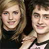
black layer_ i thought it was a bit too bright (i often get this thought through my head when i finish an icon, i think it's just that i'm paranoic or something), so i just created a new layer, flood-filled it with black, and reduced the opacity to 10%. and ta-dah! there's my final icon!
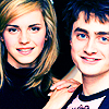
so, to make a long story short, to make this icon:
...only use the first four layers and the black layer, like so. to make this icon:

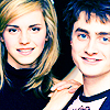
...use the first six layers, up to the curves, and the black layer, like so. and to make the last icon:

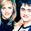
...use every layer, like this.
hope you found this tutorial useful, and i would love to see your results, so please comment! and if you like my icons/graphics and/or want to know how i made them, be sure to step by wakizashi_. i'd be glad to help you with anything.
all of this was done in PS7. uses selective coloring, so it's not translatable, but read on even if you don't have that tool, that's not ALL i use on it ^-^ you can still find some neat tricks inside.
if you DO have photoshop and CAN use selective coloring, keep in mind that this still does not work with every picture. everything depends on the quality of your original image and its inherent coloring. i find this type of color works better on images that have a bit of an earthy tone to them, lots of flesh color, like on images of blonde and brunette people. have that in mind when you use this tutorial.
***PLEASE DON'T COPY THIS EXACTLY!*** try to learn what i think while i'm making these instead of just copying and pasting every single layer onto your images, ok? remember it might not work for every single image out there, fiddle with the settings if you have to.
base_ my base was an image of daniel radcliffe & emma watson from a photoshoot for OotP. i think i rotated it a bit, cropped it, and resized to 100x100. then i ran auto contrast (image> adjustments> auto contrast) and auto color (image> adjustments> auto color) until i got something i liked for my base; this is completely at your discretion. i don't believe i sharpened it, because i prefer not to sharpen until the end if i plan to use selective coloring. this was my final base.
base duplicate_ i thought the base was a wee bit too dark, so i duplicated it and set the duplicate to screen at 100%. this made my icon so much brighter. a lot of people use curves or layers for this same purpose, and they work just as well if not better, just keep in mind that if your image is of good quality, a simple screen layer can do the trick just as easy.
saturation_ now they're bright enough, but they're looking a bit pale, aren't they? so i added a new hue/saturation adjustment layer (layer> new adjustment layer> hue/saturation) and cranked up the master saturation by about 50%. don't be shocked! at first glance it may look like they ended up looking bright orange, but don't worry, that can still be fixed. as long as they don't look as orange as the thing, it's still salvageable. and it's not as bad as you think, really. if you keep staring at it, you'll figure out that it actually looks quite nice, if you didn't go overboard with the saturation xD
color balance_ now, just to soften up the orange a bit, i decided to use a color balance layer. it's a very easy way to subtly change the coloring of an icon, so i like to use it often. i was going for making it a little bit less yellow, and have it lean more towards reddish. here are my settings:
midtones: -5/-15/5
make sure "preserve luminosity" is checked. i didn't touch the shadows OR the highlights. the reason was that if i touched either, the contrast would probably increase, and i didn't really want that at this point. here's what it looked like up to now.
selective color 1_ after i saw what i had after the last layer, i decided that i wanted to go in a different direction, so i decided to add a selective coloring layer (layer> new adjustment layer> selective color). you know, so instead of the whole thing looking orange, i could keep the blush in their faces but have their hair and eyes stand out with a different tone. my settings were the following:
reds: 100/0/0/0
yellows: 100/0/0/0
cyans: 100/0/0/0
blues: 100/0/0/0
whites: 100/0/0/0
neutrals: 100/0/-50/65
blacks: 100/0/0/100
you can see from the initial colors that i was amping up the cyan everywhere. this is because, since the icon was already orangy, adding cyan to the red would make it a bit more magenta, which is a more natural tone for their face than the orange... but then i didn't want it to be unrealistically magenta, so i increased the cyans and blacks in the neutrals; the neutrals basically affect the whole icon, so this made the whole thing a bit more blueish, taking away some of the magenta shock. i increased the blacks to get their hair to look a bit less blue, didn't want to make them look like aliens, after all xD anyway, after all that talk, this is what it looked like after that layer.
curves_ the problem with adding cyan and increasing the blacks is that now my icon ended up too contrasty (yes, i know that's not really a word ^^;;;). so i decided to go with a curves layer to soften the colors a bit. these were my settings (always in new nodes, unless stated otherwise):
RGB: 147/185 and 70/111
red: 147/158 and 88/96
blue: 77/68
i didn't touch the green because there isn't really any green on the icon and i didn't want it to be green anyway ^^;;; curves are nifty, they are. the RGB setting basically controls the brightness of the icon; the more to the left your curve is, the brighter the icon will be, and viceversa. as for the red and blue, it's the same thing-- the more to the left, the more red or blue the icon will be. in my case, the RGB setting made my icon a lot brighter (which helped with the overcontrast problem i had). the red setting didn't lean AS much to the left, just a little, so i didn't altogether lose the magenta tones i had gotten from the selective coloring layer. the blue setting, on the other hand, leans just a little bit to the right, to keep the icon from becoming too blue. here's what that looked like.
selective color 2_ i did like what i got from the last step, but i still thought i could keep experimenting. ah, curiosity is wonderful and annoying at the same time >.< so anyway, i attacked my reds again. i was trying to go back to orange, maybe see if i could get a sharper result. these were my settings:
red: -100/45/80/25
i made sure my yellow setting was increased more than my magenta setting in the red. this meant that the natural blush on their faces would lean more towards orange than magenta. here's what it came out like.
selective color 3_ now, after that i was a bit stumped. i have a few selective color layers saved, so i decided to try some of them to see if i could get something i liked. this one in particular, had these settings:
reds: -100/0/100/0
yellows: -15/0/-30/0
neutrals: 30/0/-40/0
and well, i wasn't planning on going back to blue, but i thought the result was cute enough. so yeah, not much planning for this layer ^^;;;
selective color 4_ and one last selective color layer! this is a bit of a subtle detail, but i quite like to use this layer. it turns your blues a little more cyan, and your cyans a little more green. the cool thing about it, is that it only modifies cyans and blues, so if your icon doesn't have any blue/cyan/green, the layer won't do anything to it, so there's no chance of a mess up ^_^
cyans: 89/-23/100/-27
blues: 35/-12/-19/0
like i said, the effect is very subtle, but it's there. and if your image is more cyan/blueish than mine is, it can provide really sharp results.
black layer_ i thought it was a bit too bright (i often get this thought through my head when i finish an icon, i think it's just that i'm paranoic or something), so i just created a new layer, flood-filled it with black, and reduced the opacity to 10%. and ta-dah! there's my final icon!
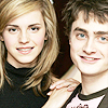
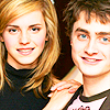
so, to make a long story short, to make this icon:
...only use the first four layers and the black layer, like so. to make this icon:
...use the first six layers, up to the curves, and the black layer, like so. and to make the last icon:
...use every layer, like this.
hope you found this tutorial useful, and i would love to see your results, so please comment! and if you like my icons/graphics and/or want to know how i made them, be sure to step by wakizashi_. i'd be glad to help you with anything.