tutorial #5-- carry your burden
hello all! by request of orlandogirl i present you guys with a full icon tutorial for this icon...
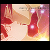
...which is one of my favorite icons so believe me, i'm very pleased to do this ^.^ done in PS7, but i'm quite sure it's easily translatable to other programs.
anyway, first step is our base. in this case i was making RK seisouhen icons, so i chose a lovely screencap of a very loving kenshin and kaoru that came from an awesome image gallery named memories. i cropped it just a little bit, resized it to a 100px width and pasted it on a white background, like so:
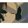
and from now on, these two layers will be called "background" and "base" respectively. now, as wonderful as that image is, it's a little dark, isn't it? the characters sort of blend into the darkness. i guess that's the way the scene was supposed to be, but i wanted to change the lighting a bit, so i did what i always do to my bases when i want to create some contrast: duplicate the base layer (the duplicate will be called "contrast"), raise the brightness by about 40 (image> adjustments> brightness/contrast) and then applying a gaussian blur with a radius of about 8.0 (filter> blur> gaussian blur). now you'll see that our contrast layer is all blurred up, like this:

and then set that layer to soft light. what the soft light blending mode does is that the dark parts get darker and the light parts end up lighter. in this case, since the layer you're setting to soft light is all blurred, it will create a sort of soft look on the icon, affecting the original lighting and leaving a more... how do i say this... sort of "ethereal" look on the icon. i'm sure you've seen this effect before, only i always use it at the beginning and most people leave it as a last step for their icons. it looks like this:

see how the light brings out their faces a little more? that's the contrast we were looking for. but now, since their faces are brighter, kenshin's scar is kind of hard to see. so i picked out a color from the scar in the base and in a new layer (very wisely called "scar" ^^;;;) i just airbrushed the color over where the scar is supposed to be. you'd probably have to zoom in a lot to get it right, i know i did. then i set this "scar" layer to soft light and as you can see, the color is now clearly viewable:

now to start on the coloring, i took this gradient, (i don't know who made it, if you know please let me know):

and set it on lighten. you can get all sorts of neat effects with a reddish-orangish-pinkish gradient and the lighten blending mode, because what it does is that basically the dark parts of your icon will become reddish-orangish-pinkish, as you can see the bottom right corner of my icon did:

and the rest of the icon takes a very subtle purplish hue from the purple in the gradient. if you do this with very dark colors (i.e.: navy blue, deep forest green, dark brown, that kinda stuff) you'll most likely only get the slight hue, so i'd recommend to go for the reddish-orangish-pinkish. anyway, this gradient layer will be called "gradient 1." gosh i'm so original ^^;;;
yet i wanted it even brighter, so i grabbed this texture from... somewhere (remember, if it's yours or you know where it's from, tell me so i can credit the maker!) and pasted it on a new layer ("texture 1").

i set this layer on overlay, which kinda does the same thing as soft light but much more intense. i reduced the opacity of this layer to 70 because it was waaaaay too bright for me (sometimes it's hard to work with images that are TOO bright-- contrast is lost and it's very hard to bring it back without letting go of the coloring). the end result was this:

now they seem like they have white splotches over their faces (which they do, but that wasn't the point i was trying to get to ^^;;;;), so to even things out a little bit but not lose the brightness, i set this gradient ("gradient 2") on top of everything:

and set the layer to hard light. hard light is also like soft light and overlay in that the darker colors become darker and the lighter colors become lighter, but much more extreme. you have to be careful when setting light or pastel colors to hard light-- i more than once tried setting a pale yellow layer to hard light and you end up with just the same pale yellow layer; it turned things so light that you can't see what was supposed to be below that layer. anyway, when i set this particular layer to hard light, since the contrast between the characters and the background was pretty good, i can actually see what i'm doing there. i lowered the opacity to 70, though, because again, i didn't want it to be TOO bright, so much that i couldn't do anything else to it.
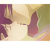
now it's time for the starry look to the icon. i took this texture, which i like very much and use often (by bombayicons)...
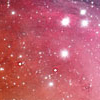
and set it on lighten. you'll see the pinkish-reddish thing happening again. this layer is called "texture 2."

i liked the starry look, but now they look a little washed out. i usually like my icons to be very contrasty, the contours very defined and all. so let's bring back the contrast that we lost! i'll use a purplish gradient, since the color is darker than the pink, but a little on the neutral side, not too dark and not too bright a shade ("gradient 3"):

i set this gradient to overlay at 50. this gave me just the right amount of contrast i was looking for. if i left it at 100 the shadows i had originally come back to their faces and we have already established that we didn't want that, right? ^-^

and i was pretty happy with this, but then i out of nowhere (yep, i'm weird like that-- my opinion can change in a snap) started thinking that maybe it was too ZOMGLOOKHOWBRIGHTIAM and it didn't really capture the essence of the scene, which was very romantic but very dramatic at the same time. so i tried to make the brightness be noticeable but not make the icon HAPPYHYPERYAAAYYY!! if you catch my drift. basically i tried to get it a wee bit darker without loosing the contrast i fought so hard to obtain. the fastest way i know of how to do this is to use a difference layer. so i took this gradient ("gradient 4"):
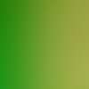
and set it to difference. now, this is a very delicate operation-- setting stuff to difference can give you things that are just weird and plain out of this world. fastest way to get someone looking like an alien is to set a green or purple layer on difference on top of a cream-colored face.

and i don't particularly think a purple face suits kenshin very much. now, i like the difference layer quite a lot (i am the self-proclaimed "queen of the difference layers" =P) because setting two different layers to difference can usually give me sharp icons with funky coloring, but it all depends on the image you're using and which colors you're using for the layers. but for this icon, i was quite satisfied with my coloring so far, so i just set the opacity to 10...

and TA-DAH! the colors are just muted a little ^____^ go us! i still wanted to add one more shiny effect, though, just to see if it didn't make the icon go overboard, so i chose this light texture ("texture 3"):

and set it to screen. the screen blending mode is kind of like lighten but it affects all colors, not only the dark ones. so if you set something to screen on a very light icon, it will only give you something even lighter. mine ended up like this:

and as you can see i blurred a little of the texture that covered their faces because i was interested in the burst of light only and not in how it cut through their faces. when you're using textures and don't want to use a part, be sure to blur it out instead of just erasing it, or you might mess up the coloring (the un-erased part of your icon will have different coloring/brightness than the part that you erased).
now what i wanted to do was to bring back the contours of the drawing. this is a very nifty effect that i like very much-- it doesn't work very well if you're making an icon of a real person but with animated stuff and manga it works like a charm. i love it to bits. duplicate your base and bring it to the top ("light edges"). desaturate it (image> adjustments> desaturate) and then go to filter> brush strokes> accented edges. a dialog box will pop up-- set your edge width to 1 and your smoothness to 2 (or well, i guess you can change the smoothness to your own taste but i always leave it at 2. the edge width i really recommend sticking to 1 because any more and kenshin and kaoru will start losing bits of their face due to too wide edges). the brightness i set to 30, which is usually very good if you want your edges to become slightly brighter than they are originally. sometimes i do the same thing if i want the edges to be darker, only i set the brightness to 20, which gives it a charcoal-painting kinda look. for this one, since it was starry and all, i stuck with 30. this is what i got:
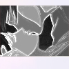
and i set that layer to soft light at 50% opacity. as expected, the edges of my icon became brighter while the dark parts became darker, like so:

i wanted the characters even more defined, so i duplicated my base again, desaturated it (we do this so the blending will affect the tone of the colors, but not change the colors themselves since it's ony black, white and shades of gray) and set it on soft light ("contrast 2").

then i just covered the white with a black border ("border"), added some brushes and text (set to soft light as well so they look kind of semi-transparent-- "text 1," "text 2" and "text 3") and we're done! the final product:

here is the layers palette, in case you got lost somewhere along the way:

i hope you guys learned something from this tutorial-- i do know that i really enjoyed making this icon, i love it very much. i hope the tut was easy to follow. if you have any questions or comments, just click the reply link! thanks for your attention! ^_^
...which is one of my favorite icons so believe me, i'm very pleased to do this ^.^ done in PS7, but i'm quite sure it's easily translatable to other programs.
anyway, first step is our base. in this case i was making RK seisouhen icons, so i chose a lovely screencap of a very loving kenshin and kaoru that came from an awesome image gallery named memories. i cropped it just a little bit, resized it to a 100px width and pasted it on a white background, like so:

and from now on, these two layers will be called "background" and "base" respectively. now, as wonderful as that image is, it's a little dark, isn't it? the characters sort of blend into the darkness. i guess that's the way the scene was supposed to be, but i wanted to change the lighting a bit, so i did what i always do to my bases when i want to create some contrast: duplicate the base layer (the duplicate will be called "contrast"), raise the brightness by about 40 (image> adjustments> brightness/contrast) and then applying a gaussian blur with a radius of about 8.0 (filter> blur> gaussian blur). now you'll see that our contrast layer is all blurred up, like this:

and then set that layer to soft light. what the soft light blending mode does is that the dark parts get darker and the light parts end up lighter. in this case, since the layer you're setting to soft light is all blurred, it will create a sort of soft look on the icon, affecting the original lighting and leaving a more... how do i say this... sort of "ethereal" look on the icon. i'm sure you've seen this effect before, only i always use it at the beginning and most people leave it as a last step for their icons. it looks like this:

see how the light brings out their faces a little more? that's the contrast we were looking for. but now, since their faces are brighter, kenshin's scar is kind of hard to see. so i picked out a color from the scar in the base and in a new layer (very wisely called "scar" ^^;;;) i just airbrushed the color over where the scar is supposed to be. you'd probably have to zoom in a lot to get it right, i know i did. then i set this "scar" layer to soft light and as you can see, the color is now clearly viewable:

now to start on the coloring, i took this gradient, (i don't know who made it, if you know please let me know):

and set it on lighten. you can get all sorts of neat effects with a reddish-orangish-pinkish gradient and the lighten blending mode, because what it does is that basically the dark parts of your icon will become reddish-orangish-pinkish, as you can see the bottom right corner of my icon did:

and the rest of the icon takes a very subtle purplish hue from the purple in the gradient. if you do this with very dark colors (i.e.: navy blue, deep forest green, dark brown, that kinda stuff) you'll most likely only get the slight hue, so i'd recommend to go for the reddish-orangish-pinkish. anyway, this gradient layer will be called "gradient 1." gosh i'm so original ^^;;;
yet i wanted it even brighter, so i grabbed this texture from... somewhere (remember, if it's yours or you know where it's from, tell me so i can credit the maker!) and pasted it on a new layer ("texture 1").

i set this layer on overlay, which kinda does the same thing as soft light but much more intense. i reduced the opacity of this layer to 70 because it was waaaaay too bright for me (sometimes it's hard to work with images that are TOO bright-- contrast is lost and it's very hard to bring it back without letting go of the coloring). the end result was this:

now they seem like they have white splotches over their faces (which they do, but that wasn't the point i was trying to get to ^^;;;;), so to even things out a little bit but not lose the brightness, i set this gradient ("gradient 2") on top of everything:

and set the layer to hard light. hard light is also like soft light and overlay in that the darker colors become darker and the lighter colors become lighter, but much more extreme. you have to be careful when setting light or pastel colors to hard light-- i more than once tried setting a pale yellow layer to hard light and you end up with just the same pale yellow layer; it turned things so light that you can't see what was supposed to be below that layer. anyway, when i set this particular layer to hard light, since the contrast between the characters and the background was pretty good, i can actually see what i'm doing there. i lowered the opacity to 70, though, because again, i didn't want it to be TOO bright, so much that i couldn't do anything else to it.

now it's time for the starry look to the icon. i took this texture, which i like very much and use often (by bombayicons)...

and set it on lighten. you'll see the pinkish-reddish thing happening again. this layer is called "texture 2."

i liked the starry look, but now they look a little washed out. i usually like my icons to be very contrasty, the contours very defined and all. so let's bring back the contrast that we lost! i'll use a purplish gradient, since the color is darker than the pink, but a little on the neutral side, not too dark and not too bright a shade ("gradient 3"):

i set this gradient to overlay at 50. this gave me just the right amount of contrast i was looking for. if i left it at 100 the shadows i had originally come back to their faces and we have already established that we didn't want that, right? ^-^

and i was pretty happy with this, but then i out of nowhere (yep, i'm weird like that-- my opinion can change in a snap) started thinking that maybe it was too ZOMGLOOKHOWBRIGHTIAM and it didn't really capture the essence of the scene, which was very romantic but very dramatic at the same time. so i tried to make the brightness be noticeable but not make the icon HAPPYHYPERYAAAYYY!! if you catch my drift. basically i tried to get it a wee bit darker without loosing the contrast i fought so hard to obtain. the fastest way i know of how to do this is to use a difference layer. so i took this gradient ("gradient 4"):

and set it to difference. now, this is a very delicate operation-- setting stuff to difference can give you things that are just weird and plain out of this world. fastest way to get someone looking like an alien is to set a green or purple layer on difference on top of a cream-colored face.

and i don't particularly think a purple face suits kenshin very much. now, i like the difference layer quite a lot (i am the self-proclaimed "queen of the difference layers" =P) because setting two different layers to difference can usually give me sharp icons with funky coloring, but it all depends on the image you're using and which colors you're using for the layers. but for this icon, i was quite satisfied with my coloring so far, so i just set the opacity to 10...

and TA-DAH! the colors are just muted a little ^____^ go us! i still wanted to add one more shiny effect, though, just to see if it didn't make the icon go overboard, so i chose this light texture ("texture 3"):

and set it to screen. the screen blending mode is kind of like lighten but it affects all colors, not only the dark ones. so if you set something to screen on a very light icon, it will only give you something even lighter. mine ended up like this:

and as you can see i blurred a little of the texture that covered their faces because i was interested in the burst of light only and not in how it cut through their faces. when you're using textures and don't want to use a part, be sure to blur it out instead of just erasing it, or you might mess up the coloring (the un-erased part of your icon will have different coloring/brightness than the part that you erased).
now what i wanted to do was to bring back the contours of the drawing. this is a very nifty effect that i like very much-- it doesn't work very well if you're making an icon of a real person but with animated stuff and manga it works like a charm. i love it to bits. duplicate your base and bring it to the top ("light edges"). desaturate it (image> adjustments> desaturate) and then go to filter> brush strokes> accented edges. a dialog box will pop up-- set your edge width to 1 and your smoothness to 2 (or well, i guess you can change the smoothness to your own taste but i always leave it at 2. the edge width i really recommend sticking to 1 because any more and kenshin and kaoru will start losing bits of their face due to too wide edges). the brightness i set to 30, which is usually very good if you want your edges to become slightly brighter than they are originally. sometimes i do the same thing if i want the edges to be darker, only i set the brightness to 20, which gives it a charcoal-painting kinda look. for this one, since it was starry and all, i stuck with 30. this is what i got:

and i set that layer to soft light at 50% opacity. as expected, the edges of my icon became brighter while the dark parts became darker, like so:

i wanted the characters even more defined, so i duplicated my base again, desaturated it (we do this so the blending will affect the tone of the colors, but not change the colors themselves since it's ony black, white and shades of gray) and set it on soft light ("contrast 2").

then i just covered the white with a black border ("border"), added some brushes and text (set to soft light as well so they look kind of semi-transparent-- "text 1," "text 2" and "text 3") and we're done! the final product:
here is the layers palette, in case you got lost somewhere along the way:

i hope you guys learned something from this tutorial-- i do know that i really enjoyed making this icon, i love it very much. i hope the tut was easy to follow. if you have any questions or comments, just click the reply link! thanks for your attention! ^_^