tutorial #6-- hero
hey, all! darkeyedwolf asked me to make a tutorial for one of the icons in this batch, explaining how to work with difference layers, those wonderful favorites of mine. not one specific icon was requested (did i sound like lawyer right there?) and so i decided to-- *coughcoughshamelesslycoughcough*-- go with my favorite icon out of the whole bunch. and so i shall tell you in detail HOW I MADE TEH OBITO ICON! *thunder* ^^;;;
teh icon:
well, i started with this manga scan that i got from the INANE collection. it was colored by paintpixel. and paintpixel, wherever you are, i have to tell you that I ABSOLUTELY LOVE THAT PIC. awesome coloring job. i haven't read the gaiden but i already think obito is TEH SMEX. of course he had to be an uchiha ^.^ oooohhhhh...
anyway! [/fangirl moment] i cropped the pic in a nice fashion, to one side (and rotated it a bit, if i'm not mistaken), and then resized to 100x100. i sharpened it as necessary.
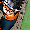
i liked the orange in his clothes and i knew orange would be a good color to add a difference layer to, so i pasted this layer on ("orange"):
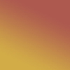
and set it to overlay. now the icon took a nice orangy color, even the grass ^_^
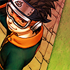
now i went for the ever-useful blue exclusion layer ("exclusion"), which i'm sure you've heard of and used before. it's awesome to mute the colors a little i use it as an intermediate step in almost every single icon i make.

and it makes the icon look like this:
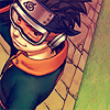
i still thought it needed a little bit more orange, though, so i added a few textures by... some people... (if you know who made them, tell me so i can credit the makers properly!) and set them on multiply on the icon ("texture 1" and "texture 2").

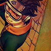

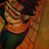
one problem of the multiply setting though, is that it multiplies the colors-- hence the name, duh-- and the icon becomes way darker. so now i like the color but obito is hard to see. blah. so i selected only obito, copied him as a new layer and set it to color dodge. this dodge setting makes everything brighter, like so...

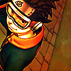
...which is WAY too bright. he looks like he swallowed neon lightbulbs. color dodge does this, so you gotta be careful to use it at lower opacities (unless you're purposely trying to make people blind, of course ^^;;; it is a rather helpful setting, yep)-- i set this one to 50%.
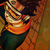
so now i can distinguish obito from the background. neat. TIME FOR DIFFERENCE, YAY! ^_________^
one thing i've learned from experience is that using a bright blue difference layer ("difference 1") on an orange icon gives me a neat BLUE effect!, so that's what i did:

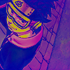
...and that's, well, yeah, it's very blue ^^;;; it looks weird. i lowered the opacity to see if i could get it to look better-- at 70%:
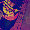
and while that wasn't much improvement, it was something i could at least work with, i felt. TIME FOR A SECOND DIFFERENCE LAYER! i duplicated my base, brought the duplicate to the top and set it on difference ("difference 2").
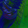
"ZOMG OBITO WHERE DID YOU GOOOOOO?! COME BACK!! OBITOOOOO!!..." yeah, i know you're thinking that ^^;;;; but be brave! we can bring him back! ^.^ difference layers tend to funk up the colors as you can see. but duplicating that same difference layer on top will usually bring back the image-- and if you're lucky and have a very well-defined base, you will get some awesome coloring around the edges. it works great with anime/manga pics, for one. so i duplicated the difference layer ("difference 3").
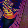
see, now, how the drawn edges around obito became that bright blue color? i love that effect. doesn't it make him look unbelievably hot? (*kidnaps obito and has her wicked way with him*). it makes him stand out from the background, which is always good. i left my coloring like this because i liked it so much. then i added some text in white:
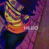
and as a last step, i added a bit of light to the icon with a light texture by... someone (again, if you know who made it, tell me!) set to lighten ("light texture"):


and TA-DAH! we've got ourselves TEH OBITO ICON! (*hugglez icon*). just in case you got lost somewhere along the way, here you have the layers palette:

i love these difference layers, they're kinda complicated but they're so useful! you can see other examples in that one naruto icon batch, like this one:
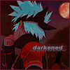
which i also like a lot and was made in a similar way. if you guys would like me to make a tutorial for that one, too, i'd be delighted XD (yes, i have no shame! XD) so i hope you liked this tutorial and could learn something from it ^^ and remember to visit wakizashi_ for more of my icons! ^___________^
teh icon:
well, i started with this manga scan that i got from the INANE collection. it was colored by paintpixel. and paintpixel, wherever you are, i have to tell you that I ABSOLUTELY LOVE THAT PIC. awesome coloring job. i haven't read the gaiden but i already think obito is TEH SMEX. of course he had to be an uchiha ^.^ oooohhhhh...
anyway! [/fangirl moment] i cropped the pic in a nice fashion, to one side (and rotated it a bit, if i'm not mistaken), and then resized to 100x100. i sharpened it as necessary.

i liked the orange in his clothes and i knew orange would be a good color to add a difference layer to, so i pasted this layer on ("orange"):

and set it to overlay. now the icon took a nice orangy color, even the grass ^_^

now i went for the ever-useful blue exclusion layer ("exclusion"), which i'm sure you've heard of and used before. it's awesome to mute the colors a little i use it as an intermediate step in almost every single icon i make.

and it makes the icon look like this:

i still thought it needed a little bit more orange, though, so i added a few textures by... some people... (if you know who made them, tell me so i can credit the makers properly!) and set them on multiply on the icon ("texture 1" and "texture 2").


one problem of the multiply setting though, is that it multiplies the colors-- hence the name, duh-- and the icon becomes way darker. so now i like the color but obito is hard to see. blah. so i selected only obito, copied him as a new layer and set it to color dodge. this dodge setting makes everything brighter, like so...


...which is WAY too bright. he looks like he swallowed neon lightbulbs. color dodge does this, so you gotta be careful to use it at lower opacities (unless you're purposely trying to make people blind, of course ^^;;; it is a rather helpful setting, yep)-- i set this one to 50%.

so now i can distinguish obito from the background. neat. TIME FOR DIFFERENCE, YAY! ^_________^
one thing i've learned from experience is that using a bright blue difference layer ("difference 1") on an orange icon gives me a neat BLUE effect!, so that's what i did:


...and that's, well, yeah, it's very blue ^^;;; it looks weird. i lowered the opacity to see if i could get it to look better-- at 70%:

and while that wasn't much improvement, it was something i could at least work with, i felt. TIME FOR A SECOND DIFFERENCE LAYER! i duplicated my base, brought the duplicate to the top and set it on difference ("difference 2").

"ZOMG OBITO WHERE DID YOU GOOOOOO?! COME BACK!! OBITOOOOO!!..." yeah, i know you're thinking that ^^;;;; but be brave! we can bring him back! ^.^ difference layers tend to funk up the colors as you can see. but duplicating that same difference layer on top will usually bring back the image-- and if you're lucky and have a very well-defined base, you will get some awesome coloring around the edges. it works great with anime/manga pics, for one. so i duplicated the difference layer ("difference 3").

see, now, how the drawn edges around obito became that bright blue color? i love that effect. doesn't it make him look unbelievably hot? (*kidnaps obito and has her wicked way with him*). it makes him stand out from the background, which is always good. i left my coloring like this because i liked it so much. then i added some text in white:

and as a last step, i added a bit of light to the icon with a light texture by... someone (again, if you know who made it, tell me!) set to lighten ("light texture"):

and TA-DAH! we've got ourselves TEH OBITO ICON! (*hugglez icon*). just in case you got lost somewhere along the way, here you have the layers palette:

i love these difference layers, they're kinda complicated but they're so useful! you can see other examples in that one naruto icon batch, like this one:
which i also like a lot and was made in a similar way. if you guys would like me to make a tutorial for that one, too, i'd be delighted XD (yes, i have no shame! XD) so i hope you liked this tutorial and could learn something from it ^^ and remember to visit wakizashi_ for more of my icons! ^___________^