tutorial #9-- "sometimes"
at dutchie_1991's request i present you with a tutorial for one of the graphics in my last CSIM batch. i hope you all find it useful.
***PLEASE DON'T COPY THIS EXACTLY!*** try to learn what i think while i'm making these instead of just copying and pasting every single layer onto your images, ok? remember it might not work for every single image out there, fiddle with the settings it if you have to.
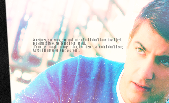
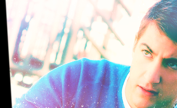
we'll be making this, in PS7 (though it is translatable to PSP and GIMP, at least, as it doesn't use selective coloring, only color balance layers):
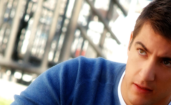
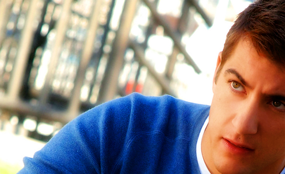
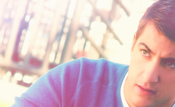
_base: we start off with this image of the ever-so-gorgeous ryan wolfe from CSI miami. to get my base, i rotated it (edit> transform> rotate) and cropped it so the focus would be towards the lower-right corner. i also made sure i could still see a good bit of his sweater, because i liked the colors. i resized it until it was a good header-size. i ran auto contrast (image> adjustments> auto contrast) and auto color (image> adjustments> auto color) as needed, though the quality of the original image was so good that those didn't do much in this case. here's the result.
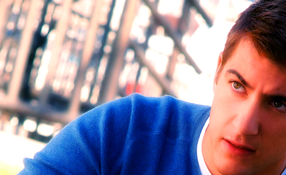
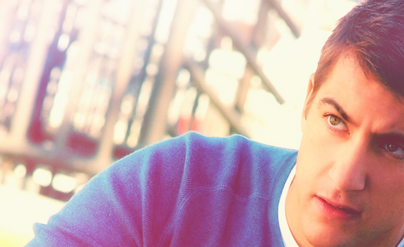
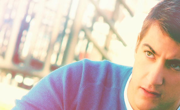
_contrast: next, i did something i do to almost every single graphic i make. i duplicated the base layer, then upped the brightness and contrast of it (image> adjustments> brightness/contrast) by about +40 and +20, respectively. then, gaussian blur it (filter> blur> gaussian blur) to a radius of about 8.0 px, and set that layer to a blend mode of "soft light." this will give the image a very nice contrast, especially if the colors of the base were already balanced. if your image is too light, doing this might just make it blinding, but something similar can be obtained, instead reducing the brightness and contrast (i usually go around -25 and -10, respectively). anyway, here's what my bright/blurred layer looked like, and this is what it looked like when blended.
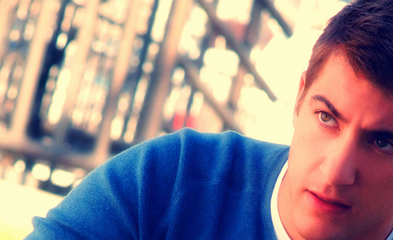
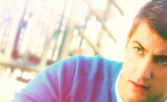
_saturation 1: dear ryan was looking kind of plain, and the colors weren't popping out, which is a pity because his eyes are gorgeous. so i used a hue/saturation adjustment layer (layer> new adjustment layer> hue/saturation). i upped the master saturation by +40. this, however, made ryan look like he's made of radioactive plutonium oxide so i went over his face with a round brush, in black and at 50% opacity. what happens here is that hue/saturation layers are coupled with a mask, and whenever you paint on the mask with black, you basically mask out the effect of the hue/saturation layer on whatever you painted over. my opacity for the brush was 50%, so i could still half-see the effect on ryan's face, but he didn't look bright orange anymore. you have to be careful if you up the saturation of images of people that are really tanned or shadowed, as this can happen, and you don't want to have orange people in your graphic if you can help it.
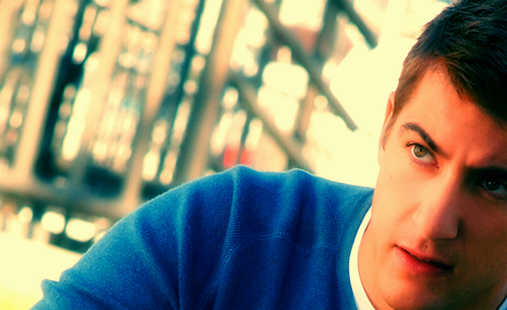
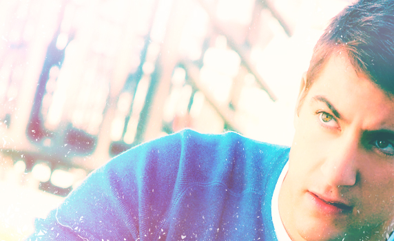
_color balance 1: i had decided early on that i wanted this image/icon to have a pinkish tint to it, so i used a color balance adjustment layer (layer> new adjustment layer> color balance). these were my settings:
midtones: -40 0 +40
highlights: +40 0 0
don't touch the shadows, and make sure the "preserve luminosity" box is checked. what this layer does is that it makes the parts of the image that are illuminated, such as his face, become reddish, while the neutral-colored parts of the image, like his sweater, become a more eye-catching tone of cyan/blue. color balance is a great way of completely changing the mood of an image if it's contrasty enough. here's what mine looked like after this layer.
_exclusion layer: to mute the colors a bit (background was standing out a bit too much for my taste, it's distracting), i added the ever-famous blue exclusion layer. i created a new layer (layer> new> layer) and flood-filled it with #020332, then set it to the exclusion blend mode. here's my result.
_light green 1: i wanted to make it darker still, focusing on just one eye, his right one, so i added a color burn layer. i used a very light green, #CCFECE, to ensure that i don't make the image too dark. the color burn setting makes darker the dark colors without affecting the light colors too much. it makes for great contrast.
_light pink 1: problem, though, now i thought it was too dark. turns out i didn't like the "one shadowed eye" thing as much as i thought i would. so i selected a very light pink, #FECCCE, and flood-filled it into a new layer, then set it to soft light. this lit up everything. "soft light" usually lightens up the light colors and darkens the dark, but as the color i chose was so light, there really isn't anything to darken. ryan was looking better now, though, even if i did lose some of my striking contrast.
_base copy: in order to get back that contrast, a good idea is to simply duplicate the base layer, and move it to the top, then setting it on soft light. if your base had a good enough balance between light and dark (wow, didn't that sound all "jedi master" of me), it will make for some very interesting results.
_light texture: time to fade out the background a bit! i used this light texture by... someone... and set it on the blend mode "screen." it was originally an icon-sized texture, i'm sure, so i had to stretch it to fit my graphic. here's what it looked like after screening it, the light parts of the texture lit up the background and a bit of ryan's hair.
_red gradient: in my quest for pink, i decided to give his sweater red undertones. so i created a new layer and filled it with a gradient from red to black, like so. then i set this layer to "lighten." and voila! his sweater is reddish. what lighten does is similar to the "screen" mode, but less intense in that it only lightens the really dark parts, like the creases in his sweater, instead of the whole thing.
_light green 2: now, i love the edgy effect luminosity layers give to graphics, so sometimes i randomly pick a color, flood-fill a new layer and set it to luminosity to see what happens. this time i picked a light green color, #C5FFD0, and set it to luminosity. this is what i got. as soon as i saw this i realized i was going to get orange-skinned ryan again (the idea of the luminosity layer is that you duplicate your base on top of it and set it to soft light to get your image back with slightly edgier coloring), so i reduced the opacity of the layer to 20% and put alien!ryan behind me forever =3
_light blue 1: this sidestep with the luminosity layer made me lose a bit of contrast, again. so i selected a light blue color, #C6FCFE, and flood-filled a new layer with it, setting it to color burn. here's what i got.
_light pink 2: i wasn't satisfied; it wasn't pink enough. so i picked out another light pink color, #FFC5C9, flood-filled a new layer with it, and set it to soft light. the effect was pretty much the same as that of the first light pink layer, it lightened the image and gave it a bit of a pinkish tone.
_light green 3: to bring back my contrast, i again used a light green burn layer, again in #C5FFD0. notice that, since the right side of his face was already so lightened from previous layers, that this time around the burn layer didn't darken it so much that the eye isn't visible anymore.
_copy merged: you saw the green burn layer didn't do much for my contrast after all. i may have just gone overboard with the lightening =/ so my one option was a copy of the base set to soft light, right? but this time i decided not to use the base, but to instead copy merge all my layers (edit> copy merged) and paste it as a new layer, then setting that one to soft light. i did it this way to emphasize the pinkish tones my overall image had, that the base did not. here's the result.
_color balance 2: this result i liked just fine, but just for kicks, i decided to introduce a second color balance layer on top of everything else. i thought "hey, if i hate the result i can always delete it, right?" i tried to bring out the blue in his sweater without losing much of the pink. here are my settings:
midtones: -100 0 +40
highlights: +20 0 0
like the last time, don't touch the shadows, and make sure "preserve luminosity" is checked. looking at it, i realized i actually quite liked this result. notice how everything lit up except his right eye? that was absolutely bloody awesome xD i actually didn't know it would happen, but now i realize it's because i didn't mess with the greens at all, and his eyes are honey-green. it's what i was going for with the very first "light green" layer, only i didn't have to darken anything to get it right xD
_grunge texture 1: my original icon had used a grungy texture, and i wanted this graphic to have the same feel to it, so i pasted this grungy white texture (by latexandleather if i'm not mistaken) and set it on screen. this was the result.
_saturation 2: just to bring up the colors a bit, i added a second hue/saturation layer, and upped the master saturation by +15. after all the pink soft light layers, he didn't become neon bright again ;3
_black border: again, going by how my original icon had come out like, i wanted to add a black, slanted border towards the left side of the graphic. in the icon i'd used a texture, but this time around i just used the polygonal lasso tool, selected an area in that shape with 1px feathering, and flood-filled it with black. i set it to multiply, although i don't think it makes much of a difference if you leave it at normal. here's what it all looked like.
_grunge texture 2: i wanted to make it even more textured, so i chose a texture with a subtler grunge to it (i don't remember who it's by-- it was an icon-sized texture but i modified it) and set it on screen, at 80% opacity. here's the result.
_text: then i added my text. nothing unusual about this layer-- lyrics by will young, in black, at 50% opacity. this step is definitely up to your preference. and with this, we get to our finished product.
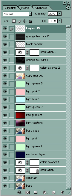
as always, here's the layers palette, just in case you got lost somewhere along the way. i hope you found this useful! please comment, i'd love to see your results! and if you like my icons/graphics and/or want to know how i made them, step by wakizashi_! i'll be glad to help ^-^
***PLEASE DON'T COPY THIS EXACTLY!*** try to learn what i think while i'm making these instead of just copying and pasting every single layer onto your images, ok? remember it might not work for every single image out there, fiddle with the settings it if you have to.
we'll be making this, in PS7 (though it is translatable to PSP and GIMP, at least, as it doesn't use selective coloring, only color balance layers):
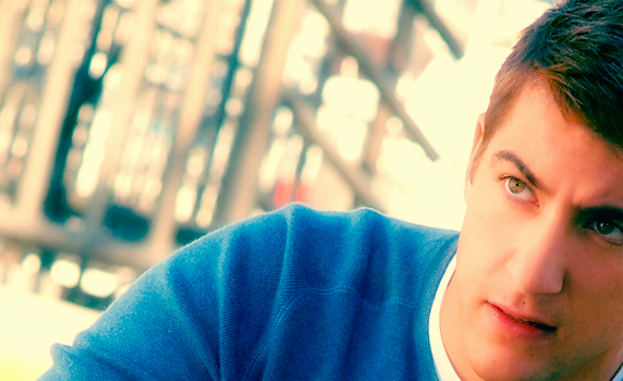
_base: we start off with this image of the ever-so-gorgeous ryan wolfe from CSI miami. to get my base, i rotated it (edit> transform> rotate) and cropped it so the focus would be towards the lower-right corner. i also made sure i could still see a good bit of his sweater, because i liked the colors. i resized it until it was a good header-size. i ran auto contrast (image> adjustments> auto contrast) and auto color (image> adjustments> auto color) as needed, though the quality of the original image was so good that those didn't do much in this case. here's the result.
_contrast: next, i did something i do to almost every single graphic i make. i duplicated the base layer, then upped the brightness and contrast of it (image> adjustments> brightness/contrast) by about +40 and +20, respectively. then, gaussian blur it (filter> blur> gaussian blur) to a radius of about 8.0 px, and set that layer to a blend mode of "soft light." this will give the image a very nice contrast, especially if the colors of the base were already balanced. if your image is too light, doing this might just make it blinding, but something similar can be obtained, instead reducing the brightness and contrast (i usually go around -25 and -10, respectively). anyway, here's what my bright/blurred layer looked like, and this is what it looked like when blended.
_saturation 1: dear ryan was looking kind of plain, and the colors weren't popping out, which is a pity because his eyes are gorgeous. so i used a hue/saturation adjustment layer (layer> new adjustment layer> hue/saturation). i upped the master saturation by +40. this, however, made ryan look like he's made of radioactive plutonium oxide so i went over his face with a round brush, in black and at 50% opacity. what happens here is that hue/saturation layers are coupled with a mask, and whenever you paint on the mask with black, you basically mask out the effect of the hue/saturation layer on whatever you painted over. my opacity for the brush was 50%, so i could still half-see the effect on ryan's face, but he didn't look bright orange anymore. you have to be careful if you up the saturation of images of people that are really tanned or shadowed, as this can happen, and you don't want to have orange people in your graphic if you can help it.
_color balance 1: i had decided early on that i wanted this image/icon to have a pinkish tint to it, so i used a color balance adjustment layer (layer> new adjustment layer> color balance). these were my settings:
midtones: -40 0 +40
highlights: +40 0 0
don't touch the shadows, and make sure the "preserve luminosity" box is checked. what this layer does is that it makes the parts of the image that are illuminated, such as his face, become reddish, while the neutral-colored parts of the image, like his sweater, become a more eye-catching tone of cyan/blue. color balance is a great way of completely changing the mood of an image if it's contrasty enough. here's what mine looked like after this layer.
_exclusion layer: to mute the colors a bit (background was standing out a bit too much for my taste, it's distracting), i added the ever-famous blue exclusion layer. i created a new layer (layer> new> layer) and flood-filled it with #020332, then set it to the exclusion blend mode. here's my result.
_light green 1: i wanted to make it darker still, focusing on just one eye, his right one, so i added a color burn layer. i used a very light green, #CCFECE, to ensure that i don't make the image too dark. the color burn setting makes darker the dark colors without affecting the light colors too much. it makes for great contrast.
_light pink 1: problem, though, now i thought it was too dark. turns out i didn't like the "one shadowed eye" thing as much as i thought i would. so i selected a very light pink, #FECCCE, and flood-filled it into a new layer, then set it to soft light. this lit up everything. "soft light" usually lightens up the light colors and darkens the dark, but as the color i chose was so light, there really isn't anything to darken. ryan was looking better now, though, even if i did lose some of my striking contrast.
_base copy: in order to get back that contrast, a good idea is to simply duplicate the base layer, and move it to the top, then setting it on soft light. if your base had a good enough balance between light and dark (wow, didn't that sound all "jedi master" of me), it will make for some very interesting results.
_light texture: time to fade out the background a bit! i used this light texture by... someone... and set it on the blend mode "screen." it was originally an icon-sized texture, i'm sure, so i had to stretch it to fit my graphic. here's what it looked like after screening it, the light parts of the texture lit up the background and a bit of ryan's hair.
_red gradient: in my quest for pink, i decided to give his sweater red undertones. so i created a new layer and filled it with a gradient from red to black, like so. then i set this layer to "lighten." and voila! his sweater is reddish. what lighten does is similar to the "screen" mode, but less intense in that it only lightens the really dark parts, like the creases in his sweater, instead of the whole thing.
_light green 2: now, i love the edgy effect luminosity layers give to graphics, so sometimes i randomly pick a color, flood-fill a new layer and set it to luminosity to see what happens. this time i picked a light green color, #C5FFD0, and set it to luminosity. this is what i got. as soon as i saw this i realized i was going to get orange-skinned ryan again (the idea of the luminosity layer is that you duplicate your base on top of it and set it to soft light to get your image back with slightly edgier coloring), so i reduced the opacity of the layer to 20% and put alien!ryan behind me forever =3
_light blue 1: this sidestep with the luminosity layer made me lose a bit of contrast, again. so i selected a light blue color, #C6FCFE, and flood-filled a new layer with it, setting it to color burn. here's what i got.
_light pink 2: i wasn't satisfied; it wasn't pink enough. so i picked out another light pink color, #FFC5C9, flood-filled a new layer with it, and set it to soft light. the effect was pretty much the same as that of the first light pink layer, it lightened the image and gave it a bit of a pinkish tone.
_light green 3: to bring back my contrast, i again used a light green burn layer, again in #C5FFD0. notice that, since the right side of his face was already so lightened from previous layers, that this time around the burn layer didn't darken it so much that the eye isn't visible anymore.
_copy merged: you saw the green burn layer didn't do much for my contrast after all. i may have just gone overboard with the lightening =/ so my one option was a copy of the base set to soft light, right? but this time i decided not to use the base, but to instead copy merge all my layers (edit> copy merged) and paste it as a new layer, then setting that one to soft light. i did it this way to emphasize the pinkish tones my overall image had, that the base did not. here's the result.
_color balance 2: this result i liked just fine, but just for kicks, i decided to introduce a second color balance layer on top of everything else. i thought "hey, if i hate the result i can always delete it, right?" i tried to bring out the blue in his sweater without losing much of the pink. here are my settings:
midtones: -100 0 +40
highlights: +20 0 0
like the last time, don't touch the shadows, and make sure "preserve luminosity" is checked. looking at it, i realized i actually quite liked this result. notice how everything lit up except his right eye? that was absolutely bloody awesome xD i actually didn't know it would happen, but now i realize it's because i didn't mess with the greens at all, and his eyes are honey-green. it's what i was going for with the very first "light green" layer, only i didn't have to darken anything to get it right xD
_grunge texture 1: my original icon had used a grungy texture, and i wanted this graphic to have the same feel to it, so i pasted this grungy white texture (by latexandleather if i'm not mistaken) and set it on screen. this was the result.
_saturation 2: just to bring up the colors a bit, i added a second hue/saturation layer, and upped the master saturation by +15. after all the pink soft light layers, he didn't become neon bright again ;3
_black border: again, going by how my original icon had come out like, i wanted to add a black, slanted border towards the left side of the graphic. in the icon i'd used a texture, but this time around i just used the polygonal lasso tool, selected an area in that shape with 1px feathering, and flood-filled it with black. i set it to multiply, although i don't think it makes much of a difference if you leave it at normal. here's what it all looked like.
_grunge texture 2: i wanted to make it even more textured, so i chose a texture with a subtler grunge to it (i don't remember who it's by-- it was an icon-sized texture but i modified it) and set it on screen, at 80% opacity. here's the result.
_text: then i added my text. nothing unusual about this layer-- lyrics by will young, in black, at 50% opacity. this step is definitely up to your preference. and with this, we get to our finished product.
as always, here's the layers palette, just in case you got lost somewhere along the way. i hope you found this useful! please comment, i'd love to see your results! and if you like my icons/graphics and/or want to know how i made them, step by wakizashi_! i'll be glad to help ^-^