12 [ tutorial 1 : basics, for the really dumb people ]
Hi. I haven't written a tutorial since I was tresmoron and posted in redribbonicons when I used to be able to write these stupid things without needing to insult people. This tutorial is for PSP 9 but anything PSP can do, Photoshop can do as well, just in a different way. Only thing is, this is full of PSP keyboard shortcuts which are no doubt different to PS ones. So uh. Yeah. Aaand I've used PSP 7 and 8 in the past, and I think these steps should work for those, as well.
This tutorial covers extremely easy, pathetic, ridiculously simple effects and things everybody should know already, and if they don't they should kill themselves. Or something. I clearly have the best tutorial-writing attitude ever.
The image used in this tutorial is of Karen from X, because I like Karen. 8)
->
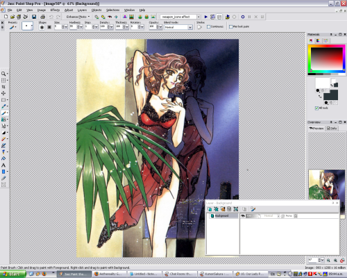
Copy the image and paste it into the program. It's like magic!!!! Now, the scan's too large to fit into an icon without looking butt ugly, so, Ctrl+S to resize the image.
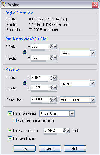
Fiddle around with the settings. I settled for 300x403. Click OK. It's like magic!!!!! Now Ctrl+C the resized picture.
Aaand Ctrl+N to make a blank canvas. A new image. Whatever.
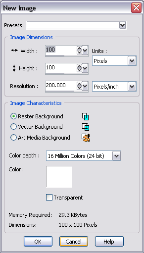
Set the width and height to 100x100 if it isn't already. The rest of the options should be like the one in the picture. It doesn't matter if you have transperancy selected. Uh. Click OK. Or press Enter. Whatever.
Now, remember the picture you copied? Yes? Now go Ctrl+E, which is the shortcut to pasting as a selection. Once you've done that, press M to use the mover thing, to position the image.

Once you're done, go Ctrl+D and it'll drop the selection and that will give you your base. It's like magic!!!!!!
Now, see the layers palette? The box that says "Layer - Background" or whatever? Yeah. That. It should have something that either says "Raster 1" or "Background." Right click it and press Duplicate. If that's confused you, go up to the menu-thing and go Layers -> Duplicate.
It should make a layer exactly the same as the one you had before, except on top of it, and reading "Copy of Background" or something similar.
Now, beside it, there's something that reads Normal. Click it and from there, select Screen.
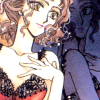
Something like this should happen. Don't panic!!1 To the left of the Screen bit, there ought to be a bar that says 100, going from black to white. Click on it and drag it towards the middle, around 50 or so. Which should give you ...
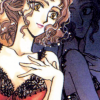
If you're wondering what the point of this is, it's to prepare the base. Making it look better, cleaner and easier to work with.
Duplicate the base layer again, and drag it to the top, above the Screened layer. Set it to Soft Light. Now go Shift+H, which is the shortcut to opening up Hue/Saturation/Lightness.
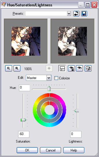
Use these settings, or something similar. The point of this is to make the colours less contrasty, so we desaturate it slightly. If you want to get rid of colour altogether, instead of having Saturation at -60, bring it all the way down to -100.
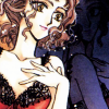
And there we go.
From here, you can do a lot of stuff, depending on what you want to do, but since this is an extreme beginner's tutorial, why not cover the one thing that everybody already knows how to do and is covered in a million tutorials far more coherant and easy to understand than this one?
The blue Exclusion layer!
Create a new Layer by clicking
. Where it says Blend mode, you might want to set it to Exclusion, just because I don't want to explain how to click Normal and select Exclusion later. Anyway, click OK.
Press F on your keyboard, or go look for the flood fill tool. Now choose a dark blue, and click to fill the layer with it. It's like more magic!!!!!!
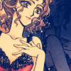
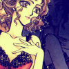
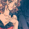
Depending on what kind of blue you use, you could get several different types of colouring. Here are just a few examples:
1.
2.
3.
1. The colour used was #001c54, a blue sort of halfway in between leaning towards green and leaning towards purple.
2. The colour used was #080054, a blue that leans heavily towards the purple side. It gives the image a yellow-ish look.
3. The colour used here was #003954, a blue more dark sky blue than anything. The further you go towards green, the more muted and sort of washed out looking it tends to be. Darker colours work better for exclusion layers, you'll find.
Experiment, fiddle with the opacity. I was lazy and #003954 was the last I tried, so I just dragged the layer opacity down to 60.
A lot of the time, using the Exclusion layer makes the image seem very flat. Duplicate the base layer (the bottom layer) again, desaturate it completely (Saturation set to -100), and set it to Soft Light, then play with the opacity. That's what I did.
Of course, it still looks incomplete, so best thing to do is to slap some sort of texture on it and pretend it took a lot of effort. Light textures are easy. Let's do that.
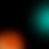
I used one of mine, because I'm incredibly lazy and I had the folder open.
Copy the texture, then go Ctrl+L on the icon you were working on, to paste the texture as a new layer. Set that new layer to Screen, which is the sensible thing to do with most light textures similar to that one.
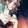
The icon so far looks like that, and my layer palette looks like this:
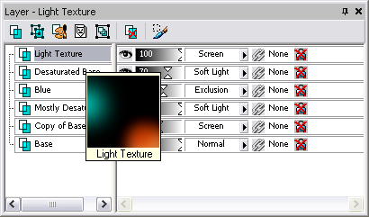
It's all so magical.
Now for text. Because I'm insane. Make a new layer. Then click this thing here
, or type T.
Click on the image somewhere, doesn't really matter. Personally, I hate text layers set as vector layers. Okay, I hate vector layers in general. Anywho.
Up the top, it should have an options sort of thing. Where it says "Create as", I suggest you go for "Selection", to move the text around easier.
Write whatever the hell you want. A suggestion, though. Try not to make the text too big. A lot of people hate unreadable text, but it's really just for decoration, while big text is sort of there and in your face and often cheesy and when not done right, really fucking ugly, though that sometimes depends on the font. It also tends to take up a lot of space and I go "ew" when people actually slap it over the main focus of the icon-- like a person's face. It's okay when it's done right, but most of the time it's not and it looks awful. Right. Anyway.
I'm personally a fan of tiny, decorative text. So that's what I'm going to do.
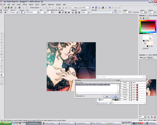
I picked a light colour from the image, and set it as my background colour-- which usually defines the colour of the text.
I wrote a line in capitals from a song I was listening to. Doesn't really matter what you write there, if you're doing tiny text, as long as it fills up enough space-- because nobody can actually really read it.
The font I used was 18thCentury, size 1, kerning 1000. What's kerning? Kerning's the thing that decides how much space is between each letter. I wouldn't suggest setting it so high for normal text, but for small text, it works.
When you're done with that, click apply, and click on the floating selection to position it. Like we did at the start, Ctrl+D to drop the selection. Hopefully onto the layer you created for text.
From there, you can decide what you want. You're a big girl/boy. I decided I wanted more than the small text, so I added more.
1.
2.
1. The font is 18thCentury in caps, set to around 4-6, kerning around 100-200.
2. The font is Carpenter ICG, a scripty, flowy font that's reasonably popularly used. This is in lowercase, around size 8, with no kerning.
Well, that's that, it's done, this has been extremely boring and no doubt unhelpful. And I will now go through the whole thing editing out the parts where I call the reader "dumbass" before I ass up an introduction and post this.
This tutorial covers extremely easy, pathetic, ridiculously simple effects and things everybody should know already, and if they don't they should kill themselves. Or something. I clearly have the best tutorial-writing attitude ever.
The image used in this tutorial is of Karen from X, because I like Karen. 8)
->
Copy the image and paste it into the program. It's like magic!!!! Now, the scan's too large to fit into an icon without looking butt ugly, so, Ctrl+S to resize the image.
Fiddle around with the settings. I settled for 300x403. Click OK. It's like magic!!!!! Now Ctrl+C the resized picture.
Aaand Ctrl+N to make a blank canvas. A new image. Whatever.
Set the width and height to 100x100 if it isn't already. The rest of the options should be like the one in the picture. It doesn't matter if you have transperancy selected. Uh. Click OK. Or press Enter. Whatever.
Now, remember the picture you copied? Yes? Now go Ctrl+E, which is the shortcut to pasting as a selection. Once you've done that, press M to use the mover thing, to position the image.
Once you're done, go Ctrl+D and it'll drop the selection and that will give you your base. It's like magic!!!!!!
Now, see the layers palette? The box that says "Layer - Background" or whatever? Yeah. That. It should have something that either says "Raster 1" or "Background." Right click it and press Duplicate. If that's confused you, go up to the menu-thing and go Layers -> Duplicate.
It should make a layer exactly the same as the one you had before, except on top of it, and reading "Copy of Background" or something similar.
Now, beside it, there's something that reads Normal. Click it and from there, select Screen.
Something like this should happen. Don't panic!!1 To the left of the Screen bit, there ought to be a bar that says 100, going from black to white. Click on it and drag it towards the middle, around 50 or so. Which should give you ...
If you're wondering what the point of this is, it's to prepare the base. Making it look better, cleaner and easier to work with.
Duplicate the base layer again, and drag it to the top, above the Screened layer. Set it to Soft Light. Now go Shift+H, which is the shortcut to opening up Hue/Saturation/Lightness.
Use these settings, or something similar. The point of this is to make the colours less contrasty, so we desaturate it slightly. If you want to get rid of colour altogether, instead of having Saturation at -60, bring it all the way down to -100.
And there we go.
From here, you can do a lot of stuff, depending on what you want to do, but since this is an extreme beginner's tutorial, why not cover the one thing that everybody already knows how to do and is covered in a million tutorials far more coherant and easy to understand than this one?
The blue Exclusion layer!
Create a new Layer by clicking
. Where it says Blend mode, you might want to set it to Exclusion, just because I don't want to explain how to click Normal and select Exclusion later. Anyway, click OK.
Press F on your keyboard, or go look for the flood fill tool. Now choose a dark blue, and click to fill the layer with it. It's like more magic!!!!!!
Depending on what kind of blue you use, you could get several different types of colouring. Here are just a few examples:
1.
2.
3.
1. The colour used was #001c54, a blue sort of halfway in between leaning towards green and leaning towards purple.
2. The colour used was #080054, a blue that leans heavily towards the purple side. It gives the image a yellow-ish look.
3. The colour used here was #003954, a blue more dark sky blue than anything. The further you go towards green, the more muted and sort of washed out looking it tends to be. Darker colours work better for exclusion layers, you'll find.
Experiment, fiddle with the opacity. I was lazy and #003954 was the last I tried, so I just dragged the layer opacity down to 60.
A lot of the time, using the Exclusion layer makes the image seem very flat. Duplicate the base layer (the bottom layer) again, desaturate it completely (Saturation set to -100), and set it to Soft Light, then play with the opacity. That's what I did.
Of course, it still looks incomplete, so best thing to do is to slap some sort of texture on it and pretend it took a lot of effort. Light textures are easy. Let's do that.
I used one of mine, because I'm incredibly lazy and I had the folder open.
Copy the texture, then go Ctrl+L on the icon you were working on, to paste the texture as a new layer. Set that new layer to Screen, which is the sensible thing to do with most light textures similar to that one.
The icon so far looks like that, and my layer palette looks like this:
It's all so magical.
Now for text. Because I'm insane. Make a new layer. Then click this thing here
, or type T.
Click on the image somewhere, doesn't really matter. Personally, I hate text layers set as vector layers. Okay, I hate vector layers in general. Anywho.
Up the top, it should have an options sort of thing. Where it says "Create as", I suggest you go for "Selection", to move the text around easier.
Write whatever the hell you want. A suggestion, though. Try not to make the text too big. A lot of people hate unreadable text, but it's really just for decoration, while big text is sort of there and in your face and often cheesy and when not done right, really fucking ugly, though that sometimes depends on the font. It also tends to take up a lot of space and I go "ew" when people actually slap it over the main focus of the icon-- like a person's face. It's okay when it's done right, but most of the time it's not and it looks awful. Right. Anyway.
I'm personally a fan of tiny, decorative text. So that's what I'm going to do.
I picked a light colour from the image, and set it as my background colour-- which usually defines the colour of the text.
I wrote a line in capitals from a song I was listening to. Doesn't really matter what you write there, if you're doing tiny text, as long as it fills up enough space-- because nobody can actually really read it.
The font I used was 18thCentury, size 1, kerning 1000. What's kerning? Kerning's the thing that decides how much space is between each letter. I wouldn't suggest setting it so high for normal text, but for small text, it works.
When you're done with that, click apply, and click on the floating selection to position it. Like we did at the start, Ctrl+D to drop the selection. Hopefully onto the layer you created for text.
From there, you can decide what you want. You're a big girl/boy. I decided I wanted more than the small text, so I added more.
1.
2.
1. The font is 18thCentury in caps, set to around 4-6, kerning around 100-200.
2. The font is Carpenter ICG, a scripty, flowy font that's reasonably popularly used. This is in lowercase, around size 8, with no kerning.
Well, that's that, it's done, this has been extremely boring and no doubt unhelpful. And I will now go through the whole thing editing out the parts where I call the reader "dumbass" before I ass up an introduction and post this.