ask the maker: 2.0

Written in Photoshop CS5.5 but probably translatable.
Extremely image heavy.
I. QUESTIONS
• invicta: I've always wondered... How do you preserve details in images that are zoomed this far out? (1) (2) (3) I can always tell what's in the icon. But when I "zoom out" of images, I get this: (4) ...which is not at all instantly recognizable as a scene from Doctor Who. ):
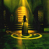
(1)
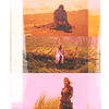
(2)
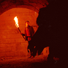
(3)

(4)
Hmm... My first thought was actually it might have been the cap quality until someone else mentioned that it couldn't be that. Still, I don't remember doing anything special to them. Sometimes I do have the same problem as you though but then that was the cap quality or due to the colors or something and then I just cropped differently or decided to not use the cap at all.
examples

to


to

I don't really know why some images work and why some don't, but what I sometimes try when I find that after coloring something the quality becomes kinda sharp, is this:

That top Soft Light layer is the one I always use the Sharpen Filter on. Sometimes it's perfect, and other times it's not. Especially when you have dark colors against light colors, it might make some of the edges quite sharp while the rest of the image is perfectly sharpened.
So then I use the Blur tool to go over those edges (on the Soft Light layer) and it usually helps.
Sorry I'm not any more help!
---
• mm3butterfly: How do you pick images to go together into blendings & multiple image icons? :)
Silhouettes! Images with lots of dark parts to play with! General negative spaces!
...That's all I've got basically, so maybe some examples:

and

to

These two for example happened on accident, to be honest. I first just had Merlin's silhouette with the text behind him, but I felt I had to make it a bit more Grimm to work (it was for merlin-elite and their Grimm challenge, so...) and so I tried to find another cap of that scene, which is the one right before Merlin starts to smile and I put it on the icon on Screen and magically it really worked without me having to do much besides erasing a bit from the cap.

and

to

As you may notice, when blending, I tend to have a close-up shot as a background and a negative space shot in the foreground. It's relatively easy and I can't help but making icons busy sometimes. The first cap for example was really easy to work with and I chose it because of that (the background is easily extended because it's so dark and there's not much going on there and the close-up shot works as well because it's dark enough at the bottom to use. As I said, dark things are a blessing!

and

to

This icon was made for 20inspirations, for the Story round. I wanted to convey this part of the story and I wanted to do it using both these scenes, because, even though they are different scenes, they're still very related. So I chose these because the first one could easily be extended at the bottom and the latter could easily be extended at the top. (I had to flip the second one though because it just worked better to blend)
Other icon examples:


---
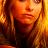
• shalowater: i am going back a little while and asking about some older icons. i hope that is ok. i love the crops, saturation and "texture" to these styles of icons made from caps. they are sharp and smooth at the same time. i also love the yellow coloring. i love look of yellow coloring and red/pink lips. i hope i made sense. thank you so much & happy new year. (1) (2)
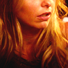
(1)
(2)
That was still the same coloring as I used in this tut, except I didn't use the Gradient texture and I added Vibrance. It just worked really excellent for these caps though.
This is the layer palette:


Which is it, basically. On that icon I might have added a light texture on top to soften the blacks, but otherwise nothing else.
Other icon examples:


---
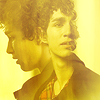
• xxmannequin: 1. How do you use gradient on your icons? It really looks soft and the colors are beautiful. Could you share some tips? (1) (2)

(1)
(2)
As I said, it's probably a combination of textures. What I always like to do is to light everything up with light textures and at the end darken everything again with a Levels layer.
example:
without levels layer | with levels layer


In this case I decided to go for the first one because it just fitted more with the scene.
So, in conclusion I say - play with all kinds of things, light up stuff, create colors, and then at the end bring the contrast back with a Soft Light layer and a Levels layer. And even then you can still add a Light texture on top to not have such dark blacks.
I hope this is kinda what you meant!
---
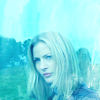
• navi_glow: Also interested what methods you use for your colouring in icons such as these: (1) (2)
(1)

(2)

to


So basically, between my last Screen layer and last Soft Light layer, I have two Color layers. A very light blue one set on Hard Light to lighten everything up, and then a slightly darker blue one on Soft Light, which creates this effect. This really works on caps that are already blue, I've found.
For the Kahlan icon it's the same except the Soft Light layer was a much darker blue.
I also use this technique with other colors sometimes, like yellow and green:

to


Sometimes the first colors you chose don't always work though, and sometimes, like me, you just REALLY want something to work and you just experiment a little. It's very easy to just edit a Color Layer by first selecting the Color Layer on your palette, going to Layer > Layer Content Options... and editing it again until you end up with something that you like.
Other icon examples:


---
• fuuurs: You have so many icons that seem to have PERFECT lighting. Is this just you having flawless taste in caps, or do you have any pointers when it comes to creating light and shadows?
Flawless taste in caps, obvs! :p LOL, I think this is kind of the same answer I gave xxmannequin. A mix of light textures and Levels/Soft Light.
• fuuurs: Secondly, because I'm lame and boring... how do you get such perfect neutral-ish colorings? (1) (2)

(1)

(2)
I think it's a bit of what I said to shalowater, except to not add so much Vibrance and Saturation. Those caps already were pretty bland before coloring them and I just kept them that way.
---
• vampire_sessah: How do you decide what text to put on an icon and which fonts do you like most?
That is usually decided by something that comes to mind while making the icon in question, which is mostly a song lyric or a quote that relates to it. And then sometimes there are moments in which I decide 'I just really want to use this as text' and I don't even know why.
Favorite fonts would be Bodoni MT, League Gothic and Franklin Gothic.
Examples:


quote


song lyrics


what came up in my head
• vampire_sessah: Also do you have a kind of textures you like most for example grainy textures or painted textures? What are your favourite texture makers?
Light textures mostly. Lately I've also fallen in love with paint textures though.
Favorite texture makers would be: innocent_lexys, fprintmoon, mm3butterfly, tinebrella, lookslikerain, fuuurs, and sometimes I also like to use my own.
---
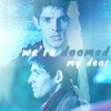
• wickedgrdn: How do you go about achieving a solid color tone such as blue on your icons? I've tried this with gradients and solid color fill layers but they always end up looking weird. Do you add textures? Pick a color from the icon and go from there? I can never seem to nail this effect down and you do it so well! (1)
(1)
See navi_glow's question. It's basically a Hard Light layer and a Soft Light layer and random blues :P It doesn't work as well when the cap itself isn't already blue though.
• wickedgrdn: Also, I notice you are dabbling more with text. I'd love to know your process for adding text -- what you fonts you choose, your settings, etc etc. I'm always curious as to how other makers work with text, LOL.
As soon as I know what text to use, I go about what font to choose. Which is usually between Bodoni MT or League Gothic or Franklin Gothic. After I've chosen, I just put it on the icon and then play with it a little to figure out where and how to place it. After I've figured that out, I pick out a color - which, if it isn't white, will be a color picked from the image itself.
Sometimes though, picking the color can be a problem because no matter what you choose, the text just isn't readable, so then I try and use the same text layer (behind the original one) moved a little to the bottom left and which has a different color, so it becomes more of a shadow (without using Drop Shadow, which I do not like). It's something I picked up of this tutorial by fuuurs and usually works better on bigger graphics such as these but still! Sometimes I also like to randomly use brushes like in these:


For both of these I used a Hard Round brush underneath them and put them on either Screen or Soft Light (at a lower opacity) so you can read the text but not notice the brush too much.
At the end I also like to blur my text a little. With around 50% opacity.
II. TUTORIALS
• xxmannequin: Merlin/Morgana
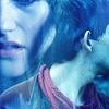
So... First we have these two caps:


Which have absolutely nothing in common besides being blue and pretty, but for some reason I chose them anyway. Scumbag brain!
So we crop them and make sure we still have some space on the side to blend.


Note that I ended up flipping the Merlin one so it would fit the icon better.
Now we put them on top of eachother (pun not intended, although maybe :p) and put the top layer (in our case the Merlin one) to Lighten.

YESH. PRETTY. Except... no. But no panic, that's what erasing (and to an extent Layer Masks) are for!
So what we do is select the Merlin layer and erase what we don't want (which would be Morgana)

Then we select the Morgana layer (if you can't edit it because it's locked, just double click on it and then press Enter to unlock) and we do the same but we erase the parts over Merlin.

So now we have a base! As you can see, it's not as perfect as I would have wanted it, but then there's textures and colors to cover up those mistakes.
So now I Ctrl + Shift + Alt + E the entire thing to merge the layers. I duplicate that layer three times, of which the middle one is set to Screen and the other two to Soft Light. Duplicate the Screen layer as much as you need to.

And now the coloring! Which is basically what I explained navi_glow and gives us this:

(I didn't save the original .psd so the result is kinda different but the same gest)

Textures used were 1 2
• navi_glow: I'd love to see a tutorial of this icon (or similar):

So we start off with these two caps:


Is that... a silhouette?! DO YOU KNOW WHAT THIS MEANS? Blending!
So we crop both first!


Note that in the silhouette one I had to smudge/blur the background a bit so we didn't have the darkness of the door.
So now we put them on top of eachother and put the top one on Lighten

Because there's a nice silhouette cap and the other one is already quite dark, it looks like it may have just done the job for us! So let's just finetune it a little bit.
I decided to make the darker cap a little smaller by selecting the Move tool, Ctrl + T and holding Shift while dragging it to the size you want.

Then we keep that same layer selected, and erase everything we don't want.

And then we have the base! So, same as the other one, press Ctrl + Shift + Alt + E to merge the layers and start working from there! For this icon I also used the same coloring method as the previous tutorial but I worked with orange instead.


texture used: 1
So... if any of this wasn't clear enough or if I forgot to answer something, do not hesitate to tell me so! :)