Icon Tutorial No. 10: EIE2 - Lady Spider (Jorougumo)
I remember a time in my graphic making career where I thought that every base deserved a texture--OK, so more than one texture--every time I made an icon using it. This is not true! You can get some of the prettiest icons EVER by simply cropping nicely, changing the hue, adding a light texture, etc.--if even. Thus starts the series of Easiest Icons EVER... All of these SUPER EASY icons have placed FIRST at icontest communities.
Level: SUPER!DUPER!EASY
Program: Adobe Photoshop 7.0 (undoubtably transferable!)
xxxHOLiC STILL WEEK 12 FIRST
(Icon taught in tutorial is not a direct replica, but is darn close ^^)
Go from this to this: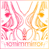
This tutorial has been made for your benefit and teaches you a very important lesson--not every base needs a trillion preps/textures/brushes/gradients/etc. Beautiful icons can be made with one simple texture, as shown below.
(NOTE: The effect this tutorial teaches can be used on all black/white pictures. Grayscale can also be used but doesn't look as cool as plain black and white, which is common in the form of manga scans.)
1. (The theme for Week 15 at
xxxholic_still was Provided Bases, so I already have a cropped 100x100 base to work with. If you have a regular picture, crop it so that the area of focus is the character's face.) Start with this image and crop it at 50x100 px, cutting Jorougumo's face in half.
You should see something like this:
2. Copy your new document to an empty 50x100 px document with white background (CTRL A>>CTRL C>>CTRL V). Move your cropped picture up slighty so there's an empty space below.
You should see something like this:
3. Use this brush by Amethystia and paint a stroke in #000000 on the empty space you just made. Don't mind the fact that it won't all fit.
You should see something like this:
4. Type in the word 'mirror' in Century Gothic, 14 pt, in #000000. Change blending options so that there is a 1 pt stroke in #FFFFFF (this avoids cluttering).
You should see something like this:
5. Save your icon as a png., then open a new 100x100 document. Open your saved document up and paste it onto the new document (CTRL A>>CTRL C>>CTRL V). Move this document so that Jorougumo's face is against the side, not facing the middle. Rotate the entire icon (IMAGE>>ROTATE CANVAS>>FLIP CANVAS HORIZONTAL) and paste on another layer of the same half icon. Move the second layer to the opposite side.
You should see something like this: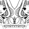
6. Use this border brush by me in #000000 and change blending options so there's a 2 pt stroke in #FFFFFF. (This can be done in all 100x100 icons--however, edges may not be sharp in colored bases.)
You should see something like this: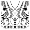
7. Our icon looks plain, doesn't it? Well, simply use this simple gradient by moi, and set it to SCREEN at 100%. Viola! Instant color! (You can use any gradient you want as long as there's smooth coloring.)
Your finished product should look like this:
_________
Was this tutorial helpful? Confusing? Too hard? Feedback would be wonderful!
[x] Like what you see? FRIEND
wicked_avis to stay updated on fresh tutorials, icons, textures, and more!
Level: SUPER!DUPER!EASY
Program: Adobe Photoshop 7.0 (undoubtably transferable!)
xxxHOLiC STILL WEEK 12 FIRST
(Icon taught in tutorial is not a direct replica, but is darn close ^^)
Go from this to this:

This tutorial has been made for your benefit and teaches you a very important lesson--not every base needs a trillion preps/textures/brushes/gradients/etc. Beautiful icons can be made with one simple texture, as shown below.
(NOTE: The effect this tutorial teaches can be used on all black/white pictures. Grayscale can also be used but doesn't look as cool as plain black and white, which is common in the form of manga scans.)
1. (The theme for Week 15 at

xxxholic_still was Provided Bases, so I already have a cropped 100x100 base to work with. If you have a regular picture, crop it so that the area of focus is the character's face.) Start with this image and crop it at 50x100 px, cutting Jorougumo's face in half.
You should see something like this:

2. Copy your new document to an empty 50x100 px document with white background (CTRL A>>CTRL C>>CTRL V). Move your cropped picture up slighty so there's an empty space below.
You should see something like this:

3. Use this brush by Amethystia and paint a stroke in #000000 on the empty space you just made. Don't mind the fact that it won't all fit.
You should see something like this:

4. Type in the word 'mirror' in Century Gothic, 14 pt, in #000000. Change blending options so that there is a 1 pt stroke in #FFFFFF (this avoids cluttering).
You should see something like this:

5. Save your icon as a png., then open a new 100x100 document. Open your saved document up and paste it onto the new document (CTRL A>>CTRL C>>CTRL V). Move this document so that Jorougumo's face is against the side, not facing the middle. Rotate the entire icon (IMAGE>>ROTATE CANVAS>>FLIP CANVAS HORIZONTAL) and paste on another layer of the same half icon. Move the second layer to the opposite side.
You should see something like this:

6. Use this border brush by me in #000000 and change blending options so there's a 2 pt stroke in #FFFFFF. (This can be done in all 100x100 icons--however, edges may not be sharp in colored bases.)
You should see something like this:

7. Our icon looks plain, doesn't it? Well, simply use this simple gradient by moi, and set it to SCREEN at 100%. Viola! Instant color! (You can use any gradient you want as long as there's smooth coloring.)
Your finished product should look like this:

_________
Was this tutorial helpful? Confusing? Too hard? Feedback would be wonderful!
[x] Like what you see? FRIEND

wicked_avis to stay updated on fresh tutorials, icons, textures, and more!