Tutorial 1: Coloring
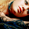
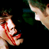
Since a coloring tut was kind of requested, I figured I'd post the one which I have the PSD from. LOL. So, here it is. :) Works on lots of images and has a soft coloring. Nothing too harsh. :)
Goes from

to

Made in Photoshop CS3.
Not translatable.
Other examples:


#01: So, first of all, you need a pic. You get the best results if it's a pic with good quality, if not high quality. I chose this pic of Michelle Rodriguez and cropped it. You can sharpen it if you want to. I only do that when it's absolutely necessary. I have something against oversharpened icons and I don't want to risk that to happen. :)

#02: Screen the layer. If it's already bright, then maybe just a little or just don't. I duplicated the base, and set it on Screen 85%. Make sure you don't set your icon too bright. You can always lower the screen layer at the end if it comes out too bright.

#03: Then I went to Layer > New Adjustment Layer > Hue/Saturation and upped the Saturation with +10. It gives the icon more color in general. It doesn't make a huge difference on this one, but it could make one on yours.

#04: Yay! Layer > New Adjustment Layer > Selective Coloring. Never make an icon without it. Only with B&W pics I don't use it. Most of the time. Sometimes I actually do use it, but that's besides the point. These were my settings.
REDS
-100
+15
+100
+15
YELLOWS
+25
0
-20
-15
CYANS
+100
0
-100
+100
BLUES
+100
0
-100
+100
NEUTRALS
+5
-5
+2
+5
BLACKS
0
0
0
+5

Now this is starting to make a huge difference, huh? :P
#05: Layer > New Adjustment Layer > Color Balance. The settings aren't that huge, but it does make a difference. Trust me. :)
MIDTONES
+5, 0, -5
SHADOWS
+5, 0, +5
HIGHLIGHTS
+5, +5, +10
Make sure Preserve Luminosity is checked.

#06: Now go to Layer > New Fill Layer > Solid color and fill it with #FFFFFF (that'd be white. :D) and set it on Soft Light 30%. If it's too dark, higher it. If it's too light, lower the opacity. Simple as that. :)

#07: Now go to Layer > New Adjustment Layer > Levels. I seem to do that a lot when I'm near the end. Now I ask you, is it just me or adds it a little more contrast? Allright, I'm moving on. The settings aren't that huge.
RGB
Input Levels:
10
1,00
255
Output Levels remain the same.

#08: The skin can come out a little yellow and unnatural now. Not that much on mine which I'm using for example, but this is wat I usually do then; duplicate the base, drag it to the top and set it to Hue. I set the opacity to 30%. This varies from icon to icon.

So, this is done. Don't know that much to say anymore. Although, don't be afraid to show me your results. :)
The PSD is also downloadable here.