~48
~~ Icon Progression 2012 ~~

January:
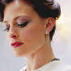
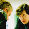
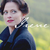
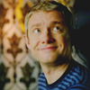
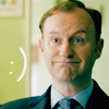
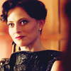
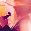
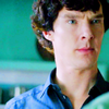
Oh, wow. Can I hide somewhere? Okay, so these were made when I was still using Gimp, and obviously not doing a very good job at it. Basically all I did back then was use Curves and Levels to lighten and tweak the colours and then add saturation. Then I just cropped and re-sized. Although I think I discovered the Gimp version of Variations when I was making these Sherlock icons. They were the first I made that year, and I managed to make 100 icons of ASiB. The batch got me lots and lots of comments, I was very surprised given that they were basic and bad (but still better than what I did before, and people seemed to like them, I still see them around :))
February:
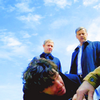
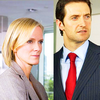
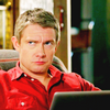
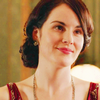
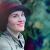
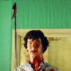
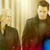
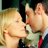
February was the month I gave up on Gimp and installed Photoshop, except it was Photoshop 7, so... Still, I discovered Selective Colour (what a shock, lol) and started paying more attention to what I was doing. But apart from that, nothing significant. I remember having a really hard time trying to colour Downton Abbey caps. Sherlock was a lot easier to icon.
March:
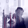
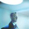
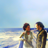
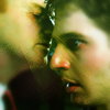

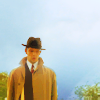
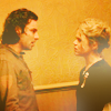
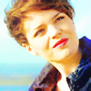
March a.k.a The Month I Discovered Blending Modes And Layer Masks. I'm not kidding, I didn't know how to use Soft Light or anything before, so when I got around to it it was a revelation and a blessing =P. I was obsessed with Being Human and Sherlock. These were a huuuge step forward at the time, although I realise now that they look terrible. But it was the beginning of my love for negative space, vibrancy and monotone colourings.
April:
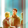
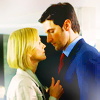
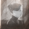
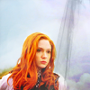
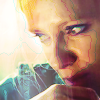
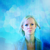
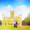
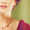
The first row is me experimenting like hell with Photoshop 7. At the time I thought overusing Smart Blur was a good idea... Still, I was trying, and some of them don't look that bad (okay, they do look bad). The second row was made after I got CS5 (hurray!!). I had so much fun with the new features, it really helped. But I was still relying on my old techniques, so these aren't very good. They're so blurry it makes me ashamed now!
May:
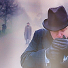
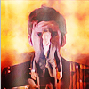
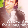
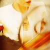
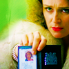
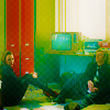
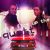
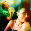
My first inspired20in20 batch! I worked hard on that one, but sadly I didn't know how to use Photoshop, lol. Overdose on the Surface Blur, no sharpening, disgustingly vibrant colours... I still love my 'The King's Speech' icon from this batch though, it was poorly executed but it's one of my first icons that really worked imo, and for that reason I'm proud of it. The second round is my other batch of the year, an Ashes to Ashes one. I made these icons very quickly, but with a surge of inspiration and it's still one of my favourite sets of the whole year, I like most of the icons, although I went a bit too far with some of them.
June:
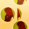
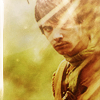
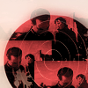
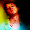

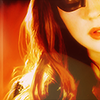
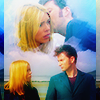
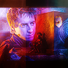
I remember making many, many icons and experimenting a lot in June. I was more audacious then then I've been lately. My Sherlock batch for "Good vs Evil' at inspired20in20 was a big step forward, I learned to use more tools in Photoshop, read tutorials and started to understand more about texture use, sharpening etc. In the Doctor Who batch that followed I experimented with colours and blending. I wish these batches had been more consistent but I'm still fond of 2, 4 and 5-8. June was a big step forward for me.
July:
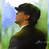

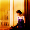
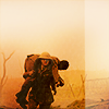
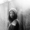
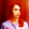

More experimentation and adjustments. Overall I like my July icons less than my June icons. My Matthew/Mary batch is still one I really like, although my main regret is most of the icons were too dark. I liked experimenting with more natural colours as well.
August:
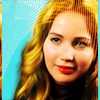
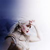
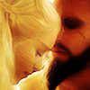
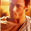
Only one post in August (requests fulfilled) and it pretty bad. I was mostly away from home and couldn't use PS and when I did my attempts were not very successful.
September:
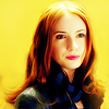
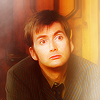
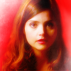
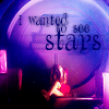
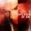
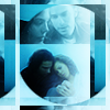
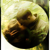
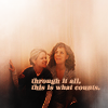
Another inspired20in20 that changed a lot of things. I was very proud of my Doctor Who rainbow set, and then I did the palettes challenge for theiconquest and experimented with composition, text and fake backgrounds and realised I could do more creative things and they worked.
October:
I think I only posted a few icons to some challenge communities. I had so much work I didn't get the time to open PS.
November:
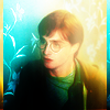
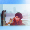
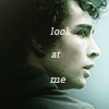
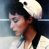
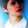
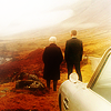
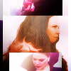
This month was only contest icons that I got around to posting, mostly a set I did for the last round at trope-overdosed and the amazing guild battle we did for theiconquest. I also got an invite to the7days and I was over the moon. I still don't know who suggested my name, but thank you :) Vibrant is still mixed with muted in these sets but I experimented with grunge, monochrome and overall darker and more contrasted icons, perhaps going a bit too far. If I had to re-make them now I'd use more light. But I'm proud of those I picked here :)
December:


I got invited to several elite comms and was really happy about it, so I tried to enter some challenges in spite of all the work I had to do. I think my icons this month are pretty uneven but I like some of them. Mostly the thing is I didn't get the time to work on them as much as I'd have liked to. But I think you can see a difference, compared to my January icons :)
What I hope to achieve next year:
Be more consistent and more creative! I'm very proud of my progress this year, but now I'd like to make 'proper' icons with interesting compositions, more text, more meaningful crops etc. And get a better hold on sharpening, saturation, all these little things which I hope will make my icons better. It was a wonderful year and lately I got to speak to more people in the icon-making community, and you guys are wonderful, I hope I'll have enough free time to keep participating! I also didn't think this community would get this many watchers. You're nearly 70 now, and I think I had less than 10 in January, so a big thanks to all of you <3 I'll try to post more often, even if it means the batches are smaller.
HAPPY NEW YEAR :D