Results LIMS Challenge 5
Great turnout for Lims Challenge 5! Unfortunately 2 people will be leaving us tonight.
ELIMINATIONS
VOTED OFF
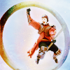
by salphone (-7)
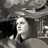
by restlessme (-4)
CONGRATULATIONS!
FAVORITE ICON + BANNER

by lastyearswishes (+3) » Click to Save your Banner !
NO NEGATIVE VOTE (eligible for a SKIP)
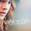
by flame_eternel (1)
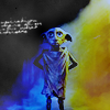
by purple_wings (2)

by lastyearswishes (3)
EARNED A SKIP!
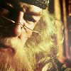
and
by flame_eternel
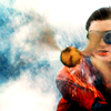
and
by lastyearswishes
MOVING ON TO NEXT ROUND
17tvfreek
♥ alinemcb54
♥ beybey16510
♥ ♥ flame_eternel
♥ lastyearswishes
♥ ♥ narniacmr
pointblankdarcy
purple_wings
♥ red_planet31
rhye
VOTING TALLIES!
Here's the tally. Remember we're picking 3 least favorites and 1 favorite. Therefore, a negative (-) denotes how many people voted against your icon and a plus (+) denotes how many people voted your icon their favorit, zero (0) means you got neither or that they anuled each other out. So if you have a + point, pat yourself on the back!
Lims Challenge 5: Provided Textures
01
02
03
04


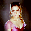
05
06
07
08

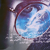
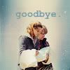

01: -0 + 1 = 1
02: -4 + 0 = -4
03: -0 + 2 = 2
04: -3 + 0 = -3
05: -0 + 3 = 3
06: -2 + 2 = 0
07: -3 + 1 = -2
08: -8 + 1 = -7
+ POSITIVE VOTING COMMENTS +
#01 -- The crop is very great, the colors and the composition are nicely done.
#03 -- Awesome coloring, and the contrast between dark and light has some interesting yin yang effect.
#03 -- Very good association of the textures.
#05 -- I enjoy the lightening bolt along with the dumbfounded expression on Harry.
#05 -- LOVE THIS ICON. Everything works. The colouring is amazing, the texture is perfect, the bolt is awesome.
#05 -- It's nice and simple, beautiful coloring and the texture really helps to soften it and gives the icon a nice glow.
#06 -- The blended images and the touches of color make for a great icon.
#06 -- Great use of coloring and placement of the text.
#07 -- I love the crop and how you used the texture. The text is perfect and really brings emotion to the icon.
#08 -- Really nice choice of image, the coloring is great and the way the texture highlights the Quidditch ring is great.
- NEGATIVE VOTING COMMENTS -
» Don't take these comments as mean pointless critics, they could help you make a better icon for the next challenge!
#02 -- The textures overwhelm the subject too much.
#02 -- There is something off about this icon. Ginny seems stuck in the twilight zone or something, the texture does not work well with the image. It also seems too blurry at some places.
#02 -- The coloring doesn't make the character look good. Also, it's a bit too sharpened.
#02 -- The icon is a bit flat, it would look better with more contrast.
#04 -- The icon looks a bit plain and uninspired.
#04 -- The coloring is a bit dull, maybe a little bit more contrast could help. The background and the main image of Hermione don't really blend well together.
#04 -- Hermione looks quite a bit over sharpened and the background doesn't really match the image well.
#06 -- There's a little too much going on in the icon with the text and the image of Dumbledore.
#06 -- The coloring is too washed out and pale, the image needs some saturation.
#07 -- It was quite difficult to fully see the two characters in this image after realizing it wasn't a blending of some sort. Perhaps a darker/lighter background to make them stand out more.
#07 -- The colors of the background texture and the text don't work well with the image.
#07 -- The focus of the icon is hard to see, the image chosen just doesn't work well and it is too sharp and out of focus.
#08 -- It seems too contrasted in the upper right-hand corner and overall too contrasted as a whole.
#08 -- The texture does not work well with the photo. Ron looks good in the icon but the rest of the icon looks like a negative of the original picture.
#08 -- The coloring/texture makes the icon washed out.
#08 -- The coloring is very bright and somewhat overpowers the icon. The coloring of the goal ring around Ron, especially the dark part, doesn't suit the color scheme of the icon.
#08 -- The coloring in this icon seems off. The color part is rather to bright and doesn't match up well with the grey area.
#08 -- The use of the texture makes it nice and colorful, but it also makes Ron look really washed out and hard to see.
#08 -- the coloring and the textures makes Ron looks like he has no head.
#08 -- The icon seems a bit blurry, too bright and the details are moslty washed out. It would have looked better if the texture was set to a lower opacity.
It's my turn to do the Nomination for the winning icon. (with the Noms for Week 244 in a couple of days)
ELIMINATIONS
VOTED OFF
by salphone (-7)
by restlessme (-4)
CONGRATULATIONS!
FAVORITE ICON + BANNER
by lastyearswishes (+3) » Click to Save your Banner !
NO NEGATIVE VOTE (eligible for a SKIP)
by flame_eternel (1)
by purple_wings (2)
by lastyearswishes (3)
EARNED A SKIP!
and
by flame_eternel
and
by lastyearswishes
MOVING ON TO NEXT ROUND
17tvfreek
♥ alinemcb54
♥ beybey16510
♥ ♥ flame_eternel
♥ lastyearswishes
♥ ♥ narniacmr
pointblankdarcy
purple_wings
♥ red_planet31
rhye
VOTING TALLIES!
Here's the tally. Remember we're picking 3 least favorites and 1 favorite. Therefore, a negative (-) denotes how many people voted against your icon and a plus (+) denotes how many people voted your icon their favorit, zero (0) means you got neither or that they anuled each other out. So if you have a + point, pat yourself on the back!
Lims Challenge 5: Provided Textures
01
02
03
04
05
06
07
08
01: -0 + 1 = 1
02: -4 + 0 = -4
03: -0 + 2 = 2
04: -3 + 0 = -3
05: -0 + 3 = 3
06: -2 + 2 = 0
07: -3 + 1 = -2
08: -8 + 1 = -7
+ POSITIVE VOTING COMMENTS +
#01 -- The crop is very great, the colors and the composition are nicely done.
#03 -- Awesome coloring, and the contrast between dark and light has some interesting yin yang effect.
#03 -- Very good association of the textures.
#05 -- I enjoy the lightening bolt along with the dumbfounded expression on Harry.
#05 -- LOVE THIS ICON. Everything works. The colouring is amazing, the texture is perfect, the bolt is awesome.
#05 -- It's nice and simple, beautiful coloring and the texture really helps to soften it and gives the icon a nice glow.
#06 -- The blended images and the touches of color make for a great icon.
#06 -- Great use of coloring and placement of the text.
#07 -- I love the crop and how you used the texture. The text is perfect and really brings emotion to the icon.
#08 -- Really nice choice of image, the coloring is great and the way the texture highlights the Quidditch ring is great.
- NEGATIVE VOTING COMMENTS -
» Don't take these comments as mean pointless critics, they could help you make a better icon for the next challenge!
#02 -- The textures overwhelm the subject too much.
#02 -- There is something off about this icon. Ginny seems stuck in the twilight zone or something, the texture does not work well with the image. It also seems too blurry at some places.
#02 -- The coloring doesn't make the character look good. Also, it's a bit too sharpened.
#02 -- The icon is a bit flat, it would look better with more contrast.
#04 -- The icon looks a bit plain and uninspired.
#04 -- The coloring is a bit dull, maybe a little bit more contrast could help. The background and the main image of Hermione don't really blend well together.
#04 -- Hermione looks quite a bit over sharpened and the background doesn't really match the image well.
#06 -- There's a little too much going on in the icon with the text and the image of Dumbledore.
#06 -- The coloring is too washed out and pale, the image needs some saturation.
#07 -- It was quite difficult to fully see the two characters in this image after realizing it wasn't a blending of some sort. Perhaps a darker/lighter background to make them stand out more.
#07 -- The colors of the background texture and the text don't work well with the image.
#07 -- The focus of the icon is hard to see, the image chosen just doesn't work well and it is too sharp and out of focus.
#08 -- It seems too contrasted in the upper right-hand corner and overall too contrasted as a whole.
#08 -- The texture does not work well with the photo. Ron looks good in the icon but the rest of the icon looks like a negative of the original picture.
#08 -- The coloring/texture makes the icon washed out.
#08 -- The coloring is very bright and somewhat overpowers the icon. The coloring of the goal ring around Ron, especially the dark part, doesn't suit the color scheme of the icon.
#08 -- The coloring in this icon seems off. The color part is rather to bright and doesn't match up well with the grey area.
#08 -- The use of the texture makes it nice and colorful, but it also makes Ron look really washed out and hard to see.
#08 -- the coloring and the textures makes Ron looks like he has no head.
#08 -- The icon seems a bit blurry, too bright and the details are moslty washed out. It would have looked better if the texture was set to a lower opacity.
It's my turn to do the Nomination for the winning icon. (with the Noms for Week 244 in a couple of days)