Results LIMS Challenge 6
Great turnout for Lims Challenge 6! Unfortunately 2 people will be leaving us tonight.
ELIMINATIONS
VOTED OFF
by alinemcb54 (-5)
by pointblankdarcy (-3)
CONGRATULATIONS!
FAVORITE ICON + BANNER

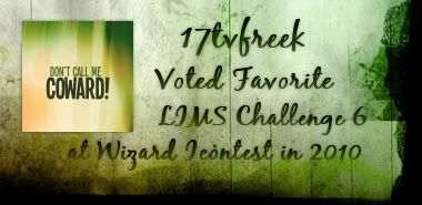
by 17tvfreek (+3) » Click to Save your Banner !
NO NEGATIVE VOTE (eligible for a SKIP)
by 17tvfreek (3) You already won a skip, you can't win another one but congrats for no negative vote :)
MOVING ON TO NEXT ROUND
17tvfreek
♥ beybey16510
♥ flame_eternel
lastyearswishes
♥ narniacmr
purple_wings
red_planet31
rhye
VOTING TALLIES!
Here's the tally. Remember we're picking 3 least favorites and 1 favorite. Therefore, a negative (-) denotes how many people voted against your icon and a plus (+) denotes how many people voted your icon their favorit, zero (0) means you got neither or that they anuled each other out. So if you have a + point, pat yourself on the back!
Lims Challenge 6: Text Only Quote
01
02
03
04
05
06
-
-
-
-
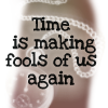
01: -2 + 1 = -1
02: -1 + 1 = 0
03: -5 + 0 = -5
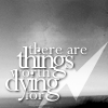
04: -1 + 1 = 0
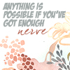
05: -0 + 3 = 3
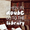
06: -3 + 0 = -3
+ POSITIVE VOTING COMMENTS +
#01 -- The text works really well with the textures, great job at matching the colors and great composition.
#02 -- The contrast is great. The quotes really stands out against the background.
#04 -- Clear and simple. Great use of image with the quote.
#05 -- The text color corresponds beautifully with the background used.
#05 -- The background texture is unique and attention grabbing. The text color makes it stand out well and is an all around well done icon.
#05 -- The bright colors on this icon really pop. The use of two sizes of text brings focus to the right word.
- NEGATIVE VOTING COMMENTS -
» Don't take these comments as mean pointless critics, they could help you make a better icon for the next challenge!
#01 -- The background of the icon is very busy, and there are too many different colors going on. The text seems disconnected by having one word in a different font.
#01 -- There's no relation with the text and the texture, it seems too random. The texture is too distracting from the quote.
#02 -- Because of the overlapping text, some of the words are obscured and hard to read.
#03 -- The text style and font do not match the background's image and color.
#03 -- The background image is too faded and distracting. The text size is a little large and disrupts the flow of the icon.
#03 -- The darkness of the text is too heavy for the icon, it completely overruns the background image.
#03 -- The color of the text doesn't really go with the rest of the icon.
#03 -- The black text really doesn't look like it fits with the background, something softer in a different font would have made it look more coherent.
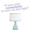
#04 -- The icon looks a bit too simple, maybe a texture would have helped. The blue coloring on the text would have looked better if it was matching the blue of the lamp.
#06 -- The background image (while relevant) is just too busy and it makes the text hard to read.
#06 -- It's a little hard to read the text because of the the background.
#06 -- The two fonts really don't seem to match well and look kind of awkward against the library image.
It's my turn to do the Nomination for the winning icon. (with the Noms for Week 244 in a couple of days)
ELIMINATIONS
VOTED OFF
by alinemcb54 (-5)
by pointblankdarcy (-3)
CONGRATULATIONS!
FAVORITE ICON + BANNER
by 17tvfreek (+3) » Click to Save your Banner !
NO NEGATIVE VOTE (eligible for a SKIP)
by 17tvfreek (3) You already won a skip, you can't win another one but congrats for no negative vote :)
MOVING ON TO NEXT ROUND
17tvfreek
♥ beybey16510
♥ flame_eternel
lastyearswishes
♥ narniacmr
purple_wings
red_planet31
rhye
VOTING TALLIES!
Here's the tally. Remember we're picking 3 least favorites and 1 favorite. Therefore, a negative (-) denotes how many people voted against your icon and a plus (+) denotes how many people voted your icon their favorit, zero (0) means you got neither or that they anuled each other out. So if you have a + point, pat yourself on the back!
Lims Challenge 6: Text Only Quote
01
02
03
04
05
06
-
-
-
-
01: -2 + 1 = -1
02: -1 + 1 = 0
03: -5 + 0 = -5
04: -1 + 1 = 0
05: -0 + 3 = 3
06: -3 + 0 = -3
+ POSITIVE VOTING COMMENTS +
#01 -- The text works really well with the textures, great job at matching the colors and great composition.
#02 -- The contrast is great. The quotes really stands out against the background.
#04 -- Clear and simple. Great use of image with the quote.
#05 -- The text color corresponds beautifully with the background used.
#05 -- The background texture is unique and attention grabbing. The text color makes it stand out well and is an all around well done icon.
#05 -- The bright colors on this icon really pop. The use of two sizes of text brings focus to the right word.
- NEGATIVE VOTING COMMENTS -
» Don't take these comments as mean pointless critics, they could help you make a better icon for the next challenge!
#01 -- The background of the icon is very busy, and there are too many different colors going on. The text seems disconnected by having one word in a different font.
#01 -- There's no relation with the text and the texture, it seems too random. The texture is too distracting from the quote.
#02 -- Because of the overlapping text, some of the words are obscured and hard to read.
#03 -- The text style and font do not match the background's image and color.
#03 -- The background image is too faded and distracting. The text size is a little large and disrupts the flow of the icon.
#03 -- The darkness of the text is too heavy for the icon, it completely overruns the background image.
#03 -- The color of the text doesn't really go with the rest of the icon.
#03 -- The black text really doesn't look like it fits with the background, something softer in a different font would have made it look more coherent.
#04 -- The icon looks a bit too simple, maybe a texture would have helped. The blue coloring on the text would have looked better if it was matching the blue of the lamp.
#06 -- The background image (while relevant) is just too busy and it makes the text hard to read.
#06 -- It's a little hard to read the text because of the the background.
#06 -- The two fonts really don't seem to match well and look kind of awkward against the library image.
It's my turn to do the Nomination for the winning icon. (with the Noms for Week 244 in a couple of days)