Results LIMS Challenge 7
Great turnout for Lims Challenge 7! Unfortunately 2 people will be leaving us tonight.
ELIMINATIONS
VOTED OFF
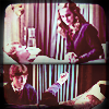
by red_planet31 (-6)
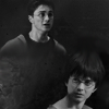
by purple_wings (-4)
CONGRATULATIONS!
FAVORITE ICON + BANNER
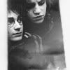
by flame_eternel (+7) » Click to Save your Banner !
NO NEGATIVE VOTE (eligible for a SKIP)

by flame_eternel (+7) You already won a skip, you can't win another one but congrats for no negative vote :)
MOVING ON TO NEXT ROUND
17tvfreek
beybey16510
♥ flame_eternel
lastyearswishes
♥ narniacmr
rhye
VOTING TALLIES!
Here's the tally. Remember we're picking 3 least favorites and 1 favorite. Therefore, a negative (-) denotes how many people voted against your icon and a plus (+) denotes how many people voted your icon their favorit, zero (0) means you got neither or that they anuled each other out. So if you have a + point, pat yourself on the back!
Lims Challenge 7: Mix of Pictures
01
02
03
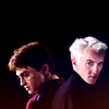
04
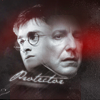


05
06
07
-


-
01: -4 + 1 = -3
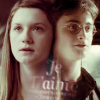
02: -0 + 7 = 7
03: -4 + 0 = -4
04: -2 + 1 = -1
05: -1 + 1 = 0
06: -6 + 0 = -6
07: -3 + 0 = -3
+ POSITIVE VOTING COMMENTS +
#01 -- The contrast of emotions between Harry and Snape's face is wonderful. It captures Potter's stubborn determination and Severus' desperate/lonely plight perfectly. It feels like it encompasses their emotions for the entire series.
#02 -- The use of the textures are really well done. They give the icon a very moody and emotional feel.
#02 -- The contrast here is just perfect. Harry and Hermione's faces both stand out very well. The framing adds interest.
#02 -- The cropping and layering is just really well done.
#02 -- Love the overall mood of the icon.
#02 -- Very nice image choice and the texture use is great.
#02 -- Brilliant job blending the two pics. The cropping and smoky texture are perfect for the emotion of the icon, as is the black and white coloring.
#02 -- The images fits well together and the overall icon is very lovely.
#04 -- Good contrast and color and super negative space.
#05 -- I love the coloring of this icon. The cropping is also well done and the images blend together nicely.
- NEGATIVE VOTING COMMENTS -
» Don't take these comments as mean pointless critics, they could help you make a better icon for the next challenge!
#01 -- The text seems blurry and is oddly placed in such a way that the second "t" cuts across Snape's chin. The idea of using the light textures is a good one but their placement, especially the one over Snape's eye, is awkward.
#01 -- The way their faces are blended together just doesn't look right. also the red light texture is too overpowering and doesn't work well.
#01 -- The blending between Harry's and Snape's head is rather awkward, it looks like Harry is coming out of Snape.
#01 -- The images don't really blend well together. It looks like their heads are connected.
#03 -- It's much too dark. It would have been a beautiful combination of pictures showing how Harry has grown if it had a bit more contrast.
#03 -- The positioning of the images does not work well and the icon is too dark.
#03 -- While I like the idea, the icon turned out a little bit too dark and the composition could have been better perhaps if the pictures were next to each other instead of one on top of the other.
#03 -- The icon is quite dark. It would have looked better if it was brighter and maybe if it had more contrast.
#04 -- I've seen this same combination of exact pictures far too many times, but here the coloration of the blend doesn't match well. There should be more of a balance between the pink/purple of Draco's face in the pic and the brown/yellow of Harry's. As it is, it feels mismatched and a bit sloppy.
#04 -- The coloring is a bit off, making Draco's face look purple.
#05 -- The whole icon is oversharpened, especially so with the foreground image.
#06 -- The coloring is too dark and gives the whole icon a muddy look. The images are also oversharpened.
#06 -- The contrast between these two scenes is a good idea, but the images seem oversharpened and oversaturated.
#06 -- The image is too saturated and makes the images look funny. The border might be a bit too much with all the busy images.
#06 -- I like the images that were chosen, but the coloring used is unflattering and is really washing them out.
#06 -- The icon is too saturated, we cannot see Hermione's face.
#06 -- The icon is too sharpened. The face of Hermione is too pale, making the details washed out.
#07 -- The blending of the two images is kind of awkward and the coloring doesn't work well. I like the way the text was done, though.
#07 -- The text placement does not work and is quite hard to read.
#07 -- The icon is washed out and blurry. The faded text doesn't work very well there.
It's hezzda's turn to do the Nomination for the winning icon. (with the Noms for Week 245 in a couple of days)
ELIMINATIONS
VOTED OFF
by red_planet31 (-6)
by purple_wings (-4)
CONGRATULATIONS!
FAVORITE ICON + BANNER
by flame_eternel (+7) » Click to Save your Banner !
NO NEGATIVE VOTE (eligible for a SKIP)
by flame_eternel (+7) You already won a skip, you can't win another one but congrats for no negative vote :)
MOVING ON TO NEXT ROUND
17tvfreek
beybey16510
♥ flame_eternel
lastyearswishes
♥ narniacmr
rhye
VOTING TALLIES!
Here's the tally. Remember we're picking 3 least favorites and 1 favorite. Therefore, a negative (-) denotes how many people voted against your icon and a plus (+) denotes how many people voted your icon their favorit, zero (0) means you got neither or that they anuled each other out. So if you have a + point, pat yourself on the back!
Lims Challenge 7: Mix of Pictures
01
02
03
04
05
06
07
-
-
01: -4 + 1 = -3
02: -0 + 7 = 7
03: -4 + 0 = -4
04: -2 + 1 = -1
05: -1 + 1 = 0
06: -6 + 0 = -6
07: -3 + 0 = -3
+ POSITIVE VOTING COMMENTS +
#01 -- The contrast of emotions between Harry and Snape's face is wonderful. It captures Potter's stubborn determination and Severus' desperate/lonely plight perfectly. It feels like it encompasses their emotions for the entire series.
#02 -- The use of the textures are really well done. They give the icon a very moody and emotional feel.
#02 -- The contrast here is just perfect. Harry and Hermione's faces both stand out very well. The framing adds interest.
#02 -- The cropping and layering is just really well done.
#02 -- Love the overall mood of the icon.
#02 -- Very nice image choice and the texture use is great.
#02 -- Brilliant job blending the two pics. The cropping and smoky texture are perfect for the emotion of the icon, as is the black and white coloring.
#02 -- The images fits well together and the overall icon is very lovely.
#04 -- Good contrast and color and super negative space.
#05 -- I love the coloring of this icon. The cropping is also well done and the images blend together nicely.
- NEGATIVE VOTING COMMENTS -
» Don't take these comments as mean pointless critics, they could help you make a better icon for the next challenge!
#01 -- The text seems blurry and is oddly placed in such a way that the second "t" cuts across Snape's chin. The idea of using the light textures is a good one but their placement, especially the one over Snape's eye, is awkward.
#01 -- The way their faces are blended together just doesn't look right. also the red light texture is too overpowering and doesn't work well.
#01 -- The blending between Harry's and Snape's head is rather awkward, it looks like Harry is coming out of Snape.
#01 -- The images don't really blend well together. It looks like their heads are connected.
#03 -- It's much too dark. It would have been a beautiful combination of pictures showing how Harry has grown if it had a bit more contrast.
#03 -- The positioning of the images does not work well and the icon is too dark.
#03 -- While I like the idea, the icon turned out a little bit too dark and the composition could have been better perhaps if the pictures were next to each other instead of one on top of the other.
#03 -- The icon is quite dark. It would have looked better if it was brighter and maybe if it had more contrast.
#04 -- I've seen this same combination of exact pictures far too many times, but here the coloration of the blend doesn't match well. There should be more of a balance between the pink/purple of Draco's face in the pic and the brown/yellow of Harry's. As it is, it feels mismatched and a bit sloppy.
#04 -- The coloring is a bit off, making Draco's face look purple.
#05 -- The whole icon is oversharpened, especially so with the foreground image.
#06 -- The coloring is too dark and gives the whole icon a muddy look. The images are also oversharpened.
#06 -- The contrast between these two scenes is a good idea, but the images seem oversharpened and oversaturated.
#06 -- The image is too saturated and makes the images look funny. The border might be a bit too much with all the busy images.
#06 -- I like the images that were chosen, but the coloring used is unflattering and is really washing them out.
#06 -- The icon is too saturated, we cannot see Hermione's face.
#06 -- The icon is too sharpened. The face of Hermione is too pale, making the details washed out.
#07 -- The blending of the two images is kind of awkward and the coloring doesn't work well. I like the way the text was done, though.
#07 -- The text placement does not work and is quite hard to read.
#07 -- The icon is washed out and blurry. The faded text doesn't work very well there.
It's hezzda's turn to do the Nomination for the winning icon. (with the Noms for Week 245 in a couple of days)