Lost Icon Tutorial for GIMP
We will be Going from this 
to this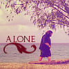
.
1. I took a screen cap from Lost and cropped the image and than scaled it to 100x100 pixels.

This is what I am using.
In the same step I sharpened it at 30. Since it is a some what blurry picture it needed that much sharpening. You may not have to sharpen as much depending on the quality of the picture you are using.
2.Duplicate your base. You will want to desaturate this layer. Layer>Colors>Desaturate. Once this layer has been desaturated you will need to play with the Brightness and Contrast. The reason I did this was because it actually brightens Hurley who in the previous step was very dark.
Layers>Colors>Brightness/Contrast. I set the Brightness to 59 and the Contrat to -22. Once this is done you need to set this layer to Divide 100%
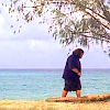
You Should have this.
3.I still do not think that Hurley is as bright as I would like him to be. So I duplicated my base again and dragged it to the top of my other 2 layers. I set this to screen 100%.
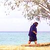
You should have this.
4.I then duplicated my base yet again. I dragged this to the top of my other three layers. Set it to normal 40%. I then took my erase tool and erased Hurley from this layer so that the previous brightness came through but it leaves the rest of the icon at a nice color. I then Flattened my image.
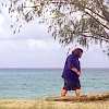
5.Now add a new layer in transparent. Fill this with a darker blue. I used #321679 in mine. Duplicate this blue layer once so that you have to blue layers. Set the firts layer to Subtract 100% and the second layer to Screen 100%.
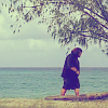
you should have this.
*Note-creating the two blue layers in GIMP=Exclusion in other image programs
6.Now add another new layer in transparent and fill it with a darker pink I used #ed527a for mine. Set this layer to Overlay 70%
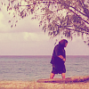
You should have this.
7.Add a new layer in transparent. I used this pattern
and set it to Softlight 30%.
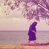
You should have this.
8.For the text I used Augustus Ultra-Light (this happenes to be one of my favorite fonts. I tend to use it a lot) text at 12 px with color #660820.
10.Now make a new layer in transparent. I used this
made by scarsonchest *think that I actually got it from Deviant Art but I can't remember so the lj user tag may not work.* Anyway....I set the brush right underneath the text layer. Now you need to move the text and brush layers beneath the pattern layers that you previously made. Once this is done. Merge all of your layers together and you will have your finished icon.
Which sould look something like this....

I hope that you like it:)
Please do not copy exactly. Play with the settings and have fun with it:)

to this

.
1. I took a screen cap from Lost and cropped the image and than scaled it to 100x100 pixels.

This is what I am using.
In the same step I sharpened it at 30. Since it is a some what blurry picture it needed that much sharpening. You may not have to sharpen as much depending on the quality of the picture you are using.
2.Duplicate your base. You will want to desaturate this layer. Layer>Colors>Desaturate. Once this layer has been desaturated you will need to play with the Brightness and Contrast. The reason I did this was because it actually brightens Hurley who in the previous step was very dark.
Layers>Colors>Brightness/Contrast. I set the Brightness to 59 and the Contrat to -22. Once this is done you need to set this layer to Divide 100%

You Should have this.
3.I still do not think that Hurley is as bright as I would like him to be. So I duplicated my base again and dragged it to the top of my other 2 layers. I set this to screen 100%.

You should have this.
4.I then duplicated my base yet again. I dragged this to the top of my other three layers. Set it to normal 40%. I then took my erase tool and erased Hurley from this layer so that the previous brightness came through but it leaves the rest of the icon at a nice color. I then Flattened my image.

5.Now add a new layer in transparent. Fill this with a darker blue. I used #321679 in mine. Duplicate this blue layer once so that you have to blue layers. Set the firts layer to Subtract 100% and the second layer to Screen 100%.

you should have this.
*Note-creating the two blue layers in GIMP=Exclusion in other image programs
6.Now add another new layer in transparent and fill it with a darker pink I used #ed527a for mine. Set this layer to Overlay 70%

You should have this.
7.Add a new layer in transparent. I used this pattern

and set it to Softlight 30%.

You should have this.
8.For the text I used Augustus Ultra-Light (this happenes to be one of my favorite fonts. I tend to use it a lot) text at 12 px with color #660820.
10.Now make a new layer in transparent. I used this

made by scarsonchest *think that I actually got it from Deviant Art but I can't remember so the lj user tag may not work.* Anyway....I set the brush right underneath the text layer. Now you need to move the text and brush layers beneath the pattern layers that you previously made. Once this is done. Merge all of your layers together and you will have your finished icon.
Which sould look something like this....

I hope that you like it:)
Please do not copy exactly. Play with the settings and have fun with it:)