Session 4 Round 3 - Results
Session 4 Round 3 - Results
Voted out: ribbon_crimson
Favorite: shinseikakumei

+ The crop is intriguing. Nice typography & coloring.
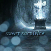
+ The text and tiny text are blended nicely into the image and match the color scheme of the image. The circles in the corner balance out the placement of the casket and cross.
+ This one looks really pretty and the typography is nice too. Just be careful about choosing your light textures. I think there's too many dots in the texture for this icon. Other than that great job! =D

: The colors of the background are a bit too vibrant compared to the foreground image, it makes the background more of a focus.

: The black text on white background seems perhaps too extreme of a difference from the image. Maybe it could all be better unified.
: The choice of text doesn't suit the image well and the image itself looks fairly plain.
: I hate to do this to you because this is really a nice icon (creativity points too) but this looks like a little more can be done. Everyone made great icons so I had to start basing it on mickey mouse stuff...

: I wish you made the text more noticable. Its really hard to see it. Also Maybe you could have made the picture a little brighter in order to bring out the details in the base.

: I like the image you chose but I wish you did more with the icon besides some small text. The monotone to color didn't really give the icon more flair.
: The text is somewhat difficult to read and the dark spot in the lower left corner is distracting.
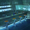
: Wow the scenery is gorgeous but the text needs to contrast a little more to be more legible. (In other words make the text darker a few shades?)
New theme will be posted shortly~
Voted out: ribbon_crimson
Favorite: shinseikakumei
+ The crop is intriguing. Nice typography & coloring.
+ The text and tiny text are blended nicely into the image and match the color scheme of the image. The circles in the corner balance out the placement of the casket and cross.
+ This one looks really pretty and the typography is nice too. Just be careful about choosing your light textures. I think there's too many dots in the texture for this icon. Other than that great job! =D
: The colors of the background are a bit too vibrant compared to the foreground image, it makes the background more of a focus.

: The black text on white background seems perhaps too extreme of a difference from the image. Maybe it could all be better unified.
: The choice of text doesn't suit the image well and the image itself looks fairly plain.
: I hate to do this to you because this is really a nice icon (creativity points too) but this looks like a little more can be done. Everyone made great icons so I had to start basing it on mickey mouse stuff...
: I wish you made the text more noticable. Its really hard to see it. Also Maybe you could have made the picture a little brighter in order to bring out the details in the base.

: I like the image you chose but I wish you did more with the icon besides some small text. The monotone to color didn't really give the icon more flair.
: The text is somewhat difficult to read and the dark spot in the lower left corner is distracting.
: Wow the scenery is gorgeous but the text needs to contrast a little more to be more legible. (In other words make the text darker a few shades?)
New theme will be posted shortly~