Soft and Dreamy Icon Tutorial
Today we're going to learn how to create an icon that has a soft dreamy look to it. This coloring is simple to achieve and requires only five or six layers to make depending upon brushes and borders. The coloring on this icon simulates the "vaseline on the lens" look. This technique is great for stock and live action icons and should work on icons from animated sources. This tutorial was made using Photoshop CS and is translatable to any program that has the Channel Mixer and Auto Levels adjustment options.


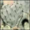
First, take your source image and crop it to your liking resizing it to 100x100px. Do not sharpen your image. This will be your base image. For this icon I wanted the entire bleeding heart flower to be in the picture.
Second, duplicate your base image. For now we'll leave the settings alone.

Here's where the magic happens. Create a new Chnnel Mixer adjustment layer and click the monochrome box. This will allow us to create a black and white image with a good balance between the shades of black, white, and gray. Leave the reds at 100% and set the blues to -66%. Slide your greens to the positive numbers until you get a black and white image to your liking. Do not go over 100% unless your base image has a lot of green in it. For this icon, I set my greens to 60%. Remember, what works for one image won't work for others so play around with the greens. Once you have your image to your liking, merge the adjustment layer with the copy of your base.

Duplicate the now black and white copy of your base. This copy will be where you make your icon soft and dreamy. Go to the Filters menu and select Gaussian Blur in the blur filters. Set the radius of the blur to 2.5. Leave the layer type to Normal or the icon won't have the soft dreamy look you want.

This is where the rest of the magic happens. We want to let the color of the base to show through. On your blurred layer set the opacity anywhere between 30 and 50 percent. This will give your icon the soft look to it. For this icon I set the opacity to 45%. To get the color to show through you need to change the settings on your first duplicated layer. Set the layer type to Soft Light. The icon looks soft but it's not dreamy looking so we'll need to lower the opacity of our now Soft Light layer. Set the opacity anywhere between 30 and 50 percent. For this icon I set the opacity to 35%.

The icon looks good but I felt it could use a bit more to the coloring. Go back to your base and create a new layer between the base and your first duplicated layer. Here we'll create an Exclusion layer to soften the reds, emphasize the greens, and help the shadows stand out in the base image. Fill the layer with a dark green color (#0D2101). A swatch of the color for fast copy and pasting can be found here. Set the layer type to Exclusion and change the opacity depending on the look you want to achieve. For this icon I left the opacity alone.

Looking at the icon I thought it appeared a little flat. I wanted the shadows and highlights to stand out so I decided to use the Auto Levels in the adjustment section of the image menu. Go to your two duplicated layers and use Auto Levels on each of them. Since I liked the look I got I left the base image alone.

Satisfied that the color looks the way I liked it to, I can now go one of two ways with the icon. At this point, I can call the icon finished and add my borders. However, since I had enough free space on the right side of the icon I decided to add a tiny text brush that I found on DeviantArt. On a new layer on top of your coloring add the brush twice in a dark gray color (#1E1E1E) to make it stand out against the background. Even though it looks good against the background, I decided to lower the opacity down to 85% to keep with the soft theme of the icon.

Once again you have two choices for the icon. You can leave your icon the way it is and consider it finished, or you can add borders to your icon. I decided my icon would look better with some borders. What you add here is totally up to you and the program you use. Create a new layer and click Ctrl + A to select your entire icon. Using a white shade go to the Edit menu and click on stroke (for Photoshop users). Set the width of your stroke to 2px. Switch to your dark gray color and click on stroke again setting the width to 1px. Your icon is now finished. If you chose to create your icon without text brushes, it will look like this when finished.
Other Icons Made With This Technique:
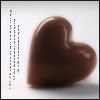

First, take your source image and crop it to your liking resizing it to 100x100px. Do not sharpen your image. This will be your base image. For this icon I wanted the entire bleeding heart flower to be in the picture.
Second, duplicate your base image. For now we'll leave the settings alone.
Here's where the magic happens. Create a new Chnnel Mixer adjustment layer and click the monochrome box. This will allow us to create a black and white image with a good balance between the shades of black, white, and gray. Leave the reds at 100% and set the blues to -66%. Slide your greens to the positive numbers until you get a black and white image to your liking. Do not go over 100% unless your base image has a lot of green in it. For this icon, I set my greens to 60%. Remember, what works for one image won't work for others so play around with the greens. Once you have your image to your liking, merge the adjustment layer with the copy of your base.
Duplicate the now black and white copy of your base. This copy will be where you make your icon soft and dreamy. Go to the Filters menu and select Gaussian Blur in the blur filters. Set the radius of the blur to 2.5. Leave the layer type to Normal or the icon won't have the soft dreamy look you want.
This is where the rest of the magic happens. We want to let the color of the base to show through. On your blurred layer set the opacity anywhere between 30 and 50 percent. This will give your icon the soft look to it. For this icon I set the opacity to 45%. To get the color to show through you need to change the settings on your first duplicated layer. Set the layer type to Soft Light. The icon looks soft but it's not dreamy looking so we'll need to lower the opacity of our now Soft Light layer. Set the opacity anywhere between 30 and 50 percent. For this icon I set the opacity to 35%.
The icon looks good but I felt it could use a bit more to the coloring. Go back to your base and create a new layer between the base and your first duplicated layer. Here we'll create an Exclusion layer to soften the reds, emphasize the greens, and help the shadows stand out in the base image. Fill the layer with a dark green color (#0D2101). A swatch of the color for fast copy and pasting can be found here. Set the layer type to Exclusion and change the opacity depending on the look you want to achieve. For this icon I left the opacity alone.
Looking at the icon I thought it appeared a little flat. I wanted the shadows and highlights to stand out so I decided to use the Auto Levels in the adjustment section of the image menu. Go to your two duplicated layers and use Auto Levels on each of them. Since I liked the look I got I left the base image alone.
Satisfied that the color looks the way I liked it to, I can now go one of two ways with the icon. At this point, I can call the icon finished and add my borders. However, since I had enough free space on the right side of the icon I decided to add a tiny text brush that I found on DeviantArt. On a new layer on top of your coloring add the brush twice in a dark gray color (#1E1E1E) to make it stand out against the background. Even though it looks good against the background, I decided to lower the opacity down to 85% to keep with the soft theme of the icon.
Once again you have two choices for the icon. You can leave your icon the way it is and consider it finished, or you can add borders to your icon. I decided my icon would look better with some borders. What you add here is totally up to you and the program you use. Create a new layer and click Ctrl + A to select your entire icon. Using a white shade go to the Edit menu and click on stroke (for Photoshop users). Set the width of your stroke to 2px. Switch to your dark gray color and click on stroke again setting the width to 1px. Your icon is now finished. If you chose to create your icon without text brushes, it will look like this when finished.
Other Icons Made With This Technique: