post #23: tutorial, supernatural, selective coloring
Okay, I've never actually done a tutorial before, so please bear with me. I would first like to thank brasaremean for making this tutorial that pretty much opened my eyes to Selective Coloring. It is my icon technique of choice, and you should all use it.
Right, since ellieptical asked. We are going to cover how to get the coloring effect on these two icons. They're not exact because I deleted my .psd files, but I made them as close as possible using the same techniques. (this is done in Adobe Photoshop 7)


Ellen first, because she's a lady.
I always color my icons at 200x200 because I get a better idea of what parts are getting color and how that looks. So, I start out with this:

Next, you want to duplicate your base twice and set both layers to screen at 100% opacity. (this step can vary depending on the lighting in the picture). You are going to end up with something like this:

Next, go to Layer --> New Adjustment Layer --> Selective Color
Red:
Cyan -100
Magenta: +61
Yellow: +100
Yellow:
Cyan: -87
Magenta: +20
Yellow: +75
Green:
Magenta: +100
Yellow: +100
Green: +100
After that, you should have something that looks like this:

Next, go back to Layer --> New Adjustment Layer --> Selective Color and create a new one with these ratios:
Red:
Cyan: -30
Magenta: +4
Yellow: +19
Yellow:
Cyan: +100
Magenta: -13
Yellow: -34
Neutral:
Cyan: +18
Yellows: +5
Your icon should now look like this:

After that step, create a new layer (ctrl +alt +n) and fill it with a light gray like #EBEBEB, then set it to color burn at 100% opacity. You should have this:

Resize it 100x100 and you're done!
Now for Dean, I decided to do two separate tutorials to show the range of Selective Coloring. The coloring on the icons look relatively similar, and the techniques used are pretty much the same, but it's the ratios you need to pay attention to. The same numbers don't work on every icon, and knowing where to add or subtract is key in getting the effect you want.
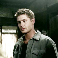
Right, on to the actual tutorial. We're starting out the same way we did with Ellen. Duplicate your base twice and set both layers to screen at 100% opacity. Which, will give you something like this:
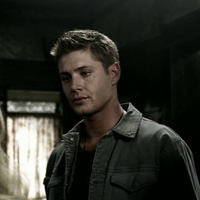
-->
Next, go to Layer --> New Adjustment Layer --> Selective Color and fill in these ratios:
Red:
Cyan: -100
Magenta: +28
Yellow: +100
Yellow:
Cyan: -33
Magenta: +8
Yellow: +79
Green:
Magenta: +100
Yellow: +100
Green: +100
This step should give you something that looks like this:

Next, go back to Layer --> New Adjustment Layer --> Selective Color and create a new layer with these ratios:
Red:
Cyan: -32
Magenta: +7
Yellow: +13
Yellow:
Cyan +100
Magenta: -21
Yellow: -30
Neutral:
Cyan: +8
Yellows: +3
Your icon should now look something like this:
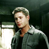
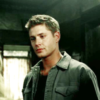
After this step, you want to create a new layer (ctrl +alt +n) and fill it with a bright yellow/gold color, like #EFE20A, then set it to color burn at 7% opacity (you want a subtle tint. if the image is dark, you can also try to overlay at a low opacity, which will give you the tint and brighten the image). You should now have this:
Following this, create a new layer (ctrl +alt +n) and fill it with a light gray like #EBEBEB, then set it to color burn at 100% opacity. Which, will give you this:
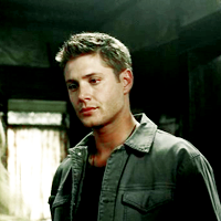
Resize it 100x100 and you're done!
I hope that helps. The main thing to remember is to pay close attention to the picture while you're playing with the color ratios. The more you mess around, the easier it will be for you to get what you want.
If there are any questions, or problems, please tell me!
Right, since ellieptical asked. We are going to cover how to get the coloring effect on these two icons. They're not exact because I deleted my .psd files, but I made them as close as possible using the same techniques. (this is done in Adobe Photoshop 7)


Ellen first, because she's a lady.
I always color my icons at 200x200 because I get a better idea of what parts are getting color and how that looks. So, I start out with this:

Next, you want to duplicate your base twice and set both layers to screen at 100% opacity. (this step can vary depending on the lighting in the picture). You are going to end up with something like this:

Next, go to Layer --> New Adjustment Layer --> Selective Color
Red:
Cyan -100
Magenta: +61
Yellow: +100
Yellow:
Cyan: -87
Magenta: +20
Yellow: +75
Green:
Magenta: +100
Yellow: +100
Green: +100
After that, you should have something that looks like this:

Next, go back to Layer --> New Adjustment Layer --> Selective Color and create a new one with these ratios:
Red:
Cyan: -30
Magenta: +4
Yellow: +19
Yellow:
Cyan: +100
Magenta: -13
Yellow: -34
Neutral:
Cyan: +18
Yellows: +5
Your icon should now look like this:

After that step, create a new layer (ctrl +alt +n) and fill it with a light gray like #EBEBEB, then set it to color burn at 100% opacity. You should have this:

Resize it 100x100 and you're done!
Now for Dean, I decided to do two separate tutorials to show the range of Selective Coloring. The coloring on the icons look relatively similar, and the techniques used are pretty much the same, but it's the ratios you need to pay attention to. The same numbers don't work on every icon, and knowing where to add or subtract is key in getting the effect you want.
Right, on to the actual tutorial. We're starting out the same way we did with Ellen. Duplicate your base twice and set both layers to screen at 100% opacity. Which, will give you something like this:

-->

Next, go to Layer --> New Adjustment Layer --> Selective Color and fill in these ratios:
Red:
Cyan: -100
Magenta: +28
Yellow: +100
Yellow:
Cyan: -33
Magenta: +8
Yellow: +79
Green:
Magenta: +100
Yellow: +100
Green: +100
This step should give you something that looks like this:

Next, go back to Layer --> New Adjustment Layer --> Selective Color and create a new layer with these ratios:
Red:
Cyan: -32
Magenta: +7
Yellow: +13
Yellow:
Cyan +100
Magenta: -21
Yellow: -30
Neutral:
Cyan: +8
Yellows: +3
Your icon should now look something like this:

After this step, you want to create a new layer (ctrl +alt +n) and fill it with a bright yellow/gold color, like #EFE20A, then set it to color burn at 7% opacity (you want a subtle tint. if the image is dark, you can also try to overlay at a low opacity, which will give you the tint and brighten the image). You should now have this:

Following this, create a new layer (ctrl +alt +n) and fill it with a light gray like #EBEBEB, then set it to color burn at 100% opacity. Which, will give you this:

Resize it 100x100 and you're done!
I hope that helps. The main thing to remember is to pay close attention to the picture while you're playing with the color ratios. The more you mess around, the easier it will be for you to get what you want.
If there are any questions, or problems, please tell me!