challenge 1; round 4: results
Thank you to those who entered this round. Unfortunately someone has to go though. With that being said, here are the results!
ELIMINATED \\ firephoenixx

with -3 votes
Sorry to see you go, hope you stick around for voting!
VOTER'S CHOICE

with +2 votes
MOD'S CHOICE
none
TALLY:
If your number is not listed, you received no comments.
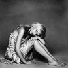
01: + + + = +3 | VOTER'S CHOICE
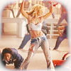
02: - - - + = -2 | ELIMINATED
03: - = -1
COMMENTS:
01.
+ Black-and-white icons are sometimes difficult to make but the iconmaker totally pulled it off here. The crop works very well with the grey tones, and I really like how rich and deep the black is. The theme was also superbly incorporated.
+ Lovely crop and the b&w is nicely done.
+ The image used is creative, they don't use the person standing to show their full body in the icon. The b&w effect was done nicely as well.
02.
- This icon could have been really nice if it weren't for the people in the background. Especially the man on the bottom left distracts from the subject of the icon. Maybe extracting the subject and placing it on a new background could help to make it stand out more.
- The crop is nice but the coloring overall is a little washed out.
- The icon is rather plain. The crop is in the center as opposed to something creative. The coloring isn't anything unique to make the icon great.
+ nice coloring.
03.
- the coloring of the person is to dark so it looks a bit blurry.
If you have a complaint/question about the results, please let me know. I will do all that I can to assist you.
ELIMINATED \\ firephoenixx

with -3 votes
Sorry to see you go, hope you stick around for voting!
VOTER'S CHOICE

with +2 votes
MOD'S CHOICE
none
TALLY:
If your number is not listed, you received no comments.
01: + + + = +3 | VOTER'S CHOICE
02: - - - + = -2 | ELIMINATED
03: - = -1
COMMENTS:
01.
+ Black-and-white icons are sometimes difficult to make but the iconmaker totally pulled it off here. The crop works very well with the grey tones, and I really like how rich and deep the black is. The theme was also superbly incorporated.
+ Lovely crop and the b&w is nicely done.
+ The image used is creative, they don't use the person standing to show their full body in the icon. The b&w effect was done nicely as well.
02.
- This icon could have been really nice if it weren't for the people in the background. Especially the man on the bottom left distracts from the subject of the icon. Maybe extracting the subject and placing it on a new background could help to make it stand out more.
- The crop is nice but the coloring overall is a little washed out.
- The icon is rather plain. The crop is in the center as opposed to something creative. The coloring isn't anything unique to make the icon great.
+ nice coloring.
03.
- the coloring of the person is to dark so it looks a bit blurry.
If you have a complaint/question about the results, please let me know. I will do all that I can to assist you.