tutorial #2
this place isn't too active anymore, is it? bah, oh well. i have a tutorial for you guys, though, and i am working on icons at the moment!
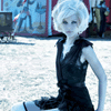
i made this tutorial because i thought that there were a lot of icons with a cold, light-blue tint to them that i couldn't do much with. i decided to do some experimenting, and this is what i came up with!

to
open color balance.
midtones:
+100
+15
-60
shadows:
+25
+10
-20
highlights:
+20
preserve luminosity checked.
usually, an image will be somewhat pale after this, so i made the master hue/saturation setting +30. it depends on your image, though.
you can stop here, but i have some selective coloring to go along with this.
REDS:
cyan: -100
magenta: +50
yellow: +65
black: +35
YELLOWS:
c: -100
m: +100
y: +50
b: 0
NEUTRALS:
c: +30
m: +20
y: +30
b: 0
this should give it a colorful reddish tint. :]
i hope you liked this tutorial! it works on similar images. :]
i made this tutorial because i thought that there were a lot of icons with a cold, light-blue tint to them that i couldn't do much with. i decided to do some experimenting, and this is what i came up with!

to

open color balance.
midtones:
+100
+15
-60
shadows:
+25
+10
-20
highlights:
+20
preserve luminosity checked.
usually, an image will be somewhat pale after this, so i made the master hue/saturation setting +30. it depends on your image, though.
you can stop here, but i have some selective coloring to go along with this.
REDS:
cyan: -100
magenta: +50
yellow: +65
black: +35
YELLOWS:
c: -100
m: +100
y: +50
b: 0
NEUTRALS:
c: +30
m: +20
y: +30
b: 0
this should give it a colorful reddish tint. :]
i hope you liked this tutorial! it works on similar images. :]