tutorial3
herogrrl asked for a tutorial of an icon in this style: 
And erm, I love that icon and feel like it was kind of a fluke, but I tried to create something similar to do a tutorial on and got this:

(I use PSP8)
So
I started off with these caps:
http://i2.photobucket.com/albums/y15/zoiciteicons2/tutorial3/serenity184.jpg
http://i2.photobucket.com/albums/y15/zoiciteicons2/tutorial3/serenity183.jpg
http://i2.photobucket.com/albums/y15/zoiciteicons2/tutorial3/serenity181.jpg
Cropped and resized:



played around with the coloring and then sharpened:



And now it's time to start putting together the icon (a lot of this was trial and error, slapping different brushes and layers on and then taking them off again until I *finally* found something I liked)
I started with a black 100x100 canvas and arranged my three bases on it:

I then desaturated the two side images, duplicated them and set them to soft light, resulting in this:

And then I started adding stuff!
Brush by miggy:
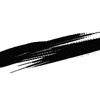
resulted in:

(and erm, I kind of really really like it just like that, but let's keep going anyway)
a few lines made using the line tool:

a rectangular selection filled with F0DF2C:

this light texture: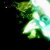
(the same one used in the faith icon. I got it from ats_challenge)
set to lighten and moved around, some pieces chopped off:

and then finally merge and add text!

(font: HelpUsGiambattista-SmallCaps, size: 18, kerning: -94)
and that's it!
I tried to play around with some shapes similar to the x's in the faith icon, but eh. they were discarded in the end. The faith icon also has a sliver of her face repeated (the bright blue areas) and set to negative image.
So anyway, yes. I hope it was helpful and definitely ask if you have any questions or need something clarified!
And erm, I love that icon and feel like it was kind of a fluke, but I tried to create something similar to do a tutorial on and got this:
(I use PSP8)
So
I started off with these caps:
http://i2.photobucket.com/albums/y15/zoiciteicons2/tutorial3/serenity184.jpg
http://i2.photobucket.com/albums/y15/zoiciteicons2/tutorial3/serenity183.jpg
http://i2.photobucket.com/albums/y15/zoiciteicons2/tutorial3/serenity181.jpg
Cropped and resized:
played around with the coloring and then sharpened:
And now it's time to start putting together the icon (a lot of this was trial and error, slapping different brushes and layers on and then taking them off again until I *finally* found something I liked)
I started with a black 100x100 canvas and arranged my three bases on it:
I then desaturated the two side images, duplicated them and set them to soft light, resulting in this:
And then I started adding stuff!
Brush by miggy:
resulted in:
(and erm, I kind of really really like it just like that, but let's keep going anyway)
a few lines made using the line tool:
a rectangular selection filled with F0DF2C:
this light texture:
(the same one used in the faith icon. I got it from ats_challenge)
set to lighten and moved around, some pieces chopped off:
and then finally merge and add text!
(font: HelpUsGiambattista-SmallCaps, size: 18, kerning: -94)
and that's it!
I tried to play around with some shapes similar to the x's in the faith icon, but eh. they were discarded in the end. The faith icon also has a sliver of her face repeated (the bright blue areas) and set to negative image.
So anyway, yes. I hope it was helpful and definitely ask if you have any questions or need something clarified!