Tutorial: Nicholas Rush
darlingbones requested a tutorial for this icon at the Ask the Maker meme at icon_talk a while back.
Going from this: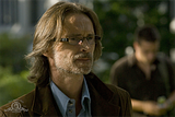
to this:
Using Photoshop Elements 6
Let me preface this by saying that sometimes, when I make an icon, I have no idea what I'm doing and just try all sorts of random stuff that looks like crap until I tweak it a bit. Sometimes I stumble across something cool looking by accident. Sometimes the process I follow is a hot mess. This icon was one of those hot messes. It was also made about a year ago, so my memory is a bit rusty and some of the steps are going to differ from what I actually did, since I basically wrote this while deconstructing the PSD. I may have gone into too much detail, but I figure more is better for those less proficient in Photoshop.
First, I just pasted the original image of Nicholas Rush into a 100 x100 canvas. I then duplicated and resized the image so that Rush was positioned in the bottom, right corner. Note: I always try to duplicate layers before I make any changes to them. That way, I can have something to go back to later if I mess something up.
To resize, I select the layer I want to adjust, use the Move tool, and click on a corner of the image to get the transform option. Alternatively, from the top drop down menu, you could also go to Image-> Transform -> Free transform. It gets you do the same place. Then I manually adjust the size by dragging the corners of the image until it is at a size and location that I like. Just make sure that the Constrain Proportions box in the top tool bar is selected in order to maintain the aspect ratio of the image.
And this is what I got after resizing:
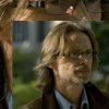
I then used the smudge tool to blend the image outward and fill the gaps my crop left on the 100 x 100 canvas. I usually use a soft edged brush when doing this. For a bit more information on using the smudge tool to extend caps, see this tutorial by me or this one by shoqolad .
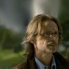
The image is very dark, so I duplicated the layer and set it's blend mode to screen in order to lighten it a bit.
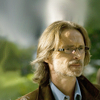
Duplicating an image and setting it to screen is usually one of the first things I do, but in this case, I knew I was going to be smudging and blending the image upward, and I didn't want to have to go back and do that for both the original and screened images.
For some reason (I'm not sure why in hindsight), I didn't like how low Rush's head was in the composition, so I selected both the "normal" and "screened" layers (you can select multiple layers at once by holding down the shift key while clicking the desired layers), duplicated them, and then dragged them upward a bit.
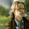
The image still looks a bit dark, so I used a levels adjustment layer to brighten it. For more information on using levels to adjust brightness and contrast, see my previous tutorial. These are the settings I used here:
RBG channel: 13, 1.79, 249
And the result:
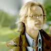
Now this is where things get a bit funky. At some point while making this icon, I must have tried to incorporate duplicate images of Rush. I didn't end up going that route, but the remnants of that attempt are still incorporated in the icon in a different way.
Basically, I used this closer crop of Rush's face:
And used the erase tool to remove most of it except for the eyes:
I obviously didn't like how this looked, but when set to soft light, it accentuates the shadows on Rush's face.
Before:
-> Image set to soft light: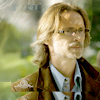
The image looked a little flat, so I created another levels layer to increase the contrast a bit. Here are the settings I used:
RBG channel: 30, 0.81, 230
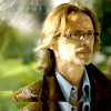
I created a third levels layer to adjust the color. This is something that I tweak and experiment individually with each cap. Again, you can check out my previous tutorial using levels to adjust coloring. These are the settings I used for this particular cap:
RBG: 0, 1.00, 255
Red: 0, 0.70, 255
Green: 28, 0.94, 206
Blue: 47, 1.43, 201
And the result:
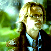
Yeah, I know, this looks like crap, but I'm not done yet. This is a case where I don't remember exactly what I did. I think I originally came up with these settings while adjusting the levels for a different set of underlying layers that I eventually deleted, but I ended up keeping this levels layer.
Sometimes, I set adjustment layers to soft light, and that's what I did here:

Setting the levels layer to soft light gets rid of that greenish-blue overtone that the layer cast on the image, and Rush has a more natural skin tone once more.
At this point, I thought the contrast was a little too high and the shadows on his face a bit too dark, so I turned down the opacity of the layer to 52%:
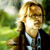
The coloring is okay, but I wasn't particularly wild about it, and I wanted to try something different, so I went texture hunting. While looking through my texture folder, I decided to give this one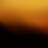
by nasirah a try. So I pasted it onto the icon and set it to multiply.
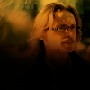
I liked the resulting orange coloring, but I didn't like how the bottom black part of the texture cut off Rush right under the chin, so I dragged the texture down a bit and used the smudge tool to spread the texture upward and fill the gap I created at the top of the layer:
drag down: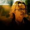
smudge up ->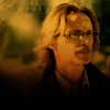
So, if you noticed, the shades of orange in this texture cover a gradient of light to dark. By dragging the texture downward, the lighter shades of orange are now dominating the image and I've lost the deeper orange hues that I was drawn to earlier. To try and get that back, I just duplicated the layer. But then I had the opposite problem: the oranges are too dark now, so I turned down the opacity of the duplicate layer down to 54%:
Duplicate: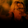
-> Set to 54% opacity: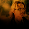
Next, I took this texture:
by cielo_gris , pasted it onto the icon, set it to multiply, rotated it horizontally, and then dragged it to the left until the black area wasn't obscuring too much of the image:
Multiply: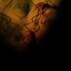
-> Flip horizontally: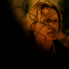
-> Drag to left: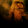
This way, I just have the squiggles on the left to add a bit of visual interest and detail.
I've always gravitated toward grunge textures, and in this instance, I felt like Rush needed a little bit of grunge here. So I used this texture: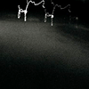
by ohfreckle . When using white grunge textures with a black background like this, I usually try setting it to screen first. The black is hidden, only showing the white. But in this case, it washed out the colors of the image.
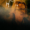
When this happens, I usually try either lowering the opacity of the texture, or setting it to lighten. I've found that lighten is not as strong and sometimes preserves the colors of the underlying image more than the screen mode does. Here, I lowered the opacity to 62%, but still wasn't happy with how washed out the colors looked compared to before adding the texture, so I changed the layer's mode to lighten.
62% opacity: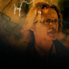
-> Set to lighten: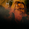
At this point, I didn't like the white squiggly lines on the top, and also decided I didn't like the grunge over Rush's face. I also felt like the left side of the icon needed something to balance it out, so I rotated the texture 90 degrees to the left:
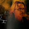
I still didn't like the squiggly lines, so I dragged the layer over more to the left until they were hidden.
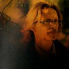
At this point, the icon still seemed unfinished to me. I felt like the image would have more focus and impact if it were smaller or had a border. Its a sort of trend that I've fallen into lately, adding a border.
I hope this part makes sense to everyone. What I usually do in this instance is to flatten the image and resize it to whatever size I feel looks good. To do this, select Layer -> Flatten image, then copy the flattened image to the clipboard by first selecting it (command + A), then copying the image to the clipboard (command + C). These are Mac commands, not sure about PCs, but you can always select from the drop down menu (Select -> All & Edit -> Copy). After I've copied the flattened image, I hit the "undo" button two times to get back to my original, unflattened image, because I don't want to loose all the work I've done on the previous layers, in case I want to go back and tweak something. Since I copied the image before undoing the flatten image command, its still in the clipboard and I can paste (command + V) the flattened version of the icon over my previous work. I usually duplicate that flattened layer before I resize it so I have something to come back to later if I mess up.
In this case, I resized the flattened image to 85%. I wanted the image to be centered on the icon, which is hard to get right when doing it by hand, so I typed the percentages into the tool bar:

By doing this, Photoshop scales it down equally on all sides, so it stays centered.
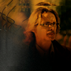
Next, I pasted a white background behind the image to form the border. In this case, I had a texture on hand that was white and I just pasted it behind the image. Alternatively, you could create a white solid fill layer.

I wanted to soften the edges a bit so it would blend more smoothly with the border, so I duplicated the image, then blurred the bottom duplicate layer a few times (from the drop down menu: Filter -> Blur -> Blur). I cant remember how many times I hit the blur button on this particular icon, probably twice. I didn't think the edges were quite soft enough, so I duplicated the blurred layer.
Blurred layer underneath: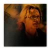
-> Duplicated blurred layer:
The image seemed a little dull and flat so I duplicated it and set to soft light, but that was too overpowering. Instead of looking flat, it looked overly dark and contrasted, so I turned down the opacity of the layer to 42%. The opacity of the soft light layer is something that you have to tweak with each individual image.
Soft light: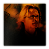
-> Soft light set to 42%: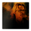
I didn't like how flat white the border was, so I added this texture: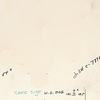
by ohfreckle , set to multiply 100% and erased the part of the texture over Rush's face:
Texture set to multiply: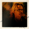
-> Erased over the face: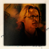
I really liked the curved, tiny script/text on this texture and wanted it to show up on the darker parts of the image as well, to help give the icon a more cohesive feel. So, I duplicated the texture, made it black & white, and set it to screen. To do this, I created a black and white gradient map layer (Layer -> New adjustment layer -> Gradient Map), then merged the gradient map with the texture underneath, and set the blend mode to screen.
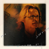
Then I dragged the new black & white version of the texture under the original version of the texture so that it doesn't cover the text in the border:

And I'm finally done. Here's some caps of what the layers look like if you want to put it all in perspective:
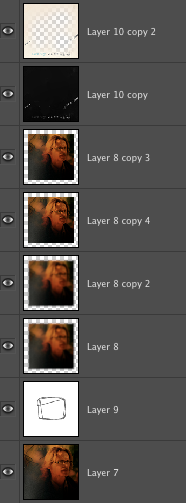
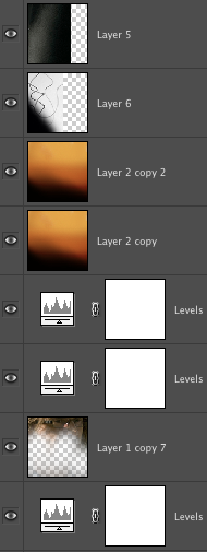
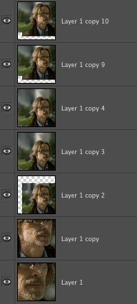
I hope that all made sense. If you have any questions or need any clarification, feel free to ask.
Going from this:

to this:

Using Photoshop Elements 6
Let me preface this by saying that sometimes, when I make an icon, I have no idea what I'm doing and just try all sorts of random stuff that looks like crap until I tweak it a bit. Sometimes I stumble across something cool looking by accident. Sometimes the process I follow is a hot mess. This icon was one of those hot messes. It was also made about a year ago, so my memory is a bit rusty and some of the steps are going to differ from what I actually did, since I basically wrote this while deconstructing the PSD. I may have gone into too much detail, but I figure more is better for those less proficient in Photoshop.
First, I just pasted the original image of Nicholas Rush into a 100 x100 canvas. I then duplicated and resized the image so that Rush was positioned in the bottom, right corner. Note: I always try to duplicate layers before I make any changes to them. That way, I can have something to go back to later if I mess something up.
To resize, I select the layer I want to adjust, use the Move tool, and click on a corner of the image to get the transform option. Alternatively, from the top drop down menu, you could also go to Image-> Transform -> Free transform. It gets you do the same place. Then I manually adjust the size by dragging the corners of the image until it is at a size and location that I like. Just make sure that the Constrain Proportions box in the top tool bar is selected in order to maintain the aspect ratio of the image.
And this is what I got after resizing:

I then used the smudge tool to blend the image outward and fill the gaps my crop left on the 100 x 100 canvas. I usually use a soft edged brush when doing this. For a bit more information on using the smudge tool to extend caps, see this tutorial by me or this one by shoqolad .

The image is very dark, so I duplicated the layer and set it's blend mode to screen in order to lighten it a bit.

Duplicating an image and setting it to screen is usually one of the first things I do, but in this case, I knew I was going to be smudging and blending the image upward, and I didn't want to have to go back and do that for both the original and screened images.
For some reason (I'm not sure why in hindsight), I didn't like how low Rush's head was in the composition, so I selected both the "normal" and "screened" layers (you can select multiple layers at once by holding down the shift key while clicking the desired layers), duplicated them, and then dragged them upward a bit.

The image still looks a bit dark, so I used a levels adjustment layer to brighten it. For more information on using levels to adjust brightness and contrast, see my previous tutorial. These are the settings I used here:
RBG channel: 13, 1.79, 249
And the result:

Now this is where things get a bit funky. At some point while making this icon, I must have tried to incorporate duplicate images of Rush. I didn't end up going that route, but the remnants of that attempt are still incorporated in the icon in a different way.
Basically, I used this closer crop of Rush's face:

And used the erase tool to remove most of it except for the eyes:

I obviously didn't like how this looked, but when set to soft light, it accentuates the shadows on Rush's face.
Before:

-> Image set to soft light:

The image looked a little flat, so I created another levels layer to increase the contrast a bit. Here are the settings I used:
RBG channel: 30, 0.81, 230

I created a third levels layer to adjust the color. This is something that I tweak and experiment individually with each cap. Again, you can check out my previous tutorial using levels to adjust coloring. These are the settings I used for this particular cap:
RBG: 0, 1.00, 255
Red: 0, 0.70, 255
Green: 28, 0.94, 206
Blue: 47, 1.43, 201
And the result:

Yeah, I know, this looks like crap, but I'm not done yet. This is a case where I don't remember exactly what I did. I think I originally came up with these settings while adjusting the levels for a different set of underlying layers that I eventually deleted, but I ended up keeping this levels layer.
Sometimes, I set adjustment layers to soft light, and that's what I did here:

Setting the levels layer to soft light gets rid of that greenish-blue overtone that the layer cast on the image, and Rush has a more natural skin tone once more.
At this point, I thought the contrast was a little too high and the shadows on his face a bit too dark, so I turned down the opacity of the layer to 52%:

The coloring is okay, but I wasn't particularly wild about it, and I wanted to try something different, so I went texture hunting. While looking through my texture folder, I decided to give this one

by nasirah a try. So I pasted it onto the icon and set it to multiply.

I liked the resulting orange coloring, but I didn't like how the bottom black part of the texture cut off Rush right under the chin, so I dragged the texture down a bit and used the smudge tool to spread the texture upward and fill the gap I created at the top of the layer:
drag down:

smudge up ->

So, if you noticed, the shades of orange in this texture cover a gradient of light to dark. By dragging the texture downward, the lighter shades of orange are now dominating the image and I've lost the deeper orange hues that I was drawn to earlier. To try and get that back, I just duplicated the layer. But then I had the opposite problem: the oranges are too dark now, so I turned down the opacity of the duplicate layer down to 54%:
Duplicate:

-> Set to 54% opacity:

Next, I took this texture:

by cielo_gris , pasted it onto the icon, set it to multiply, rotated it horizontally, and then dragged it to the left until the black area wasn't obscuring too much of the image:
Multiply:

-> Flip horizontally:

-> Drag to left:

This way, I just have the squiggles on the left to add a bit of visual interest and detail.
I've always gravitated toward grunge textures, and in this instance, I felt like Rush needed a little bit of grunge here. So I used this texture:

by ohfreckle . When using white grunge textures with a black background like this, I usually try setting it to screen first. The black is hidden, only showing the white. But in this case, it washed out the colors of the image.

When this happens, I usually try either lowering the opacity of the texture, or setting it to lighten. I've found that lighten is not as strong and sometimes preserves the colors of the underlying image more than the screen mode does. Here, I lowered the opacity to 62%, but still wasn't happy with how washed out the colors looked compared to before adding the texture, so I changed the layer's mode to lighten.
62% opacity:

-> Set to lighten:

At this point, I didn't like the white squiggly lines on the top, and also decided I didn't like the grunge over Rush's face. I also felt like the left side of the icon needed something to balance it out, so I rotated the texture 90 degrees to the left:

I still didn't like the squiggly lines, so I dragged the layer over more to the left until they were hidden.

At this point, the icon still seemed unfinished to me. I felt like the image would have more focus and impact if it were smaller or had a border. Its a sort of trend that I've fallen into lately, adding a border.
I hope this part makes sense to everyone. What I usually do in this instance is to flatten the image and resize it to whatever size I feel looks good. To do this, select Layer -> Flatten image, then copy the flattened image to the clipboard by first selecting it (command + A), then copying the image to the clipboard (command + C). These are Mac commands, not sure about PCs, but you can always select from the drop down menu (Select -> All & Edit -> Copy). After I've copied the flattened image, I hit the "undo" button two times to get back to my original, unflattened image, because I don't want to loose all the work I've done on the previous layers, in case I want to go back and tweak something. Since I copied the image before undoing the flatten image command, its still in the clipboard and I can paste (command + V) the flattened version of the icon over my previous work. I usually duplicate that flattened layer before I resize it so I have something to come back to later if I mess up.
In this case, I resized the flattened image to 85%. I wanted the image to be centered on the icon, which is hard to get right when doing it by hand, so I typed the percentages into the tool bar:

By doing this, Photoshop scales it down equally on all sides, so it stays centered.

Next, I pasted a white background behind the image to form the border. In this case, I had a texture on hand that was white and I just pasted it behind the image. Alternatively, you could create a white solid fill layer.

I wanted to soften the edges a bit so it would blend more smoothly with the border, so I duplicated the image, then blurred the bottom duplicate layer a few times (from the drop down menu: Filter -> Blur -> Blur). I cant remember how many times I hit the blur button on this particular icon, probably twice. I didn't think the edges were quite soft enough, so I duplicated the blurred layer.
Blurred layer underneath:

-> Duplicated blurred layer:

The image seemed a little dull and flat so I duplicated it and set to soft light, but that was too overpowering. Instead of looking flat, it looked overly dark and contrasted, so I turned down the opacity of the layer to 42%. The opacity of the soft light layer is something that you have to tweak with each individual image.
Soft light:

-> Soft light set to 42%:

I didn't like how flat white the border was, so I added this texture:

by ohfreckle , set to multiply 100% and erased the part of the texture over Rush's face:
Texture set to multiply:

-> Erased over the face:

I really liked the curved, tiny script/text on this texture and wanted it to show up on the darker parts of the image as well, to help give the icon a more cohesive feel. So, I duplicated the texture, made it black & white, and set it to screen. To do this, I created a black and white gradient map layer (Layer -> New adjustment layer -> Gradient Map), then merged the gradient map with the texture underneath, and set the blend mode to screen.

Then I dragged the new black & white version of the texture under the original version of the texture so that it doesn't cover the text in the border:

And I'm finally done. Here's some caps of what the layers look like if you want to put it all in perspective:


I hope that all made sense. If you have any questions or need any clarification, feel free to ask.