(no subject)
Tutorial #1 Mariska Hargitay
Learn how to get this from this:


Made it PS 8; uses Selective color, so not translatable. Sorry PSP users! You can download the selective color plug in here.
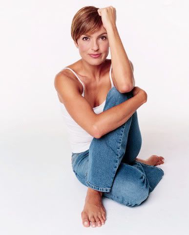
We will start with this picture of Mariska Hargitay from Mariska Resource. Resize your image until you get a nice looking, interesting base.
Now, duplicate your base layer and set it to screen. For this particular image, I am going to decrease the saturation by -40 on the screen layer (Image>>Adjustments>>Hue/Saturation), seeing as Mariska’s skin is already so tan. Were it a paler person, or a less saturated picture, I would have upped the saturation, or not have played with the saturation at all.
I also set my screen layer to 50%, but this will vary with the picture you have. You can wait until the end of the icon to play the the opacity.

Merge visible by clicking the rightward pointing arrow in the right corner of your layers palette and choosing the ‘merge visible’ option.
Now, create a color balance layer (Layer>>New Adjustment Layer>>Color Balance) with these settings:
Midtones: -50, -16, -25

Add a new layer and flood fill it with a bright yellow. I used #FFFC00. Set the blend mode to soft light.


Now, create a selective color layer (Layer>>New Ajustment Layer>>Selective Color) with these settings:
Reds:
Cyan: -100
Magenta: 0
Yellow: +100
Black: +100
Yellows:
Cyan: -23
Magenta: 0
Yellow: -20
Black: 0
Magentas:
Cyan: -100
Magenta: -100
Yellow: -100
Black: 0
Neutrals:
Cyan: 67
Magenta: +12
Yellow: -80
Black +23

Now, the image is still a little light and grainy. So we will add another selective color layer with these settings:
Reds:
Cyan: -100
Magenta: +100
Yellow: +100
Black: +100
Yellows:
Cyan: 0
Magenta: 0
Yellow: -64
Black: 0
Neutrals:
Cyan: 0
Magenta: 0
Yellow: 0
Black: +15
Blacks:
Cyan: 0
Magenta: 0
Yellow: 0
Black: +20

The image is still a little yellow for my liking, so I will fiddle with the hue and saturation to try and fix it. Add hue/saturation layer with these settings:
Hue: -5
Saturation: 7
Lightness: 0

Remember, just because I’m satisfied with the coloring doesn’t mean you have to be! Not every picture is the same, so be sure to fiddle with opacities and settings on all of the adjustment layers until you get something you can be proud of!
Now, to make the base more interested, I duplicate it twice and place the duplicates around my original, erasing what I don’t need. Just to make the icon a little more interesting.

Next, I take this texture made by gender, resize it and set it to multiply on top of all the layers at 80% opacity.
Then, finally, I take this texture made by peoplemachines, resize it and set it to screen and drag it below the multiply texture.
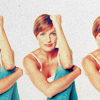
And here is your final result!
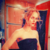
Other icons made using variations on this tutorial:

This tutorial was an elaboration on this tutorial by __belfrycons.
Remember, this tutorial should just be used as a guide, and do not expect it to work exactly the same on every photo. Be creative! If you make something using this tutorial, I’m very curious as to what you came up with.
This is also my first tutorial, so any feedback would be very nice!
Learn how to get this from this:
Made it PS 8; uses Selective color, so not translatable. Sorry PSP users! You can download the selective color plug in here.
We will start with this picture of Mariska Hargitay from Mariska Resource. Resize your image until you get a nice looking, interesting base.
Now, duplicate your base layer and set it to screen. For this particular image, I am going to decrease the saturation by -40 on the screen layer (Image>>Adjustments>>Hue/Saturation), seeing as Mariska’s skin is already so tan. Were it a paler person, or a less saturated picture, I would have upped the saturation, or not have played with the saturation at all.
I also set my screen layer to 50%, but this will vary with the picture you have. You can wait until the end of the icon to play the the opacity.
Merge visible by clicking the rightward pointing arrow in the right corner of your layers palette and choosing the ‘merge visible’ option.
Now, create a color balance layer (Layer>>New Adjustment Layer>>Color Balance) with these settings:
Midtones: -50, -16, -25
Add a new layer and flood fill it with a bright yellow. I used #FFFC00. Set the blend mode to soft light.
Now, create a selective color layer (Layer>>New Ajustment Layer>>Selective Color) with these settings:
Reds:
Cyan: -100
Magenta: 0
Yellow: +100
Black: +100
Yellows:
Cyan: -23
Magenta: 0
Yellow: -20
Black: 0
Magentas:
Cyan: -100
Magenta: -100
Yellow: -100
Black: 0
Neutrals:
Cyan: 67
Magenta: +12
Yellow: -80
Black +23
Now, the image is still a little light and grainy. So we will add another selective color layer with these settings:
Reds:
Cyan: -100
Magenta: +100
Yellow: +100
Black: +100
Yellows:
Cyan: 0
Magenta: 0
Yellow: -64
Black: 0
Neutrals:
Cyan: 0
Magenta: 0
Yellow: 0
Black: +15
Blacks:
Cyan: 0
Magenta: 0
Yellow: 0
Black: +20
The image is still a little yellow for my liking, so I will fiddle with the hue and saturation to try and fix it. Add hue/saturation layer with these settings:
Hue: -5
Saturation: 7
Lightness: 0
Remember, just because I’m satisfied with the coloring doesn’t mean you have to be! Not every picture is the same, so be sure to fiddle with opacities and settings on all of the adjustment layers until you get something you can be proud of!
Now, to make the base more interested, I duplicate it twice and place the duplicates around my original, erasing what I don’t need. Just to make the icon a little more interesting.
Next, I take this texture made by gender, resize it and set it to multiply on top of all the layers at 80% opacity.
Then, finally, I take this texture made by peoplemachines, resize it and set it to screen and drag it below the multiply texture.
And here is your final result!
Other icons made using variations on this tutorial:
This tutorial was an elaboration on this tutorial by __belfrycons.
Remember, this tutorial should just be used as a guide, and do not expect it to work exactly the same on every photo. Be creative! If you make something using this tutorial, I’m very curious as to what you came up with.
This is also my first tutorial, so any feedback would be very nice!