tutorial number 1 - cristina from grey's anatomy
7 STEPS. USING PHOTOSHOP CS.
was requested by cats_like_trees

TO

Includes curves, color balance, hue/saturation and optional selective coloring.
(without it, this is your final result)
Note: Please, do not reproduce the icon exactly. Use this tutorial as a way to learn new techniques of making icons. I don't need to say that applying the same settings to every picture might not turn out as you want. You have to play with the settings and see what works better with your base. I will try to explain all the steps the best I can - for you to know why I used those settings and then to change them yourself acording to your base - but english is not my first language, so if there are anything you don't understand, feel free to ask me.
This is a very simple tutorial. You just have to folow 7 steps. Brighten with curves, increase the magenta with color balance, up the saturation, increase the cyan with color balance and play with selective coloring (optional).
1. Choose a picture. Mine is a Grey's Anatomy screencapture from Striped Wall. Crop and resize it.

2. My base is a little dark, so I needed to make it more bright. If your base doesn't need to be brighten, skip this step.
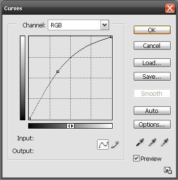
Go to Layers >> New Adjustment Layer >> Curves . Play around with the line until your base looks brighten. My Curves settings are RGB: 88, 147.

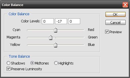
3. Now it is time to examine your base. Try to figure out what colors you need to change (increase or decrease) to achieve a good coloring. In my base, I needed to increase the magenta, because my base was little bit too yellow-ish. So, I added a "Color Balance" adjustment layer (again, go to Layers >> New Adjustment Layer >> Color Balance) and I dragged the second slider to -17.

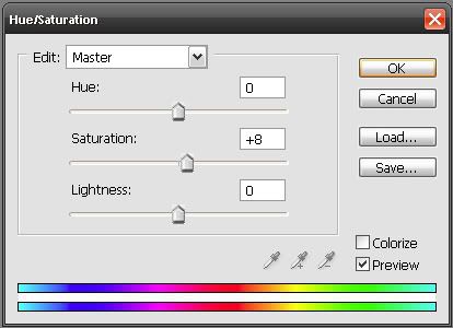
4. Next, I needed more color and brightness. That means that I have to up the saturation. If you need it too, create a "Hue/Saturation" adjustment layer and set the saturation to what you think looks good on your base. I set mine to +8.

5. We can already see some changes (good changes, in my point of view), but it is necessary some contrast. This step was taken from another tutorial by danawashere. Create a new "Curves" adjustment layer, but don't change the settings. Press OK and set this layer to Soft Light. Change the opacity if needed. How does this technique work? This gives you the equivalent of merging all, duplicating, and setting that layer to Soft Light (
danawashere ).

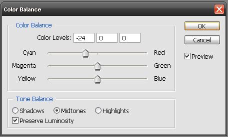
6. Now it is time to examine again your base. Mine is a little bit too red-ish, so I needed to fix it, increasing the cyan with another "Color Balance" adjustment layer. So, I dragged the first slider to -24. This step is optional, because it depends on your icon. If you think your icon doesn't need some adjustments, skip this step.

7. If you use PSP or you don't like selective coloring, stop here.
If you wish to continue, create a "Selective Coloring" adjustment layer. Now, pay attention at your icon. Try to find out what you want to change and play with the settings. I played with the reds, the greens and the cyans. I thought her face was still too red, so I increased the yellow in the reds. The rest of the settings are a little bit random, because it was the result of me just playing with the settings.


And it's done! Hope I helped you and... play around with the settings, because it is fun!
Here is my complete layer palette:
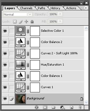
Comments are ♥! // I would love to see your results! // Do you have any questions? Just ask!
And more examples, done with this tutorial ( with some different settings)


