That cropping tute that I was shitting on about a while back? Guess what!
So..... I finished this actually quite a while ago, but wasn't going to post it. I did get quite a few people saying they thought it would be useful in the poll, but when I wrote it up I was pretty much just going "this will help NO ONE. You DON'T know what you're TALKING ABOUT. You're not even THAT GOOD!" so, not so much with the posting. But I am really really REEAAALLY bored right now, and prettyquotable has asked me many a time to post it, and she's a good friend, so I guess if this helps her, it will be worth something.
Ok. Here we go. Remember that this is based on my opinion of what makes a good crop and the way to go about making them. Please don't comment all "I don’t doooo it thaaat waaaay! That's not a good crop. You sucuuuccck". Just… Don't do that. I will become a Bitch. And I have to say, I really didn't know how to go about this. I probably wouldn't have done this at all if it weren't for prettyquotable, because I'm terrible at explaining things, and I think most of this makes me sound like a pretentious jerk, but I tried my best. And sorry if it sucks. Also! I will mostly be using my The X-Files icons and screen caps to demonstrate in this tutorial. The reason is extremely simple- I have deleted all my other screen caps.
1. Screen Caps
This is probably the most important thing, and I can't stress it enough. When saving screen caps, choose images specifically for the crop. There is no use trying to crop an image that is just uncroppable. Yes, I know you really, REALLY love that scene where X and Y were gettin' down and dirty, but sometimes, you just have to let go. If it ain't croppable, it ain't croppable, and that's that. And on the flip side, try and have a crop in mind when searching for screen caps. More often than not, you WILL be able to see the possible crop when you see the image.
So, some examples of croppable images, and what I made them into:
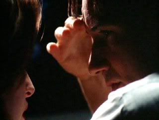
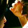
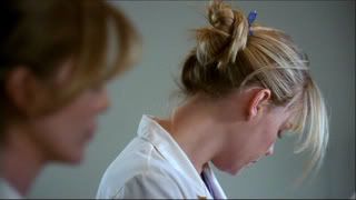
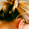
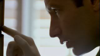
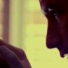
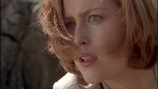
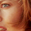
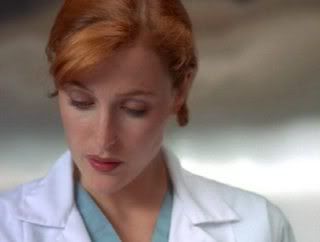
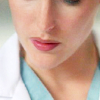
What makes an icon 'uncroppable', you ask. Well, nothing, really. Any image can be cropped. It's just a matter, to me, of whether that crop conveys anything. Does it look good? Does it look interesting? If you answered no to all of these, then it's probably not a good image to crop. I'd generally avoid images where all you see are two peoples' faces taking up the entirety of the image, images that are just boring to look at, and images that have no space to work with.
2. Creativity
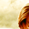
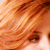
Search for imaginative crops. Half of someone's face? Not so imaginative. Be creative! Look for interesting elements to the image. Is there a lot of negative space? Perfect! Is there HAIR? Hair is key, people. Never underestimate the croppability of hair. Anyone notice I always, always seem to crop Women more than Men? In my The X-Files posts, I guarantee there will ALWAYS be more icons of Scully than Mulder. Why? (Apart from the fact that I love her with the burning fire of a thousand suns). Because her hair is simply better y'all. Hair adds interest, it adds a point of focus. And I know I've seriously talked about hair for about a paragraph, b-b-b-but HAIR!!
LOOK FOR HAIR. USE HAIR. HAIR IS YOUR FRIEND
Examples:
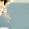
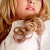
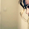
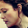
- Is there an interesting element to the image, something that catches the eye, like… Shadow… or a specific light? Look for these things to be the focus.
Examples:
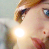
Here, the focus is on the pen light.
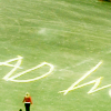
The focus is the writing. Rose is almost completely out of the icon.
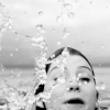
The water made this icon interesting, so I tried to really concentrate on that, and not the crop of Meredith.
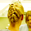
Here, it's the back of Izzy's hair and her braid. And then you have to seek out that Meredith is actually there in the background.
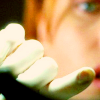
Here, it's Scully's finger.
Draw Focus. What does that mean? I have no idea, but it sure sounds like I know what I'm talking about, no? Anyway, I think an icon is interesting if the eye seeks out the focus of the icon. Push things to the very edges of your icon, remove unnecessary 'noise' from the icon. Pick what you want your focus to be, and try to capture that by crop. Examples:
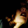
Here, I pushed Scully to the very edge of the icon and made the rest of the space dark.
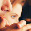
Here, you've got Mulder in the foreground and Scully in the background. The focus is Mulder's hands, but as you look closer, you see Scully in the background. This is probably the best example of what I mean by 'drawing focus'. Seeing something first… And then finding more to the icon.
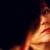
Another example of pushing to the very edge.
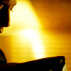
And another.
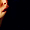
Aaaaand another.
3. Emotion
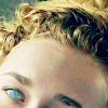
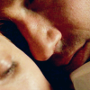
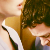
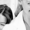
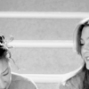
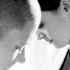
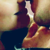
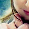
Look for the emotion of the image, and try and capture it. What do I mean by that? Good question! For example, a kissing scene. Is she touching him on the cheek? Are their foreheads touching at any point? You need to get up close and personal! Get in their faces! Still confused? Here:
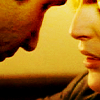
See what I mean? The emotion behind this is the physical action of touching foreheads. You don’t NEED to see the whole of someone's face to understand what that character is feeling It has been conveyed through this action already. So capture it, damn you!
Other examples:
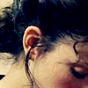
4. Negative space/empty space.
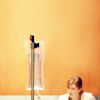
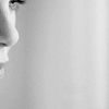
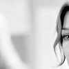
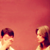
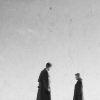
Such a friend to cropping. Look for it! Lots of sky? Fantastic. Possibility for lots of black space? Brilliant! And remember, you can create your own negative space. The rectangular selection tool is such a buddy. Use it! Some examples of when I have used this technique include:
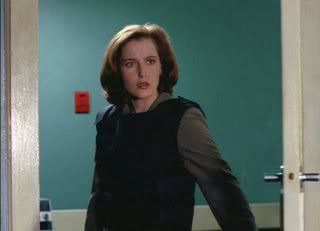
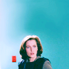
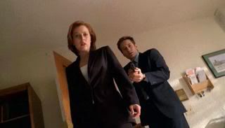
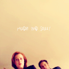
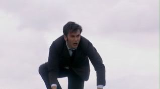
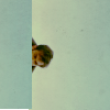
I created negative space by extending the amount of space above the heads of the characters.
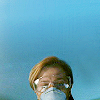
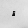
Other examples of negative space:

5. Centering.
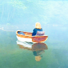
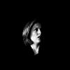
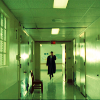
Centering is just… The shit. It makes for a great icon, adds interest and adds focus. Good times. The only thing I would recommend when centering is not to make your point of focus too big. Because then it's not really in the centre, it's the whole icon, which, whilst not necessarily a bad crop, kinda defeats the purpose of centering.
Examples:
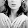
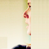
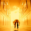
Those are pretty much all the specific tips I can give. To me, the best icons express the emotion of the scene. So try and convey that. Get in their faces, find interesting angles. Play around with different crops, don't necessarily settle for your first try. If you just don't feel the crop, ditch it. Try again with a different image.
Now, I thought I'd show some of my favourite icons of mine that I really like the crop, and try and explain why I think they work.
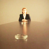
I like this crop mainly because of the ashtray in the foreground. Scully sits alone at the end of this huge table, and then there's the ashtray. I think it just ads a real sense of anticipation. Also, it looks cool. An ashtray! Wheeee!
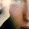
I like this because it makes you feel like you're the patient Scully is shining that light onto. It's really personal in a doctor/patient kind of way, and the light really brings out Scully's blue eyes.
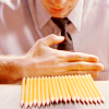
This icon is just fun, to me. You're just right into the moment where Mulder is so concentrated on getting those pencils exactly even.
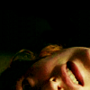
This is one of my favourites. The anguish on Scully's face is great, and I like how the mouth is the main focus, because that's where most of her expression stems from. The black empty space adds that feel of loneliness.
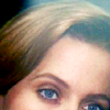
This icon…. I really like how Scully's eyes are the focus. It feels intimate to me, how the eyes are so blue and she just looks like she's… Pondering. Or something. I like it.
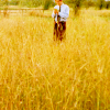
Mulder, alone in the field, squashed into the top of the icon. I like the way it makes him seem so alone and thoughtful. The fields add a nice interest and colour to the icon, but I mostly like how Mulder is just this figure in the background.
And from other icon makers

By call_me_daisy
I adore the kind of… Urgency and excitement this icon has. The way that Meredith is just out of the side of the icon gives a sense that she's leaving, she's going somewhere. Plus, it's just a beautiful icon.
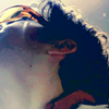
By call_me_daisy
I just… LOOK AT IT. So much perfection. I really can’t add much more to that. It is perfect. (I could pretty much just use every single one of call_me_daisy's icons, but it would be redundant. Please, just go to her journal and…. Love.)

By thatlldopig
I love this crop. It makes Scully look so… Concentrated. To me, it embodies what Scully does- She tries to find answers through science. And it's all right there in the icon. Lovely.

By foxestacado
Brilliant. Just love this. The hair is the focus, but I love the way Scully is looking away into the edge of the icon. And the way the shadow falls across her face just adds this darkness and… Vulnerability. I love it.

By orangespaces
This is just the PERFECT example of a couple icon that has the most minimal amount of the couple in it. You see the back of Donna's head, her hair, and the very front of Josh's face, which is slightly blurred. The focus of the icon is actually in-between these two. You don’t really see the expressions on either of their faces, but you can feel the comfort between them. I kinda love it, oh yes I do.
I hope that helped some of you. I didn't really know how to go about this, as cropping isn't exactly something you can tell someone specifically, but anyway. I really hope you get something out of this.
One last tip. If you do want to improve in the cropping department, I strongly suggest not using the crop tool. Resise your image, copy and paste onto your blank canvas, and experiment. I just think the crop tool doesn't really leave any room for moving the image around and seeing what works. Of course, if it works for you, don’t worry about it. If it ain't broke, don't fix it.
And also, cropping doesn't necessarily make a good icon. It makes for a good icon for me, because cropping and colouring is all I do, really. I'm not that imaginative, and I'd probably fail miserably if I tried to make the beautiful creative icons of boxed and iamalreadyinuse, but if you have a style that doesn't centre around cropping, so be it. This is just a few tips in what I think works and doesn't work. Make of it what you will. Don't abuse me! I tried! MUMMY!
If you think I have missed something you would like to know/try, please, ask.
Ok. Here we go. Remember that this is based on my opinion of what makes a good crop and the way to go about making them. Please don't comment all "I don’t doooo it thaaat waaaay! That's not a good crop. You sucuuuccck". Just… Don't do that. I will become a Bitch. And I have to say, I really didn't know how to go about this. I probably wouldn't have done this at all if it weren't for prettyquotable, because I'm terrible at explaining things, and I think most of this makes me sound like a pretentious jerk, but I tried my best. And sorry if it sucks. Also! I will mostly be using my The X-Files icons and screen caps to demonstrate in this tutorial. The reason is extremely simple- I have deleted all my other screen caps.
1. Screen Caps
This is probably the most important thing, and I can't stress it enough. When saving screen caps, choose images specifically for the crop. There is no use trying to crop an image that is just uncroppable. Yes, I know you really, REALLY love that scene where X and Y were gettin' down and dirty, but sometimes, you just have to let go. If it ain't croppable, it ain't croppable, and that's that. And on the flip side, try and have a crop in mind when searching for screen caps. More often than not, you WILL be able to see the possible crop when you see the image.
So, some examples of croppable images, and what I made them into:


What makes an icon 'uncroppable', you ask. Well, nothing, really. Any image can be cropped. It's just a matter, to me, of whether that crop conveys anything. Does it look good? Does it look interesting? If you answered no to all of these, then it's probably not a good image to crop. I'd generally avoid images where all you see are two peoples' faces taking up the entirety of the image, images that are just boring to look at, and images that have no space to work with.
2. Creativity
Search for imaginative crops. Half of someone's face? Not so imaginative. Be creative! Look for interesting elements to the image. Is there a lot of negative space? Perfect! Is there HAIR? Hair is key, people. Never underestimate the croppability of hair. Anyone notice I always, always seem to crop Women more than Men? In my The X-Files posts, I guarantee there will ALWAYS be more icons of Scully than Mulder. Why? (Apart from the fact that I love her with the burning fire of a thousand suns). Because her hair is simply better y'all. Hair adds interest, it adds a point of focus. And I know I've seriously talked about hair for about a paragraph, b-b-b-but HAIR!!
LOOK FOR HAIR. USE HAIR. HAIR IS YOUR FRIEND
Examples:


- Is there an interesting element to the image, something that catches the eye, like… Shadow… or a specific light? Look for these things to be the focus.
Examples:

Here, the focus is on the pen light.

The focus is the writing. Rose is almost completely out of the icon.

The water made this icon interesting, so I tried to really concentrate on that, and not the crop of Meredith.

Here, it's the back of Izzy's hair and her braid. And then you have to seek out that Meredith is actually there in the background.

Here, it's Scully's finger.
Draw Focus. What does that mean? I have no idea, but it sure sounds like I know what I'm talking about, no? Anyway, I think an icon is interesting if the eye seeks out the focus of the icon. Push things to the very edges of your icon, remove unnecessary 'noise' from the icon. Pick what you want your focus to be, and try to capture that by crop. Examples:

Here, I pushed Scully to the very edge of the icon and made the rest of the space dark.

Here, you've got Mulder in the foreground and Scully in the background. The focus is Mulder's hands, but as you look closer, you see Scully in the background. This is probably the best example of what I mean by 'drawing focus'. Seeing something first… And then finding more to the icon.

Another example of pushing to the very edge.

And another.

Aaaaand another.
3. Emotion
Look for the emotion of the image, and try and capture it. What do I mean by that? Good question! For example, a kissing scene. Is she touching him on the cheek? Are their foreheads touching at any point? You need to get up close and personal! Get in their faces! Still confused? Here:

See what I mean? The emotion behind this is the physical action of touching foreheads. You don’t NEED to see the whole of someone's face to understand what that character is feeling It has been conveyed through this action already. So capture it, damn you!
Other examples:


4. Negative space/empty space.
Such a friend to cropping. Look for it! Lots of sky? Fantastic. Possibility for lots of black space? Brilliant! And remember, you can create your own negative space. The rectangular selection tool is such a buddy. Use it! Some examples of when I have used this technique include:


I created negative space by extending the amount of space above the heads of the characters.
Other examples of negative space:


5. Centering.
Centering is just… The shit. It makes for a great icon, adds interest and adds focus. Good times. The only thing I would recommend when centering is not to make your point of focus too big. Because then it's not really in the centre, it's the whole icon, which, whilst not necessarily a bad crop, kinda defeats the purpose of centering.
Examples:


Those are pretty much all the specific tips I can give. To me, the best icons express the emotion of the scene. So try and convey that. Get in their faces, find interesting angles. Play around with different crops, don't necessarily settle for your first try. If you just don't feel the crop, ditch it. Try again with a different image.
Now, I thought I'd show some of my favourite icons of mine that I really like the crop, and try and explain why I think they work.

I like this crop mainly because of the ashtray in the foreground. Scully sits alone at the end of this huge table, and then there's the ashtray. I think it just ads a real sense of anticipation. Also, it looks cool. An ashtray! Wheeee!

I like this because it makes you feel like you're the patient Scully is shining that light onto. It's really personal in a doctor/patient kind of way, and the light really brings out Scully's blue eyes.

This icon is just fun, to me. You're just right into the moment where Mulder is so concentrated on getting those pencils exactly even.

This is one of my favourites. The anguish on Scully's face is great, and I like how the mouth is the main focus, because that's where most of her expression stems from. The black empty space adds that feel of loneliness.

This icon…. I really like how Scully's eyes are the focus. It feels intimate to me, how the eyes are so blue and she just looks like she's… Pondering. Or something. I like it.

Mulder, alone in the field, squashed into the top of the icon. I like the way it makes him seem so alone and thoughtful. The fields add a nice interest and colour to the icon, but I mostly like how Mulder is just this figure in the background.
And from other icon makers
By call_me_daisy
I adore the kind of… Urgency and excitement this icon has. The way that Meredith is just out of the side of the icon gives a sense that she's leaving, she's going somewhere. Plus, it's just a beautiful icon.

By call_me_daisy
I just… LOOK AT IT. So much perfection. I really can’t add much more to that. It is perfect. (I could pretty much just use every single one of call_me_daisy's icons, but it would be redundant. Please, just go to her journal and…. Love.)
By thatlldopig
I love this crop. It makes Scully look so… Concentrated. To me, it embodies what Scully does- She tries to find answers through science. And it's all right there in the icon. Lovely.
By foxestacado
Brilliant. Just love this. The hair is the focus, but I love the way Scully is looking away into the edge of the icon. And the way the shadow falls across her face just adds this darkness and… Vulnerability. I love it.
By orangespaces
This is just the PERFECT example of a couple icon that has the most minimal amount of the couple in it. You see the back of Donna's head, her hair, and the very front of Josh's face, which is slightly blurred. The focus of the icon is actually in-between these two. You don’t really see the expressions on either of their faces, but you can feel the comfort between them. I kinda love it, oh yes I do.
I hope that helped some of you. I didn't really know how to go about this, as cropping isn't exactly something you can tell someone specifically, but anyway. I really hope you get something out of this.
One last tip. If you do want to improve in the cropping department, I strongly suggest not using the crop tool. Resise your image, copy and paste onto your blank canvas, and experiment. I just think the crop tool doesn't really leave any room for moving the image around and seeing what works. Of course, if it works for you, don’t worry about it. If it ain't broke, don't fix it.
And also, cropping doesn't necessarily make a good icon. It makes for a good icon for me, because cropping and colouring is all I do, really. I'm not that imaginative, and I'd probably fail miserably if I tried to make the beautiful creative icons of boxed and iamalreadyinuse, but if you have a style that doesn't centre around cropping, so be it. This is just a few tips in what I think works and doesn't work. Make of it what you will. Don't abuse me! I tried! MUMMY!
If you think I have missed something you would like to know/try, please, ask.