MAKE TEXT YOUR FRIEND: PART II - TEXT TECHNIQUES
Program(s): Paint Shop Pro
Involves: Basic tips/suggestions
Translatable: Most graphic programs
Steps: 4 Basic Tutorials containing 10, 8, 7, & 4 steps.
Difficulty: Beginner
MAKE TEXT YOUR FRIEND
PART II: TEXT TECHNIQUES & TIPS
I've said it a few times now: text is only your friend if you know how to use it. I can't teach you how to make text look good on any and every icon. I can however teach you some techniques to at least make the text readable on just about any icon. These tutorials will be teaching you how to do just that. Though only practice and time will help you realize what text looks good on which icon and how. Remember however, these are just teaching you a few ways I use. They are not the 'right' or only ways to go about using text. Take what you learn here and apply it.
TECHNIQUE ONE: TEXT SHADOW
TECHNIQUE TWO: TEXT BORDER
TECHNIQUE THREE: TEXT MEETS TEXTURE
TECHNIQUE FOUR: TEXT MEETS BRUSH
BONUS: TEXT TIPS/SUGGESTIONS

STEP ONE
First thing is first, there's no point in adding text if you don't have a decent base. For this particular exercise we're going to start out with a base from the GOOD BASE TUTORIAL.

STEP TWO
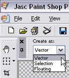
When it comes to text and Paint Shop Pro I suggest always creating the text as a 'Vector' layer. This will help you go back later and change it if need be, without having to erase it.
(To do that select the TEXT TOOL again and click directly on the text you'd like to change.)
STEP THREE
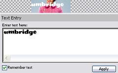
I'm going to use a bold text called teaspoon. Choose TEXT TOOL, click on the icon base and a text box should appear. Type in your text and click apply.
STEP FOUR
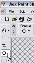
Now select the MOVE TOOL and move your text to where you'd like it.

STEP FIVE
The icon actually looks good without giving the text a shadow, but that is the point of this tutorial so here goes.
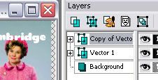
Right click on the text Vector layer in the layer toolbox and select 'duplicate'. You'll now have two layers of the same text.
STEP SIX
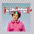
Select the Text Tool again and click directly on the top text layer (on the image, not the layer toolbox). Highlight the text in the TEXT ENTRY window that appears, make the text black. (Feel free to try another dark color depending on your base!)

STEP SEVEN
Select the MOVE TOOL again. Move the black text a few pixles in the direction where you wand your shadow to be.


STEP EIGHT
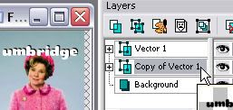
Now, in the layers toolbox on the right side of the program. Select the top layer (the black text), left click on it (keep your mouse button down) and drag it down below the other text/vector layer. Now you have shadow!
STEP NINE
If you would like to make the shadow less sharp you can blur it. To do that choose ADJUST from the top toolbar (the one with FILE, EDIT, VIEW etc.). Select BLUR from that drop down menu. There are a few choices of how to blur and how much, but the quickest and easiest is to just choose simply 'blur'. NOTE: Be sure you have the black font layer selected, you don't want to blur the wrong layer.

STEP TEN
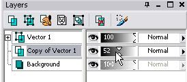
TIP: Don't be afriad to experiment. Especially with the OPACITY. Many times it's best to make the shadow much less than 100% opacity. You want to give the text a little emphasis, but you don't need the darkest shadow possible to do this.

OTHER EXAMPLES
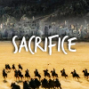
Here are a few other icons using the same effect.

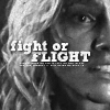


STEP ONE
First thing is first, there's no point in adding text if you don't have a decent base. For this particular exercise we're going to start out with a base from the GOOD BASE TUTORIAL.
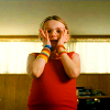
STEP TWO
Next you need to create a new Rastor layer. Click on the button pointed out by my cursor in the image to the right and just click 'ok' when the window pops open.
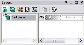
STEP THREE
We're going to fill that layer completely with black. Select the 'Flood Fill Tool', then select the color black from the color palette. Click on the image (be sure the top layer/new raster layer is selected/highlighted) and it should fill that layer with black.

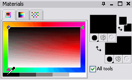
STEP FOUR
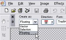
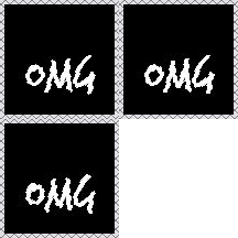
Next select the Text Tool and type in your text. Be sure the color of the text is a lighter shade, so it can be seen well when outlined in black. Also, before you hit Apply, you must set the text to 'Floating' under the 'Create As' option. Now hit apply. The text should look like it's being outlined by a blinking dotted line. As you will see in your layers toolbox the text is considered a 'floating selection' The text does not need to be in a certain place yet, just make sure that it's within the visible black area.

STEP FIVE
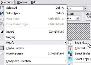
Now select 'Selections' from the very top toolbar. From that drop-down menu select 'Modify', from that drop-down menu select 'Expand'. From this window you can choose how many pixels to expand, or basically how many pixles you wand your border to be. (One or two is usually sufficient.)
STEP SIX
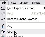
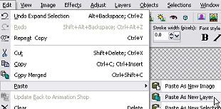
Next go to the top toolbar again and click 'Edit', select 'Copy' from the drop-down menu. After that go to 'Edit' again, this time select paste and then 'Paste As New Layer' from that drop-down menu. Through all of this be sure that the top layer is still selected, the 'floating selection' will have been gone since you selected to 'Expand'.
STEP SEVEN
You may now erase Raster Layer 1, that layer has served it's purpose as a black base for your border. You should now be left with the background and Raster Layer 2 which has your now bordered text on it. You may still have that dotted blinking line, but it has no effect on your text now. Click CTRL and D at the same time to 'deselect'. (This is a shortcut, you can also go to 'Selections' then select click 'Select None'.)

STEP EIGHT
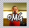
And there you have it! A text with border. You can use your 'Move Tool' to place the text wherever you please as, as well as add any other effects you see fit. While this isn't my first choice of text technique for this image, the purpose was to teach you how to create a border and hopefully you now know how to do that! :)
SIDE NOTE: I suggest saving your icons as .png files as opposed to .jpg or .gif. The quality of your icon will be much clearer. This goes for any graphic you make or save from someone's graphic community.


NOTES
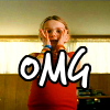
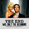
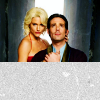
There is certainly more than one way to use a texture, as well as more than one way to use a texture with text. I'll be showing you one way that I use most often, and then you can experiment with other ways or find other tutorials for specific effects. This (icon to the right) is the final product we'll be achieveing. It's simple yet effective.
STEP ONE
First thing is first, there's no point in adding text if you don't have a decent base. For this particular exercise we're going to start out with a base from the GOOD BASE TUTORIAL.

STEP TWO
Select your texture. For this tutorial (and more times than not) I'll be using a basic grungy grey texture by sanami276. If you click the link you'll see it's well over 100x100 pixels. I prefer my textures that way. I can move it around and choose just the right part of the texture to use. I prefer having one very large texture than 10 small ones, it's just much more versatile.
Good places for textures:
Search for 'textures' at deviantART.
ownthesunshine
tragic_icons
dearest
...to name a few...
STEP THREE
Copy and paste that texture as a new layer over your existing base (on top of all your other layers).

STEP FOUR
Now, you can either erase the portion of the texture you do not want or move the texture so that the edge is covering the little bit you want it to cover. If you erase be sure to set the erase tool to 100% HARDNESS so it will be a straight edge.
STEP FIVE
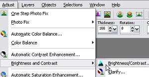
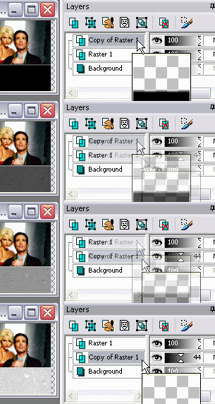
I don't do this every time I use a texture this way, but sometimes it's nice to add a shadow. It helps to give the texture and icon a little depth. To make a shadow of the texture I duplicate the texture layer (right click on the layer in the layer toolbox and select 'duplicate'). I then set the brightness/contrast so that the texture will become totally black. Now go to 'Adjust' (very top toolbar), 'Blur' then 'Blur More'.


STEP SIX
Next left click on the blackened texture layer and drag it below the grey grungy texture. You now have a shadow for your texture. Play with the opacity a bit, remember: less is more.
STEP SEVEN
Now all you need to do is add your text. For this I highly suggest you create your text as a 'Vector' layer. As I said before this will enable you to change the text later, as well as play with the angle etc. Experiment with it!
I also added some tiny text for a little extra detail. I'll be addressing tiny text at the very end of this post.


OTHER EXAMPLES
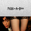
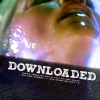
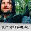
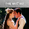
Here are a few other icons using the same effect except with different textures.
It also can look interesting if you use both the texture AND a shadow effect, like the very last example. Put the text over the edge of the texture and give the text and/or the texture a shadow. Or use a white text on the grey texture and then use a shadow.

NOTES
Brushes seem to grow on trees these days, so you shouldn't have a problem finding them. Finding ones you can find something to do something with is a bit harder though.
The same goes for brushes as with textures: there are many ways to use a brush or a brush with text, but I'm going to show you the one way I use the most.
CREATING A BRUSH
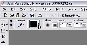
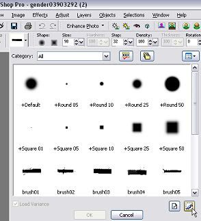
After you've downloaded some brushes open them in Paint Shop Pro. As far as I know you'll have to do this one at a time, so be patient. When you have a brush selected click on the brush selector (indicated by the cursor in image one on the right). Now go to the bottom right and 'Create brush tip from selection'. It won't let you create a brush any bigger than 500x500 pixels. In the small window that appears you'll be able to name the brush and give proper credit to who made it. When you hit select you're set! You'll now always be able to select this brush from the brush selector. This way you'll also be able to make it any size or color.
STEP ONE
First thing is first, there's no point in adding text if you don't have a decent base. For this particular exercise we're going to start out with a base from the GOOD BASE TUTORIAL.

STEP TWO
Choose your brush. For this tutorial I'll be using the brush on the right by dearest (formerly gender). You can find the brush pack that brush is from on deviantART HERE. I already have it loaded as a brush so I can make it small enough to fit on my icon.
(To do that select the TEXT TOOL again and click directly on the text you'd like to change.)

STEP THREE
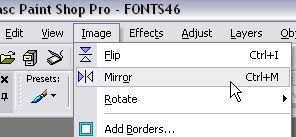
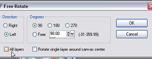
This is all really very straight forward and subjective. Just place the brush where you think it fits best. You don't need the entire brush on the icon, you could use just a small portion like I am here. To make the brush stand out a bit more I gave it a shadow the same way I gave the texture a shadow in Steps Five and Six of the previous tutorial. Don't be afraid to experiment with positioning. Utilize your 'Mirror', 'Flip' and 'Rotate' options. If you rotate be sure that 'All layers' is not selected, you'll only really want to rotate the brush not the entire image with it.


SIDE NOTE
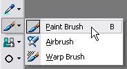
Remember: LAYERS ARE YOUR FRIEND. When you go to put the brush on using the Paint Brush tool create a New Raster Layer! If you don't you will paint over your background/original image and will not be able to rotate or move the brush.

STEP FOUR
Now add your text. For text on brushes you'll need some of the ones that look good when small (Georgia, Stamp etc.). Like I keep saying, experiment! Try different fonts to see how they look small. Use a bold font for one large word then a smaller font for some more text below it. I added some tiny text again for detail, something I'll address at the end of the post.
As with textures you can add a text shadow on the brush to add more detail and depth. Just don't overdo it, keep the opacity lower. Experiment.

OTHER EXAMPLES
Here are a few other icons using the same effect.
PLACES TO FIND BRUSHES:
100x100_brushes
brushaddicts
icon_extras


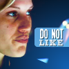


-TINY TEXT. It's not really text, it just looks like it! It's basically a brush that has one or more dotted lines. Though to make those brushes people can take text and resize it till it's unreadable, those are usually the best tiny text brushes to snag. You can usually tell the difference between those and the ones people literally just made with a dotted line.
-BAD TINY TEXT BRUSHES. If you can just barely make out what it says it's not a good text brush. You don't want people to be distracted trying to figure out what the tiny text says, you want them to focus on the subject of your icon. 'Dotted line' doesn't work well either, you don't want to be able to read it but you at least want it to look like actual tiny text.
-Don't overuse tiny text! Slapping a tiny text brush on an icon to fill space can help, but not if it looks like an essay length brush.
-Decent tiny text brushes: HERE by Bourniio, HERE by MrsSpock, HERE by ShalafiRach. There are many more good tiny text brushes out there, just search for it in LJ interests or do a search at DeviantART.
-TEXT BRUSHES, JUST DON'T. It's not the same as tiny text. What is a text brush? THIS IS. I don't use them, though I used to. Beginners tend to use them before they get a handle on using text. I suggest you just keep experimenting with your own text. Taking someone else's is a bit uncreative and unoriginal. There could be fifty icons out there with the exact same text brush. That's a lot more noticable then using the same texture.
-Try mix different font types. One line of big and bold font with a line of a smaller font underneath.
-Try mixing capitalized words with lower case words.
-Again, try mixing things up. This time with colors. Do the same as the two above suggestions except make them two different complimenting colors.
-Text doesn't always need to be 100% in the icon, just so long as you can read it you're good.
-You don't always need a texture, brush or shadow to make text stand out. If you choose the right colors it could stand out for itself.
-Experiment with text position. Put it over the side of a face or even erase part of it to make it look like it's behind something.
-When in doubt ask. If you're not sure how a new font technique you're trying out is turning out ask someone what they think. Whether it's me, a LJ friend or family member. Ask them to be honest and what you could do better.
-Remember, less is more. If you're not sure the text looks good leave it off. OR make one icon with the text and one without, post both and let people decide which they like best.
TUTORIAL SERIES:
INTRODUCTION
A GOOD BASE
BEGINNERS GUIDE TO FONTS
>>>TEXT TECHNIQUES<<<
BLEND MODES; BRUSHES & TEXTURES: THE DO'S AND DON'TS
Involves: Basic tips/suggestions
Translatable: Most graphic programs
Steps: 4 Basic Tutorials containing 10, 8, 7, & 4 steps.
Difficulty: Beginner
MAKE TEXT YOUR FRIEND
PART II: TEXT TECHNIQUES & TIPS
I've said it a few times now: text is only your friend if you know how to use it. I can't teach you how to make text look good on any and every icon. I can however teach you some techniques to at least make the text readable on just about any icon. These tutorials will be teaching you how to do just that. Though only practice and time will help you realize what text looks good on which icon and how. Remember however, these are just teaching you a few ways I use. They are not the 'right' or only ways to go about using text. Take what you learn here and apply it.
TECHNIQUE ONE: TEXT SHADOW
TECHNIQUE TWO: TEXT BORDER
TECHNIQUE THREE: TEXT MEETS TEXTURE
TECHNIQUE FOUR: TEXT MEETS BRUSH
BONUS: TEXT TIPS/SUGGESTIONS

STEP ONE
First thing is first, there's no point in adding text if you don't have a decent base. For this particular exercise we're going to start out with a base from the GOOD BASE TUTORIAL.

STEP TWO
When it comes to text and Paint Shop Pro I suggest always creating the text as a 'Vector' layer. This will help you go back later and change it if need be, without having to erase it.
(To do that select the TEXT TOOL again and click directly on the text you'd like to change.)

STEP THREE
I'm going to use a bold text called teaspoon. Choose TEXT TOOL, click on the icon base and a text box should appear. Type in your text and click apply.

STEP FOUR
Now select the MOVE TOOL and move your text to where you'd like it.


STEP FIVE
The icon actually looks good without giving the text a shadow, but that is the point of this tutorial so here goes.
Right click on the text Vector layer in the layer toolbox and select 'duplicate'. You'll now have two layers of the same text.

STEP SIX
Select the Text Tool again and click directly on the top text layer (on the image, not the layer toolbox). Highlight the text in the TEXT ENTRY window that appears, make the text black. (Feel free to try another dark color depending on your base!)


STEP SEVEN
Select the MOVE TOOL again. Move the black text a few pixles in the direction where you wand your shadow to be.


STEP EIGHT
Now, in the layers toolbox on the right side of the program. Select the top layer (the black text), left click on it (keep your mouse button down) and drag it down below the other text/vector layer. Now you have shadow!

STEP NINE
If you would like to make the shadow less sharp you can blur it. To do that choose ADJUST from the top toolbar (the one with FILE, EDIT, VIEW etc.). Select BLUR from that drop down menu. There are a few choices of how to blur and how much, but the quickest and easiest is to just choose simply 'blur'. NOTE: Be sure you have the black font layer selected, you don't want to blur the wrong layer.

STEP TEN
TIP: Don't be afriad to experiment. Especially with the OPACITY. Many times it's best to make the shadow much less than 100% opacity. You want to give the text a little emphasis, but you don't need the darkest shadow possible to do this.


OTHER EXAMPLES
Here are a few other icons using the same effect.


STEP ONE
First thing is first, there's no point in adding text if you don't have a decent base. For this particular exercise we're going to start out with a base from the GOOD BASE TUTORIAL.

STEP TWO
Next you need to create a new Rastor layer. Click on the button pointed out by my cursor in the image to the right and just click 'ok' when the window pops open.

STEP THREE
We're going to fill that layer completely with black. Select the 'Flood Fill Tool', then select the color black from the color palette. Click on the image (be sure the top layer/new raster layer is selected/highlighted) and it should fill that layer with black.


STEP FOUR
Next select the Text Tool and type in your text. Be sure the color of the text is a lighter shade, so it can be seen well when outlined in black. Also, before you hit Apply, you must set the text to 'Floating' under the 'Create As' option. Now hit apply. The text should look like it's being outlined by a blinking dotted line. As you will see in your layers toolbox the text is considered a 'floating selection' The text does not need to be in a certain place yet, just make sure that it's within the visible black area.


STEP FIVE
Now select 'Selections' from the very top toolbar. From that drop-down menu select 'Modify', from that drop-down menu select 'Expand'. From this window you can choose how many pixels to expand, or basically how many pixles you wand your border to be. (One or two is usually sufficient.)

STEP SIX
Next go to the top toolbar again and click 'Edit', select 'Copy' from the drop-down menu. After that go to 'Edit' again, this time select paste and then 'Paste As New Layer' from that drop-down menu. Through all of this be sure that the top layer is still selected, the 'floating selection' will have been gone since you selected to 'Expand'.


STEP SEVEN
You may now erase Raster Layer 1, that layer has served it's purpose as a black base for your border. You should now be left with the background and Raster Layer 2 which has your now bordered text on it. You may still have that dotted blinking line, but it has no effect on your text now. Click CTRL and D at the same time to 'deselect'. (This is a shortcut, you can also go to 'Selections' then select click 'Select None'.)


STEP EIGHT
And there you have it! A text with border. You can use your 'Move Tool' to place the text wherever you please as, as well as add any other effects you see fit. While this isn't my first choice of text technique for this image, the purpose was to teach you how to create a border and hopefully you now know how to do that! :)
SIDE NOTE: I suggest saving your icons as .png files as opposed to .jpg or .gif. The quality of your icon will be much clearer. This goes for any graphic you make or save from someone's graphic community.


NOTES
There is certainly more than one way to use a texture, as well as more than one way to use a texture with text. I'll be showing you one way that I use most often, and then you can experiment with other ways or find other tutorials for specific effects. This (icon to the right) is the final product we'll be achieveing. It's simple yet effective.

STEP ONE
First thing is first, there's no point in adding text if you don't have a decent base. For this particular exercise we're going to start out with a base from the GOOD BASE TUTORIAL.

STEP TWO
Select your texture. For this tutorial (and more times than not) I'll be using a basic grungy grey texture by sanami276. If you click the link you'll see it's well over 100x100 pixels. I prefer my textures that way. I can move it around and choose just the right part of the texture to use. I prefer having one very large texture than 10 small ones, it's just much more versatile.

Good places for textures:
Search for 'textures' at deviantART.
ownthesunshine
tragic_icons
dearest
...to name a few...
STEP THREE
Copy and paste that texture as a new layer over your existing base (on top of all your other layers).

STEP FOUR
Now, you can either erase the portion of the texture you do not want or move the texture so that the edge is covering the little bit you want it to cover. If you erase be sure to set the erase tool to 100% HARDNESS so it will be a straight edge.

STEP FIVE
I don't do this every time I use a texture this way, but sometimes it's nice to add a shadow. It helps to give the texture and icon a little depth. To make a shadow of the texture I duplicate the texture layer (right click on the layer in the layer toolbox and select 'duplicate'). I then set the brightness/contrast so that the texture will become totally black. Now go to 'Adjust' (very top toolbar), 'Blur' then 'Blur More'.


STEP SIX
Next left click on the blackened texture layer and drag it below the grey grungy texture. You now have a shadow for your texture. Play with the opacity a bit, remember: less is more.

STEP SEVEN
Now all you need to do is add your text. For this I highly suggest you create your text as a 'Vector' layer. As I said before this will enable you to change the text later, as well as play with the angle etc. Experiment with it!
I also added some tiny text for a little extra detail. I'll be addressing tiny text at the very end of this post.


OTHER EXAMPLES
Here are a few other icons using the same effect except with different textures.
It also can look interesting if you use both the texture AND a shadow effect, like the very last example. Put the text over the edge of the texture and give the text and/or the texture a shadow. Or use a white text on the grey texture and then use a shadow.

NOTES
Brushes seem to grow on trees these days, so you shouldn't have a problem finding them. Finding ones you can find something to do something with is a bit harder though.
The same goes for brushes as with textures: there are many ways to use a brush or a brush with text, but I'm going to show you the one way I use the most.

CREATING A BRUSH
After you've downloaded some brushes open them in Paint Shop Pro. As far as I know you'll have to do this one at a time, so be patient. When you have a brush selected click on the brush selector (indicated by the cursor in image one on the right). Now go to the bottom right and 'Create brush tip from selection'. It won't let you create a brush any bigger than 500x500 pixels. In the small window that appears you'll be able to name the brush and give proper credit to who made it. When you hit select you're set! You'll now always be able to select this brush from the brush selector. This way you'll also be able to make it any size or color.


STEP ONE
First thing is first, there's no point in adding text if you don't have a decent base. For this particular exercise we're going to start out with a base from the GOOD BASE TUTORIAL.

STEP TWO
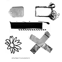
Choose your brush. For this tutorial I'll be using the brush on the right by dearest (formerly gender). You can find the brush pack that brush is from on deviantART HERE. I already have it loaded as a brush so I can make it small enough to fit on my icon.
(To do that select the TEXT TOOL again and click directly on the text you'd like to change.)

STEP THREE
This is all really very straight forward and subjective. Just place the brush where you think it fits best. You don't need the entire brush on the icon, you could use just a small portion like I am here. To make the brush stand out a bit more I gave it a shadow the same way I gave the texture a shadow in Steps Five and Six of the previous tutorial. Don't be afraid to experiment with positioning. Utilize your 'Mirror', 'Flip' and 'Rotate' options. If you rotate be sure that 'All layers' is not selected, you'll only really want to rotate the brush not the entire image with it.


SIDE NOTE
Remember: LAYERS ARE YOUR FRIEND. When you go to put the brush on using the Paint Brush tool create a New Raster Layer! If you don't you will paint over your background/original image and will not be able to rotate or move the brush.


STEP FOUR
Now add your text. For text on brushes you'll need some of the ones that look good when small (Georgia, Stamp etc.). Like I keep saying, experiment! Try different fonts to see how they look small. Use a bold font for one large word then a smaller font for some more text below it. I added some tiny text again for detail, something I'll address at the end of the post.
As with textures you can add a text shadow on the brush to add more detail and depth. Just don't overdo it, keep the opacity lower. Experiment.

OTHER EXAMPLES
Here are a few other icons using the same effect.
PLACES TO FIND BRUSHES:
100x100_brushes
brushaddicts
icon_extras

-TINY TEXT. It's not really text, it just looks like it! It's basically a brush that has one or more dotted lines. Though to make those brushes people can take text and resize it till it's unreadable, those are usually the best tiny text brushes to snag. You can usually tell the difference between those and the ones people literally just made with a dotted line.
-BAD TINY TEXT BRUSHES. If you can just barely make out what it says it's not a good text brush. You don't want people to be distracted trying to figure out what the tiny text says, you want them to focus on the subject of your icon. 'Dotted line' doesn't work well either, you don't want to be able to read it but you at least want it to look like actual tiny text.
-Don't overuse tiny text! Slapping a tiny text brush on an icon to fill space can help, but not if it looks like an essay length brush.
-Decent tiny text brushes: HERE by Bourniio, HERE by MrsSpock, HERE by ShalafiRach. There are many more good tiny text brushes out there, just search for it in LJ interests or do a search at DeviantART.
-TEXT BRUSHES, JUST DON'T. It's not the same as tiny text. What is a text brush? THIS IS. I don't use them, though I used to. Beginners tend to use them before they get a handle on using text. I suggest you just keep experimenting with your own text. Taking someone else's is a bit uncreative and unoriginal. There could be fifty icons out there with the exact same text brush. That's a lot more noticable then using the same texture.
-Try mix different font types. One line of big and bold font with a line of a smaller font underneath.
-Try mixing capitalized words with lower case words.
-Again, try mixing things up. This time with colors. Do the same as the two above suggestions except make them two different complimenting colors.
-Text doesn't always need to be 100% in the icon, just so long as you can read it you're good.
-You don't always need a texture, brush or shadow to make text stand out. If you choose the right colors it could stand out for itself.
-Experiment with text position. Put it over the side of a face or even erase part of it to make it look like it's behind something.
-When in doubt ask. If you're not sure how a new font technique you're trying out is turning out ask someone what they think. Whether it's me, a LJ friend or family member. Ask them to be honest and what you could do better.
-Remember, less is more. If you're not sure the text looks good leave it off. OR make one icon with the text and one without, post both and let people decide which they like best.
TUTORIAL SERIES:
INTRODUCTION
A GOOD BASE
BEGINNERS GUIDE TO FONTS
>>>TEXT TECHNIQUES<<<
BLEND MODES; BRUSHES & TEXTURES: THE DO'S AND DON'TS