A Guide to Colour Normalization
Program(s) version: PSP X2, but the principles should apply in any program.
Involves: Colour Normalization of blue and red-tinted caps, as well as basic colouring tips for natural caps. Brief guides on the colour balance, curves, and levels tools.
Translatable: Yes.
Steps: None and many, all at once! This is a guide, not an A to B type tutorial.
Difficulty: Absolute Beginner. I've geared the guide towards people who are very unfamiliar with their program, but there should hopefully be some tips here that are useful for more experienced users as well. (: I assume a basic understanding of how to create layers, and how layers work.
This guide is very image heavy!
This guide covers, in this order:
-A brief introduction to how colours relate to each other, shadows/midtones/highlights, and the tools I'm using in this guide (colour balance, levels, and curves) for beginners
-Correcting blue screencaps using colour balance, levels, or curves.
-Correcting red screencaps using colour balance, levels, or curves.
-General colouring tips (i.e. odds and ends)
What it is not meant to be:
-an exhaustive list of colouring techniques
-the end point for an image colouring - these are just techniques that I use to get an image to a point where I can then apply other colour adjustments without the images looking horrific
This tutorial is intended to be a guide, not a list of "do this, then this". As such, I'm not going to list any of the exact numbers that I used to achieve the colours - rather, the focus of this tutorial/guide is on understanding the tools, and how you can use them to normalize the colours of whatever picture you are working with. Obviously, this isn't going to be an exhaustive list of various techniques; there is always going to be more than one way to achieve what you want. These are simply the ways that I find myself using most often.
If you've got any questions or comments, don't hesitate to reply to this post and I'd be more than happy to answer your question! If sections of this guide are unclear, it's probably because I don't realize it, so if you find something confusing let me know so I can hopefully reword it to make it clearer.
Preamble.
When I first started iconing, one of the things I found most intimidating was trying to figure out how to get rid of overwhelming colours (usually blue, in screencaps) - however, once I figured out how the colours related to one another, I found it a lot easier to get the results I wanted.
The tools I tend to use the most for colour normalization are the colour balance, curves, and levels tools. While there are plenty of tutorials out there that teach people how to use these tools (and I've listed some of them at the bottom of this guide), I'll include a brief primer for people who have never used them before or have used them, but don't really know how they work (just that they do).
While the directions are geared towards people who have PSP X2, the ideas behind each of the tools remains the same across programs (to the best of my knowledge). You'll probably find the tools under different menus, but the rest should still be applicable.
Colours in General
Most of figuring out how to normalize the colours in a picture relies on being able to figure out what colour is the predominant colour, and what the opposite of that colour is. If I'm stumped, I usually just refer to the colour wheel in my program:
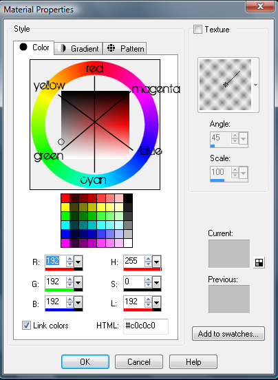
Obviously, this is labelled very roughly, but the 'important' colours and relationships are labelled. When you're working with colours (and specifically, trying to get rid of or add certain colours) it's useful to know which colour is the 'opposite' of the colour you're working with. So, as you can see by my nifty labelled colour wheel above, the opposite of Red is Cyan, of Blue is Yellow, and of Green is Magenta.
So, logically, if you're trying to get rid of a lot of blue in your image, adding yellow will go a long way to reducing the blueness of your picture.
Shadows, Midtones, and Highlights
The best explanation I can give of Shadows, Midtones, and Highlights is that they refer to the darkness of the grays in the image, assuming that you have gray-scaled the image. The greater the range from shadows to highlights, the greater the contrast of your image.

When you're changing the colours of an image, it is important to understand the differences between Shadows, Midtones, and Highlights of the images so you know what aspect of the image you're adding colour to or removing colour from. If you imagine your image gray-scaled, you'll be able to guesstimate what areas of your image are the shadows, midtones, or highlights, but as a general rule of thumb the darkest areas are the shadows, the brightest/whitest areas of the image are the highlights, and the areas in between are the midtones.
Colour Balance
The colour balance tool can be found under Layers > New Adjustment Layer > Color Balance. It will open up and look something like this:
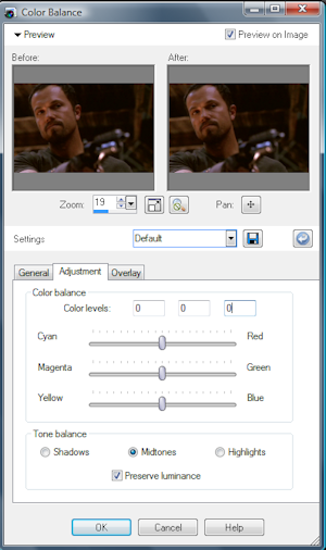
The three radio buttons at the bottom (Shadows, Midtones, and Highlights) and the sliders themselves are the parts of the box that you'll find yourself using the most. I rarely uncheck 'Preserve Luminescence'. Usually I start my adjustments with the shadows, but this isn't an exact science. Start your adjustments wherever you feel the most comfortable (or possibly, would like to see the most change).
Moving the sliders either left or right adjusts the amount of that colour in the image. So, moving the midtones Red slider right (towards the 'Red' end) increases the amount of red in the midtones of the image. Moving it left increases the amount of cyan in the midtones. Adjusting the same slider under the Shadows radio button increases the amount of red or cyan in the shadows of the image.
Levels
The levels tool can be found in two places in PSP X2. The first instance of the levels tool will only adjust the layer that you have selected and not the entire image that you are working on - it can be found under Adjust > Brightness and Contrast > Levels. This is useful if you are working with multiple layers of the same image, and you only want to adjust the colouring of (for instance), the layer that you've set to screen.
The second instance of the levels tool, and the one that I use more often, creates a new adjustment layer, which will then adjust the colouring of all of the layers below it. It can be found by going Layers > New Adjustment Layer > Levels. The tool looks something like this:
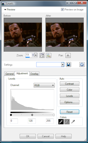
Under the Channels drop down box you have four options: RGB, Red, Green, or Blue. RGB adjusts the entire image as a whole (or, the Red, Green, and Blue channels all at once). The Red channel adjusts only the reds in the image, the Green the greens, and the Blue the blues.
I primarily use the RGB channel to adjust the contrast of the image I'm working on. The other three channels come more in handy when it comes to actual colour correction.
Each of the three diamonds below the diagram adjusts a different aspect of the image; the diamond furthest to the left (the black one) adjusts the shadows, the middle diamond adjusts the midtones, and the white diamond furthest to the right adjusts highlights. So, by dragging the white diamond further to the centre, a person is increasing the highlights (or reds, greens, blues) of the image. By dragging the black diamond further towards the centre, a person is increasing the shadows (or cyans, magentas, yellows - the 'opposites' of red, green, and blue) of the image. By dragging the midtones (gray) diamond left, a person is increasing the highlights (red, green, blue) of the image; by dragging the diamond right, a person is increasing the shadows (cyan, magenta, yellow) of the image.
Curves
As with the levels tool, the curves tool can be found in two places in PSP X2. The first place (Adjust > Brightness and Contrast > Curves) only alters the layer that you have selected, and not the entire image, but otherwise functions the same as the curves adjustment layer.
The curves tool that I use in this tutorial is the curves adjustment layer - Layers > New Adjustment Layer > Curves. This creates a new layer which adjusts all of the layers below it.
The curves tool opens up in a box like so:
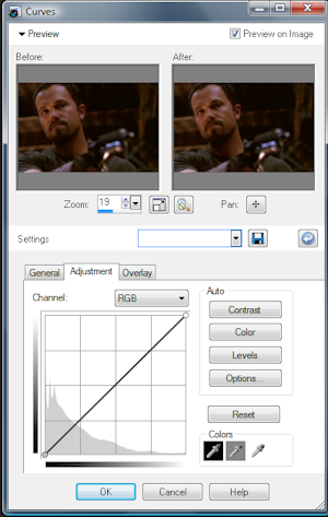
As with the levels tool, there are four channels you can adjust using curves: RGB, Red, Green, and Blue. The RGB channel is used to adjust the brightness and contrast of the image, whereas each of the channels adjusts (surprise XD ) the red/cyan, green/magenta, or blue/yellow of the image, depending on which one you have selected.
For this section, I'll use the red channel for my examples, but the idea is the same for the other channels as well.

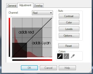
When you adjust curves, you add a point to the diagonal line in the middle and pull the point in one direction or another. Depending on the place where you add the point (to the left or right of the line) you will be adjusting the highlights, midtones, or shadows. The picture on the right isn't an exact example of where the shadows, midtones, or highlights will be on the image - they fall along a gradient, not a solid block of dark/medium/light gray - but it should give you an idea of what point on the line you want to adjust in order to adjust the shadows (or midtones or highlights).
Dragging the point you have created either up or down adds either red or cyan to your image (up for red, down for cyan). The further away from the centre line you pull your point, the greater the curve will be and the more colour you will be adding to your image. Adding more points to the line and pulling them in one direction or another further adjusts your image.
Blue and Green Screencaps.
When it comes to blue screencaps, my first goal is to get rid of the blue - and the way to do that is by adding the opposite of blue, yellow. Adjusting green screencaps is similar to adjusting blue screencaps - by adding the opposite of green, magenta, you can get rid of the green.
Colour Balance
When it comes to adjusting screencaps using colour balance layers, I tend to focus on all three channels - Shadows, Midtones, and Highlights. I don't just play with the Yellow/Blue spectrum, either. Don't be afraid to touch the sliders! You can always push them back to 0 if you don't like the result.

This is my base image. Since it's dark, I duplicate the base twice and set both duplicates to screen.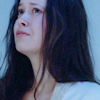

First things first, I start with the shadows. This (click) is what the image looks like when the yellow Shadows slider has been pulled all of the way to the left (-100). Ick. Reducing that even by half is a huge improvement, and for this image, I don't break -40. Whatever your screencap, you're going to want to toy with this until the image has lost some of it's blue-hued skin.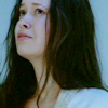

Repeating the above with the Midtones and the Highlights gets me something that's a whole lot closer to natural all ready! The key, here, is to allow yourself to experiment; no two pictures are going to be the same, which is why punching in exact numbers isn't going to get you very far when you're trying a tutorial out on another image. Keep in mind, though, that you want to keep your adjustments (relatively) small. I very rarely find myself making a colour adjustment that goes beyond /-50 on any of the sliders.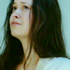

Now, my goal is to add some more fleshy tones into the image. I go up to the red sliders next, since generally speaking most people I know aren't either Green or Magenta. ;) I usually leave those sliders for last and make the smallest adjustments there.
On the red slider, I make slight adjustments towards the right (or red) side of the slider. For this picture, none of the adjustments went above 20, but this might be in part because adding all of the yellow before removed some of the cyan cast of the image.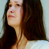

Last but not least, I play with the Green/Magenta slider. Now, in the shadows and the highlights, I touched the slider towards the Green end of the spectrum ever so slightly (no more than 10) in order to brighten up the image. Pushing the slider towards the magenta end of the image makes things darker, but also has the added advantage of adding something slightly more reddish to the tone of the image (versus adding green, which only tends to make people look sickly).
Since I didn't want to make the overall image darker I added green in the shadows and highlights, because this image mostly consists of midtones. My midtones adjustments have had the greatest effects, and when I push the midtones slider towards the green end of the spectrum, River looks terrible. Pushing it towards the magenta side, however, has a more positive effect. Obviously, this is going to vary depending on the contrast of your image, because the greater an image's contrast, the greater the range of tones (shadows, midtones, and highlights) your overall image has.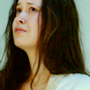
Curves
As with the colour balance tool, I don't just focus on the Blue channel when I'm using curves to correct the colour of an image - I focus on all four. Don't be afraid to experiment; as with the colour balance tool, you can always reset everything or get rid of your points if you don't like the result.

I'll start with the same base image as before, but instead of using a screen layer to brighten the image up, I'll use my curves layer, so I don't have a ton of layers floating around at the end of everything (once I've applied other colouring techniques to the image).
I create a new curves adjustment layer and under RGB create a new point near the middle of the black line, which I then drag upwards to increase the highlights in the entire image. The curve ends up pretty steep, because this is a dark image. (Cap)

Desired brightness achieved, I then move down to the Blue channel. Again, I create a point near the centre of the black line, but instead of pulling up, this time I pull the point down. This adds more yellow to the image. You don't need to make a huge adjustment (as in, your point shouldn't be in the bottom right corner, or anything). (Cap)

The image is still pretty blah looking, so I turn to the other channels at this point. I want to make River's face look a little more flesh-toned, so I add two points on the red curve. The first is near the shadows and the second is near the highlights, and both I pull up slightly. The reason I add two points rather than one in the middle is because this gives me a little more control over how dramatic the curve is - I found when I was just adding one point, the red became too overwhelming. (Cap)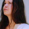

I'm pretty satisfied with where this image is at, but I decide to brighten up the image a bit using the Green curves channel. I add a new point near the bottom of the line (in the shadows) and push it up very slightly, and it brightens the image considerably.(Cap)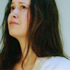
Levels
Last but not least is levels! To shake things up, I'll be working on a picture of Jayne this time.
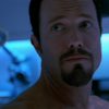
As with the picture of River, this cap is rather dark. I'll use my levels adjustment layer to brighten things up, rather than a screen layer (though that would work just as well). I take the white diamond (the one furthest right) and push it to the left. With this image, it goes past the centre since this picture's rather dark. (Cap)

I scroll down to the Blue channel and this time, only adjust the gray diamond. Most of the blue in this image is in the midtones and the highlights, so I push the midtones right to add more yellow. I don't touch anything else.

Now I move to the red channel. A lot of the blue in this image also seems to be cyan (so, lighter/brighter blue) and so I opt to add more red to the image. This time I adjust the highlights diamond (the white one) by pushing it further left in order to add more red to the image; the midpoints diamond also moves. While the background still remains rather blue/cyan, Jayne's face looks relatively human. I could definitely stop here, if I so chose.

In order to brighten things up and add a little contrast, I go over to the Greens channel. This time I move the shadows diamond closer to the centre (so, right), which adds more magenta to the image. Then, in order to counter the magenta, I move the midpoints diamond to the left, which adds a little green to brighten things up. The change isn't big, but it does add a little more contrast (especially to larger images). (Cap)
Red Screencaps.
The ideas behind adjusting Red screencaps really aren't that different from adjusting Blue screencaps, except you're working in the opposite direction; rather than adding yellow and red, you're adding blue and cyan! Even so, I've written up a guide for each tool (colour balance, curves, levels), just for the sake of thoroughness. (:
Colour Balance

So we begin with a lovely picture of Inara! Obviously, this image is incredibly dark so I duplicate the base twice and set both duplicates to screen.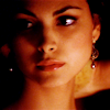

Now we have a very red, but brighter, picture of Inara. In a new colour balance layer, I increase the amount of cyan in the shadows, midtones, and highlights. The midtones and highlights weren't adjust a lot (no more than -15 for either of them), but the shadows needed a bit of help so that was a bigger adjustment.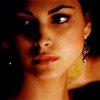

Now onto the other sliders. I increase the amount of blue in the shadows, but when I move to the midtones I decide that adding more blue would probably be detrimental to the whole 'normalization' idea. Instead, I increase the yellows very slightly, so as to add a more natural tone to Inara's skin. Lastly, I go to the highlights and increase the blue just a tad so the yellow and red doesn't look completely overwhelming.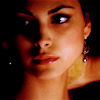

Last but not least, I adjust the Magenta/Green slider. I don't touch the shadows, since I'm satisfied with where the shadows of this image are, but I want to brighten the picture up slightly so I increase the greens in the midtones and the highlights just slightly.
Curves
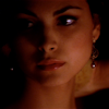
Now we'll be working with a very red image of the lovely Inara. (: First things first, it's time to lighten this image up. Instead of using several screen layers, I open up my curves adjustment layer in order to cut down on the number of layers in the image over all. (Cap)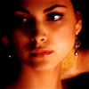

Now that the image is bright enough (for now) I hop down to the Red channel and create a new point near the middle. I start to drag it downwards, but the image gets to be too dark for me so I move the point further to the right and continue pulling down. Eventually, that results in a point that is near the top right of the box. (Cap)

The picture looks better already! In order to warm the image up a bit, since adding cyan cools it down a lot, I go down to the Blue channel and create a new point in the darker-midtones/shadows area and pull down slightly to add a little yellow. It's not a major change, but it does warm things up a little. Then, to increase the brightness of the highlights, I create another point near the top of the line and pull it up, adding a little more blue and brightening things slightly. Overall, it's still a very minor change, but I'm satisfied. (Cap)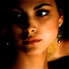
Levels
Last up is levels!
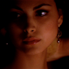
Again, since this is a dark image, I'll use levels to brighten it before adjusting the colouring. I drag the highlights (white) diamond almost halfway across the bottom bar to the left, brightening the image up considerably.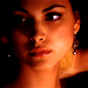

Now to get rid of the red in the image. I move down to the Red channel and pull the midtones (gray) diamond to the right in order to add a great deal more cyan to the image. I also moved the shadows (black) diamond slightly right, but this also has the added effect of darkening the image. (Cap)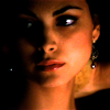

In order to brighten the image somewhat, I go down to the Blues channel and pull the midtones diamond slightly right. This brightens the image and takes away some of the yellowish aspects that still remain in Inara's skintone. At this point, I'm satisfied with the image (aside from its darkness, which can be fixed through later colouring).
General Colouring Tips.
Obviously, this section is going to be heavily influenced by my own personal tastes when it comes to icons and icon-making - there's no real 'right' way to colour an image. This section is geared towards achieving a more 'natural' colouring, or general tips and tricks to get the sort of colours you're going for.
These are tools beyond what I discussed at the beginning and together, these do not create a complete list of all of the tools to use when colouring your images; there are a ton of tools in your graphics program that can be useful for this. These are simply the ideas I find myself using most often, and have noticed cropping up in tutorials most often. Remember: experiment!
Colour Fill Layers
These are the simplest way to alter the colouring of your images. When it comes to colouring images, I tend to use a combination of multiply, burn and soft light layers. I may at some point put together a group of tables to illustrate various combinations of colours and blend modes, but since this guide is both long enough and already ridiculously image-heavy, that will have to wait.
In PSP X2, the layer blend modes can be found in the layer palette. (Cap)
Here's an example of a colouring achieved solely with colour layers and duplications of the base (so, without adjustment layers):

>
After duplicating the base three times and setting the duplicates to screen in order to brighten the image up, I added a new flood fill layer with a light cyan colour that I then set to Burn in order to darken the shadows of the image (and add a blue tinge to them). I then added a new flood fill layer with brown, set to multiply at a low opacity, in order to add some browns to the image. Next, I added a pink layer set to soft light at 50% opacity, partially to brighten the image up and partially to add some pinky-reddy tones to the image (to return things to a less corpse-like flesh tone). Next, I duplicated the base and pulled it to the top of the image, which I then set to soft light and set to around 25% in order to add some contrast to the image. Last but not least, I added a white-black gradient (white on the top) that I set to soft light (around 60% opacity), in order to create a light source coming from the top of the image.
Brightness and Contrast
Personally, I prefer icons that are bright and have a decent amount of contrast, which makes the colouring pop. For example:

>

>

>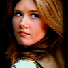
I tend to use Brightness/Contrast layers to increase the brightness of an image without having to use another screen layer (which will wash out the shadows as well as brightening the image) as well as increase the contrast. The Brightness/Contrast tool in PSP XII can be found under Layers > New Adjustment Layer > Brightness/Contrast.
There are several other ways of increasing the contrast:
1. Using curves. To use curves to create contrast, create a new curves adjustment layer and create an 'S' curve in the RGB section. This makes the shadows darker and the highlights brighter, and viola! Instant contrast. You can do something similar using levels, by moving the black and white diamond of the RGB channel towards the centre.
2. Soft light layers. Duplicating your base or copy-merging your entire image and pasting it as a new layer, and then setting this layer to 'Soft Light' will increase the contrast of your image. As well as those two methods, another I occasionally use is duplicating the base and, after setting the image to soft light, adjusting the Hue/Saturation of the duplicated base either to brighten the image, or take the colouring out of the duplicated base. Here's a comparison table:
Base
Base + Coloring
Duplicate Base, Pull to Top
Set to Softlight
Copy-Merge Image
Paste as New Layer
Set to Softlight
Duplicate Base, Set to Softlight
Adjust>Hue and Saturation>Hue/Saturation/Lightness
Grayscale (Cap)
Duplicate Base, Set to Softlight
Adjust>Hue and Saturation>Hue/Saturation/Lightness
Increase Brightness (Cap)
Channel Mixer
Since this guide is already quite lengthy, if you're interested in learning more about the channel mixer I would suggest that you read this tutorial, written by yours truly, which has a couple of paragraphs on the use of the channel mixer in the middle. Another good tutorial that explains how the channel mixer works is this one.
Useful Tutorials.
These are some tutorials that I've found incredibly useful over the years when it came to understanding how various PSP (and by extension, PS and possibly GIMP) tools work. In large part, these tutorials have helped me when it comes to writing this guide, because a lot of the above comes from a combination of playing around and reading.
The concepts of all of these tutorials are translatable, even if they are originally written for another program.
A series of tutorials by bethyj, explaining basics of icon making, fonts, text techniques, blend modes, texture use, and all sorts of good things. Written for PSP 9, but useful even if you don't use that program.
Understanding Histograms, Levels and Curves by nomadicwriter
Photoshop's Channel Mixer by pixelempress
Beginner's Guide to Color Balance by cardcaptur
How To Use Levels (A Guide) by effulgency
A colouring tutorial written by myself, that includes a brief explanation of the channel mixer.
Selective Colouring: What is it and how does it work? by going_x_crazy - this tutorial obviously isn't translatable for users of PSP or GIMP. However, if you are interested in translating tutorials that use selective colouring for your program, it might be an idea to read this, just to learn what's really going on, so you can replicate it.
*To the writers of these tutorials - if (for whatever reason) you don't want your tutorial listed here, just let me know and I'll take it out. (:
**Caps were all taken from Leave Me the White.
Involves: Colour Normalization of blue and red-tinted caps, as well as basic colouring tips for natural caps. Brief guides on the colour balance, curves, and levels tools.
Translatable: Yes.
Steps: None and many, all at once! This is a guide, not an A to B type tutorial.
Difficulty: Absolute Beginner. I've geared the guide towards people who are very unfamiliar with their program, but there should hopefully be some tips here that are useful for more experienced users as well. (: I assume a basic understanding of how to create layers, and how layers work.
This guide is very image heavy!
This guide covers, in this order:
-A brief introduction to how colours relate to each other, shadows/midtones/highlights, and the tools I'm using in this guide (colour balance, levels, and curves) for beginners
-Correcting blue screencaps using colour balance, levels, or curves.
-Correcting red screencaps using colour balance, levels, or curves.
-General colouring tips (i.e. odds and ends)
What it is not meant to be:
-an exhaustive list of colouring techniques
-the end point for an image colouring - these are just techniques that I use to get an image to a point where I can then apply other colour adjustments without the images looking horrific
This tutorial is intended to be a guide, not a list of "do this, then this". As such, I'm not going to list any of the exact numbers that I used to achieve the colours - rather, the focus of this tutorial/guide is on understanding the tools, and how you can use them to normalize the colours of whatever picture you are working with. Obviously, this isn't going to be an exhaustive list of various techniques; there is always going to be more than one way to achieve what you want. These are simply the ways that I find myself using most often.
If you've got any questions or comments, don't hesitate to reply to this post and I'd be more than happy to answer your question! If sections of this guide are unclear, it's probably because I don't realize it, so if you find something confusing let me know so I can hopefully reword it to make it clearer.
Preamble.
When I first started iconing, one of the things I found most intimidating was trying to figure out how to get rid of overwhelming colours (usually blue, in screencaps) - however, once I figured out how the colours related to one another, I found it a lot easier to get the results I wanted.
The tools I tend to use the most for colour normalization are the colour balance, curves, and levels tools. While there are plenty of tutorials out there that teach people how to use these tools (and I've listed some of them at the bottom of this guide), I'll include a brief primer for people who have never used them before or have used them, but don't really know how they work (just that they do).
While the directions are geared towards people who have PSP X2, the ideas behind each of the tools remains the same across programs (to the best of my knowledge). You'll probably find the tools under different menus, but the rest should still be applicable.
Colours in General
Most of figuring out how to normalize the colours in a picture relies on being able to figure out what colour is the predominant colour, and what the opposite of that colour is. If I'm stumped, I usually just refer to the colour wheel in my program:

Obviously, this is labelled very roughly, but the 'important' colours and relationships are labelled. When you're working with colours (and specifically, trying to get rid of or add certain colours) it's useful to know which colour is the 'opposite' of the colour you're working with. So, as you can see by my nifty labelled colour wheel above, the opposite of Red is Cyan, of Blue is Yellow, and of Green is Magenta.
So, logically, if you're trying to get rid of a lot of blue in your image, adding yellow will go a long way to reducing the blueness of your picture.
Shadows, Midtones, and Highlights
The best explanation I can give of Shadows, Midtones, and Highlights is that they refer to the darkness of the grays in the image, assuming that you have gray-scaled the image. The greater the range from shadows to highlights, the greater the contrast of your image.

When you're changing the colours of an image, it is important to understand the differences between Shadows, Midtones, and Highlights of the images so you know what aspect of the image you're adding colour to or removing colour from. If you imagine your image gray-scaled, you'll be able to guesstimate what areas of your image are the shadows, midtones, or highlights, but as a general rule of thumb the darkest areas are the shadows, the brightest/whitest areas of the image are the highlights, and the areas in between are the midtones.
Colour Balance
The colour balance tool can be found under Layers > New Adjustment Layer > Color Balance. It will open up and look something like this:

The three radio buttons at the bottom (Shadows, Midtones, and Highlights) and the sliders themselves are the parts of the box that you'll find yourself using the most. I rarely uncheck 'Preserve Luminescence'. Usually I start my adjustments with the shadows, but this isn't an exact science. Start your adjustments wherever you feel the most comfortable (or possibly, would like to see the most change).
Moving the sliders either left or right adjusts the amount of that colour in the image. So, moving the midtones Red slider right (towards the 'Red' end) increases the amount of red in the midtones of the image. Moving it left increases the amount of cyan in the midtones. Adjusting the same slider under the Shadows radio button increases the amount of red or cyan in the shadows of the image.
Levels
The levels tool can be found in two places in PSP X2. The first instance of the levels tool will only adjust the layer that you have selected and not the entire image that you are working on - it can be found under Adjust > Brightness and Contrast > Levels. This is useful if you are working with multiple layers of the same image, and you only want to adjust the colouring of (for instance), the layer that you've set to screen.
The second instance of the levels tool, and the one that I use more often, creates a new adjustment layer, which will then adjust the colouring of all of the layers below it. It can be found by going Layers > New Adjustment Layer > Levels. The tool looks something like this:

Under the Channels drop down box you have four options: RGB, Red, Green, or Blue. RGB adjusts the entire image as a whole (or, the Red, Green, and Blue channels all at once). The Red channel adjusts only the reds in the image, the Green the greens, and the Blue the blues.
I primarily use the RGB channel to adjust the contrast of the image I'm working on. The other three channels come more in handy when it comes to actual colour correction.
Each of the three diamonds below the diagram adjusts a different aspect of the image; the diamond furthest to the left (the black one) adjusts the shadows, the middle diamond adjusts the midtones, and the white diamond furthest to the right adjusts highlights. So, by dragging the white diamond further to the centre, a person is increasing the highlights (or reds, greens, blues) of the image. By dragging the black diamond further towards the centre, a person is increasing the shadows (or cyans, magentas, yellows - the 'opposites' of red, green, and blue) of the image. By dragging the midtones (gray) diamond left, a person is increasing the highlights (red, green, blue) of the image; by dragging the diamond right, a person is increasing the shadows (cyan, magenta, yellow) of the image.
Curves
As with the levels tool, the curves tool can be found in two places in PSP X2. The first place (Adjust > Brightness and Contrast > Curves) only alters the layer that you have selected, and not the entire image, but otherwise functions the same as the curves adjustment layer.
The curves tool that I use in this tutorial is the curves adjustment layer - Layers > New Adjustment Layer > Curves. This creates a new layer which adjusts all of the layers below it.
The curves tool opens up in a box like so:

As with the levels tool, there are four channels you can adjust using curves: RGB, Red, Green, and Blue. The RGB channel is used to adjust the brightness and contrast of the image, whereas each of the channels adjusts (surprise XD ) the red/cyan, green/magenta, or blue/yellow of the image, depending on which one you have selected.
For this section, I'll use the red channel for my examples, but the idea is the same for the other channels as well.


When you adjust curves, you add a point to the diagonal line in the middle and pull the point in one direction or another. Depending on the place where you add the point (to the left or right of the line) you will be adjusting the highlights, midtones, or shadows. The picture on the right isn't an exact example of where the shadows, midtones, or highlights will be on the image - they fall along a gradient, not a solid block of dark/medium/light gray - but it should give you an idea of what point on the line you want to adjust in order to adjust the shadows (or midtones or highlights).
Dragging the point you have created either up or down adds either red or cyan to your image (up for red, down for cyan). The further away from the centre line you pull your point, the greater the curve will be and the more colour you will be adding to your image. Adding more points to the line and pulling them in one direction or another further adjusts your image.
Blue and Green Screencaps.
When it comes to blue screencaps, my first goal is to get rid of the blue - and the way to do that is by adding the opposite of blue, yellow. Adjusting green screencaps is similar to adjusting blue screencaps - by adding the opposite of green, magenta, you can get rid of the green.
Colour Balance
When it comes to adjusting screencaps using colour balance layers, I tend to focus on all three channels - Shadows, Midtones, and Highlights. I don't just play with the Yellow/Blue spectrum, either. Don't be afraid to touch the sliders! You can always push them back to 0 if you don't like the result.

This is my base image. Since it's dark, I duplicate the base twice and set both duplicates to screen.


First things first, I start with the shadows. This (click) is what the image looks like when the yellow Shadows slider has been pulled all of the way to the left (-100). Ick. Reducing that even by half is a huge improvement, and for this image, I don't break -40. Whatever your screencap, you're going to want to toy with this until the image has lost some of it's blue-hued skin.


Repeating the above with the Midtones and the Highlights gets me something that's a whole lot closer to natural all ready! The key, here, is to allow yourself to experiment; no two pictures are going to be the same, which is why punching in exact numbers isn't going to get you very far when you're trying a tutorial out on another image. Keep in mind, though, that you want to keep your adjustments (relatively) small. I very rarely find myself making a colour adjustment that goes beyond /-50 on any of the sliders.


Now, my goal is to add some more fleshy tones into the image. I go up to the red sliders next, since generally speaking most people I know aren't either Green or Magenta. ;) I usually leave those sliders for last and make the smallest adjustments there.
On the red slider, I make slight adjustments towards the right (or red) side of the slider. For this picture, none of the adjustments went above 20, but this might be in part because adding all of the yellow before removed some of the cyan cast of the image.


Last but not least, I play with the Green/Magenta slider. Now, in the shadows and the highlights, I touched the slider towards the Green end of the spectrum ever so slightly (no more than 10) in order to brighten up the image. Pushing the slider towards the magenta end of the image makes things darker, but also has the added advantage of adding something slightly more reddish to the tone of the image (versus adding green, which only tends to make people look sickly).
Since I didn't want to make the overall image darker I added green in the shadows and highlights, because this image mostly consists of midtones. My midtones adjustments have had the greatest effects, and when I push the midtones slider towards the green end of the spectrum, River looks terrible. Pushing it towards the magenta side, however, has a more positive effect. Obviously, this is going to vary depending on the contrast of your image, because the greater an image's contrast, the greater the range of tones (shadows, midtones, and highlights) your overall image has.

Curves
As with the colour balance tool, I don't just focus on the Blue channel when I'm using curves to correct the colour of an image - I focus on all four. Don't be afraid to experiment; as with the colour balance tool, you can always reset everything or get rid of your points if you don't like the result.

I'll start with the same base image as before, but instead of using a screen layer to brighten the image up, I'll use my curves layer, so I don't have a ton of layers floating around at the end of everything (once I've applied other colouring techniques to the image).
I create a new curves adjustment layer and under RGB create a new point near the middle of the black line, which I then drag upwards to increase the highlights in the entire image. The curve ends up pretty steep, because this is a dark image. (Cap)


Desired brightness achieved, I then move down to the Blue channel. Again, I create a point near the centre of the black line, but instead of pulling up, this time I pull the point down. This adds more yellow to the image. You don't need to make a huge adjustment (as in, your point shouldn't be in the bottom right corner, or anything). (Cap)


The image is still pretty blah looking, so I turn to the other channels at this point. I want to make River's face look a little more flesh-toned, so I add two points on the red curve. The first is near the shadows and the second is near the highlights, and both I pull up slightly. The reason I add two points rather than one in the middle is because this gives me a little more control over how dramatic the curve is - I found when I was just adding one point, the red became too overwhelming. (Cap)


I'm pretty satisfied with where this image is at, but I decide to brighten up the image a bit using the Green curves channel. I add a new point near the bottom of the line (in the shadows) and push it up very slightly, and it brightens the image considerably.(Cap)

Levels
Last but not least is levels! To shake things up, I'll be working on a picture of Jayne this time.

As with the picture of River, this cap is rather dark. I'll use my levels adjustment layer to brighten things up, rather than a screen layer (though that would work just as well). I take the white diamond (the one furthest right) and push it to the left. With this image, it goes past the centre since this picture's rather dark. (Cap)


I scroll down to the Blue channel and this time, only adjust the gray diamond. Most of the blue in this image is in the midtones and the highlights, so I push the midtones right to add more yellow. I don't touch anything else.


Now I move to the red channel. A lot of the blue in this image also seems to be cyan (so, lighter/brighter blue) and so I opt to add more red to the image. This time I adjust the highlights diamond (the white one) by pushing it further left in order to add more red to the image; the midpoints diamond also moves. While the background still remains rather blue/cyan, Jayne's face looks relatively human. I could definitely stop here, if I so chose.


In order to brighten things up and add a little contrast, I go over to the Greens channel. This time I move the shadows diamond closer to the centre (so, right), which adds more magenta to the image. Then, in order to counter the magenta, I move the midpoints diamond to the left, which adds a little green to brighten things up. The change isn't big, but it does add a little more contrast (especially to larger images). (Cap)

Red Screencaps.
The ideas behind adjusting Red screencaps really aren't that different from adjusting Blue screencaps, except you're working in the opposite direction; rather than adding yellow and red, you're adding blue and cyan! Even so, I've written up a guide for each tool (colour balance, curves, levels), just for the sake of thoroughness. (:
Colour Balance

So we begin with a lovely picture of Inara! Obviously, this image is incredibly dark so I duplicate the base twice and set both duplicates to screen.


Now we have a very red, but brighter, picture of Inara. In a new colour balance layer, I increase the amount of cyan in the shadows, midtones, and highlights. The midtones and highlights weren't adjust a lot (no more than -15 for either of them), but the shadows needed a bit of help so that was a bigger adjustment.


Now onto the other sliders. I increase the amount of blue in the shadows, but when I move to the midtones I decide that adding more blue would probably be detrimental to the whole 'normalization' idea. Instead, I increase the yellows very slightly, so as to add a more natural tone to Inara's skin. Lastly, I go to the highlights and increase the blue just a tad so the yellow and red doesn't look completely overwhelming.


Last but not least, I adjust the Magenta/Green slider. I don't touch the shadows, since I'm satisfied with where the shadows of this image are, but I want to brighten the picture up slightly so I increase the greens in the midtones and the highlights just slightly.

Curves

Now we'll be working with a very red image of the lovely Inara. (: First things first, it's time to lighten this image up. Instead of using several screen layers, I open up my curves adjustment layer in order to cut down on the number of layers in the image over all. (Cap)


Now that the image is bright enough (for now) I hop down to the Red channel and create a new point near the middle. I start to drag it downwards, but the image gets to be too dark for me so I move the point further to the right and continue pulling down. Eventually, that results in a point that is near the top right of the box. (Cap)


The picture looks better already! In order to warm the image up a bit, since adding cyan cools it down a lot, I go down to the Blue channel and create a new point in the darker-midtones/shadows area and pull down slightly to add a little yellow. It's not a major change, but it does warm things up a little. Then, to increase the brightness of the highlights, I create another point near the top of the line and pull it up, adding a little more blue and brightening things slightly. Overall, it's still a very minor change, but I'm satisfied. (Cap)

Levels
Last up is levels!

Again, since this is a dark image, I'll use levels to brighten it before adjusting the colouring. I drag the highlights (white) diamond almost halfway across the bottom bar to the left, brightening the image up considerably.


Now to get rid of the red in the image. I move down to the Red channel and pull the midtones (gray) diamond to the right in order to add a great deal more cyan to the image. I also moved the shadows (black) diamond slightly right, but this also has the added effect of darkening the image. (Cap)


In order to brighten the image somewhat, I go down to the Blues channel and pull the midtones diamond slightly right. This brightens the image and takes away some of the yellowish aspects that still remain in Inara's skintone. At this point, I'm satisfied with the image (aside from its darkness, which can be fixed through later colouring).

General Colouring Tips.
Obviously, this section is going to be heavily influenced by my own personal tastes when it comes to icons and icon-making - there's no real 'right' way to colour an image. This section is geared towards achieving a more 'natural' colouring, or general tips and tricks to get the sort of colours you're going for.
These are tools beyond what I discussed at the beginning and together, these do not create a complete list of all of the tools to use when colouring your images; there are a ton of tools in your graphics program that can be useful for this. These are simply the ideas I find myself using most often, and have noticed cropping up in tutorials most often. Remember: experiment!
Colour Fill Layers
These are the simplest way to alter the colouring of your images. When it comes to colouring images, I tend to use a combination of multiply, burn and soft light layers. I may at some point put together a group of tables to illustrate various combinations of colours and blend modes, but since this guide is both long enough and already ridiculously image-heavy, that will have to wait.
In PSP X2, the layer blend modes can be found in the layer palette. (Cap)
Here's an example of a colouring achieved solely with colour layers and duplications of the base (so, without adjustment layers):

>

After duplicating the base three times and setting the duplicates to screen in order to brighten the image up, I added a new flood fill layer with a light cyan colour that I then set to Burn in order to darken the shadows of the image (and add a blue tinge to them). I then added a new flood fill layer with brown, set to multiply at a low opacity, in order to add some browns to the image. Next, I added a pink layer set to soft light at 50% opacity, partially to brighten the image up and partially to add some pinky-reddy tones to the image (to return things to a less corpse-like flesh tone). Next, I duplicated the base and pulled it to the top of the image, which I then set to soft light and set to around 25% in order to add some contrast to the image. Last but not least, I added a white-black gradient (white on the top) that I set to soft light (around 60% opacity), in order to create a light source coming from the top of the image.
Brightness and Contrast
Personally, I prefer icons that are bright and have a decent amount of contrast, which makes the colouring pop. For example:

>


>


>

I tend to use Brightness/Contrast layers to increase the brightness of an image without having to use another screen layer (which will wash out the shadows as well as brightening the image) as well as increase the contrast. The Brightness/Contrast tool in PSP XII can be found under Layers > New Adjustment Layer > Brightness/Contrast.
There are several other ways of increasing the contrast:
1. Using curves. To use curves to create contrast, create a new curves adjustment layer and create an 'S' curve in the RGB section. This makes the shadows darker and the highlights brighter, and viola! Instant contrast. You can do something similar using levels, by moving the black and white diamond of the RGB channel towards the centre.
2. Soft light layers. Duplicating your base or copy-merging your entire image and pasting it as a new layer, and then setting this layer to 'Soft Light' will increase the contrast of your image. As well as those two methods, another I occasionally use is duplicating the base and, after setting the image to soft light, adjusting the Hue/Saturation of the duplicated base either to brighten the image, or take the colouring out of the duplicated base. Here's a comparison table:
Base

Base + Coloring

Duplicate Base, Pull to Top
Set to Softlight

Copy-Merge Image
Paste as New Layer
Set to Softlight

Duplicate Base, Set to Softlight
Adjust>Hue and Saturation>Hue/Saturation/Lightness
Grayscale (Cap)

Duplicate Base, Set to Softlight
Adjust>Hue and Saturation>Hue/Saturation/Lightness
Increase Brightness (Cap)

Channel Mixer
Since this guide is already quite lengthy, if you're interested in learning more about the channel mixer I would suggest that you read this tutorial, written by yours truly, which has a couple of paragraphs on the use of the channel mixer in the middle. Another good tutorial that explains how the channel mixer works is this one.
Useful Tutorials.
These are some tutorials that I've found incredibly useful over the years when it came to understanding how various PSP (and by extension, PS and possibly GIMP) tools work. In large part, these tutorials have helped me when it comes to writing this guide, because a lot of the above comes from a combination of playing around and reading.
The concepts of all of these tutorials are translatable, even if they are originally written for another program.
A series of tutorials by bethyj, explaining basics of icon making, fonts, text techniques, blend modes, texture use, and all sorts of good things. Written for PSP 9, but useful even if you don't use that program.
Understanding Histograms, Levels and Curves by nomadicwriter
Photoshop's Channel Mixer by pixelempress
Beginner's Guide to Color Balance by cardcaptur
How To Use Levels (A Guide) by effulgency
A colouring tutorial written by myself, that includes a brief explanation of the channel mixer.
Selective Colouring: What is it and how does it work? by going_x_crazy - this tutorial obviously isn't translatable for users of PSP or GIMP. However, if you are interested in translating tutorials that use selective colouring for your program, it might be an idea to read this, just to learn what's really going on, so you can replicate it.
*To the writers of these tutorials - if (for whatever reason) you don't want your tutorial listed here, just let me know and I'll take it out. (:
**Caps were all taken from Leave Me the White.