(no subject)
TUTORIAL!
a. This tutorial is pretty much about that the cut said: fonts and text use. The first thing I'm going to do here is point out the font guide I posted over at tragic_radiance a while back. It's work in progress with some of the fonts I use the most often.
b. Back on the post where I was taking questions, foreign_origin asked me: Where are you taking from the inspiration/ideas for fonts? Well, in general, like when I'm downloading fonts, I'll download anything that appeals, because it might come in handy. If we're talking about when I'm working on the text for an icon, I go through a few simple steps: I decided what I want the text to say first, before I do anything. After, that, I choose one of my more popular fonts to see if it works, and if it doesn't (and sometimes even if it does), I scroll through my list of fonts, trying to find the one that looks best.
c. How I usually keep my settings:
i.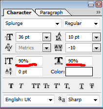
I had a font that I used a while back that didn't look that nice at 100% of its height and width, so I moved it down to 90 it looked better. I kind of got used to doing that so I don't change it.
ii.
For the spacing between the letters, I change it all the time. For certain fonts, depending on what size, it's better for it to be space out or close together. Folks for one, is sometimes better spaced out. I'm always messing with that, and the spacing between the lines. Especially when the text on an icon is all on the same layer (with the same font), but I want to use different sizes. Good examples of what I mean:



iii.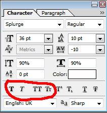
Faux bold, faux italic, all caps and small caps. They come in handy and I use the last two often instead of capslocking, because then if I decide to change the font, I don't have to retype the text.
d. My tips to using fonts and text:
i. Have a variety to choose from, even if they're very similar. That little bit of difference could definitely come in handy!
ii. Colors. I love using white and picking out a singular word to use another color on. It's always a color you can find in the icon though - unless the icon is black and white (then, it's some random color I picked out of thin air). Also - use more than one font, if it fits! Sometimes, better than using a different color, a better way to make a specific word stand out is a different font. Or, even, mix both and use a different font and a different color.





iii. Have fun with it and don't take it so seriously. If it works, it works. If it doesn't, it doesn't. And if you really, really, want text on the icon, save the psd, take a break, and try it again later. Like looking at it with fresh eyes.
iv. Rotate! Rotating text is always good! Except not. It really depends. I find that sometimes it makes a font look wonky, while other times, it's good.



v. If something works use it. There's nothing wrong with using the same font often as long as you can switch it up every once in a while.
What else do you have to look forward to in the next day or so?
More tutorials, yes. And one other thing I'm working on.
other MOTM posts:
questions answered!
progress post.
requests post.
50 favs of my own.
a. This tutorial is pretty much about that the cut said: fonts and text use. The first thing I'm going to do here is point out the font guide I posted over at tragic_radiance a while back. It's work in progress with some of the fonts I use the most often.
b. Back on the post where I was taking questions, foreign_origin asked me: Where are you taking from the inspiration/ideas for fonts? Well, in general, like when I'm downloading fonts, I'll download anything that appeals, because it might come in handy. If we're talking about when I'm working on the text for an icon, I go through a few simple steps: I decided what I want the text to say first, before I do anything. After, that, I choose one of my more popular fonts to see if it works, and if it doesn't (and sometimes even if it does), I scroll through my list of fonts, trying to find the one that looks best.
c. How I usually keep my settings:
i.

I had a font that I used a while back that didn't look that nice at 100% of its height and width, so I moved it down to 90 it looked better. I kind of got used to doing that so I don't change it.
ii.

For the spacing between the letters, I change it all the time. For certain fonts, depending on what size, it's better for it to be space out or close together. Folks for one, is sometimes better spaced out. I'm always messing with that, and the spacing between the lines. Especially when the text on an icon is all on the same layer (with the same font), but I want to use different sizes. Good examples of what I mean:


iii.

Faux bold, faux italic, all caps and small caps. They come in handy and I use the last two often instead of capslocking, because then if I decide to change the font, I don't have to retype the text.
d. My tips to using fonts and text:
i. Have a variety to choose from, even if they're very similar. That little bit of difference could definitely come in handy!
ii. Colors. I love using white and picking out a singular word to use another color on. It's always a color you can find in the icon though - unless the icon is black and white (then, it's some random color I picked out of thin air). Also - use more than one font, if it fits! Sometimes, better than using a different color, a better way to make a specific word stand out is a different font. Or, even, mix both and use a different font and a different color.


iii. Have fun with it and don't take it so seriously. If it works, it works. If it doesn't, it doesn't. And if you really, really, want text on the icon, save the psd, take a break, and try it again later. Like looking at it with fresh eyes.
iv. Rotate! Rotating text is always good! Except not. It really depends. I find that sometimes it makes a font look wonky, while other times, it's good.


v. If something works use it. There's nothing wrong with using the same font often as long as you can switch it up every once in a while.
What else do you have to look forward to in the next day or so?
More tutorials, yes. And one other thing I'm working on.
other MOTM posts:
questions answered!
progress post.
requests post.
50 favs of my own.