4 Tutorials: Colouring with Textures
I've had several people ask about how I achieved the colouring on these icons, so I figured I would do tutorials for them. All of them are based on a similar technique, using textures largely for colouring, so I'm grouping them together. These tuts are all for Photoshop CS2, but the basic ideas about texture use should be translateable. These techniques won't work for every single image, and shouldn't be copied directly, but hopefully they will give you some ideas. Play around and see what you can come up with - I'd love to see what you make :)
From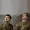
to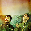
1.
: my base image. I extended the background using the technique I described in my most recent tutorial, to get that nice big sky to work with.
2. Duplicate base, set to Screen 100%: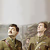
3. Duplicate base, set to Soft Light 100%: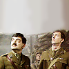
. These steps add depth and contrast to the base image, and are often the first steps I use for making an icon.
4.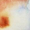
Add this texture by rainharbour, Soft Light 100%, giving this: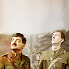
5.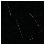
Add a scratchy texture (I don't know who this one is by - if you know, tell me!), Soft Light 72%, giving this: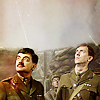
. Because it's mostly black, setting this texture to Soft Light darkens the icon, as well as adding the nice little scratchy bits.
6.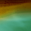
Add this texture by colorfilter, Overlay 100%. This imparts a lot of the colour to the icon, as you can see: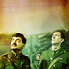
7. I felt like the figures were getting a bit too dark, so I duplicated the base and brought it to the top, desaturated it, and set it to Screen 25%. I used a Layer Mask so that it would only cover the figures and not lighten my lovely sky I've worked so hard on: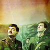
8. Finally, I made a new layer set to Soft Light 100% and, with a large soft brush, coloured a few areas of the image with a reddish-brown shade similar to the one in the first texture, to tie it in a bit more. This was my result:
From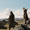
to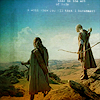
1.
: My base image. Again, I extended the sky area slightly to give me more room to work with.
2. Duplicate base, set to Screen 36%:
3. Duplicate base, set to Soft Light 34%: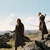
. This image was already fairly light and had decent contrast, so it didn't need overly high levels of Screen/Soft Light to make it nice to work with.
4. New adjustment layer: Hue/Saturation, increase Master Saturation +22:
. It's a fairly subtle change on this image, but it just makes the colours a little richer.
5. New adjustment layer: Brightness/Contrast, decrease Brightness -3, increase Contrast +5: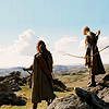
. Again, it's not a large change - the sky was just a little too bright for my liking, and this seemed to help.
6.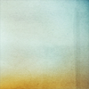
Add this texture (sorry, don't know who made it - tell me if you know!) set to Soft Light 100%: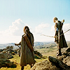
7. The same texture as above, but flipped horizontally, set to Multiply 100%: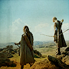
. This darkens the image considerably, and adds some of the colour you'll see in the final product.
8.
Add this gradient (again, sorry, don't know who it's by) set to Color Burn 28%: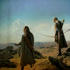
. Lots of colour coming through now, but it was looking a bit too purple for my taste.
9.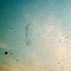
Add this texture (and once more, I suck and don't remember who it's by) set to Soft Light 100%: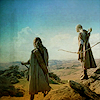
. Getting some nice blue-green shades going on now!
10. A selective color layer. My settings were as follows, but these will depend greatly on your base image - just fiddle around with it until it looks nice! Mainly what I was trying to do was make it more yellowish.
Reds: Cyan -48, Magenta +8, Yellow +100
Greens: Yellow +100
Cyans: Cyan +13
Whites: Black -16
Neutrals: Cyan +12, Magenta +10, Yellow +15, Black -1
Result: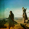
11. Added a tiny text brush: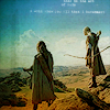
12. Finally, I felt it was looking just a little over-sharpened, so I merged-duplicated everything (ctrl+shift+alt+e) and used Gaussian Blur on it, 0.5 radius, then set that layer to Darken at 40%:
From
to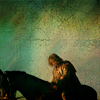
1.
: My base image. I extended the sky area on this one as well.
2. New adjustment layer: Levels. It was a very dark and low-contrast image to begin with, so I wanted to fix that up. Here are my settings, but again, this will vary from icon to icon, so don't take this as a given:
RGB: Input levels: 0/1.00/197
Red: Input levels: 0/1.00/166
Green: Input levels: 0/1.00/180
Blue: Input levels: 0/1.00/239
Basically what I did was take the right-hand slider for each channel and slide it leftwards until it got to the area where the black bars start. Heh, that's probably a very unclear explanation, but if you try it, you'll see what I mean. It should lighten the image as you slide each one over. I didn't slide the Blue channel quite as far, because I wanted to keep a bit more of a greenish tone to the icon: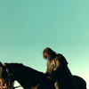
3. Duplicate base, set to Screen 100%: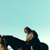
4. Duplicate base, set to Soft Light 27%: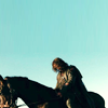
. I didn't want to darken it too much, so this was set fairly low.
5.
Add this texture by gender set to Soft Light 100%: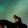
. This darkens it again, but I liked the way the lighter diagonal band fell across his face and body.
6. Duplicate the same texture as in the last step, set to Multiply 55%: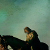
. I masked this and uncovered the lightest areas of his face and body, so they didn't get too dark.
7.
Add this texture (don't know who made it - tell me if you recognize it!) set to Soft Light 100%. Because it's a fairly light texture, this lightens the whole icon: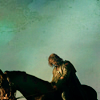
8.
Add this texture (again, not sure who made it - I suck) set to Multiply 100%. This darkens it slightly, but adds a slight graininess that I like:
9.
Add this texture by _iconographer set to Soft Light 100%. Mainly this darkens the top section of the icon and lightens the middle a bit, but it also adds some colour: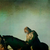
10.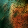
Finally, add this texture (I really should know who made this one, I just downloaded it last week or so, but I don't. Boo.) Set to Soft Light 100%:
. This adds a lot more colour, plus that awesome papery-grungy texture to the sky section.
From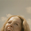
to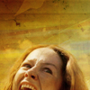
1.
My base. I don't think I did anything to this apart from cropping it - maybe extended the sky just a little.
2. New adjustment layer: Curves. Because the image was quite low-contrast, I wanted to give it some more depth. On the RGB channel, I slid the dot on the lower left corner slightly to the right, the dot in the upper right corner slightly to the left. This makes the darks a bit darker, the lights a bit lighter, and will work on most icons to improve their contrast: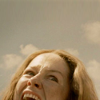
3.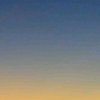
Add this texture by concrete_icons, set to Soft Light 100%: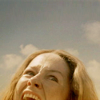
It makes the sky a bit bluer, and her face a bit more yellow-orange.
4.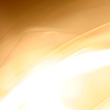
Add this texture by lookslikerain, set to Multiply 100%. This darkens the top part of the icon, while leaving her face mostly unaffected: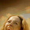
5. I still wanted greater contrast, so I duplicated the base, brought it to the top, and set it to Soft Light 100%: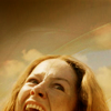
6.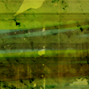
Add this texture by _iconographer, set to Soft Light 100%. I masked it to remove the areas covering her face: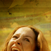
7.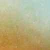
Add this texture by Velvet, flipped on its side and set to Soft Light 100%. Again, I masked off the areas over her face, so this is only affecting the sky, adding a bit of redness to the left-hand side and a bit of green-ness to the right:
8. New adjustment layer: Selective Color. As I said earlier, these exact settings won't work for your particular icon - play around with them until you get something that looks good to you.
Reds: Cyan +21, Magenta -11, Yellow +16
Neutrals: Cyan +7, Magenta +7, Yellow -12
Result: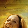
9. I felt her face was looking just a little too red, so I added a new layer, and with a soft brush set to low opacity, added some light blue over her face, then set that layer to Soft Light 50%: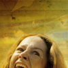
10. Finally, another selective color layer. This was to make the whole thing a bit less green and a bit more warm in tone.
Reds: Cyan -36, Magenta +9
Neutrals: Cyan -6, Magenta +4, Yellow +5
Result:
I hope you found this useful. If you have any questions or if anything is confusing, please ask me! And if you'd like to request tutorials for any of my other icons, I'd be happy to make more :)
Credit policy | Friend this journal | Make a request
From

to

1.

: my base image. I extended the background using the technique I described in my most recent tutorial, to get that nice big sky to work with.
2. Duplicate base, set to Screen 100%:

3. Duplicate base, set to Soft Light 100%:

. These steps add depth and contrast to the base image, and are often the first steps I use for making an icon.
4.

Add this texture by rainharbour, Soft Light 100%, giving this:

5.

Add a scratchy texture (I don't know who this one is by - if you know, tell me!), Soft Light 72%, giving this:

. Because it's mostly black, setting this texture to Soft Light darkens the icon, as well as adding the nice little scratchy bits.
6.

Add this texture by colorfilter, Overlay 100%. This imparts a lot of the colour to the icon, as you can see:

7. I felt like the figures were getting a bit too dark, so I duplicated the base and brought it to the top, desaturated it, and set it to Screen 25%. I used a Layer Mask so that it would only cover the figures and not lighten my lovely sky I've worked so hard on:

8. Finally, I made a new layer set to Soft Light 100% and, with a large soft brush, coloured a few areas of the image with a reddish-brown shade similar to the one in the first texture, to tie it in a bit more. This was my result:

From

to

1.

: My base image. Again, I extended the sky area slightly to give me more room to work with.
2. Duplicate base, set to Screen 36%:

3. Duplicate base, set to Soft Light 34%:

. This image was already fairly light and had decent contrast, so it didn't need overly high levels of Screen/Soft Light to make it nice to work with.
4. New adjustment layer: Hue/Saturation, increase Master Saturation +22:

. It's a fairly subtle change on this image, but it just makes the colours a little richer.
5. New adjustment layer: Brightness/Contrast, decrease Brightness -3, increase Contrast +5:

. Again, it's not a large change - the sky was just a little too bright for my liking, and this seemed to help.
6.

Add this texture (sorry, don't know who made it - tell me if you know!) set to Soft Light 100%:

7. The same texture as above, but flipped horizontally, set to Multiply 100%:

. This darkens the image considerably, and adds some of the colour you'll see in the final product.
8.

Add this gradient (again, sorry, don't know who it's by) set to Color Burn 28%:

. Lots of colour coming through now, but it was looking a bit too purple for my taste.
9.

Add this texture (and once more, I suck and don't remember who it's by) set to Soft Light 100%:

. Getting some nice blue-green shades going on now!
10. A selective color layer. My settings were as follows, but these will depend greatly on your base image - just fiddle around with it until it looks nice! Mainly what I was trying to do was make it more yellowish.
Reds: Cyan -48, Magenta +8, Yellow +100
Greens: Yellow +100
Cyans: Cyan +13
Whites: Black -16
Neutrals: Cyan +12, Magenta +10, Yellow +15, Black -1
Result:

11. Added a tiny text brush:

12. Finally, I felt it was looking just a little over-sharpened, so I merged-duplicated everything (ctrl+shift+alt+e) and used Gaussian Blur on it, 0.5 radius, then set that layer to Darken at 40%:

From

to

1.

: My base image. I extended the sky area on this one as well.
2. New adjustment layer: Levels. It was a very dark and low-contrast image to begin with, so I wanted to fix that up. Here are my settings, but again, this will vary from icon to icon, so don't take this as a given:
RGB: Input levels: 0/1.00/197
Red: Input levels: 0/1.00/166
Green: Input levels: 0/1.00/180
Blue: Input levels: 0/1.00/239
Basically what I did was take the right-hand slider for each channel and slide it leftwards until it got to the area where the black bars start. Heh, that's probably a very unclear explanation, but if you try it, you'll see what I mean. It should lighten the image as you slide each one over. I didn't slide the Blue channel quite as far, because I wanted to keep a bit more of a greenish tone to the icon:

3. Duplicate base, set to Screen 100%:

4. Duplicate base, set to Soft Light 27%:

. I didn't want to darken it too much, so this was set fairly low.
5.

Add this texture by gender set to Soft Light 100%:

. This darkens it again, but I liked the way the lighter diagonal band fell across his face and body.
6. Duplicate the same texture as in the last step, set to Multiply 55%:

. I masked this and uncovered the lightest areas of his face and body, so they didn't get too dark.
7.

Add this texture (don't know who made it - tell me if you recognize it!) set to Soft Light 100%. Because it's a fairly light texture, this lightens the whole icon:

8.

Add this texture (again, not sure who made it - I suck) set to Multiply 100%. This darkens it slightly, but adds a slight graininess that I like:

9.
Add this texture by _iconographer set to Soft Light 100%. Mainly this darkens the top section of the icon and lightens the middle a bit, but it also adds some colour:

10.

Finally, add this texture (I really should know who made this one, I just downloaded it last week or so, but I don't. Boo.) Set to Soft Light 100%:

. This adds a lot more colour, plus that awesome papery-grungy texture to the sky section.
From

to

1.

My base. I don't think I did anything to this apart from cropping it - maybe extended the sky just a little.
2. New adjustment layer: Curves. Because the image was quite low-contrast, I wanted to give it some more depth. On the RGB channel, I slid the dot on the lower left corner slightly to the right, the dot in the upper right corner slightly to the left. This makes the darks a bit darker, the lights a bit lighter, and will work on most icons to improve their contrast:

3.

Add this texture by concrete_icons, set to Soft Light 100%:

It makes the sky a bit bluer, and her face a bit more yellow-orange.
4.

Add this texture by lookslikerain, set to Multiply 100%. This darkens the top part of the icon, while leaving her face mostly unaffected:

5. I still wanted greater contrast, so I duplicated the base, brought it to the top, and set it to Soft Light 100%:

6.

Add this texture by _iconographer, set to Soft Light 100%. I masked it to remove the areas covering her face:

7.

Add this texture by Velvet, flipped on its side and set to Soft Light 100%. Again, I masked off the areas over her face, so this is only affecting the sky, adding a bit of redness to the left-hand side and a bit of green-ness to the right:

8. New adjustment layer: Selective Color. As I said earlier, these exact settings won't work for your particular icon - play around with them until you get something that looks good to you.
Reds: Cyan +21, Magenta -11, Yellow +16
Neutrals: Cyan +7, Magenta +7, Yellow -12
Result:

9. I felt her face was looking just a little too red, so I added a new layer, and with a soft brush set to low opacity, added some light blue over her face, then set that layer to Soft Light 50%:

10. Finally, another selective color layer. This was to make the whole thing a bit less green and a bit more warm in tone.
Reds: Cyan -36, Magenta +9
Neutrals: Cyan -6, Magenta +4, Yellow +5
Result:

I hope you found this useful. If you have any questions or if anything is confusing, please ask me! And if you'd like to request tutorials for any of my other icons, I'd be happy to make more :)
Credit policy | Friend this journal | Make a request