Tutorial 08
Tutorial requested by my_graphx. This tutorial is very graphic heavy, contains numerous steps and involves some selective coloring.
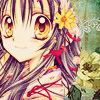
I'll show you how to go from:
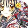
to
Made with Photoshop CS2.

Start off with our base. Sharpen the base and go Edit > Fade Sharpen and lower the opacity if the image is too sharp. I know there's an empty space to the top right, but I'll cover that up later.

The next few steps (including this one) follow the Aged Plum tutorial. Add a new layer and fill it with #6FBE57 and set it to Color Burn, 66%.
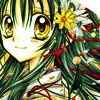

Create a new layer and fill with #03073B and set to Exclusion, 100%
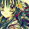

Fill another new layer with #A09E72, and set to Darken, 44%.
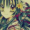

Add a new layer and fill with #FFA9A9, set to Soft Light, 100%.
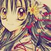

Fill another new layer with #EE9BA9, and set to Soft Light, 100%.
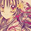
Duplicate your base, bring to the top and set to Soft Light, 100%.
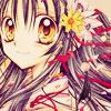
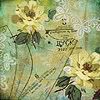
Now take pick out a texture (preferably a pattern or design one). This is where I cover up the white space. I'm going to give this texture by tragic_icons a concave shape and I achieve this my removing part of the texture I don't want with the Elliptical Marquee Tool or the Ellipse Tool. Choose the former if you aren't familiar with the Pen Tool.
I add a New Adjustment Layer > Color Balance and a New Adjustment Layer > Selective Color. At this point my icon has no sense of colour unity whatsoever, but I'll correct this later.


I grab a couple light textures (and at this point I'm deciding that this icon will have a yellow colour scheme). This first is by colorfilter (modified by me) and the other is by ewanism. Set both to Screen, 100%.

Now duplicate your base texture, bring to the top and set to Soft Light, 100%. Then duplicate your image base twice, bring to the top and desaturate. Set both to Soft Light. Add a Gaussian Blur of around 2-4 to the second layer (top) and I lower the opacity of the first layer (unblurred one) to around 55%.


Create and fill a new layer with #C8C3AF, and set to Soft Light, 70%.

Add any finishing touches you would like. I add a New Adjustment Layer > Selective Color.

As always, following tutorials require experimentation and results will vary depending on your icon. Don't hesitate to ask my any questions, give me feedback or to post your results. X)
I normally keep personal things out of my icon journal but... I'm kind of miffed right now because it seems I'm not able to give my opinion with people bitching at me or telling me off (I wasn't even rude or immature). Freedom of speech my ass. Last time I give my input to anyone.
I'll show you how to go from:

to

Made with Photoshop CS2.

Start off with our base. Sharpen the base and go Edit > Fade Sharpen and lower the opacity if the image is too sharp. I know there's an empty space to the top right, but I'll cover that up later.

The next few steps (including this one) follow the Aged Plum tutorial. Add a new layer and fill it with #6FBE57 and set it to Color Burn, 66%.


Create a new layer and fill with #03073B and set to Exclusion, 100%


Fill another new layer with #A09E72, and set to Darken, 44%.


Add a new layer and fill with #FFA9A9, set to Soft Light, 100%.


Fill another new layer with #EE9BA9, and set to Soft Light, 100%.

Duplicate your base, bring to the top and set to Soft Light, 100%.

Now take pick out a texture (preferably a pattern or design one). This is where I cover up the white space. I'm going to give this texture by tragic_icons a concave shape and I achieve this my removing part of the texture I don't want with the Elliptical Marquee Tool or the Ellipse Tool. Choose the former if you aren't familiar with the Pen Tool.

I add a New Adjustment Layer > Color Balance and a New Adjustment Layer > Selective Color. At this point my icon has no sense of colour unity whatsoever, but I'll correct this later.


I grab a couple light textures (and at this point I'm deciding that this icon will have a yellow colour scheme). This first is by colorfilter (modified by me) and the other is by ewanism. Set both to Screen, 100%.

Now duplicate your base texture, bring to the top and set to Soft Light, 100%. Then duplicate your image base twice, bring to the top and desaturate. Set both to Soft Light. Add a Gaussian Blur of around 2-4 to the second layer (top) and I lower the opacity of the first layer (unblurred one) to around 55%.


Create and fill a new layer with #C8C3AF, and set to Soft Light, 70%.

Add any finishing touches you would like. I add a New Adjustment Layer > Selective Color.

As always, following tutorials require experimentation and results will vary depending on your icon. Don't hesitate to ask my any questions, give me feedback or to post your results. X)
I normally keep personal things out of my icon journal but... I'm kind of miffed right now because it seems I'm not able to give my opinion with people bitching at me or telling me off (I wasn't even rude or immature). Freedom of speech my ass. Last time I give my input to anyone.