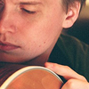
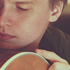
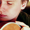
When the wind picked up, the fire spread

->
Made with Photoshop CS2
♪ Curves
♪ Selective Coloring
4 steps and 4 examples.
The first step is standard, if you read my previous tut you can skip the first part.

Step 1: Make your base.
Open your image. I used a picture of Chris Walla from Death Cab for Cutie that I had found here. I copied the image and pasted it in a 100x100 pixel 72 dpi new document. I then resized it, clicking the chain button;

; to keep the image constrained as I used the boxes;

; that appear in the corner of the image to resize it. Then when I got what I want, I clicked the check mark;

;. I duplicated the image once and sharpened (Filter > Sharpen > Sharpen) it. **I changed the opacity to 40%-60% and merged the duplicate to the image so it would not be over sharpened. Now you got a base.

Step 2: Color Fill
Fill: #390c15
Set to: Exclusion
Opacity: 100%
This layer creates the bluish tint to lighter colors that is so popular amongst icons today. It also creates a brownish to purplish tint to darker colors. It was a good way to get rid of the original cross-processing color that the original image had. The fill layer gives me a clean slate to build upon.

Step 3: Curves
The curves layer is used to brighten and give contrast to the image. As well as changing the colors a bit. I didn't want too much blue or too much purple/brown. So I messed with the colors a bit using curves. The RGB for contrast, darken the dark areas with the bottom left dot, brightened the bright areas with center dot, you get the picture it's under the settings.
Red; the center dot was to cut down on the red, which makes purple and brown. The bottom left dot was to darken the red in darker areas. Later I found that the bottom left dot in 'Red' adds green/takes away from the red.
Green; the center dot was to also get rid of some red so it was moved up a smudge. The bottom left dot was to darken the green which makes a red/purple color in those shadowy areas. I know we just tried getting rid of that in the 'red' why add it in the green. At the time I didn't know but without taking away from the 'red' and using the green to add red back we wouldn't have a good depth where Chris's chin and guitar meet.
Blue; the center dot adds blue; it keeps the bottom left dot making the image look all yellow. Another reason to cut down on them reds a better red to blue ratio, as we all know red + blue = purple.
The bottom left dot makes more yellow in it's setting on blue. I could go without it and get a better looking cross-processing effect, but I didn't want that. I wanted some, some-what natural color. So moving the slider to the left I got darker and more yellow in my image.
You may have to adjust each dot for your image. Sometimes the darker colors of the images may end up black with these settings. You still want to see that the darker colors have a brown or purple tint to them just not as much as with a bare exclusion layer.
Note: The way I work I only click once in the middle of the line then input numbers to change its placement. I then I move the bottom left dot to the right, which darkens colors and creates contrast. So the second numbers are the bottom left dot.
InputOutput RGB128158 520Red128130 100Green128130 100 Blue128138 300
Here's what it looks like if your confused:
RGB
Red
Green
Blue
Step 4: Selective Color
Used to heighten the colors in the image mostly the reds and yellows and the blue tint. You might have to change the settings on each slider to your image. In 'Reds' what red I added I wanted some yellow in it, so when I took away yellow in 'Yellows' I wouldn't take a lot away. The taking away of yellows makes a pinkish color which is close to purple thus keeping the purple constant. What little green there is in the image I wanted to keep by using 'Green' in selective coloring. If your image has green it might end up looking bright and ugly so if you do have green you might want to change these sliders. 'Cyans' and 'Blues,' you might want to ignore unless you got a lot of blue in your icon. By default I try and enhance what little blue is in all of my bases using 'Blues' and 'Cyans.' To add a little pink to Chris's lips I messed with Magentas, I admit it's kind of girlie but I think it works for him. I had washed away a lot of the blue tint, which is what I was going for at first but I realized it would look a little better if I added some blue tint using 'Whites.' This is something you can easily go overboard with is the whites. It's nice to remove some red from the face using it and adding a little more blue but be careful or an all blue image be your fate. Bumping the cyan up on 'Neutrals' is another good way to get rid of excess red. And the 'blacks' to darken Chris's shoulder just a tiny bit. Other wise it's a good way to darken shadows and dark colors as well.
[colors][cyan][magenta][yellow][black]
REDS;-300+300YELLOWS;-200-200
GREENS;+100-100+1000
CYANS;+1000-1000
BLUES;+1000-1000
MAGENTAS;-1000-1000
WHITES;+300-500
NEUTRALS;+10000
BLACKS;000+1
Finished!
Other Examples:
Any brush or textures you want to add go ahead. It's all you. ;) You will have to be careful with them, choose colors that won't clash with image, change opacities, and layer modes. Just experiment, don't always be set on one single layer mode.
**ADDITIONAL NOTES:
1. You don't have to duplicate your base and click 'sharpen' and change the opacity of the base so what sharpening there is isn't too much/over done. On Photoshop CS2, you just click sharpen then go to Edit > Fade or Shift + Ctrl + F and then just move the slider to get the right amount of sharpening you want. Be careful of over sharpening, it's the leader in crummy icons next to over usage of selective coloring, color layers, and textures... in the same icon. :3
I hope I made sense. If not here's the psd:
Have fun making those icons.
DO NOT HOTLINK OR COPY MY ICONS/IMAGES PLEASE.
Any questions, just ask?
Comments are always nice.
And I'd like to to see what you've done with the tutorial.
My Resources
Join imfraudulent if you like. :D
-Bunny