The cold concrete cuts against her back
UPDATED TUTORIAL
->
Made with Photoshop CS2
♪ Selective Coloring
9 steps and 3 examples.
The first step is standard, if you read my previous tut you can skip the first part.
Step 1: Make your base.
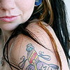
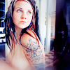
Open your image. I used a picture of Quinne from her "" set from Suicide Girls. I copied the image and pasted it in a 100x100 pixel 72 dpi new document. I then shrunk it, clicking the chain button;
; to keep the image constrained as I used the boxes;
; that appear in the corner of the image to shrink/warp it. Then when I got what I want, I clicked the check mark;
;. I duplicated the image once and sharpened (Filter > Sharpen > Sharpen) it. **I changed the opacity to 40%-60% and merged the duplicate to the image so it would not be over sharpened. Now you got a base.
Step 2: Duplicate Base
Set to: Screen
Opacity: 50%
This layer is brighten the base up. If your base is already bright enough it would be best to skip this step. If your base is extra dark you might need to keep the opacity at 100% and maybe even duplicate the screen layer again and change the opacity to get what you want.
Step 3: Color Fill
Fill: #eee0cc
Set to: Soft Light
Opacity: 100%
Create a new layer and fill it with a light yellow color (eee0cc.)
This layer brightens and helps with the manipulation of colors in selective coloring.
Step 4: Selective Color 1
The yellow blends in with the base's colors. So with selective coloring we change the blended colors to make them more red with reds and more blue with cyans/blues. We also remove a little bit of the yellow.
Settings:
[colors][cyan][magenta][yellow][black]
REDS;-1000+1000
YELLOWS;+400-700
GREENS;0000
CYANS;+100+100-100+100
BLUES;+100+100-100+100
MAGENTAS;0000
WHITES;0000
NEUTRALS;+100-200
BLACKS;0000

Step 5: Selective Color 2
This Selective Color layer deepens the reds and bluse and removes a little more yellow.
Settings:
[colors][cyan][magenta][yellow][black]
REDS;-100+30+100+30
YELLOWS;+1000-1000
GREENS;0000
CYANS;+1000-1000
BLUES;+100+100+1000
MAGENTAS;0000
WHITES;0000
NEUTRALS;-150-10+20
BLACKS;000+30
Step 6: Hue/Saturation
This is just to bump up the colors.
Settings: Master; Saturation: +20
OPTIONAL:
Step 7: New layer
Create a new layer either by the button at the bottom of the Layers pallet or by going to the menu "Layer > New > Layer." You can also use the key shortcut "Shift + Ctrl + N"
In the new layer hold down "Ctrl + Alt + Shift + E keys and then let go. It will basically copy-merge the layers below the new layer.
You can copy merge in a new layer with the menu: you have to "Ctrl + A" or menu "Select > All." Then go to "Edit > Copy Merged" then paste ("Ctrl + V" or "Edit > Paste") in new layer.
Either way you go, this copy-merge layer will be used to create the blur around the edges.
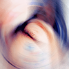
Step 8: Blured/Spun Edges
Filter: Radial Blur
Menu Location: Filter > Blur > Radial Blur
Amount: 10
Blur Method: Spin
Quality: Good
Leave the little graft alone, keep it center. Though you can mess with the position of the spin it looks less wonky if left centered.
There's really nothing much to say when it comes to this. It's an effect, something that should be learned, specially since it's good use at making textures and it can add to the icon. But be careful because it can also take away from the icon.
Step 9: Erasing Center
Brush: 100px Soft
On the Radial Blur layer erase the center and in areas you want revealed. I just wanted a little blur so most of the layer got erased.
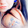
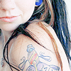
Finished!
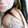
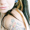
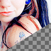
Other Examples:

Any brush or textures you want to add go ahead. It's all you. ;) You will have to be careful with them, choose colors that won't clash with image, change opacities, and layer modes. Just experiment, don't always be set on one single layer mode.
**ADDITIONAL NOTES:
1. You don't have to duplicate your base and click 'sharpen' and change the opacity of the base so what sharpening there is isn't too much/over done. On Photoshop CS2, you just click sharpen then go to Edit > Fade or Shift + Ctrl + F and then just move the slider to get the right amount of sharpening you want. Be careful of over sharpening, it's the leader in crummy icons next to over usage of selective coloring, color layers, and textures... in the same icon. :3
2. Step 8 used to be step 3. After the screen layer I created a new layer then copy merged. I left it alone and then worked on coloring. When I was done with coloring and went on the the Radial Blur step by going back to the copy merged layer and applying that effect. Then I erased. So if you download the PSD you will see how the radial blur layer is below the coloring.
I hope I made sense. If not here's the psd:
Have fun making those icons.
DO NOT HOTLINK OR COPY MY ICONS/IMAGES PLEASE.
Any questions, just ask?
Comments are always nice.
And I'd like to to see what you've done with the tutorial.
My Resources
Join imfraudulent if you like. :D
-Bunny
->
Made with Photoshop CS2
♪ Selective Coloring
9 steps and 3 examples.
The first step is standard, if you read my previous tut you can skip the first part.
Step 1: Make your base.
Open your image. I used a picture of Quinne from her "" set from Suicide Girls. I copied the image and pasted it in a 100x100 pixel 72 dpi new document. I then shrunk it, clicking the chain button;
; to keep the image constrained as I used the boxes;
; that appear in the corner of the image to shrink/warp it. Then when I got what I want, I clicked the check mark;
;. I duplicated the image once and sharpened (Filter > Sharpen > Sharpen) it. **I changed the opacity to 40%-60% and merged the duplicate to the image so it would not be over sharpened. Now you got a base.
Step 2: Duplicate Base
Set to: Screen
Opacity: 50%
This layer is brighten the base up. If your base is already bright enough it would be best to skip this step. If your base is extra dark you might need to keep the opacity at 100% and maybe even duplicate the screen layer again and change the opacity to get what you want.
Step 3: Color Fill
Fill: #eee0cc
Set to: Soft Light
Opacity: 100%
Create a new layer and fill it with a light yellow color (eee0cc.)
This layer brightens and helps with the manipulation of colors in selective coloring.
Step 4: Selective Color 1
The yellow blends in with the base's colors. So with selective coloring we change the blended colors to make them more red with reds and more blue with cyans/blues. We also remove a little bit of the yellow.
Settings:
[colors][cyan][magenta][yellow][black]
REDS;-1000+1000
YELLOWS;+400-700
GREENS;0000
CYANS;+100+100-100+100
BLUES;+100+100-100+100
MAGENTAS;0000
WHITES;0000
NEUTRALS;+100-200
BLACKS;0000
Step 5: Selective Color 2
This Selective Color layer deepens the reds and bluse and removes a little more yellow.
Settings:
[colors][cyan][magenta][yellow][black]
REDS;-100+30+100+30
YELLOWS;+1000-1000
GREENS;0000
CYANS;+1000-1000
BLUES;+100+100+1000
MAGENTAS;0000
WHITES;0000
NEUTRALS;-150-10+20
BLACKS;000+30
Step 6: Hue/Saturation
This is just to bump up the colors.
Settings: Master; Saturation: +20
OPTIONAL:
Step 7: New layer
Create a new layer either by the button at the bottom of the Layers pallet or by going to the menu "Layer > New > Layer." You can also use the key shortcut "Shift + Ctrl + N"
In the new layer hold down "Ctrl + Alt + Shift + E keys and then let go. It will basically copy-merge the layers below the new layer.
You can copy merge in a new layer with the menu: you have to "Ctrl + A" or menu "Select > All." Then go to "Edit > Copy Merged" then paste ("Ctrl + V" or "Edit > Paste") in new layer.
Either way you go, this copy-merge layer will be used to create the blur around the edges.
Step 8: Blured/Spun Edges
Filter: Radial Blur
Menu Location: Filter > Blur > Radial Blur
Amount: 10
Blur Method: Spin
Quality: Good
Leave the little graft alone, keep it center. Though you can mess with the position of the spin it looks less wonky if left centered.
There's really nothing much to say when it comes to this. It's an effect, something that should be learned, specially since it's good use at making textures and it can add to the icon. But be careful because it can also take away from the icon.
Step 9: Erasing Center
Brush: 100px Soft
On the Radial Blur layer erase the center and in areas you want revealed. I just wanted a little blur so most of the layer got erased.
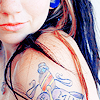
Finished!
Other Examples:
Any brush or textures you want to add go ahead. It's all you. ;) You will have to be careful with them, choose colors that won't clash with image, change opacities, and layer modes. Just experiment, don't always be set on one single layer mode.
**ADDITIONAL NOTES:
1. You don't have to duplicate your base and click 'sharpen' and change the opacity of the base so what sharpening there is isn't too much/over done. On Photoshop CS2, you just click sharpen then go to Edit > Fade or Shift + Ctrl + F and then just move the slider to get the right amount of sharpening you want. Be careful of over sharpening, it's the leader in crummy icons next to over usage of selective coloring, color layers, and textures... in the same icon. :3
2. Step 8 used to be step 3. After the screen layer I created a new layer then copy merged. I left it alone and then worked on coloring. When I was done with coloring and went on the the Radial Blur step by going back to the copy merged layer and applying that effect. Then I erased. So if you download the PSD you will see how the radial blur layer is below the coloring.
I hope I made sense. If not here's the psd:
Have fun making those icons.
DO NOT HOTLINK OR COPY MY ICONS/IMAGES PLEASE.
Any questions, just ask?
Comments are always nice.
And I'd like to to see what you've done with the tutorial.
My Resources
Join imfraudulent if you like. :D
-Bunny