13 Tutorial | Veronica Mars
New tutorial, this one came in first, which I figured it would. The good thing is, this coloring is actually the same for three of the icons featured in the poll. Thanks for filling out the poll by the way, I'll definitely be taking into consideration all of the suggestions given. I should have an icon post maybe tonight if I can get enough done before PB and Heroes and The Hills (YAY x 3!!!). Anyhoo, the tutorial.
• I use PSP9. Minus the radial blur effect (only PSP9+), this is translateable to other versions of PSP. Maybe translateable to PS.
• Semi-image heavy.
• Fairly text heavy..
• Intermediate-Advance. (Lots of Adjustment Layers)
• Any questions? Please ask!
• JOIN to keep up with updates.
• Request for tutorials can be made HERE.
NOTE: You won't be getting exact settings. I'll be rounding all my numbers to the nearest 10th, seeing as each image is different this is the best way I think that will get you to play around with your image and the settings. This is a fun coloring, but definitely needs to be played around with. I'll show where the tinkering needs to take place. Everything that is in Italics are my little notes, ..... there are a lot of Italics. And also, I had to remake the icon because some of the changes I made weren't as new adjustment layers, so the icon isn't exactly as the one I made intially.
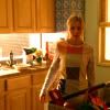
TO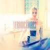
..01 Grab your picture. Mine is a cap from Veronica Mars, you can find the full image here. Resize and crop to your liking.

..02 This step will only be needed if your base is very Saturated. Go to Adjust >> Automatic Saturation Enhancement. My settings were as follows:
Bias: Normal
Strength: Weak
Skintones Present: Checked

>>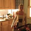
..03 This is our new base. Duplicate your base and set to Screen - 100%
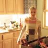
..04 While still on your Screen layer go to Adjust >> Automatic Color Balance. My settings were as follows:
Strength: 100
Remove Color Cast: Checked
Temp: 7400
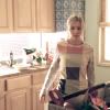
Generally, I like to leave this step until the end. It's hard to tell exactly how warm/cool you want to make your icon from the beginning. So generally, I follow step 1-3, and then do the rest of the coloring and come back to my screen layer and adjust the color balance to my liking. If your icon is already blue (also referred to as "cool"), you'll want to warm it up instead, so you'll end up adding in orange (also referred to as "warm").
..05 Flood fill with a beige color (#FEE7AE) and set to Multiply - 100%.
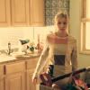
..06 New adjustment layer. Layers >> New Adjustment Layer >> Channel Mixer. My settings where in the range of:
Red || Red: 90, Green: -20, Blue: 0, Constant: 0
Green || Red: -10, Green: 40, Blue: 60, Constant: 0
Blue || Red: -50, Green: 80, Blue: 60, Constant: 20
Set this layer to Screen - 100%.

>>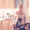
..07 New adjustment layer. Layers >> New Adjustment Layer >> Hue/Saturation. My settings were in the range of (only messing with the Saturations of each, if it isn't mentioned - leave it be):
Master: 10
Yellows: -60
Set this layer to Screen - 100%.

>>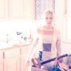
The Reds are nearly always going to need to tinkered with. More often than not, it'll needed to be brought down, it varies like I said, but generally my Reds are anywhere from -10 - +10.
..08 New adjusment layer. Layers >> New Adjustment Layer >> Color Balance. My settings were in the range of:
Midtones: 0, 20, -20
Shadows: -40, 50, 70
Preserve Luminance Checked

The setting I usually tinker with is the Cyans and Blues under Shadows. In some cases, they're way over-the-top. So I usually bring the Cyan's down / adding Reds, and bring the Blues down / adding Yellow. This is another reason why I usually do Step 4 last. If you do Step 4 in that order, and then adjust these settings, you'll counteract whatever you did in Step 4. So tinker this step first, and then step 4. That way you know how warm/cool to make your icon.
..09 New adjustment layer. Layers >> New Adjustment Layer >> Levels. My settings were in the range of:
RGB || Input: 15, .85, 255
Red || Input: 0, .85, 255
Green || Input: 0, .85, 255
Blue || Input: 10, 1.25, 255 Output: 35, 225
Set this layer to Color (L) - 100%.
>>
..10 New adjustment layer. Layers >> New Adjustment Layer >> Curves. My settings were in the range of:
Blue || Input: 70, Output: 0 (Slide the point in the lower left hand corner over to the right.)
Will always need to be tinkered with.
..011 Flood fill a sky blue (#B2D4F4) and set to Burn - 100%.

I wanted to bring more blue into the icon. If your icon is "cool" enough, and you'd like to warm it up instead, use a light beige instead of a light blue.
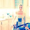
..012 At this point, you could pretty much stop. However, I wanted to bring out all of the colors just a little more. So I copy merged and pasted as a new layer (CTRL+SHIFT+C - CTRL+L).
Go to Adjust >> Automatic Saturation Enhancement.
Bias: More Colorful
Strength: Strong
Skintones Present: Unchecked
Set this layer to Color (L) - 60%.
>>
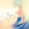
..013 Coloring wise, we're done. Now for effects. Copy merge again and paste as a new layer. Go to Adjust >> Blur >> Radial Blur. Put in the following settings:
Blur Type: Spin
Blur: Strength: 21%
Center: 0,0,0
Grab your Eraser. Put in the following settings:
Shape: Circle
Size: 100px
Hardness: 0
Opacity: 100
Click as many times as you'd like.
>>
>>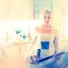
This is just personal preference, but whenever I do the whole radial blur thing, I like to duplicate the blur layer (after everything that I don't want has been erased) and set it to Soft Light or Overlay. That's what I did in this case.
..14 Finishing touches.
Text: Veronica Mars - Empire BT, size 14, in colors I pulled out of the icon.
Behind Text: I grabbed a random brush and made splotches behind the text in white so it'd come out better.
I went to my Blue Burn layer and brought the opacity down to 70% instead of 100%.
And because it isn't a tutorial by ordinary_dream without a Brightness/Contrast adjustment, I went to my base and set the Contrast +10.

Layers, for those that need it.
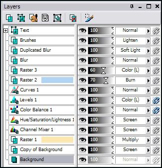
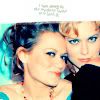
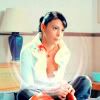
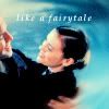
FINAL NOTES: And there you have it. This coloring can be applied to non-screencaps. The biggest adjustment you'll have to make is not adding the first screen layer (Step 3). At step 3, still duplicate your base and make all of your Automatic Color Balance Adjustments to the duplicated base. If the icon is still too light, because of the other two screen layers in the tutorial, go to your duplicated base and make a curve adjustment/level adjustment/brightness contrast adjustment/which ever you feel most comfortable with, and bring the brightness down. Below you'll find the other icons made with this technique, hover over the icon to find out a few tips on what adjustments were made to customize them to the specific picture (if it says n/a, it means the only thing customized to fit the picture was the Automatic Color Balance setting, the rest stayed the same).

I know this tutorial is a lot more text heavy than most of mine, is if I didn't explain something well enough, please let me know and I'll try to help you.
ETA: Read Please.
• I use PSP9. Minus the radial blur effect (only PSP9+), this is translateable to other versions of PSP. Maybe translateable to PS.
• Semi-image heavy.
• Fairly text heavy..
• Intermediate-Advance. (Lots of Adjustment Layers)
• Any questions? Please ask!
• JOIN to keep up with updates.
• Request for tutorials can be made HERE.
NOTE: You won't be getting exact settings. I'll be rounding all my numbers to the nearest 10th, seeing as each image is different this is the best way I think that will get you to play around with your image and the settings. This is a fun coloring, but definitely needs to be played around with. I'll show where the tinkering needs to take place. Everything that is in Italics are my little notes, ..... there are a lot of Italics. And also, I had to remake the icon because some of the changes I made weren't as new adjustment layers, so the icon isn't exactly as the one I made intially.

TO

..01 Grab your picture. Mine is a cap from Veronica Mars, you can find the full image here. Resize and crop to your liking.

..02 This step will only be needed if your base is very Saturated. Go to Adjust >> Automatic Saturation Enhancement. My settings were as follows:
Bias: Normal
Strength: Weak
Skintones Present: Checked

>>

..03 This is our new base. Duplicate your base and set to Screen - 100%

..04 While still on your Screen layer go to Adjust >> Automatic Color Balance. My settings were as follows:
Strength: 100
Remove Color Cast: Checked
Temp: 7400

Generally, I like to leave this step until the end. It's hard to tell exactly how warm/cool you want to make your icon from the beginning. So generally, I follow step 1-3, and then do the rest of the coloring and come back to my screen layer and adjust the color balance to my liking. If your icon is already blue (also referred to as "cool"), you'll want to warm it up instead, so you'll end up adding in orange (also referred to as "warm").
..05 Flood fill with a beige color (#FEE7AE) and set to Multiply - 100%.

..06 New adjustment layer. Layers >> New Adjustment Layer >> Channel Mixer. My settings where in the range of:
Red || Red: 90, Green: -20, Blue: 0, Constant: 0
Green || Red: -10, Green: 40, Blue: 60, Constant: 0
Blue || Red: -50, Green: 80, Blue: 60, Constant: 20
Set this layer to Screen - 100%.

>>

..07 New adjustment layer. Layers >> New Adjustment Layer >> Hue/Saturation. My settings were in the range of (only messing with the Saturations of each, if it isn't mentioned - leave it be):
Master: 10
Yellows: -60
Set this layer to Screen - 100%.

>>

The Reds are nearly always going to need to tinkered with. More often than not, it'll needed to be brought down, it varies like I said, but generally my Reds are anywhere from -10 - +10.
..08 New adjusment layer. Layers >> New Adjustment Layer >> Color Balance. My settings were in the range of:
Midtones: 0, 20, -20
Shadows: -40, 50, 70
Preserve Luminance Checked

The setting I usually tinker with is the Cyans and Blues under Shadows. In some cases, they're way over-the-top. So I usually bring the Cyan's down / adding Reds, and bring the Blues down / adding Yellow. This is another reason why I usually do Step 4 last. If you do Step 4 in that order, and then adjust these settings, you'll counteract whatever you did in Step 4. So tinker this step first, and then step 4. That way you know how warm/cool to make your icon.
..09 New adjustment layer. Layers >> New Adjustment Layer >> Levels. My settings were in the range of:
RGB || Input: 15, .85, 255
Red || Input: 0, .85, 255
Green || Input: 0, .85, 255
Blue || Input: 10, 1.25, 255 Output: 35, 225
Set this layer to Color (L) - 100%.

>>

..10 New adjustment layer. Layers >> New Adjustment Layer >> Curves. My settings were in the range of:
Blue || Input: 70, Output: 0 (Slide the point in the lower left hand corner over to the right.)

Will always need to be tinkered with.
..011 Flood fill a sky blue (#B2D4F4) and set to Burn - 100%.

I wanted to bring more blue into the icon. If your icon is "cool" enough, and you'd like to warm it up instead, use a light beige instead of a light blue.
..012 At this point, you could pretty much stop. However, I wanted to bring out all of the colors just a little more. So I copy merged and pasted as a new layer (CTRL+SHIFT+C - CTRL+L).
Go to Adjust >> Automatic Saturation Enhancement.
Bias: More Colorful
Strength: Strong
Skintones Present: Unchecked
Set this layer to Color (L) - 60%.

>>

..013 Coloring wise, we're done. Now for effects. Copy merge again and paste as a new layer. Go to Adjust >> Blur >> Radial Blur. Put in the following settings:
Blur Type: Spin
Blur: Strength: 21%
Center: 0,0,0
Grab your Eraser. Put in the following settings:
Shape: Circle
Size: 100px
Hardness: 0
Opacity: 100
Click as many times as you'd like.

>>

>>

This is just personal preference, but whenever I do the whole radial blur thing, I like to duplicate the blur layer (after everything that I don't want has been erased) and set it to Soft Light or Overlay. That's what I did in this case.
..14 Finishing touches.
Text: Veronica Mars - Empire BT, size 14, in colors I pulled out of the icon.
Behind Text: I grabbed a random brush and made splotches behind the text in white so it'd come out better.
I went to my Blue Burn layer and brought the opacity down to 70% instead of 100%.
And because it isn't a tutorial by ordinary_dream without a Brightness/Contrast adjustment, I went to my base and set the Contrast +10.

Layers, for those that need it.

FINAL NOTES: And there you have it. This coloring can be applied to non-screencaps. The biggest adjustment you'll have to make is not adding the first screen layer (Step 3). At step 3, still duplicate your base and make all of your Automatic Color Balance Adjustments to the duplicated base. If the icon is still too light, because of the other two screen layers in the tutorial, go to your duplicated base and make a curve adjustment/level adjustment/brightness contrast adjustment/which ever you feel most comfortable with, and bring the brightness down. Below you'll find the other icons made with this technique, hover over the icon to find out a few tips on what adjustments were made to customize them to the specific picture (if it says n/a, it means the only thing customized to fit the picture was the Automatic Color Balance setting, the rest stayed the same).


I know this tutorial is a lot more text heavy than most of mine, is if I didn't explain something well enough, please let me know and I'll try to help you.
ETA: Read Please.