Q&A, a tutorial and two psds
This post includes the questions I already answered in the previous post (I might have added a word or two, here and there), plus:
- the translation of the Italian Qs&As;
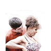
- tutorial + psd of this icon:
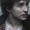
>
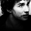
- some tips on how to remove the background + the psd of this icon:
>
>
How do you choose your images? (afeastforme)
I always lack inspiration and I don't make random icons: I look for interesting challenges in the icontest comms I participate in and then I search for caps that fit the theme.
I choose the fandom depending on the theme, on my mood, and on my most recent obsessions (Misfits, at the moment :D). I usually save lots of caps, because I like being spoilt for choice.
As for the image, I look for an intriguing angle, an interesting detail, a potential close crop... it's difficult to tell. I work on girls/women mostly, because there are lots of interesting details, compared to men - in my opinion, of course.
Do you work on the cap before resizing, or do you resize first and then work on the image in the 100x100px canvas? (afeastforme)
I don't work on the cap before resizing. I resize, choose the crop, and then work on the colors, contrast and so on in my 100x100x canvas.
How do you decide how to crop an icon? (afeastforme)
I don't actually decide the crop of an icon just by looking at the picture I'm working with. I might have an idea of what I'm looking for (a close crop or a negative space icon, for example), but I usually stick to a method I learnt a while ago:
- for close crops, I generally resize to 500/600px of width, at first, depending on the quality of the picture. Then I drag the image to my 100x100px canvas and I move it all around. If I don't find a placement I'm satisfied with, I go back to my original picture and resize again. I reduce the width of 50px a time, more or less - from 600px to 550px, from 550px to 500px, and so on, and for every size I repeat the process. Every time I go back to the original size, of course, to preserve the quality.
Sometimes, if there might be a good crop between... let's say, 500 and 550px, for example, I resize to 520px, or 540px - somewhere in the middle of the sizes I've already tried.
My last resort is 100px of height (which normally corresponds to 178px of width, working with caps).
- for negative space icons and far crops, I usually try something like 60/70/80 px of height.
A great guide on cropping is this one, by kellslawells.
How do you prepare your base/are there any steps you usually take in the beginning of the icon-making process/how do you work on the coloring? (giulsss)
I often begin with a Curves layer and then click on Auto, especially when I'm working with a very dark cap. It can improve the contrast and the colors dramatically.
Sometimes I use this step in the middle of the coloring to check the contrast, too.
If the outcome of the Auto-Curves layer is quite extreme - and it can happen - I delete the layer or lower its opacity. Sometimes I also set it to Soft light, mainly when I add it in the middle of the coloring and not at the very beginning.
If the cap is grainy/LQ, I duplicate the image and then go to Filter > Blur > Gaussian blur and input a radius between 3 and 6px. Then I set the layer to Normal/Screen/Soft Light, depending on the cap, and play with the opacity until I'm satisfied with the result.
Sometimes I duplicate the base again and drag it to the top (above the blurred layer). Then I sharpen it (Filter > Sharpen > Sharpen) and play with the Blending Mode and the opacity of the layer.
Instead of Gaussian blur, sometimes I use Diffuse glow (I've already talked about it in this tut!).
If colors are quite good, but the picture is rather dark, I duplicate it once or twice and set the layer/layers to Screen. Again, depending on the cap, I play with opacity of those layers.
Else, I use Curves:
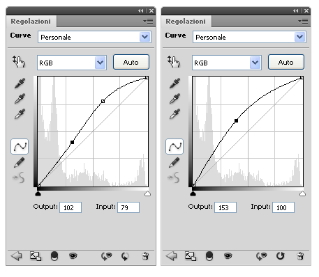
- two points when I want to add some contrast while brightening the cap;
- only one point when I want to brighten the whole cap.
To fix the colors of the cap, sometimes I use Variations (Image > Adjustments > Variations).
First, I duplicate my base (or I copy merged and paste, if I'm in the middle of the process). Then I use almost all settings: I play with the Fine - Coarse slider to adjust the intensity of the variations I'm about to make, and I work with Midtones and Shadows, mostly.
It's difficult to tell how I work on the coloring, because it totally depends on the cap.
However, my favourite adjustments layer are:
- Curves: to brighten the image;
- Levels: to work on the contrast (I handle Levels better than Curves, I make subtler changes to midtones, shadows and highlights);
- Selective color: to make subtle changes to the color scheme and to work on the contrast (I play with the black slider of Whites to work on the highlights, and with the black slider of Neutrals and Blacks to work on midtones and shadows);
- Color Balance: to make more substantial changes to the color scheme;
- Gradient Map: to desaturate the picture (that is, for b/w icons) and to work on colors (I pick colorful gradients and then I play with the blending mode and the opacity of the layer);
- Vibrance: to make colors more vivid and to add some depth to the picture (increasing the vibrancy of colors darkens the image a little)
- Hue/Saturation: to make subtle changes to the hue/saturation, instead of using Vibrance.
What's left to say?
When working with Fill layers, I prefer gradients to solid colors.
I also use monochromatic textures instead of solid colors: this way, I can make subtle changes to the lighting/contrast while I'm working on the coloring.
Some examples:


(by: another_trauma emonet25 nokitas ohfreckle)
How do you sharpen your icons? Your icons always look perfectly sharpened. (dudette_in_town)
Usually, I duplicate my base and go to Filter > Sharpen > Sharpen. Then I lower the opacity of the sharpened layer until I'm happy with the result.
Sometimes, when I have a duplicated layer set to Screen, I sharpen that one. If needed, I go to Edit > Fade sharpen.
If the image is very grainy/pixelly, I duplicate it and drag the layer between the base and the sharpened layer; then I go to Filter > Blur > Gaussian Blur and choose a Radius between 3 and 6px, more or less. I lower the opacity of that layer till I get a soft, glow-like look.
Other times I duplicate the base and I use the Blur tool (60-100% opacity) on the over-sharpened/grainy areas, instead of blurring the whole picture with the Gaussian Blur.
Other methods I know of:
- Duplicate the base, go to Filter > Other > High Pass > Radius: from 0.3 to 1.0 px. Set the layer to Overlay.
(great with LQ pictures, it preserves the quality better than the Sharpen filter does)
- Duplicate the base, go to Filter > Artistic > Paint Daubs > Default brush, Brush Size 1, Sharpness 1. Set the layer to Normal.
I learnt this one thanks to this tut by raiindust. It makes the icon look crisp in a lovely way.
Most makers have a 'natural instinct' to make certain icons. It's not that they can do just that style or that kind of crop, but it's what comes most natural to them. Do you have that yourself, something that always feels 'right' when iconing? And if so, what is it? :) (firstillusion)
Mostly, I think it depends on the fandom and the caps I'm working with.
In terms of crop, I usually go for a close crop when caps are HQ, while I prefer far crops and negative space icons when I'm working with LQ caps. I'm a lazy person, and it bothers me to fix grainy skins, pixelly backgrounds and such things. :)
Sometimes I work with mid-shoots, but I usually prefer close crops or far crops. I like having a huge negative space or no negative space at all.
In terms of colors, I prefer intense, warm hues like red, pink and purple. I love purple! ♥
I also like yellow, but I rarely make yellow icons. Oh, and blue. I also like working with blue shades, while cyan and green hues are not my cup of tea, to be honest. I admire those who can make a beautiful cold coloring full of green/cyan hues, because I just can't handle it, most of the times.
And I usually go for a vibrant colorful coloring. I also like pale/muted colorings, but I seldom make pale/muted icons. Raising up the Vibrance is a natural instinct, to me. :D
That being said about the coloring, I pay a lot of attention to the contrast of my icons. I care about the contrast more than I do for the coloring, actually. I love having a neat contrast between highlights and shadows, so I use Curves and Levels layers a lot.
I don't mind working with very dark caps, as long as I can brighten them without losing quality.
And finally! In terms of composition, I prefer making simple icons. I'm not very confident with the blocking technique, or with complex blending, and working with text usually frustrates me.
TL; DR!
Natural instinct:
- close crops or negative space icons;
- vibrant coloring (fav hues: red, pink, purple ♥, blue);
- bright icons with a neat contrast;
- simple icons in terms of composition.
I'm having some problems making B&W icons, I can't seem to get them just right. How do you make your beautiful B&W icons (like this one), and do you have any tips for me? :) (kasiopeia)
Usually, b/w isn't my first choice. I begin with the coloring and at some point, if nothing is working, I give b/w a try. I always use a b/w Gradient Map layer to desaturate the icon, because it adds some contrast too (while desaturating with a Hue/Saturation layer tends to give a pretty flat outcome, in terms of contrast).
Contrast is very important in a b/w icon, in my opinion: you have no colors to make the icon pop, so you have to rely on the contrast, mostly. Curves, Levels and Brightness/Contrast are your friends.
Selective color is very useful too: you can work on the black setting of Whites and Blacks to lighten/darken highlights and shadows, respectively.
Then, depending on the crop:
- Far crops & negative space icons: textures can help to add some interest to your background and to the lighting, also. You can use b/w textures or desaturated colored textures as well.
Texture sets you may find useful:
http://lemonpunch.livejournal.com/73586.html#cutid2
http://lemonpunch.livejournal.com/55812.html#cutid2
http://unpresented.livejournal.com/3692.html#cutid2
- Close crops: you'd better be careful with the texture use, in this case, because the highlights/midtones/shadows scheme must be preserved. If the lighting looks unnatural, your subject might look weird. Gradients may be a better choice, here: black to grey, grey to white, dark grey to light grey, and so on. The blending mode is up to you, and depends on the picture you're working with. You can also use colorful gradients to add some subtle colors to your b/w icons - but in this case, you might need to lower the opacity to 10-20%.
You can also add some light blobs (on Normal/Soft light) to soften shadows, or to draw the attention to the focal point of your icon. You may need to lower the opacity of the blob layer a little or to blur them, sometimes.
TUTORIAL: NATHAN FROM MISFITS, B/W
STEP ONE

>
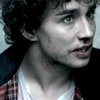
The cap was a little dark and it lacked some contrast, so I started with a Levels layer:
RGB - Input: 11 1.35 255 (I darkened the shadows and brightened the midtones)
RED - Input: 24 1.00 211
GREEN - Input: 22 1.00 202
BLUE - Input: 22 1.00 204
You see, I basically did the same thing with all the settings:
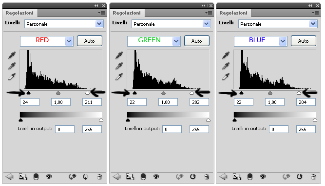
I moved the arrows towards the center, so that the black arrow (shadows) was under the left border of the histogram, and the white arrow (highlights) was under the right border.
This kind of step helps to even out the color scheme a little.
Here you can find a good tut about Levels, by spud66cat. :)
STEP TWO

>

As a result of the previous step, I had brighter highlights and I gained some contrast. Plus, it added some interesting cold shades to the whole picture (that in the beginning was mostly red and muted).
BUT! There wasn't a clear focal point. His face was bright, but his neck was even brighter. I wanted to draw the attention to his face and especially on his eyes.
So I created a Gradient Map layer, from black to trasparent (black on the bottom, trasparent to the upper side):
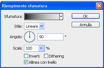
I set this layer to Normal, 100% opacity.
The black side of the gradient covers his neck, so that the bottom part of the icon is now very dark. The only bright spot is his face, so that it becomes the focal point of the icon.
STEP THREE

>
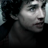
A bit of the black side of the gradient was covering is face, so I needed to brighten it up again. I created a new Levels layer, and I moved the white arrow to the left, to brighten the highlights:
RGB - Input: 0 1.00 216
STEP FOUR

>
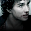
I created a new Curves layer to brighten the whole image:
RGB - One point: Output 135 Input 99
STEP FIVE

>
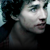
The contrast was fine, but the colors were very dull and bland. So I added a Vibrance layer:
Vibrance: 60
Saturation: 25
If you don't have Vibrance, you can use a Hue/Saturation layer with these settings:
Master:
Hue 0
Saturation +59
Brightness +2
STEP SIX

>

Colors were still dull. So, I gave b/w a try: I added a b/w Gradient Map.
STEP SEVEN

>
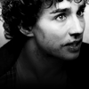
I added a Brightness/Contrast layer with these settings (only for CS4+!):
Brightness: 4
Contrast: 25
For the previous versions of PS:
Brightness: 6
Contrast: 8
STEP EIGHT

>

I wanted a little more contrast, so I selected the whole canvas (Select > All), and then went to Edit > Copy Merged, Edit > Paste.
I set this layer to Soft Light and lowered the opacity:
77% for CS4+;
49% for the previous versions.
The opacity is different for the two versions: I think this may be due to the slightly different effects of the Brightness/Contrast layer, and to the replacement of the Vibrance layer with the Hue/Saturation one.
After lowering the opacity, I masked this layer and covered a little bit of his neck.
And that's all. :)
PSD:
Download from box.net (CS4+)
Download from box.net (previous versions)
Do you have any easy suggestions for removing a background of an image? (needtakehave)
I'll start with an obvious advice: choose images in which there's a clear border between the background and the subject.
good example - nice, clean cut-out.
bad example - working with her hair would be a real pain.
Credits for the screencaps: here
And of course, a pretty even background is better that a crowded one. :)
That being said, I use a couple of method to remove the background or a combination of both:
A. I add a layer mask, and using a round brush at 100% hardness, I cover the background. If the subject is small (compared to the background), I cover the subject instead, and then I invert the layer mask. To invert the layer mask: select it, and then go to Image > Adjustments > Invert. Then I refine the borders with a soft round brush, if needed.
A couple of tips:
1. If the background is brighter then the subject, I add a Curves layer before masking to brighten the image so that the borders become even clearer. Sometimes, you don't even need to be accurate!
For example, I used this technique for this icon.
Without Curves ---- With Curves

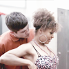
This is my base.
Without Curves ---- With Curves
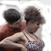
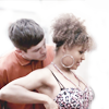
I masked it and used a soft round brush to cover the background.
Then I added a Brightness/Contrast layer.
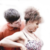
The cut out looks sharp and you don't see the flaws of the mask. I wasn't accurate, but brightening the picture did the trick.
I went to Edit > Copy Merged, Edit > Paste and then resized the picture a little to have more negative space. I created a new Fill layer below my new base and filled with white (#ffffff) because after resizing the picture was smaller than the 100x100px canvas. I duplicated my new base, sharpened it, and lower the opacity of the layer till I was satisfied with it.
I didn't like that abrupt, straight border on the left, so I picked this texture by pandavirus:
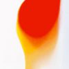
I rotated it 180° clockwise, shifted it to the left and masked it. (I set it to Normal, 100% opacity)

PSD:
Download from box.net (CS4+)
Download from box.net (previous versions)
2. Sometimes, I add a new Fill layer in a solid color below the layer I'm masking: I pick a color contrasting with the background I'm removing (a dark color if the background is white, for example) so that the imperfections of the mask become easier to spot.
B. Above the base, I create a new layer; I pick a color from the background with the Eyedropper tool, and then I cover the background with a round brush (100% hardness at first, and then a softer one to refine borders).
Do you know of any easy ways to remove the logos from tv shows from caps, like from rawr caps etc, without smudging things out of proportion or the image we want to use (meaning, like if the logo is right over part of the image you actually want to use)? (needtakehave)
Sadly, no. I pick caps without the logo, or I choose a crop in which the logo isn't showing/is easy to remove with the Blur tool. I'm a lazy person. :D
However, I suggest you to take a look at this video-tut by newkidfan: she uses the Smudge tool to remove the bars from the face of a character. Her technique might be a little tricky to master, but it's brilliant. She uses a default brush (Oil Pastel Large) at 45-50% opacity, I believe.
A huge THANKS to all of you. You've made some really interesting questions, and I hope my answers are clear and interesting to read too.
You can still ask questions HERE and I'll be glad to answer.
For those who missed the Requests post, WORRY NOT! I'll be making a SPAM ME WITH PICTURES post soon! <3