Tutorial 9 - Only Adjustment Layers
In an effort to find a suitable coloring for Emma Watson's Italian Vogue photoshoot, I realized that the coloring in the images makes it impossible to use my usual color palette. Therefore, as an experiment, I decided to look at my different coloring options, and I thought I'd share my findings with everybody else.
PS CS - Not translatable to PSP or Gimp
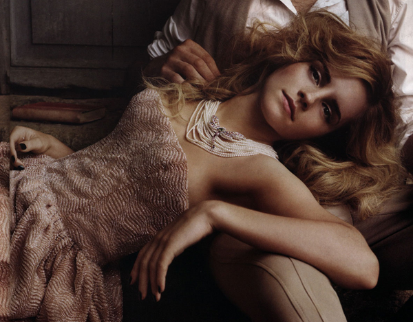
1. Okay, so first of all, we have our original image, which because it's a magazine scan has no real depth to it at all:
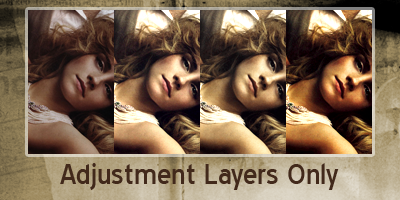
2. First things first, we need to give it some depth before we want to attempt anything. Create a new curves adjustment layer ( Layers >> New Adjustment Layer >> Curves... ) and set it auto. Click okay. Now we have something to work with. The image is already looking better:

3. However, I really like strong contrast in images. So let's give it that much more depth. This is what is really going to give our image a rich look. Create a new brightness/contrast adjustment layer ( Layers >> New Adjustment Layer >> Brightness/Contrast... ) and raise both the properties. The important thing to remember in this step is to move the brightness up to just a little below where you want the highlights to be, then match the contrast so that black is again true black. Obviously images with more contrast will not require anywhere near as much of an adjustment. For my image, my brightness is set to +25 and contrast to +23. Please, experiment with your own images to find the right balance.
But, as you can see, we've got an image with better clarity of shadows, midtones, and highlights:
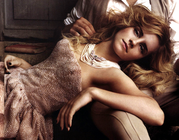
4. Now, if you needed something with a monochromatic base, the picture as is works perfectly for you because everything seems to be a varying shade of pink. This is not a bad thing, but it's not what I'm looking for. I want a variant of shades. We're going to create a new color balance adjustment layer ( Layers >> New Adjustment Layer >> Color Balance... ). Again, you should be paying attention to your image, but the basic idea I was using was to take the pink out of the midtones, makes the shadows cooler, and the highlights warmer. I used the following settings:
SHADOWSMIDTONESHIGHLIGHTS
+5 / 0 / +8 -40 / 0 / -5 0 / -5 / -33
Your image would now look like this:
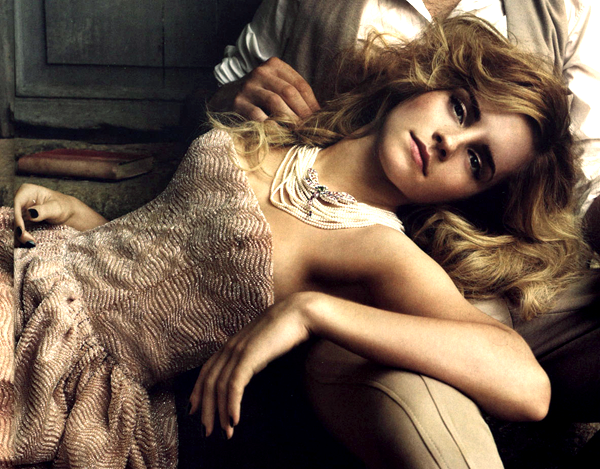
This could be called done at this point, but me? Well remember I was looking for other colorings to find one I was happy with. Let me just show you some of the others that I experimented with. This will be directions you can go from here.
5A. The image already has a vintage look about it, but what if you want to take it one step farther? I'll show you how. You're going to want to create a new gradient map adjustment layer ( Layers >> New Adjustment Layer >> Gradient Map... ). I think these are a fun tool that just don't get used enough. Once you're got your box up, click on the gradient and we're going to change the colors. On the left side of the gradient, input color #572300 and on the right input color #EACF6F. Hit okay and okay, and then Emma looks very brown and beige, right? We're going to fix that. Set your layer style as Hue, and drop the opacity to 40%. Viola! Emma in classic vintage:

5B. What if you want a different look? Say you want this image to be more saturated? Well, selective color is the best way to do that without blowing the colors overboard. If you tried 5A, please don't forget to delete or turn the layer off. Now we're going to create a new selective coloring adjustment layer ( Layers >> New Adjustment Layer >> Selective Coloring... ). Now I know out in the iconing world that there are a number of people who think selective coloring is the easy way out, or a way of completely screwing with colors. Well, yeah, sure, if you use it incorrectly. However, it's your best and most concise photoshop color for color clarifying and tweaking. It takes practice and patience, but eventually you can do exactly what you want just by using the sliders. So, let me show you the colors I used for this setting. For more info on selective coloring, I would recommend you take a look at my selective coloring tutorial.
Here are my settings:
RedsYellowsCyansBluesMagentasNeutralsBlacks
Cyan: -20
Megenta: +14
Yellow: +45
Black: +53
Cyan: 0
Magenta: 0
Yellow: +29
Black: +15
Cyan: +100
Magenta: 0
Yellow: -100
Black: +100
Cyan: +100
Magenta: 0
Yellow: 0
Black: 0
Cyan: -100
Magenta: 0
Yellow: +100
Black: 0
Cyan: +14
Magenta: +8
Yellow: +16
Black: 0
Cyan: 0
Magenta: 0
Yellow: 0
Black: +6
The image looks like so!
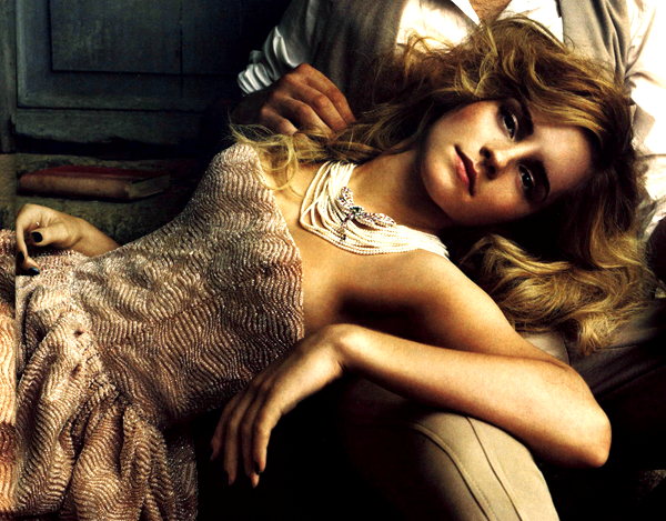
So there you have it! I hope you enjoyed this tutorial and that this coloring will help you with other monochrome, contrastless images. Comments are love, thanks :)
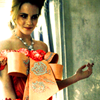
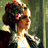
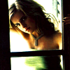
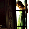
and with a little saturation enchancement, here's what you can do with icons:


PS CS - Not translatable to PSP or Gimp
1. Okay, so first of all, we have our original image, which because it's a magazine scan has no real depth to it at all:

2. First things first, we need to give it some depth before we want to attempt anything. Create a new curves adjustment layer ( Layers >> New Adjustment Layer >> Curves... ) and set it auto. Click okay. Now we have something to work with. The image is already looking better:

3. However, I really like strong contrast in images. So let's give it that much more depth. This is what is really going to give our image a rich look. Create a new brightness/contrast adjustment layer ( Layers >> New Adjustment Layer >> Brightness/Contrast... ) and raise both the properties. The important thing to remember in this step is to move the brightness up to just a little below where you want the highlights to be, then match the contrast so that black is again true black. Obviously images with more contrast will not require anywhere near as much of an adjustment. For my image, my brightness is set to +25 and contrast to +23. Please, experiment with your own images to find the right balance.
But, as you can see, we've got an image with better clarity of shadows, midtones, and highlights:

4. Now, if you needed something with a monochromatic base, the picture as is works perfectly for you because everything seems to be a varying shade of pink. This is not a bad thing, but it's not what I'm looking for. I want a variant of shades. We're going to create a new color balance adjustment layer ( Layers >> New Adjustment Layer >> Color Balance... ). Again, you should be paying attention to your image, but the basic idea I was using was to take the pink out of the midtones, makes the shadows cooler, and the highlights warmer. I used the following settings:
SHADOWSMIDTONESHIGHLIGHTS
+5 / 0 / +8 -40 / 0 / -5 0 / -5 / -33
Your image would now look like this:

This could be called done at this point, but me? Well remember I was looking for other colorings to find one I was happy with. Let me just show you some of the others that I experimented with. This will be directions you can go from here.
5A. The image already has a vintage look about it, but what if you want to take it one step farther? I'll show you how. You're going to want to create a new gradient map adjustment layer ( Layers >> New Adjustment Layer >> Gradient Map... ). I think these are a fun tool that just don't get used enough. Once you're got your box up, click on the gradient and we're going to change the colors. On the left side of the gradient, input color #572300 and on the right input color #EACF6F. Hit okay and okay, and then Emma looks very brown and beige, right? We're going to fix that. Set your layer style as Hue, and drop the opacity to 40%. Viola! Emma in classic vintage:

5B. What if you want a different look? Say you want this image to be more saturated? Well, selective color is the best way to do that without blowing the colors overboard. If you tried 5A, please don't forget to delete or turn the layer off. Now we're going to create a new selective coloring adjustment layer ( Layers >> New Adjustment Layer >> Selective Coloring... ). Now I know out in the iconing world that there are a number of people who think selective coloring is the easy way out, or a way of completely screwing with colors. Well, yeah, sure, if you use it incorrectly. However, it's your best and most concise photoshop color for color clarifying and tweaking. It takes practice and patience, but eventually you can do exactly what you want just by using the sliders. So, let me show you the colors I used for this setting. For more info on selective coloring, I would recommend you take a look at my selective coloring tutorial.
Here are my settings:
RedsYellowsCyansBluesMagentasNeutralsBlacks
Cyan: -20
Megenta: +14
Yellow: +45
Black: +53
Cyan: 0
Magenta: 0
Yellow: +29
Black: +15
Cyan: +100
Magenta: 0
Yellow: -100
Black: +100
Cyan: +100
Magenta: 0
Yellow: 0
Black: 0
Cyan: -100
Magenta: 0
Yellow: +100
Black: 0
Cyan: +14
Magenta: +8
Yellow: +16
Black: 0
Cyan: 0
Magenta: 0
Yellow: 0
Black: +6
The image looks like so!

So there you have it! I hope you enjoyed this tutorial and that this coloring will help you with other monochrome, contrastless images. Comments are love, thanks :)
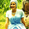
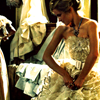
and with a little saturation enchancement, here's what you can do with icons:

