tutorial #2
twinkletwilight asked me for a tutorial for this icon 
. I managed to recreate my steps, so here is it.
from
to
Made in PS7. 14 steps, including Curves and Selective Coloring. Might be translatable to other programs by advanced users.
Note: Apparently, my photoshop is on drugs. Step 4 is now revised so you can actually follow the tutorial. Thanks to girl3744 for bringing the problem to my attention.
Note 2: Revised again. This tutorial turns out to be way more complicated than I first thought. I missed something on step 6 that's now fixed, and edited the wording on the steps 6 and 8 to make it easier to understand. Also posted a new picture of my layer palette since the old one didn't reflect the tutorial anymore.
If there are still problems, please let me know!
1. Take your cap and crop it. Because of the next step, it's best if the cap has a faint bluish tint to it.

2. Curves layer so the natural colors come out. Depending on the cap you use, you'll need to adjust the settings. I mainly wanted to get rid of the blueish tint and get out Galadriel's skin tone and the colors of the leaves in the background. If your cap has a very different coloring from the one I used, this step is where you should try to even out the differences.
The settings I used are:
RGB
1st point: I: 132 / O: 172
2nd point: I: 52 / O: 61
Red
1st point: I: 194 / O: 207
2nd point: I: 153 / O: 164
Green
1st point: I: 167 / O: 150
2nd point: I: 91 / O: 89
Blue
1st point: I: 168 / O: 132
2nd point: I: 76 / O: 73

to
If you're following this with a different cap, keep note of how light (and red/pinkish) her skin is after this step and how little contrast there is in total. Your end result will be way darker if, after this step, your icon is much darker and/or has lots of contrast.
3. Added a dark blue layer (#05052E) and set it to Difference 42% Fill because there was still way too much blue in the icon for my liking.

to
4. REVISED Galadriel's skin looks horrible now, so let's change that. Make a new Levels Layer (Layer - New Adjustment Layer - Levels).
My settings are:
RGB
Input Levels: 26 / 0.95 / 187
Output Levels: 26 / 255
Red
Input Levels: 0 / 0.95 / 253
Output Levels: 1 / 248
Green
Input Levels: 5 / 0.86 / 255
Output Levels: 0 / 255
Blue
Input Levels: 0 / 1.03 / 255
Output Levels: 0 / 255
The result of this is minimal different from what's show below. The finished icon will be a tiny bit darker in the greens of the background, but the overall coloring effect will be the same. If you're following this tutorial with the same cap and want to archieve the exact look of the finished icon, adjusting the settings of the last Selective Coloring Layer (step 13) will get you that.
Note: If you're following this with a different picture, take note of how little contrast there is in the icon at this point and how light it is. Adjust your level settings accordingly or add a Brightness/Contrast layer to the same effect.

to
5. Dark blue exclusion layer to get rid of the constrast (yes, even more so) and make the colors more soft and dreamy looking. I used #001A4E on Exclusion, left it at 100%.

to
6. At this point, I think I decided it was too dark for my liking (I honestly can't really remember why I did the next steps the way I did). Anyway, I used a light grey paper texture on soft light, and another (with a bit more texture) on color burn. As I have no idea which textures I used, I'm recreating this now with first
- a light grey layer (#E6E6E6) on soft light, 100% (this was the main color of the texture in the original icon, that hardly had any texture at all anyway)
- and then a light grey texture (this one by dusty_memories) on color burn 64% fill.
- Make a new layer on top of all layers, then turn off the visibility of the last three layers (the two grey ones and the exclusion layer). Select the empty layer on top, and then stamp (Ctrl + Alt + Shft + E) all (now) visible layer (from background to the levels layer). and put this stamped layer (that should be on top of all layers) to Soft Light 100%. Turn on the visiblity of the two grey layers and the exclusion layer again (so that all layers are visible once more).
Stamping is the same as selecting the entire canvas, then going to Edit - Copy Merged, and then pasting this (Edit - Paste). Both ways will give you a copy of all visible layers on a new layer. If you use the copy merged commands, you do not need to first make a new layer, but you will need to select your entire canvas before you can use the copy merged command.

to
7. Not enough contrast, so I duplicated that (stamped/copy-merged) layer again and left it on soft light 100%. Since I really wanted the background to be less blueish though, I added another blue exclusion layer (#001A4E) between the two topmost soft light layers.

to
8. Copy merged and pasted (or stamped, whichever you prefer) all layers again (like in step 4), and set this layer to Soft Light 28% Fill for a bit more contrast. This step won't be necessary on all icons.

to
9. Selective Color Layer to bring out the greens and magentas a bit more. You can leave this out if you want or fiddle with color balance if you don't use PS.
My settings were:
[Methode: Relative]
Greens
Cyan: +100%
Yellow: +100%
Cyans
Cyan: +100%
Blues
Cyan: +100%
Magentas
Magenta: +100%
Blacks
Black: +40%

to
10. Fixed the pixelated bits on Galadriel's skin (mostly at the neck). New Raster Layer, take the blur brush, enable Use All Layers and lower the Strength a bit. Then carefully blur the too pixelated bits (I needed this more on the original icon than here).

to
11. Light yellow/orangeish layer on Multiply so it looks a bit more dreamy/soft. I used #FEEBC7 on Multiply with 41% opacity and 45% fill.

to
12. I decided the green/turquoise color of the background was too saturated, so I added a Hue/Saturation layer and lowered the Saturation by -31. That takes care of the background, but Galadriel is too light and washed out now, so I used the Mask of the Hue/Saturation layer and went over her face and hair with a soft round brush.


to
13. Another Selective Color Layer to make the background more green and less turquoise.
My settings:
[Methode: Absolute]
Greens
Cyan: -30%
Yellow: +7%
Black: +12%
Cyans
Cyan: -33%
Blues
Cyan: +29%
It should be possible to get a similar result by either using Color Balance or Hue/Saturation (working not with the Masters, but the Greens, Cyans and Blues).

to
14. Sharpen at will (or leave it as it is). I made a new raster layer and used the sharpen brush (enable Use All Layers; Strength: 22%) on Galadriel's face and the leaves.

to
Done!
My layer palette looks like this:
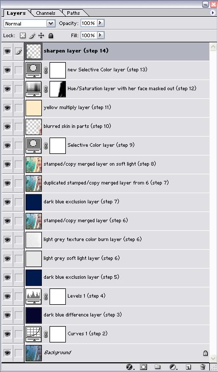
And I had to go through this with different pictures to see if it even works on other caps. I found that, with some tweaking, it does.
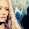
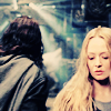
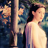
Feel free to ask any question :)
. I managed to recreate my steps, so here is it.
from
to
Made in PS7. 14 steps, including Curves and Selective Coloring. Might be translatable to other programs by advanced users.
Note: Apparently, my photoshop is on drugs. Step 4 is now revised so you can actually follow the tutorial. Thanks to girl3744 for bringing the problem to my attention.
Note 2: Revised again. This tutorial turns out to be way more complicated than I first thought. I missed something on step 6 that's now fixed, and edited the wording on the steps 6 and 8 to make it easier to understand. Also posted a new picture of my layer palette since the old one didn't reflect the tutorial anymore.
If there are still problems, please let me know!
1. Take your cap and crop it. Because of the next step, it's best if the cap has a faint bluish tint to it.
2. Curves layer so the natural colors come out. Depending on the cap you use, you'll need to adjust the settings. I mainly wanted to get rid of the blueish tint and get out Galadriel's skin tone and the colors of the leaves in the background. If your cap has a very different coloring from the one I used, this step is where you should try to even out the differences.
The settings I used are:
RGB
1st point: I: 132 / O: 172
2nd point: I: 52 / O: 61
Red
1st point: I: 194 / O: 207
2nd point: I: 153 / O: 164
Green
1st point: I: 167 / O: 150
2nd point: I: 91 / O: 89
Blue
1st point: I: 168 / O: 132
2nd point: I: 76 / O: 73
to
If you're following this with a different cap, keep note of how light (and red/pinkish) her skin is after this step and how little contrast there is in total. Your end result will be way darker if, after this step, your icon is much darker and/or has lots of contrast.
3. Added a dark blue layer (#05052E) and set it to Difference 42% Fill because there was still way too much blue in the icon for my liking.
to
4. REVISED Galadriel's skin looks horrible now, so let's change that. Make a new Levels Layer (Layer - New Adjustment Layer - Levels).
My settings are:
RGB
Input Levels: 26 / 0.95 / 187
Output Levels: 26 / 255
Red
Input Levels: 0 / 0.95 / 253
Output Levels: 1 / 248
Green
Input Levels: 5 / 0.86 / 255
Output Levels: 0 / 255
Blue
Input Levels: 0 / 1.03 / 255
Output Levels: 0 / 255
The result of this is minimal different from what's show below. The finished icon will be a tiny bit darker in the greens of the background, but the overall coloring effect will be the same. If you're following this tutorial with the same cap and want to archieve the exact look of the finished icon, adjusting the settings of the last Selective Coloring Layer (step 13) will get you that.
Note: If you're following this with a different picture, take note of how little contrast there is in the icon at this point and how light it is. Adjust your level settings accordingly or add a Brightness/Contrast layer to the same effect.
to
5. Dark blue exclusion layer to get rid of the constrast (yes, even more so) and make the colors more soft and dreamy looking. I used #001A4E on Exclusion, left it at 100%.
to
6. At this point, I think I decided it was too dark for my liking (I honestly can't really remember why I did the next steps the way I did). Anyway, I used a light grey paper texture on soft light, and another (with a bit more texture) on color burn. As I have no idea which textures I used, I'm recreating this now with first
- a light grey layer (#E6E6E6) on soft light, 100% (this was the main color of the texture in the original icon, that hardly had any texture at all anyway)
- and then a light grey texture (this one by dusty_memories) on color burn 64% fill.
- Make a new layer on top of all layers, then turn off the visibility of the last three layers (the two grey ones and the exclusion layer). Select the empty layer on top, and then stamp (Ctrl + Alt + Shft + E) all (now) visible layer (from background to the levels layer). and put this stamped layer (that should be on top of all layers) to Soft Light 100%. Turn on the visiblity of the two grey layers and the exclusion layer again (so that all layers are visible once more).
Stamping is the same as selecting the entire canvas, then going to Edit - Copy Merged, and then pasting this (Edit - Paste). Both ways will give you a copy of all visible layers on a new layer. If you use the copy merged commands, you do not need to first make a new layer, but you will need to select your entire canvas before you can use the copy merged command.
to
7. Not enough contrast, so I duplicated that (stamped/copy-merged) layer again and left it on soft light 100%. Since I really wanted the background to be less blueish though, I added another blue exclusion layer (#001A4E) between the two topmost soft light layers.
to
8. Copy merged and pasted (or stamped, whichever you prefer) all layers again (like in step 4), and set this layer to Soft Light 28% Fill for a bit more contrast. This step won't be necessary on all icons.
to
9. Selective Color Layer to bring out the greens and magentas a bit more. You can leave this out if you want or fiddle with color balance if you don't use PS.
My settings were:
[Methode: Relative]
Greens
Cyan: +100%
Yellow: +100%
Cyans
Cyan: +100%
Blues
Cyan: +100%
Magentas
Magenta: +100%
Blacks
Black: +40%
to
10. Fixed the pixelated bits on Galadriel's skin (mostly at the neck). New Raster Layer, take the blur brush, enable Use All Layers and lower the Strength a bit. Then carefully blur the too pixelated bits (I needed this more on the original icon than here).
to
11. Light yellow/orangeish layer on Multiply so it looks a bit more dreamy/soft. I used #FEEBC7 on Multiply with 41% opacity and 45% fill.
to
12. I decided the green/turquoise color of the background was too saturated, so I added a Hue/Saturation layer and lowered the Saturation by -31. That takes care of the background, but Galadriel is too light and washed out now, so I used the Mask of the Hue/Saturation layer and went over her face and hair with a soft round brush.
to
13. Another Selective Color Layer to make the background more green and less turquoise.
My settings:
[Methode: Absolute]
Greens
Cyan: -30%
Yellow: +7%
Black: +12%
Cyans
Cyan: -33%
Blues
Cyan: +29%
It should be possible to get a similar result by either using Color Balance or Hue/Saturation (working not with the Masters, but the Greens, Cyans and Blues).
to
14. Sharpen at will (or leave it as it is). I made a new raster layer and used the sharpen brush (enable Use All Layers; Strength: 22%) on Galadriel's face and the leaves.
to
Done!
My layer palette looks like this:
And I had to go through this with different pictures to see if it even works on other caps. I found that, with some tweaking, it does.
Feel free to ask any question :)