& it's not just that i'm so selfish and scared
Sorry this is kind of late, been pretty busy lately *___* The other ones will hopefully follow soon?
Today, we're going from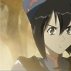
to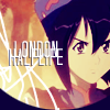
, as requested by chyama ♥ Uses Selective Color, so it's not translatable.
We obviously need a base image to start, and it's courtesy of silvie_chan's lovely screencaps this time ♥ Side-of-the-face crop ftw 8D

The base is already fairly dark, but I'm going to try something different and put #F1DCC9 on Multiply, 100% before anything else. That way it looks even darker, but then I duplicate the base on Soft Light, 100% to brighten it up again, like this:
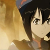
The browns in the image are intensified this way, and it enhances the smoke or whatever it is around Chloe. Now let's have some fill layers!
☆ #080039, Exclusion, 100%, duplicated TWICE (so there are three exclusion layers) gives you this
☆ #F9CECE, Soft Light, 100%, gives you this
☆ #C7C6CD, Color Burn, 100% gives you:
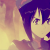
The colouring looks really, really purple right now, but that's what I wanted for this image because it highlights Chloe's dark hair and her hat so well. So just bring another Soft Light, 100% duplicate to the top so it doesn't look so bland~
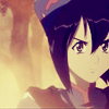
And this is where the Selective Color comes in, joy! Visit this gorgeous tutorial by my friend almateria and follow step 3. If it helps, save the settings when you're done under an easy-to-remember name - I used "almateria" so I'd remember where it came from (it sure makes my life easier, that's why I'm so adamant about suggesting it!). Anyway, set the resulting adjustment layer to Soft Light, 100% (what a surprise) and the whole image is shinied up!
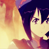
After all this, I felt the left side of the icon was still lacking, so I added a rough-looking scribble texture. Despite the ambiguous outcome, I think it came from this texture by sanami276 (rest of the set here). I inversed it and set it to Screen, 100%, resized/positioned it, then cut part of it off to come up with this.
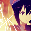
Now we have something interesting, yes? Now for some random text! I was listening to London Halflife by Metric while making this icon so that's where it came from. The font is Tall Dark and Handsome, and the line spacing is really small so the letters overlap and it looks kind of cool %D I duplicated the type layer, set the colour to the Exclusion colour from earlier, nudged it down and to the left and set the opacity to 50% to get the shadow.
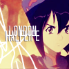
But it still feels like it's missing something. How about a circle border? %D Take this strange-looking texture by me (but the idea is from alvanista the awesome) and set it to Multiply, 100%. Or you could just draw one yourself with the Circle Marquee, whatever;;; Now we're done! :DDD

Other examples:
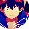
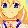
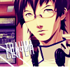
I encourage you to go play around and show me your finished icons! DOOO IIIIIIT, I wanna see what you guys come up with~
If you like what you see, why not friend tacticons for future updates?
Today, we're going from

to

, as requested by chyama ♥ Uses Selective Color, so it's not translatable.
We obviously need a base image to start, and it's courtesy of silvie_chan's lovely screencaps this time ♥ Side-of-the-face crop ftw 8D

The base is already fairly dark, but I'm going to try something different and put #F1DCC9 on Multiply, 100% before anything else. That way it looks even darker, but then I duplicate the base on Soft Light, 100% to brighten it up again, like this:

The browns in the image are intensified this way, and it enhances the smoke or whatever it is around Chloe. Now let's have some fill layers!
☆ #080039, Exclusion, 100%, duplicated TWICE (so there are three exclusion layers) gives you this
☆ #F9CECE, Soft Light, 100%, gives you this
☆ #C7C6CD, Color Burn, 100% gives you:

The colouring looks really, really purple right now, but that's what I wanted for this image because it highlights Chloe's dark hair and her hat so well. So just bring another Soft Light, 100% duplicate to the top so it doesn't look so bland~

And this is where the Selective Color comes in, joy! Visit this gorgeous tutorial by my friend almateria and follow step 3. If it helps, save the settings when you're done under an easy-to-remember name - I used "almateria" so I'd remember where it came from (it sure makes my life easier, that's why I'm so adamant about suggesting it!). Anyway, set the resulting adjustment layer to Soft Light, 100% (what a surprise) and the whole image is shinied up!

After all this, I felt the left side of the icon was still lacking, so I added a rough-looking scribble texture. Despite the ambiguous outcome, I think it came from this texture by sanami276 (rest of the set here). I inversed it and set it to Screen, 100%, resized/positioned it, then cut part of it off to come up with this.

Now we have something interesting, yes? Now for some random text! I was listening to London Halflife by Metric while making this icon so that's where it came from. The font is Tall Dark and Handsome, and the line spacing is really small so the letters overlap and it looks kind of cool %D I duplicated the type layer, set the colour to the Exclusion colour from earlier, nudged it down and to the left and set the opacity to 50% to get the shadow.

But it still feels like it's missing something. How about a circle border? %D Take this strange-looking texture by me (but the idea is from alvanista the awesome) and set it to Multiply, 100%. Or you could just draw one yourself with the Circle Marquee, whatever;;; Now we're done! :DDD

Other examples:


I encourage you to go play around and show me your finished icons! DOOO IIIIIIT, I wanna see what you guys come up with~
If you like what you see, why not friend tacticons for future updates?