Thanks! That's one of my personal favorites, too. :) I'm glad you like that one. This also gives me a good idea of which icons to use for previews when I start to post the batch.
oooo, pink shiny thingy in 1-4. That's hot that is! Your icons are of such quality Justine that you can get away with giant lettering. Especially if it's funny ;)
Aww, well thanks! That's a kind of answer that really encourages me. I, personally, have icon makers who I consider to set the trends when it comes to icon making, and I also consider them to be able to get away with different styles; so naturally, I'm trying to achieve something like that. So thanks sooo much! ♥
I love your 'trademark vibrant colours'. They are what make your icons unique. I think these are lovely, I love the purply/pink thing. As a personal thing I don't really like the tiny text that is on alot of icons at the moment, simply because I want to know what it says and start squinting at the screen! :D I like the big text though, I think you pull it off nicely.
Thanks! I'm glad for your input on the tiny text. Honestly, I don't think I'll ever stop using it no matter what the world says, because I just love it! IMO, I believe it can detail an icon perfectly when used correctly. But I definitely respect your input, and I can see where you're coming from. To me, I think tiny text leaves something to the imagination. Like, what would you *think* that this icon might say if it were captioned? What about text used like this, when it's tiny but readable?
It may because it's very much in fashion at the moment, and my imagination is having to work overtime! I love the way you've used it in that one; I do like icons with text on, I have to say. I think maybe because like fox said below, I like my icons to be 'mood' icons, refelecting what I'm thinking sometimes.
Hee, I like your top row, 1-4. I must say, I don't really care for what your friend calls your "trademark vibrant colors" mostly because I've seen this kind of coloring all over the place, and it doesn't really hit me as "vibrant" either. Kind of like...an overall mediocrity of color. Like, nothing really sticks out, the colors are neutral kind of...kind of bland. I really like your bright, bright stuff (i.e. icons 1-4). I hate trendy, obnoxious lettering, but then again, some people like it, because they want "mood" icons.
Oh, okay, we're not talking about the same kind of "vibrant coloring" :D I like the icons you posted in your response. I like them a LOT. This is the kind of coloring that got you my vote in elite_xf_icons :D However, your "neutral" icon isn't showing up for me.
I guess what I really mean is I don't like the peachiness of it. But really, I think this borders on personal preference. There's really nothing artistically wrong about the peachiness, except maybe it strikes me as a tad unnatural.
Oooohhh. Okay I totally understand what you mean now! *giggles* That was an older icon, and when I look at it now, I honestly don't care for it one bit. Haha. The peachiness seems to clash with the bright blues that I used, instead of complimenting it. I think more yellows or greens in that instance would've worked better.
Tsk tsk tsk. Foxy hotlinked. What shall I ever do about that?? Well, I guess I can forgive you since you're cool like that, and since you accepted me into elite. ;) Hee.
*hugs* Btw, I just noticed that you have two new batches of beauties up at your journal. I usually just check at xf_icons, but since these aren't xf, I never even noticed! I'm so incredibly sorry hun. I'm gonna go leave some comments over there right now! =D
1-3-4 are my fav sweetie!!! I agree that your "trademark vibrant colours" is so awsome!!!!! As for the text, well I sometimes like it, but here it doesn't really appeal to me. Your colouring with smart style and sometimes text brushes are the best to me.
By the way I hope you are doing rather good and I'm sending you *big hugs* hun!
Thanks hun! I'm glad you made your input on the text. I think I'll use it in one or two icons just for "mood" icons, as I've just heard them called, but otherwise I'll ditch it. :P I'm glad my coloring and tiny text is considered smart tho! Thank you very much. *hugs* ♥
Comments 13
Reply
Reply
Your icons are of such quality Justine that you can get away with giant lettering. Especially if it's funny ;)
Reply
Reply
Reply
( ... )
Reply
Reply
Reply
( ... )
Reply
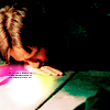
Pardon me for hotlinking, but here is an example:
http://i11.photobucket.com/albums/a198/justinebe/rs007.png
I guess what I really mean is I don't like the peachiness of it. But really, I think this borders on personal preference. There's really nothing artistically wrong about the peachiness, except maybe it strikes me as a tad unnatural.
Reply
Tsk tsk tsk. Foxy hotlinked. What shall I ever do about that?? Well, I guess I can forgive you since you're cool like that, and since you accepted me into elite. ;) Hee.
*hugs* Btw, I just noticed that you have two new batches of beauties up at your journal. I usually just check at xf_icons, but since these aren't xf, I never even noticed! I'm so incredibly sorry hun. I'm gonna go leave some comments over there right now! =D
Reply
By the way I hope you are doing rather good and I'm sending you *big hugs* hun!
Reply
Reply
Leave a comment