002;
Vibrant Color Guide requested b consumedly
If you want to request something here is my thread to Ask The Maker 4.0!
Well, I have different styles of vibrant coloring, bu consumedly sked for this one:
other icons I made with this technique are this ones:
Not really too much icons, but I'm using this way to bright the colors in my newest icons.
So here we go!
You'll see it's pretty simple. In fact, most of my icons are super simple.
ONE.
I used these caps:
one two three.
The thing I always do with every icon? Curves.
I always make a curves layer to light up the cap.
I make another curves layer, but this time I play around with the Red, Green and Blue curves
to "color" the cap, to highlight the tone I want (if you know what I mean).
Examples;
without the second curves

ith the second curves
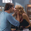
without the second curves
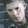
ith the second curves

TWO.
Color all the way!
The color they have to start coloring is pretty amazing right now, right?
But we still need to highlight those colors, so I add a new color fill layer
with the color I think it would be the best for the style of icon I want, but you know,
you have to experiment with this!
I used this color (#5c7586) for the first icon and this color (#1e2965) for the second one.
I put both icons to soft light, the first: 100% opacity and the second: 17%
And this is how it would look like atm:
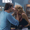
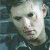
THREE.
You'll see that the color desaturated a little bit the icon, and this is exactly what we want!
If you see that your icon have a lot of color, then follow this step (Non examples because I couldn't find any icon to show how it would look like, but I make this in almost every "vibrant" icon).
Make a new gradient map layer with dark gray color (something like this: #131313) to white.
Move the color stop of whites to highlight well, the whites [click].
And then, lower the opacity around 20%, but that depends in the cap and the result you're looking for!
FOUR.
Light textures is the key.
They bring to the icon more life, and it makes them a lot more interesting.
I used this and this textures in both icons (Idk the maker, sorry!).
Both set to soft light.
They would look like this:
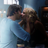
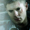
[the second icon looked a little dark to me so I made a new color fill layer with this color (#191e26) set to screen 76% opacity. This is how it looks like].
FIVE.
And finally, we're going to make it vibrant! How?
Make a new vibrance layer. If you don't have Vibrance, then play around with hue/saturation.
100% of vibrance. And if it's not enough, add a little bit of hue, or just duplicate the layer until you're satisfied!

Some parts of the first icon were over saturated, so I erased the parts I didn't like, like the face of Anya.
It looked too orange-y, so I just erased it, that simple!
The second icon is done, but for the first one I added one more texture by rebel) set to screen 100%
AND VOILÀ!
I don't know if this is a guide lol. But I hope this is useful for someone! ;)
Rules
»Comments are really apreciated.
»Please, don't just copy/paste, be creative!
Previous tutorial post:
>>
