tutorial #7-- gravity
hey guys! fragilecat asked me how i made one of my x-men icons, so here we go. PLEASE DON'T COPY THIS EXACTLY! how to make this (in PS7):
so first, i started with this image of magneto. i cropped it as desired, resized it to 100x100 and sharpened it. then i rotated it counterclockwise by going to edit> transform> rotate 90º CCW. i applied auto contrast and auto color by going to image> adjustments, but the original image was pretty balanced so it didn't have much of an effect.
i thought the magnetic waves coming out of his hand weren't... uh... shiny enough, so i used the dodge tool lightly around his hand and the waves:
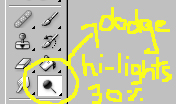
the dodge tool does pretty much what the color dodge layer setting does-- blows up the colors and leaves the image neon bright. this is why you have to be careful and use it lightly and at low opacities, else magneto's had would've disappeared under the brightness, and i definitely didn't want that. i was going for earthy/blueish colors ^^;;; anyway, now i have my final base, which is this:
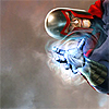
after that, i did what i do to almost every icon i make-- fix up the contrast a bit. i've used this trick so many times, i've even explained it more than once on other tutorials, so i'm going to quote myself this time:
"i wanted to change the lighting a bit, so i did what i always do to my bases when i want to create some contrast: duplicate the base layer (the duplicate will be called "contrast"), raise the brightness by about 40 (image> adjustments> brightness/contrast) and then applying a gaussian blur with a radius of about 8.0 (filter> blur> gaussian blur). now you'll see that our contrast layer is all blurred up, like this:"

"and then set that layer to soft light. what the soft light blending mode does is that the dark parts get darker and the light parts end up lighter. in this case, since the layer you're setting to soft light is all blurred, it will create a sort of soft look on the icon, affecting the original lighting and leaving a more... how do i say this... sort of "ethereal" look on the icon. i'm sure you've seen this effect before, only i always use it at the beginning and most people leave it as a last step for their icons." (~from my " carry your burden" tutorial).
we get this:
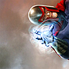
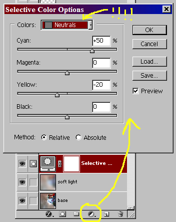
i'm sure you can see the difference: the background became more bright, and magneto stood out even more. now, since i was going for blue tones (for some reason, i think blue when i think of magnetism @_@ lol), i decided to use a selective color adjustment layer. these are very useful, and almost every icon in my x-men batch had one of these. it works really well with images that are in earthy tones, pink/orange or even yellow. not so hot with white, blue or green images. what i usually do is that in the neutrals sheet, i up cyan by a very high percentage, diminish magenta by about 20-30%, and diminish yellow by about double the value i used for magenta, so 40-60%. this image was kind of blueish from the beginning, so i just played with the settings until i got something i liked, and in the end used lower values: 50% for cyan, 0 for magenta and -20% for yellow.
i left that layer at normal, and got this:

yay, mags is bluuuuuueeeee ^_^ this looked pretty to me, but i felt the background was kinda blah. so i decided to add some textures! i used this one by tihana:

if i'm not mistaken i had to rotate it before i used it. i set it on multiply:
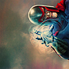
the multiply setting basically does what it's name implies-- it meshes the content of this layer together with the ones previous, and the result is always a darker icon. now my earthy tones are coming back, but mags' uniform went a little too dark for my tastes. so i grabbed this texture, again by tihana:
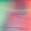
and set it on soft light. as expected, the icon took on green/pink tones, and since pink is way brighter than the colors that previously covered mags, now he became a little lighter-colored.
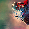
with the lighter coloring i lost some of the texture in the background, so i duplicated my base and brought it to the top, setting it to soft light ("duplicate base").
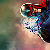
this also had the side effect of creating striking contrast between the background and shiny mags ^-^ which i love. but all my lovely blueish background was gone! ;_; so i added some more blue. what i did was that i created a new layer and flooded it with #CFEFFF. i set it to soft light-- and this was a very light blue so you can probably guess what happened...
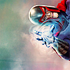
...it went bright. very bright. now if you know x-men, you know mags is not a very bright-happy-YAY person, so i wanted to bring it down a notch. i created a new layer, filled it with #FCF2C8 (a very light yellow/orange) and set it on multiply. the icon immediately went a little darker.
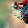
i liked this result, but i wanted to add a little... something to the background. so i looked up a very nice and textured light texture by awmpdotnet.

now, in the case of these light textures with grey backgrounds, i'm always reluctant to set them to blend modes like lighten or screen because the gray often makes me lose the whole icon if i use those blend modes. if they were on black backgrounds that's okay, because the black parts don't show up when these blend modes are used, but the grey parts do, because they're not too light or too dark. like so:
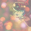
so i set this one to hard light, which is just like soft light except much, MUCH more intense. it won't hide magneto, and since grey is not light or dark, it doesn't really affect the icon. i got this:
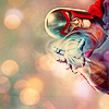
now, if you recall, i've said before that magneto isn't "a very bright-happy-YAY person," and this background felt a little too festive for him, so i reduced the opacity to 50% and obtained this...
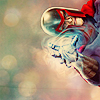
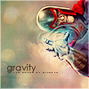
...which i DID like. then i just added some text: "gravity" in century gothic, and a tiny text brush by chouchoune, both layers duplicated as necessary until i felt it looked right. and in one last layer, a white 1px border (by going select> select all, and then edit> stroke), which i set to soft light. and TA-DAAAHHHH! we finally come to the final product:

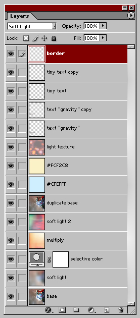
here are the layers in case you got lost somewhere along the road:
i hope you found this tutorial useful, and would love to see icons you made with things you learned from it.
so first, i started with this image of magneto. i cropped it as desired, resized it to 100x100 and sharpened it. then i rotated it counterclockwise by going to edit> transform> rotate 90º CCW. i applied auto contrast and auto color by going to image> adjustments, but the original image was pretty balanced so it didn't have much of an effect.
i thought the magnetic waves coming out of his hand weren't... uh... shiny enough, so i used the dodge tool lightly around his hand and the waves:

the dodge tool does pretty much what the color dodge layer setting does-- blows up the colors and leaves the image neon bright. this is why you have to be careful and use it lightly and at low opacities, else magneto's had would've disappeared under the brightness, and i definitely didn't want that. i was going for earthy/blueish colors ^^;;; anyway, now i have my final base, which is this:

after that, i did what i do to almost every icon i make-- fix up the contrast a bit. i've used this trick so many times, i've even explained it more than once on other tutorials, so i'm going to quote myself this time:
"i wanted to change the lighting a bit, so i did what i always do to my bases when i want to create some contrast: duplicate the base layer (the duplicate will be called "contrast"), raise the brightness by about 40 (image> adjustments> brightness/contrast) and then applying a gaussian blur with a radius of about 8.0 (filter> blur> gaussian blur). now you'll see that our contrast layer is all blurred up, like this:"

"and then set that layer to soft light. what the soft light blending mode does is that the dark parts get darker and the light parts end up lighter. in this case, since the layer you're setting to soft light is all blurred, it will create a sort of soft look on the icon, affecting the original lighting and leaving a more... how do i say this... sort of "ethereal" look on the icon. i'm sure you've seen this effect before, only i always use it at the beginning and most people leave it as a last step for their icons." (~from my " carry your burden" tutorial).
we get this:

i'm sure you can see the difference: the background became more bright, and magneto stood out even more. now, since i was going for blue tones (for some reason, i think blue when i think of magnetism @_@ lol), i decided to use a selective color adjustment layer. these are very useful, and almost every icon in my x-men batch had one of these. it works really well with images that are in earthy tones, pink/orange or even yellow. not so hot with white, blue or green images. what i usually do is that in the neutrals sheet, i up cyan by a very high percentage, diminish magenta by about 20-30%, and diminish yellow by about double the value i used for magenta, so 40-60%. this image was kind of blueish from the beginning, so i just played with the settings until i got something i liked, and in the end used lower values: 50% for cyan, 0 for magenta and -20% for yellow.

i left that layer at normal, and got this:

yay, mags is bluuuuuueeeee ^_^ this looked pretty to me, but i felt the background was kinda blah. so i decided to add some textures! i used this one by tihana:

if i'm not mistaken i had to rotate it before i used it. i set it on multiply:

the multiply setting basically does what it's name implies-- it meshes the content of this layer together with the ones previous, and the result is always a darker icon. now my earthy tones are coming back, but mags' uniform went a little too dark for my tastes. so i grabbed this texture, again by tihana:

and set it on soft light. as expected, the icon took on green/pink tones, and since pink is way brighter than the colors that previously covered mags, now he became a little lighter-colored.

with the lighter coloring i lost some of the texture in the background, so i duplicated my base and brought it to the top, setting it to soft light ("duplicate base").

this also had the side effect of creating striking contrast between the background and shiny mags ^-^ which i love. but all my lovely blueish background was gone! ;_; so i added some more blue. what i did was that i created a new layer and flooded it with #CFEFFF. i set it to soft light-- and this was a very light blue so you can probably guess what happened...

...it went bright. very bright. now if you know x-men, you know mags is not a very bright-happy-YAY person, so i wanted to bring it down a notch. i created a new layer, filled it with #FCF2C8 (a very light yellow/orange) and set it on multiply. the icon immediately went a little darker.

i liked this result, but i wanted to add a little... something to the background. so i looked up a very nice and textured light texture by awmpdotnet.

now, in the case of these light textures with grey backgrounds, i'm always reluctant to set them to blend modes like lighten or screen because the gray often makes me lose the whole icon if i use those blend modes. if they were on black backgrounds that's okay, because the black parts don't show up when these blend modes are used, but the grey parts do, because they're not too light or too dark. like so:

so i set this one to hard light, which is just like soft light except much, MUCH more intense. it won't hide magneto, and since grey is not light or dark, it doesn't really affect the icon. i got this:

now, if you recall, i've said before that magneto isn't "a very bright-happy-YAY person," and this background felt a little too festive for him, so i reduced the opacity to 50% and obtained this...

...which i DID like. then i just added some text: "gravity" in century gothic, and a tiny text brush by chouchoune, both layers duplicated as necessary until i felt it looked right. and in one last layer, a white 1px border (by going select> select all, and then edit> stroke), which i set to soft light. and TA-DAAAHHHH! we finally come to the final product:
here are the layers in case you got lost somewhere along the road:

i hope you found this tutorial useful, and would love to see icons you made with things you learned from it.