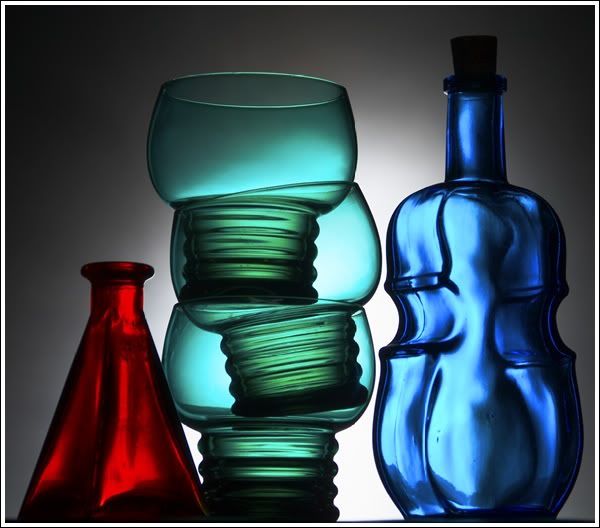
I like the top photo because I feel the ratio of the bluegreens works better with that strong red in the corner. In the second photo, the yellowish tone seems to create a more Primary Color feel, and for me, the visual beauty of balance/counterbalance, Golden Mean, or wotevah else you want to call it, is taken away by red, yellow, blue, just sort of sitting there, not even having a conversation with each other. 'Hope that made some sense!
i totally understand the "sitting there not having a conversation." comment. I also like the first photo with the red, green, and blue, because I find the way that yellow color came out as dull. The green seems more interesting.
I like both, but if I had to go with one, if you had a gun to my head or something, I'd go with the second one. It contains the three primary colors: red, yellow, blue.
Both have very strong points, but if you're selling prints, you'd probably want to go for the second. Americans are raised/programmed to respond better to primary colors and warmer tones, both of which the second has.
I have a strong preference for the first one. I don't have a detailed explanation for why. All I can say is that I really, really like looking at the first one, and I would scroll right past the second. Nice work.
Comments 28
Reply
better with that strong red in the corner. In the second photo, the
yellowish tone seems to create a more Primary Color feel, and
for me, the visual beauty of balance/counterbalance, Golden Mean,
or wotevah else you want to call it, is taken away by red, yellow,
blue, just sort of sitting there, not even having a conversation
with each other. 'Hope that made some sense!
Reply
Reply
Reply
Reply
Reply
Reply
Reply
Reply
Reply
Leave a comment