Results LIMS Challenge 4
Great turnout for Lims Challenge 4! Unfortunately 2 people will be leaving us tonight.
ELIMINATIONS
VOTED OFF
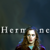
by restlessme (-7)
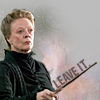
by kimaginethis (-5)
CONGRATULATIONS!
FAVORITE ICON + BANNER
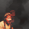
by that_was_cheesy (+3) » Click to Save your Banner ! You also got a ♥ on the Icon Talent List !
NO NEGATIVE VOTE (eligible for a SKIP)
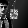
by pasta_and_pepsi (1)
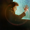
by curtana (0) You already won a skip, you can't win another one but congrats for no negative vote :)
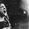
by stefycarter (0) You already won a skip, you can't win another one but congrats for no negative vote :)
EARNED A SKIP!
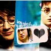
and
by pasta_and_pepsi
MOVING ON TO NEXT ROUND
♥ ♥ curtana
driveshaft108
♥ endgegner07
fabi7
♥ ♥ fahrenheit1993
♥ farfadine
fightclubs
hermionesparkle
♥ ♥ hezzda
karlakaine
♥ ♥ pasta_and_pepsi
♥ ♥ stefycarter
that_was_cheesy
utkari02
weasley_hobbit
VOTING TALLIES!
Here's the tally. Remember we're picking 3 least favorites and 1 favorite. Therefore, a negative (-) denotes how many people voted against your icon and a plus (+) denotes how many people voted your icon their favorit, zero (0) means you got neither or that they anuled each other out. So if you have a + point, pat yourself on the back!
Lims Challenge 4: Negative Space
01
02
03
04

05
06
07
08


09
10
11
12



13
-
-
-

-
-
-
01: -1 + 2 = 1
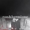
02: -4 + 0 = -4
03: -5 + 0 = -5
04: -3 + 0 = -3
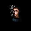
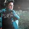
05: -0 + 1 = 1
06: -0 + 0 = 0
07: -1 + 1 = 0
08: -1 + 2 = 1
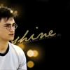
09: -7 + 0 = -7
10: -1 + 4 = 3
11: -1 + 3 = 2
12: -2 + 0 = -2
13: -0 + 0 = 0
+ POSITIVE VOTING COMMENTS +
#01 -- Very creative use of text.
#01 -- Really original text placement. You don't focus on the negative space at all, it draws you right to the image.
#05 -- Good texts and colouring.
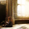
#07 -- I like the light and the bright coloring. But I like most that you can only see Emma's back. Nice idea!
#08 -- Nice cropping, good use of light texture and excellent font and placement of text.
#08 -- The image is clear and clean, the hint of color and text works well together. The slaint of the text helps also.
#10 -- The coloring really stands out, the repetition was a good choice, and the icon is composed nicely.
#10 -- Lovely blending and I like the smoke effect.
#10 -- I like the coloring and use of repetition!
#10 -- I love the vibrant colors and the duplication of the image.
#11 -- The texture use is phenomenal, it accentuates the picture. The font/color of the font/positioning really work in the icon.
#11 -- I love the use of light texture and text.
#11 -- Good composition with the two images and good use of textures.
- NEGATIVE VOTING COMMENTS -
» Don't take these comments as mean pointless critics, they could help you make a better icon for the next challenge!
#01 -- The text looks jumbled and disoriented.
#02 -- It is very difficult to see the image, if it were not for the text i would not know who it was.
#02 -- Ron and Hermione are quite unsharp, the text could have been more creative.
#02 -- The text looks squished on top of the image under the empty space, almost giving the icon a unbalanced look.
#02 -- It would have looked better if there was more contrast, the details would be more defined.
#03 -- The cut out of Maggie Smith still has bits from the original photograph it was taken from and the background is a bit too light for the photo, plus the words are crooked and too close to the photograph.
#03 -- McGonagall stands out too starkly against the background, I would have liked to see more effort on making her blend in.
#03 -- The colour is a bit dull, and it's a bit pixely.
#03 -- The coloring on the subject is bland and unflattering.
#03 -- The cropping is very simple and the background doesn't fit very well with the image.
#04 -- The font used is very difficult to read and the light texture doesn't work very well on an icon of this colouring.
#04 -- The image is dark and a little blurry.
#04 -- Daniel clearly still fills out a lot of space in this icon.
#07 -- It's very simple compared to the other icons, it could have been more creative.
#08 -- The subject looks a bit blurry.
#09 -- The font doesn't fit the icon & takes my eye away from the picture of Hermione.
#09 -- The text is too aggressive, if it were a darker colour or stood out less it would be better.
#09 -- The text effect doesn't quite match the icon, it's a bit distracting.
#09 -- The text placement is nice, but the image has a strange coloring: blueish and too light.
#09 -- The background is too much simple and doesn't say nothing to the icon. Also I think the icon needs more color cause it's a little dark.
#09 -- The font doesn't work with the icon, also the shadow behind the text makes it pop out which doesn't fit with the image which is more blended into the background.
#09 -- The text stands out too much, it would have looked better if it was blended in the background.
#10 -- Ron is too saturated.
#11 -- The white space between the blended images is distracting as is the light texture.
#12 -- The subjects don't really stand out very much and they're cut out rather sloppily.
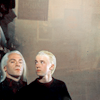
#12 -- The texture is confusing on the left side. It is drawing your eye away from the malfoy's, having draco's eyes looking up at the texture, which is unclear of what it is, giving it a 'what is it?' look to the icon.
It's my turn to do the Nomination for the winning icon. (with the Noms for Week 188 in a couple of days)
ELIMINATIONS
VOTED OFF
by restlessme (-7)
by kimaginethis (-5)
CONGRATULATIONS!
FAVORITE ICON + BANNER
by that_was_cheesy (+3) » Click to Save your Banner ! You also got a ♥ on the Icon Talent List !
NO NEGATIVE VOTE (eligible for a SKIP)
by pasta_and_pepsi (1)
by curtana (0) You already won a skip, you can't win another one but congrats for no negative vote :)
by stefycarter (0) You already won a skip, you can't win another one but congrats for no negative vote :)
EARNED A SKIP!
and
by pasta_and_pepsi
MOVING ON TO NEXT ROUND
♥ ♥ curtana
driveshaft108
♥ endgegner07
fabi7
♥ ♥ fahrenheit1993
♥ farfadine
fightclubs
hermionesparkle
♥ ♥ hezzda
karlakaine
♥ ♥ pasta_and_pepsi
♥ ♥ stefycarter
that_was_cheesy
utkari02
weasley_hobbit
VOTING TALLIES!
Here's the tally. Remember we're picking 3 least favorites and 1 favorite. Therefore, a negative (-) denotes how many people voted against your icon and a plus (+) denotes how many people voted your icon their favorit, zero (0) means you got neither or that they anuled each other out. So if you have a + point, pat yourself on the back!
Lims Challenge 4: Negative Space
01
02
03
04
05
06
07
08
09
10
11
12
13
-
-
-
-
-
-
01: -1 + 2 = 1
02: -4 + 0 = -4
03: -5 + 0 = -5
04: -3 + 0 = -3
05: -0 + 1 = 1
06: -0 + 0 = 0
07: -1 + 1 = 0
08: -1 + 2 = 1
09: -7 + 0 = -7
10: -1 + 4 = 3
11: -1 + 3 = 2
12: -2 + 0 = -2
13: -0 + 0 = 0
+ POSITIVE VOTING COMMENTS +
#01 -- Very creative use of text.
#01 -- Really original text placement. You don't focus on the negative space at all, it draws you right to the image.
#05 -- Good texts and colouring.
#07 -- I like the light and the bright coloring. But I like most that you can only see Emma's back. Nice idea!
#08 -- Nice cropping, good use of light texture and excellent font and placement of text.
#08 -- The image is clear and clean, the hint of color and text works well together. The slaint of the text helps also.
#10 -- The coloring really stands out, the repetition was a good choice, and the icon is composed nicely.
#10 -- Lovely blending and I like the smoke effect.
#10 -- I like the coloring and use of repetition!
#10 -- I love the vibrant colors and the duplication of the image.
#11 -- The texture use is phenomenal, it accentuates the picture. The font/color of the font/positioning really work in the icon.
#11 -- I love the use of light texture and text.
#11 -- Good composition with the two images and good use of textures.
- NEGATIVE VOTING COMMENTS -
» Don't take these comments as mean pointless critics, they could help you make a better icon for the next challenge!
#01 -- The text looks jumbled and disoriented.
#02 -- It is very difficult to see the image, if it were not for the text i would not know who it was.
#02 -- Ron and Hermione are quite unsharp, the text could have been more creative.
#02 -- The text looks squished on top of the image under the empty space, almost giving the icon a unbalanced look.
#02 -- It would have looked better if there was more contrast, the details would be more defined.
#03 -- The cut out of Maggie Smith still has bits from the original photograph it was taken from and the background is a bit too light for the photo, plus the words are crooked and too close to the photograph.
#03 -- McGonagall stands out too starkly against the background, I would have liked to see more effort on making her blend in.
#03 -- The colour is a bit dull, and it's a bit pixely.
#03 -- The coloring on the subject is bland and unflattering.
#03 -- The cropping is very simple and the background doesn't fit very well with the image.
#04 -- The font used is very difficult to read and the light texture doesn't work very well on an icon of this colouring.
#04 -- The image is dark and a little blurry.
#04 -- Daniel clearly still fills out a lot of space in this icon.
#07 -- It's very simple compared to the other icons, it could have been more creative.
#08 -- The subject looks a bit blurry.
#09 -- The font doesn't fit the icon & takes my eye away from the picture of Hermione.
#09 -- The text is too aggressive, if it were a darker colour or stood out less it would be better.
#09 -- The text effect doesn't quite match the icon, it's a bit distracting.
#09 -- The text placement is nice, but the image has a strange coloring: blueish and too light.
#09 -- The background is too much simple and doesn't say nothing to the icon. Also I think the icon needs more color cause it's a little dark.
#09 -- The font doesn't work with the icon, also the shadow behind the text makes it pop out which doesn't fit with the image which is more blended into the background.
#09 -- The text stands out too much, it would have looked better if it was blended in the background.
#10 -- Ron is too saturated.
#11 -- The white space between the blended images is distracting as is the light texture.
#12 -- The subjects don't really stand out very much and they're cut out rather sloppily.
#12 -- The texture is confusing on the left side. It is drawing your eye away from the malfoy's, having draco's eyes looking up at the texture, which is unclear of what it is, giving it a 'what is it?' look to the icon.
It's my turn to do the Nomination for the winning icon. (with the Noms for Week 188 in a couple of days)